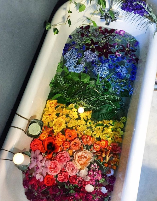
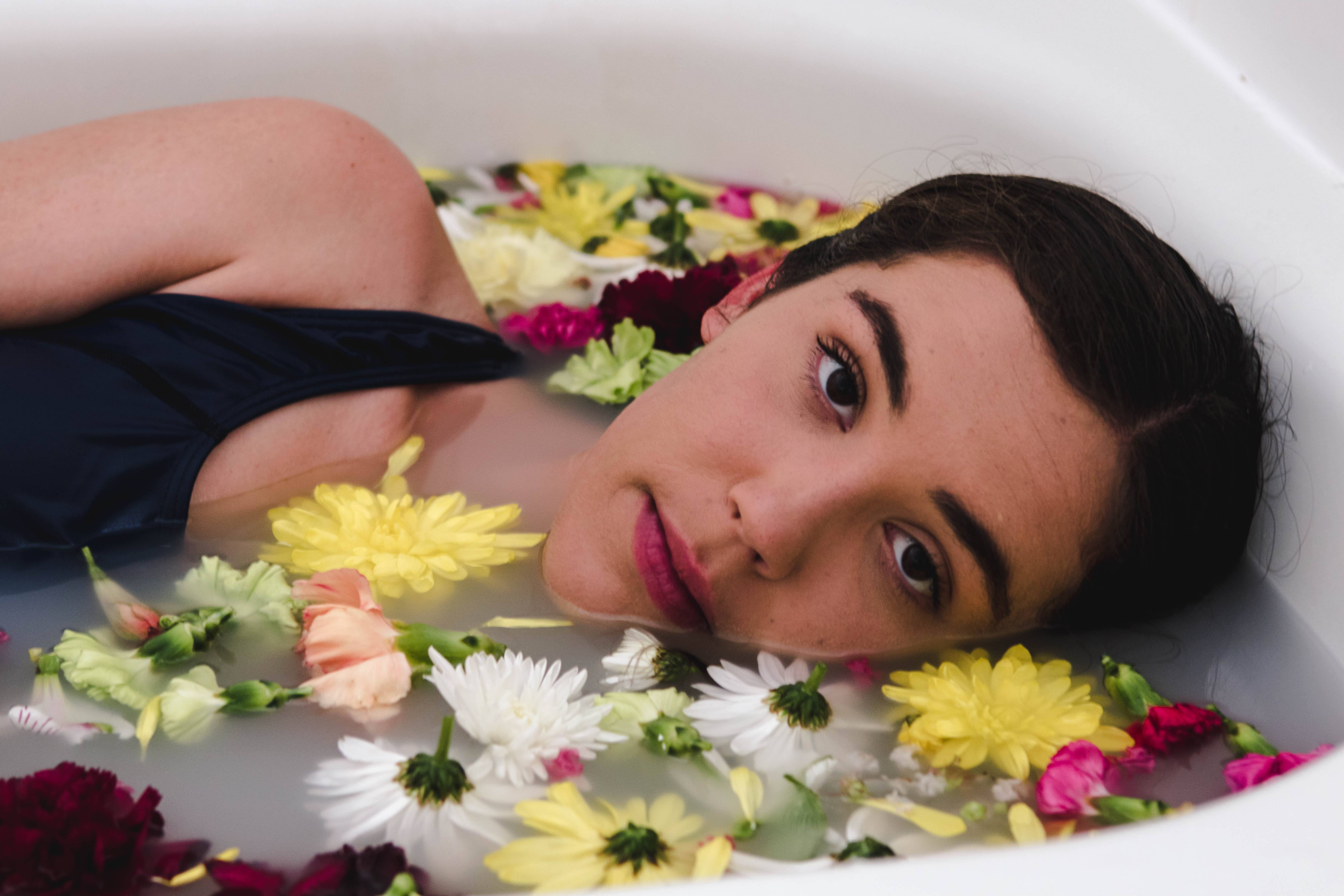
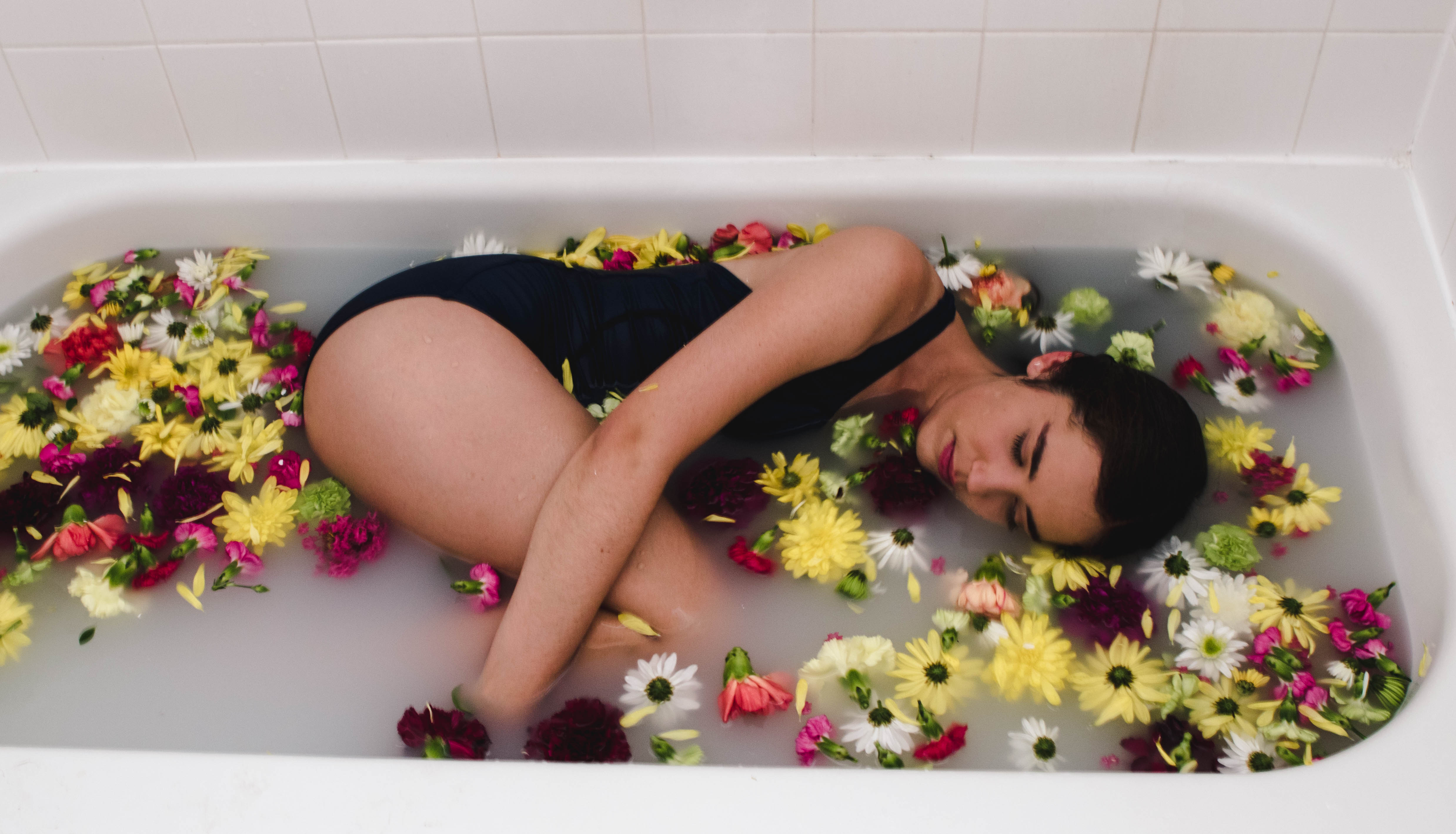
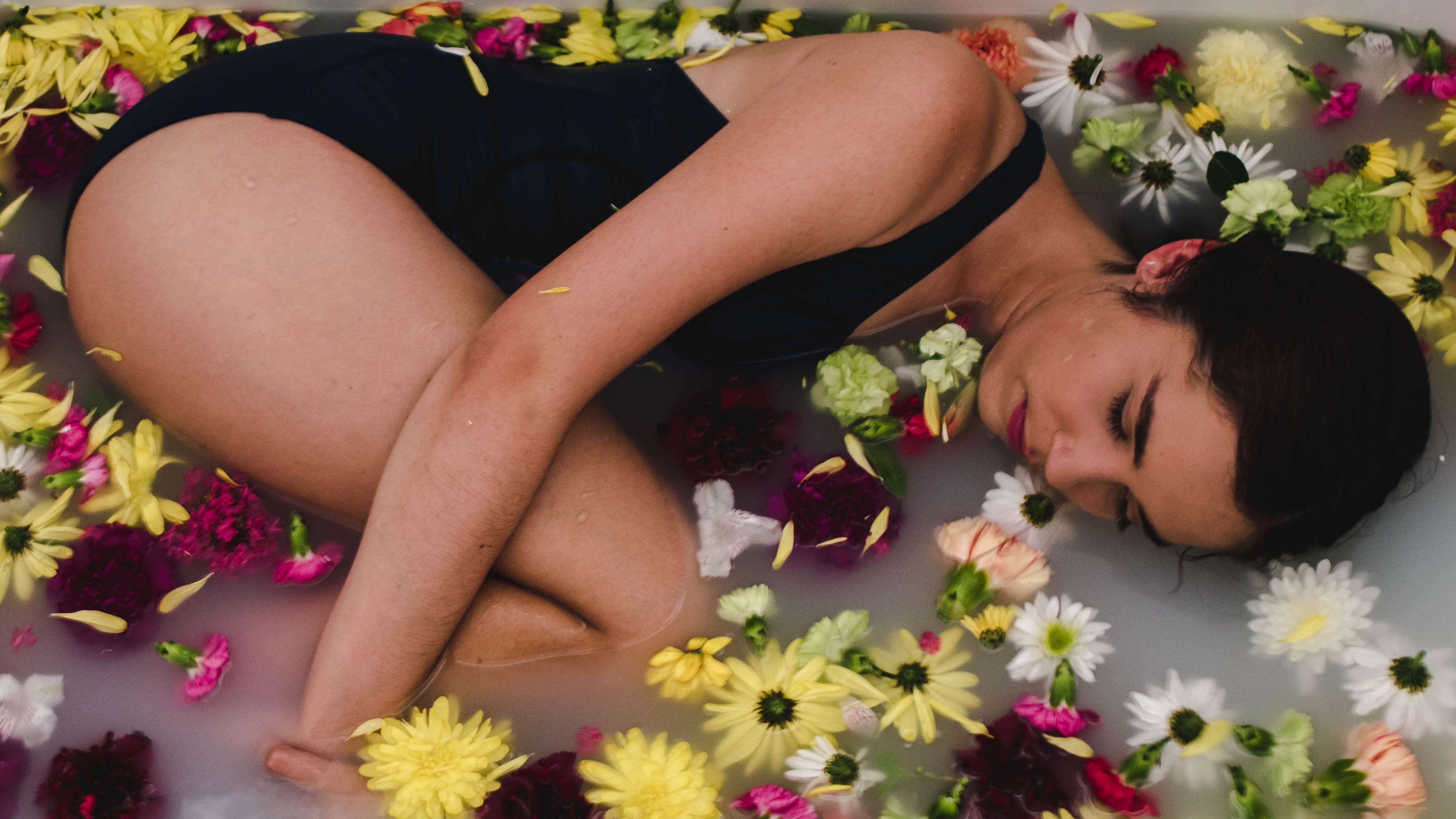
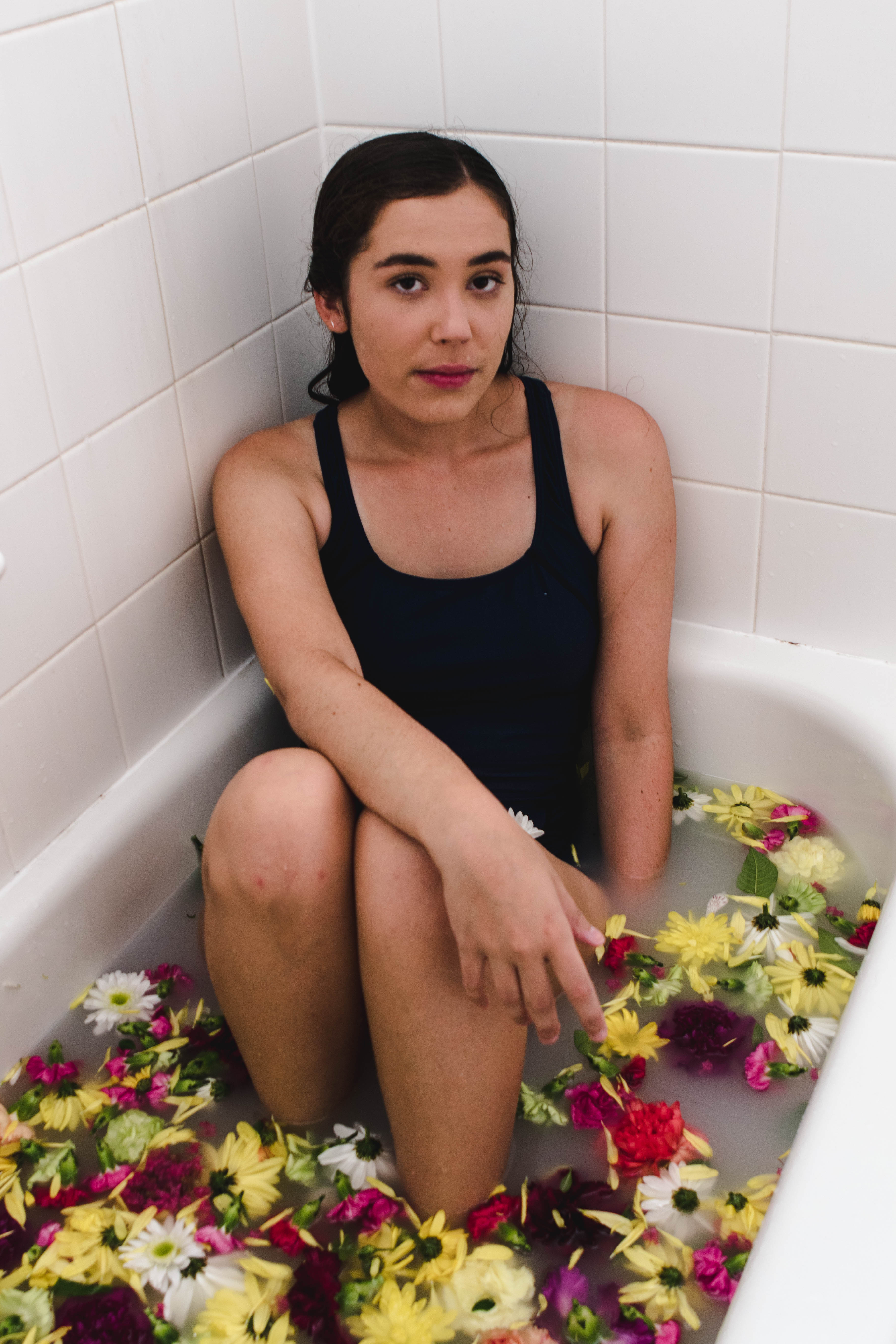
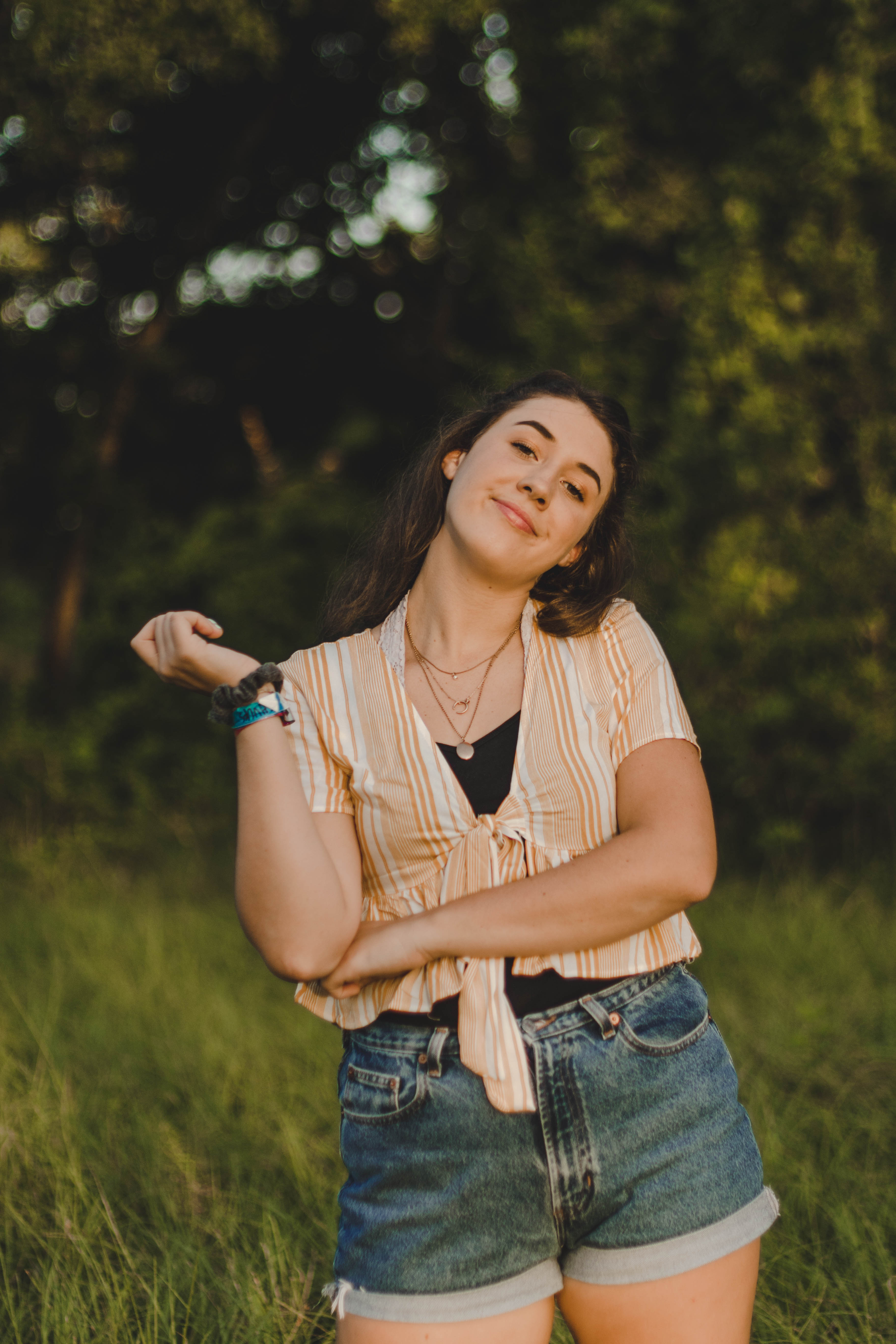
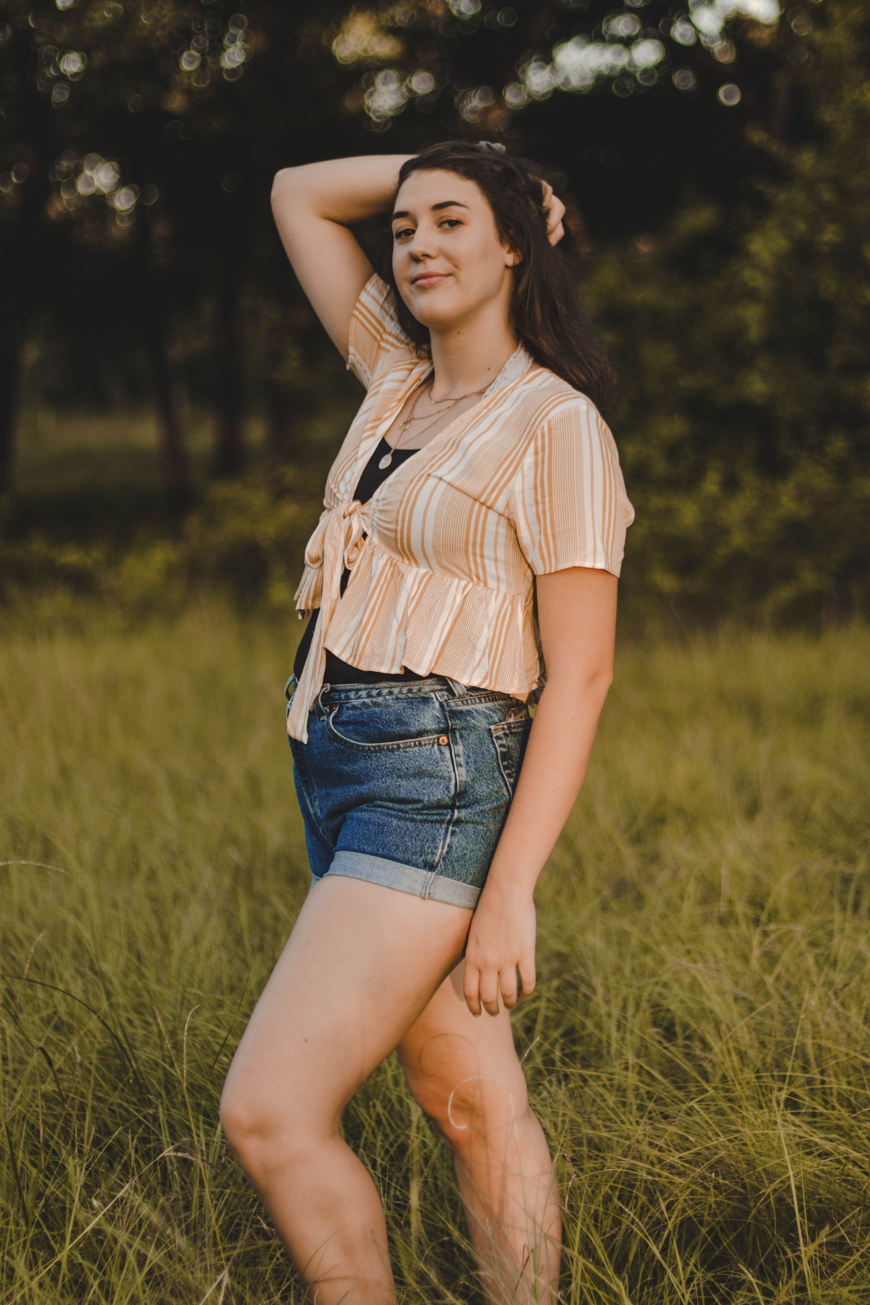
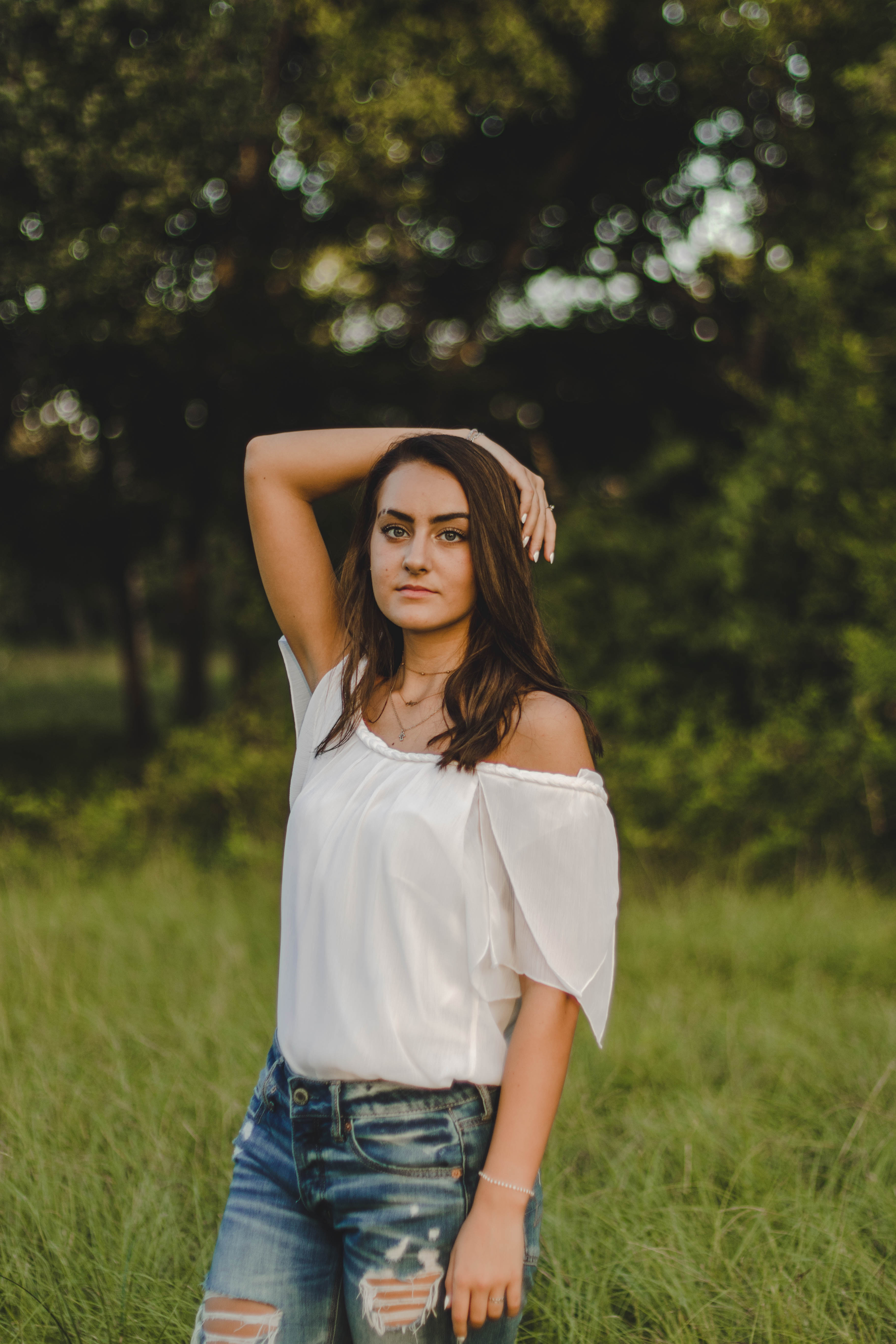
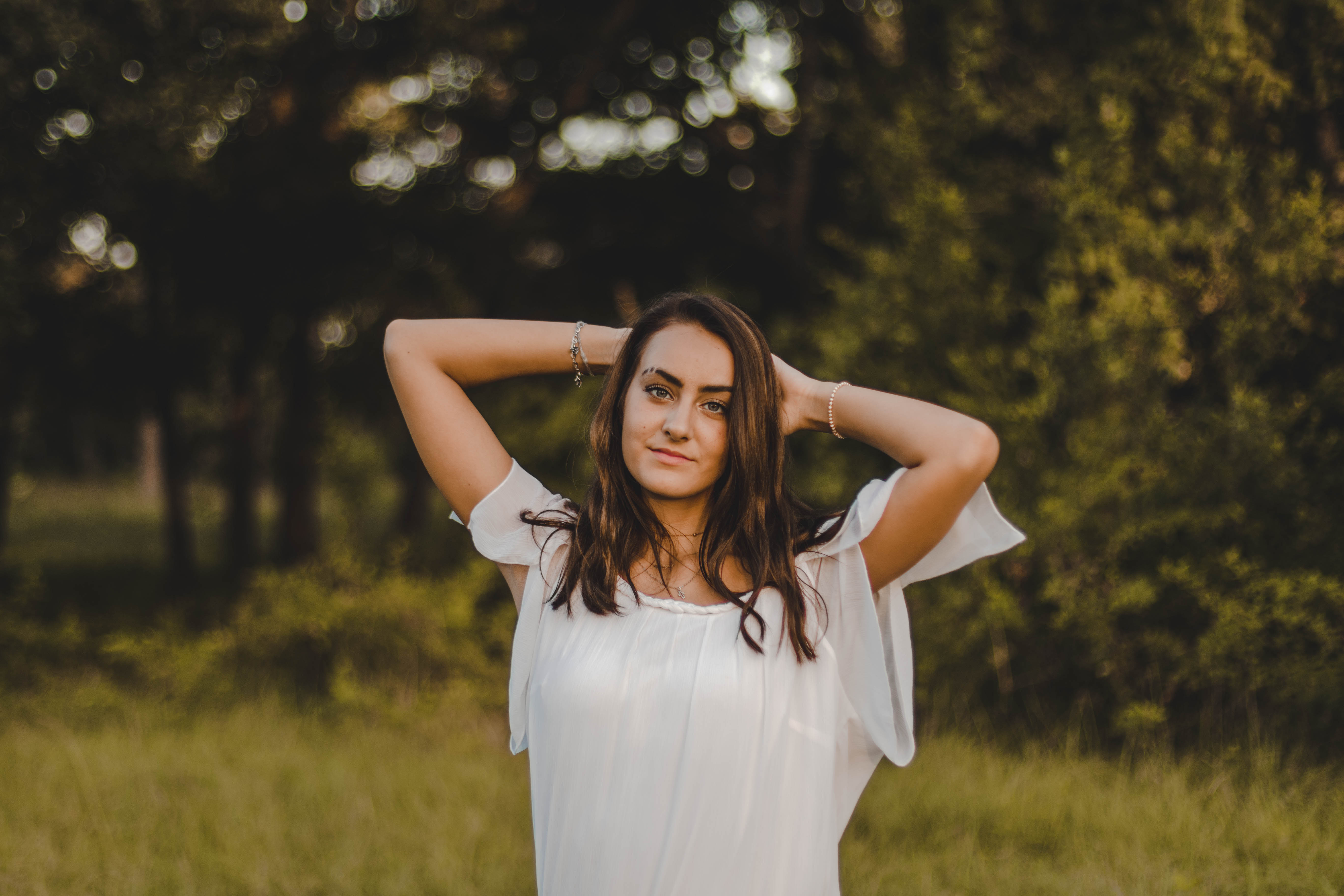
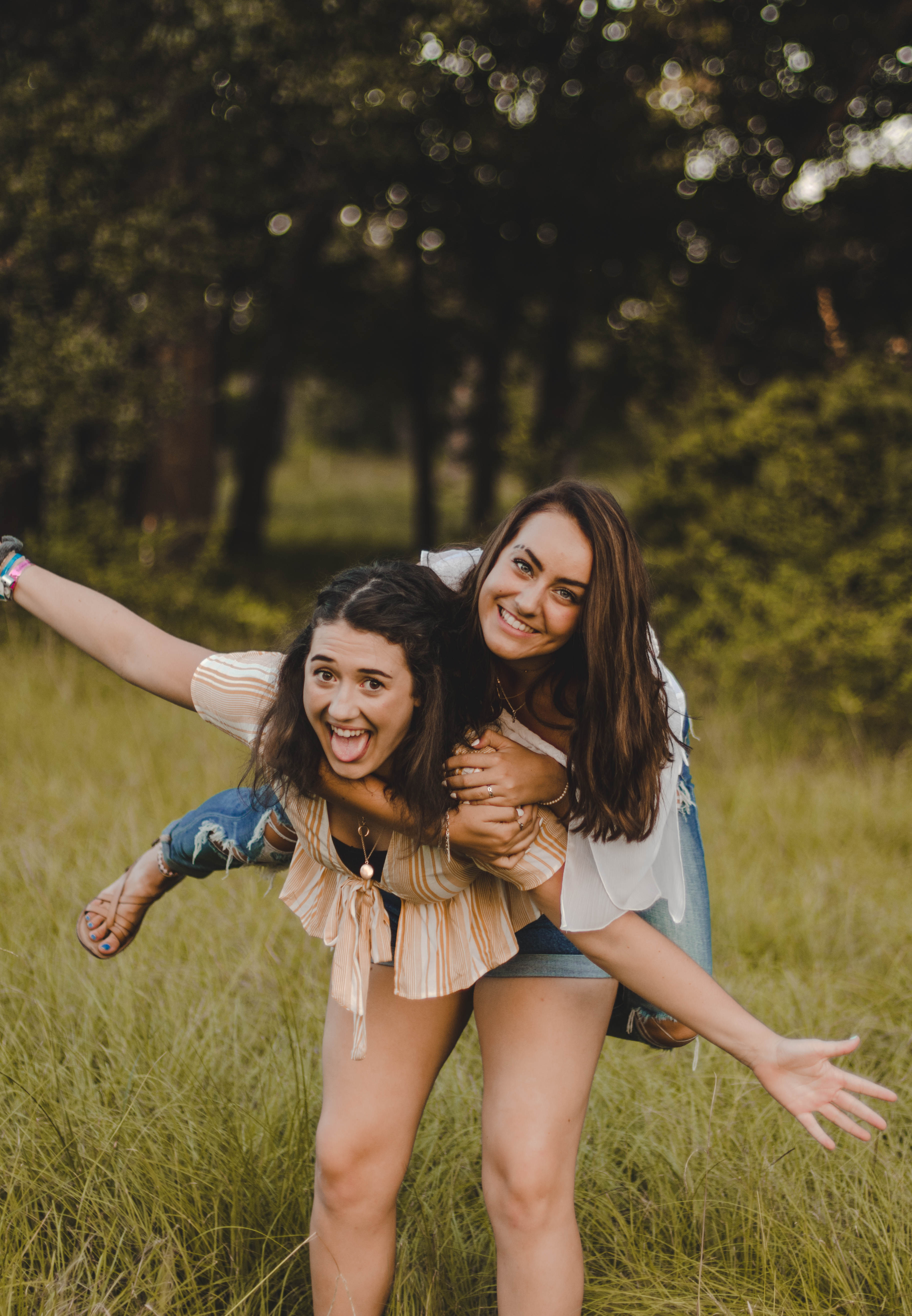
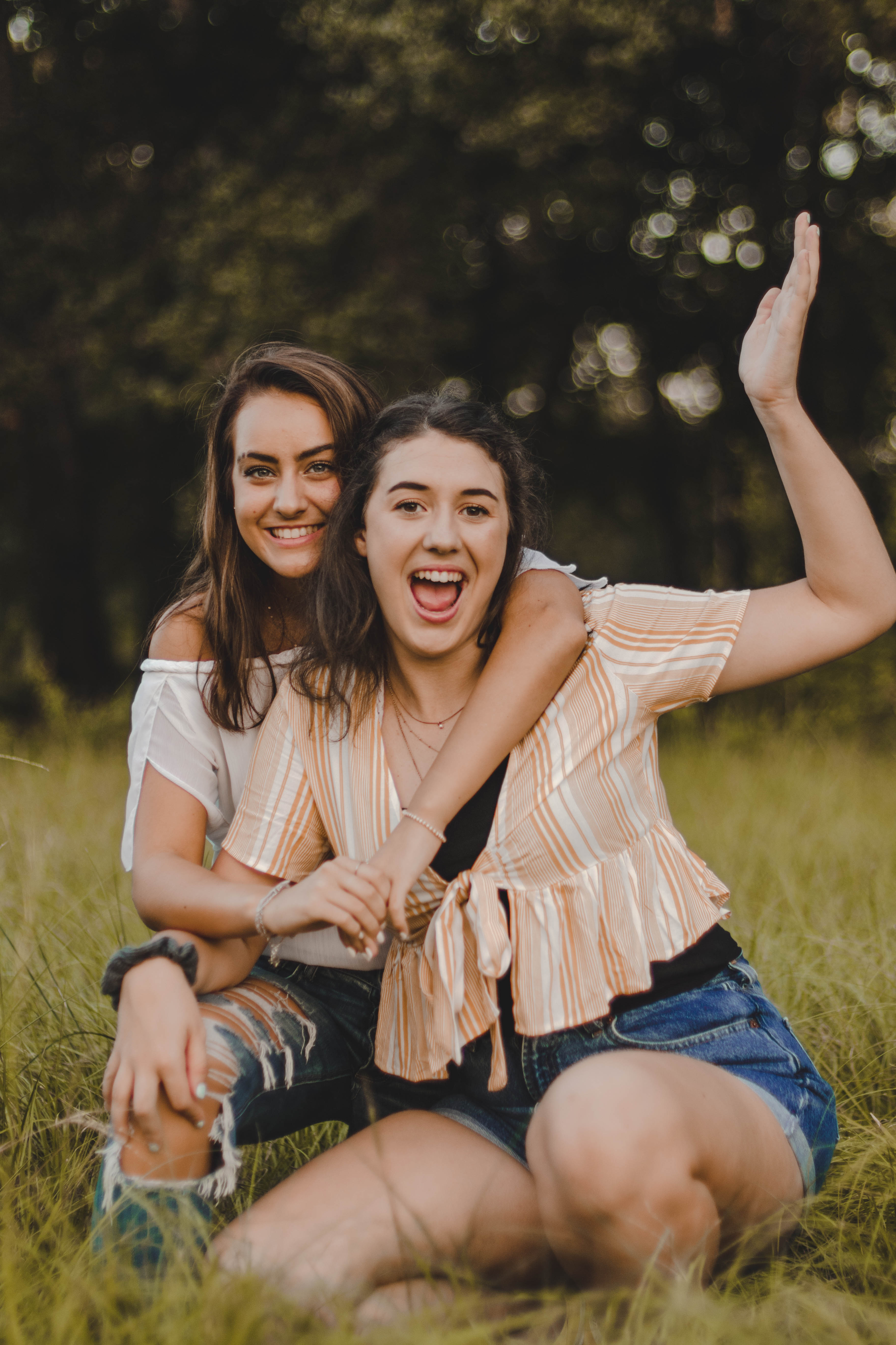
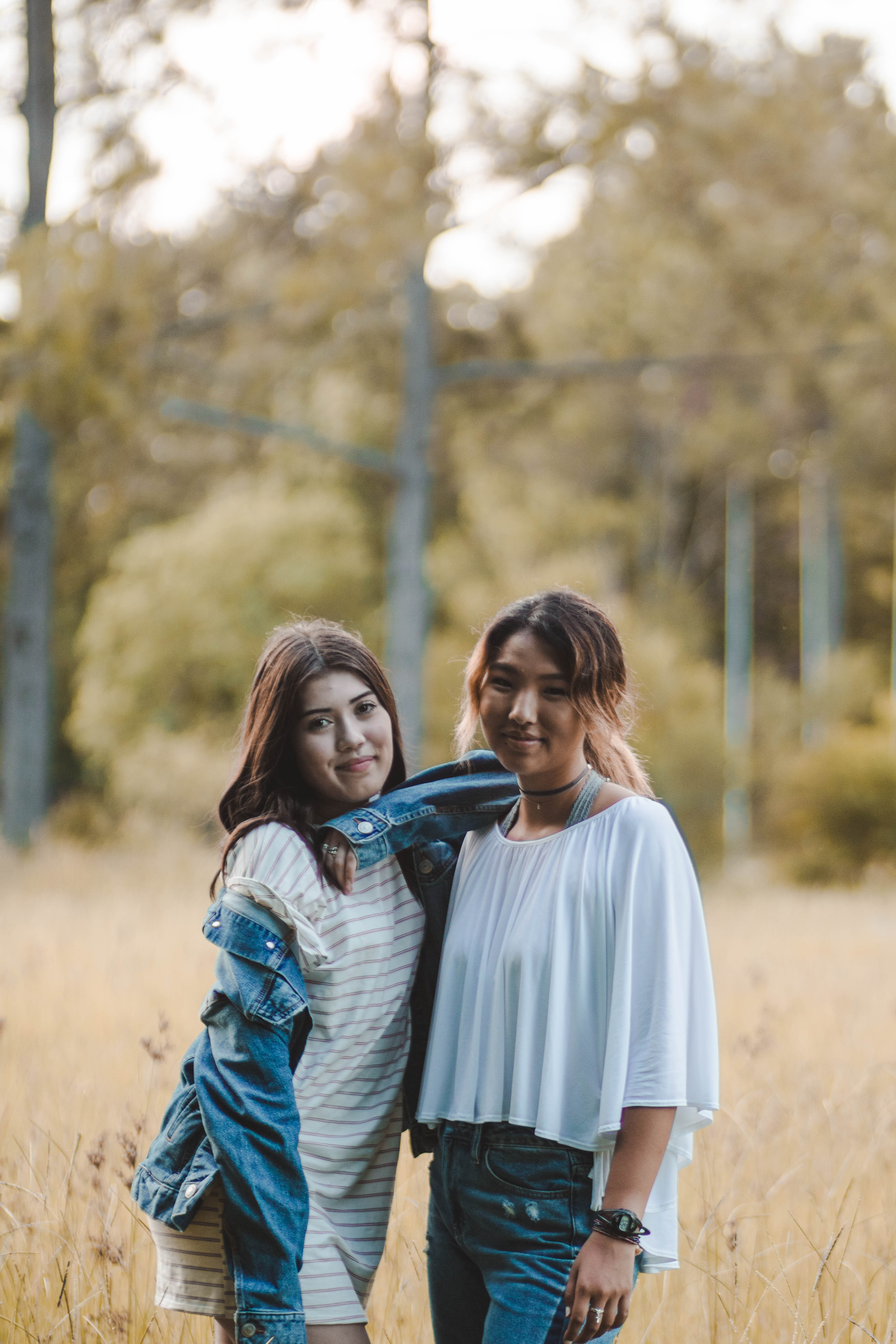
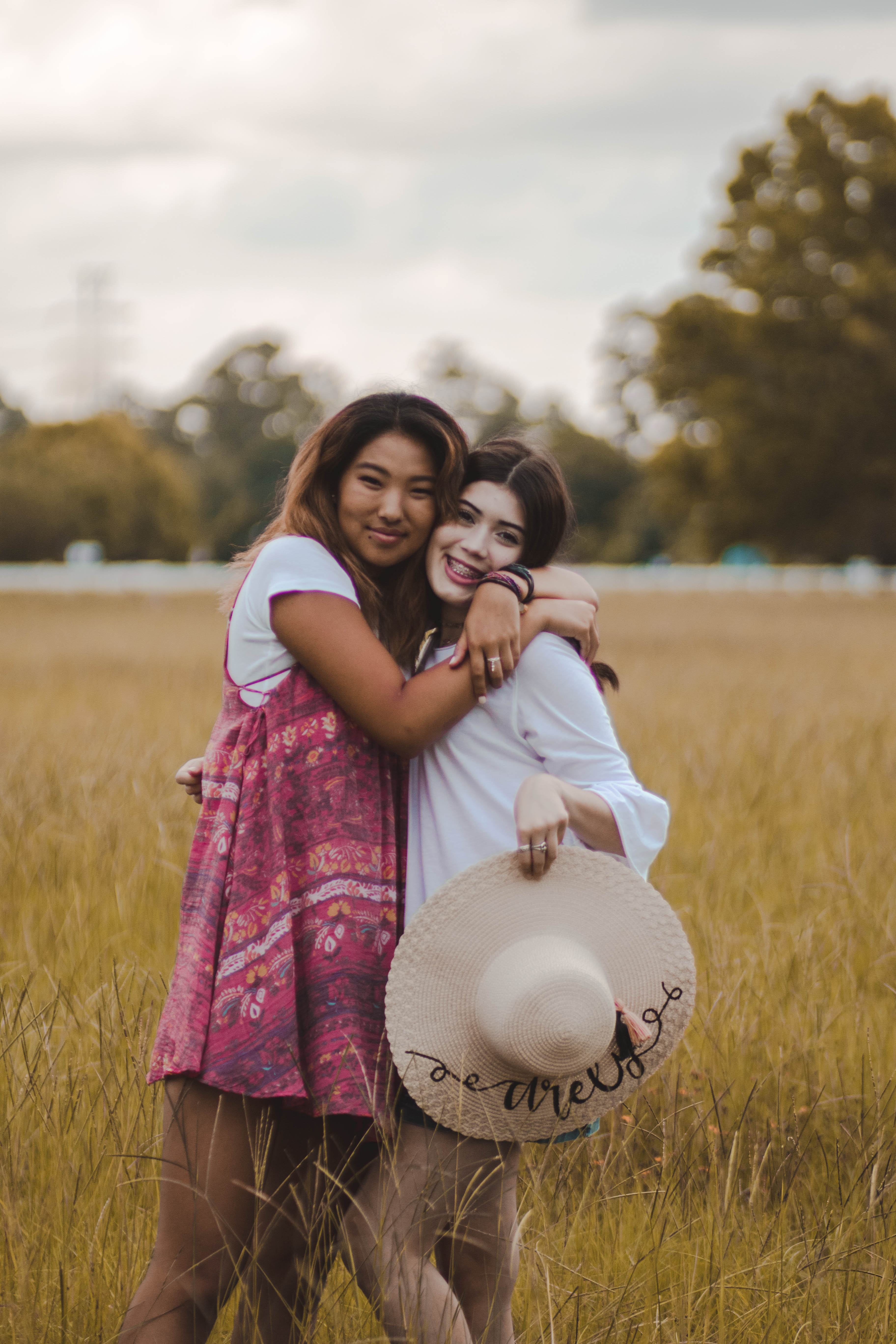
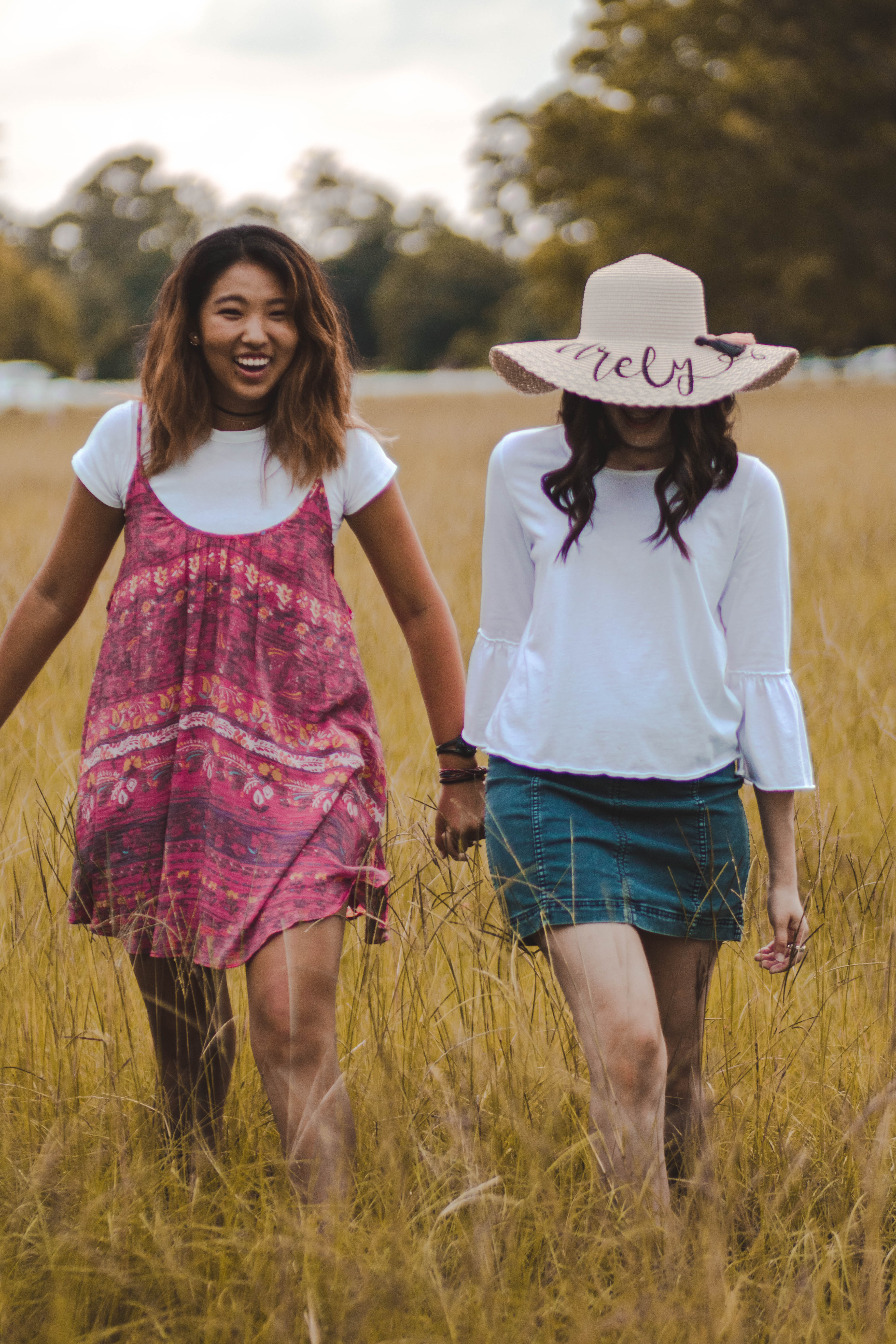
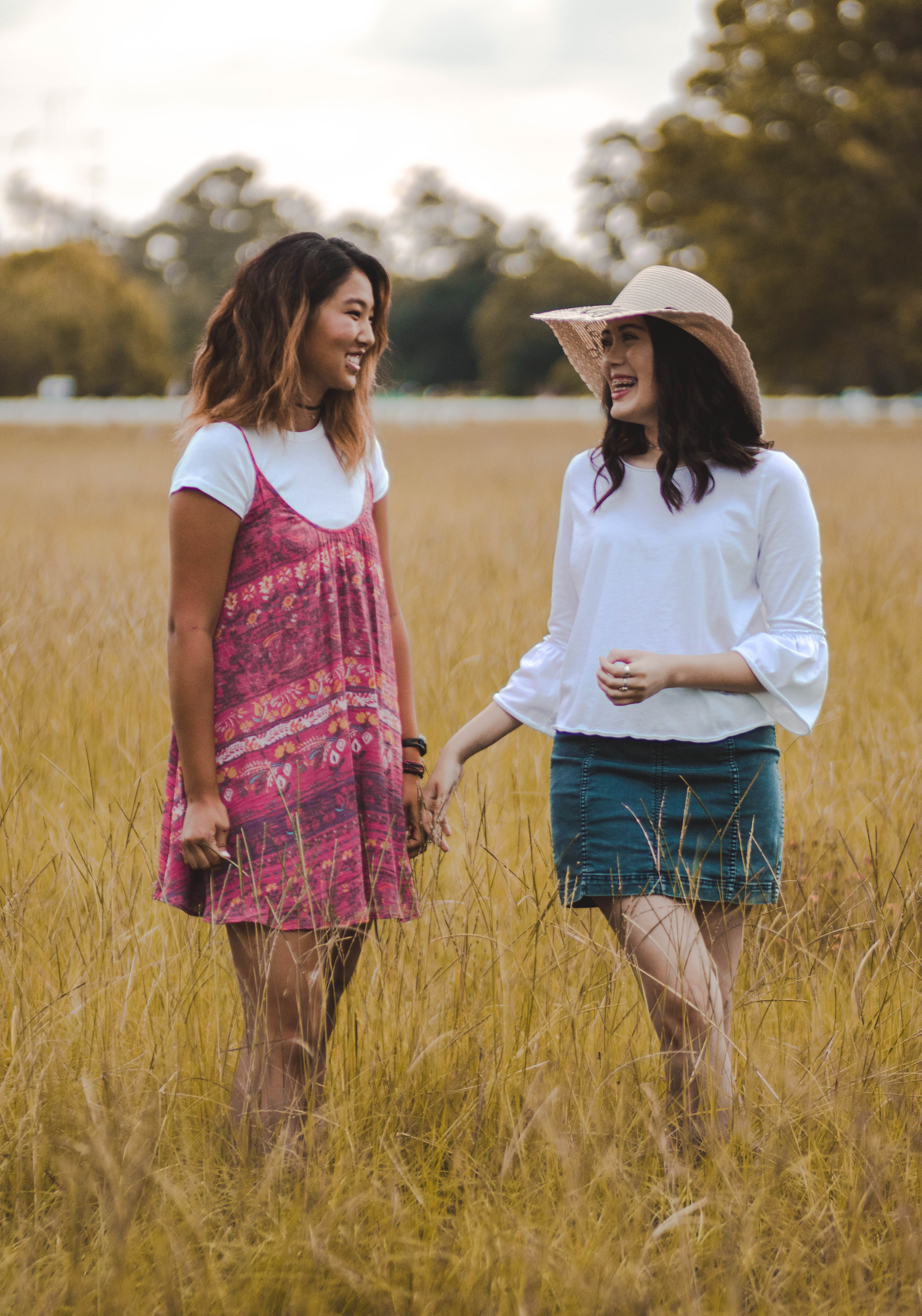
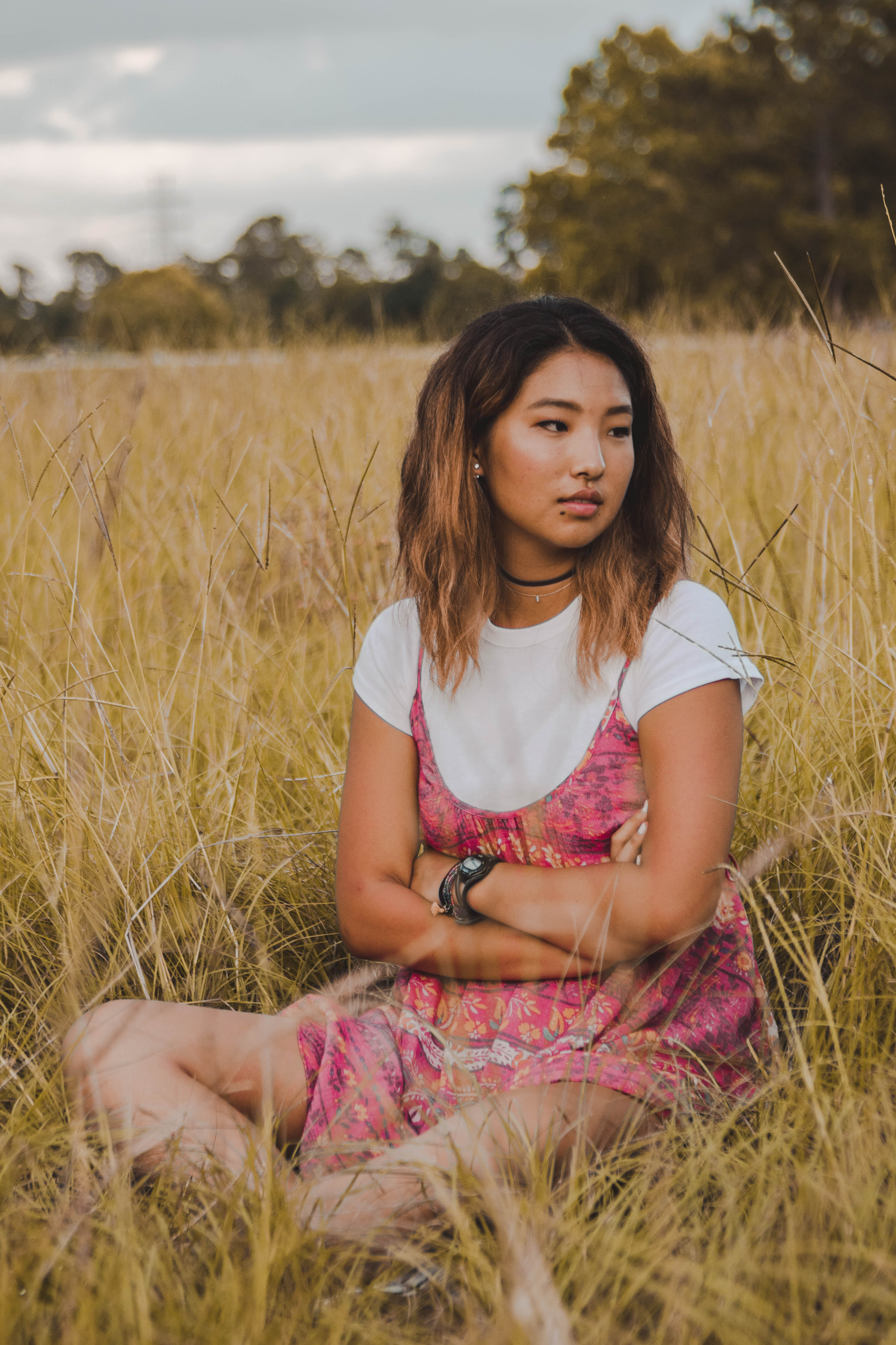
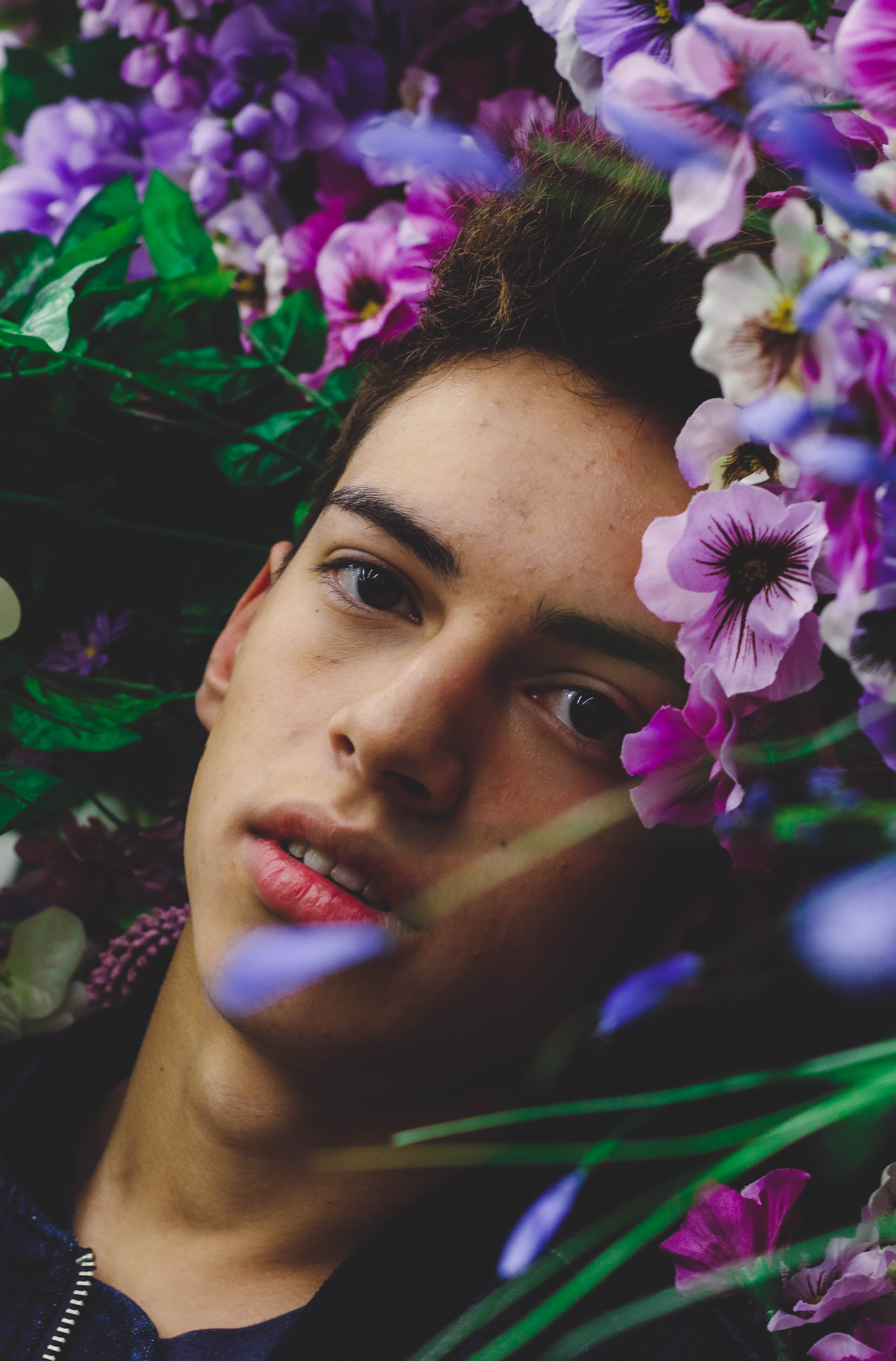
I recently learned about color theory and how it affects images from my photo class and I wanted to share my knowledge with all of you. I did a shoot with the extremes of color using only the secondary colors purple, orange and green in my image. I made the color saturation and shade as similar as possible to create a cohesive and creative looking image but this is only the most dramatic of creating a color scheme. To make a color scheme I love using the website Paletton because it creates a color scheme for you depending on if you want complimentary, monochromatic, adjacent, triad or a tetrad color scheme. Most photoshoots try to have complimentary colors that cause the image to be more appealing to the eye. In this post, I will go over the psychology behind color to show you how color can affect your images.
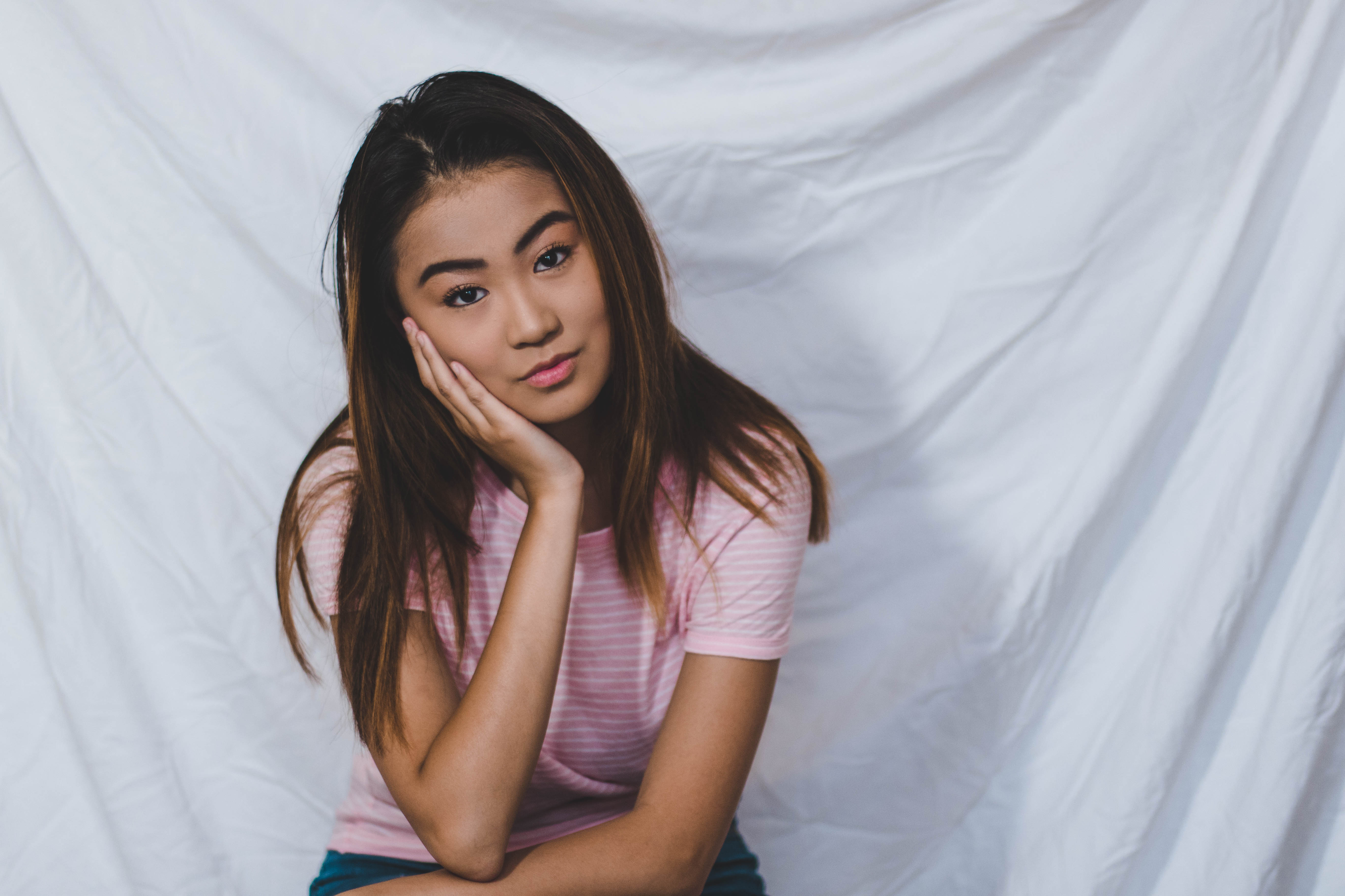
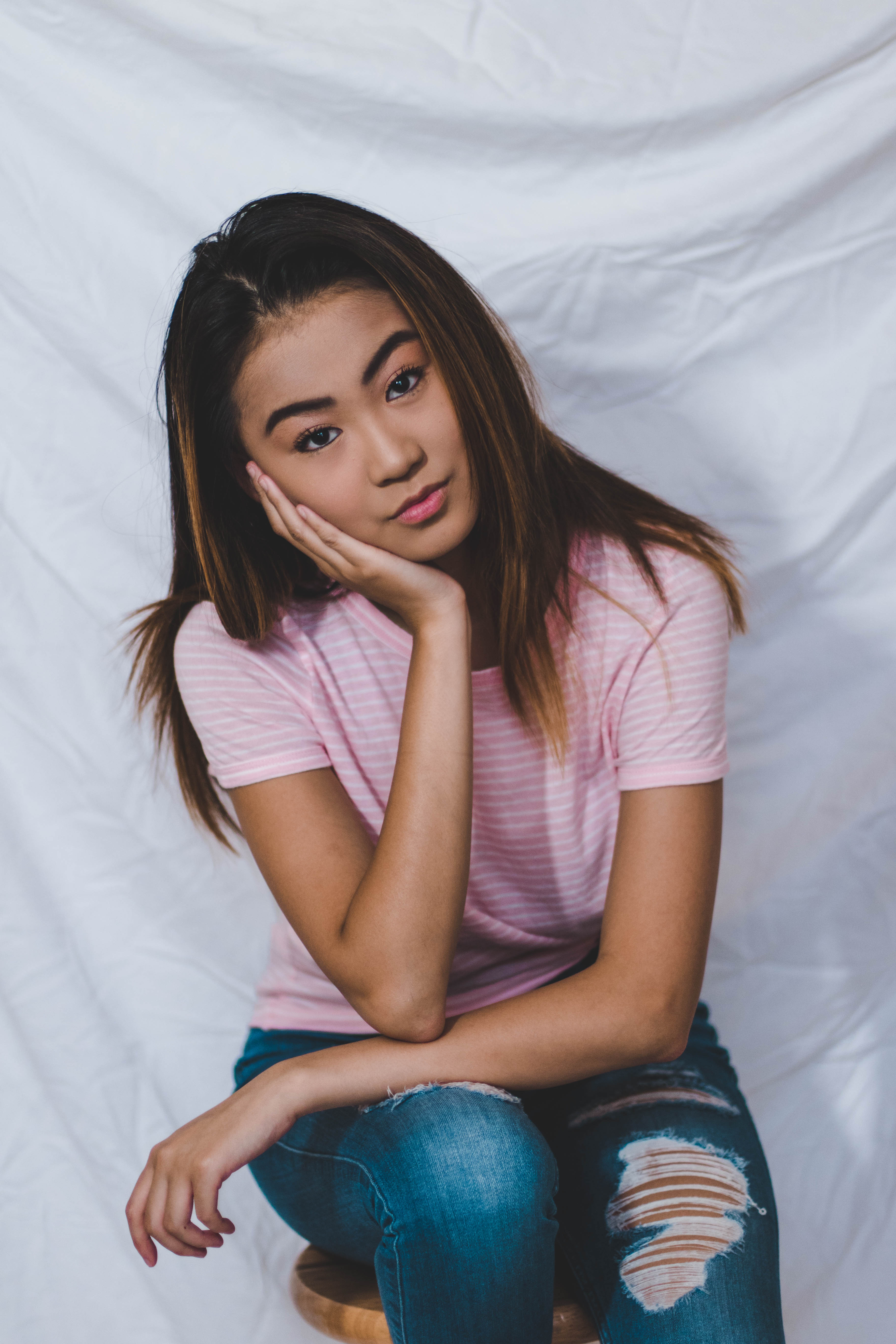
Warm Tones
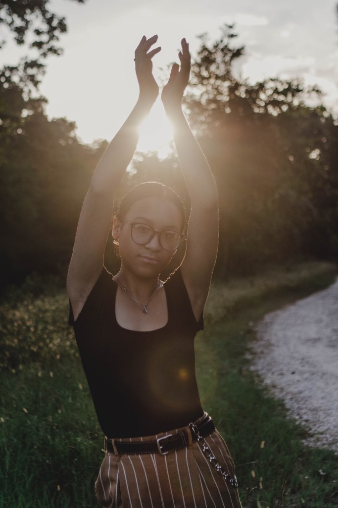
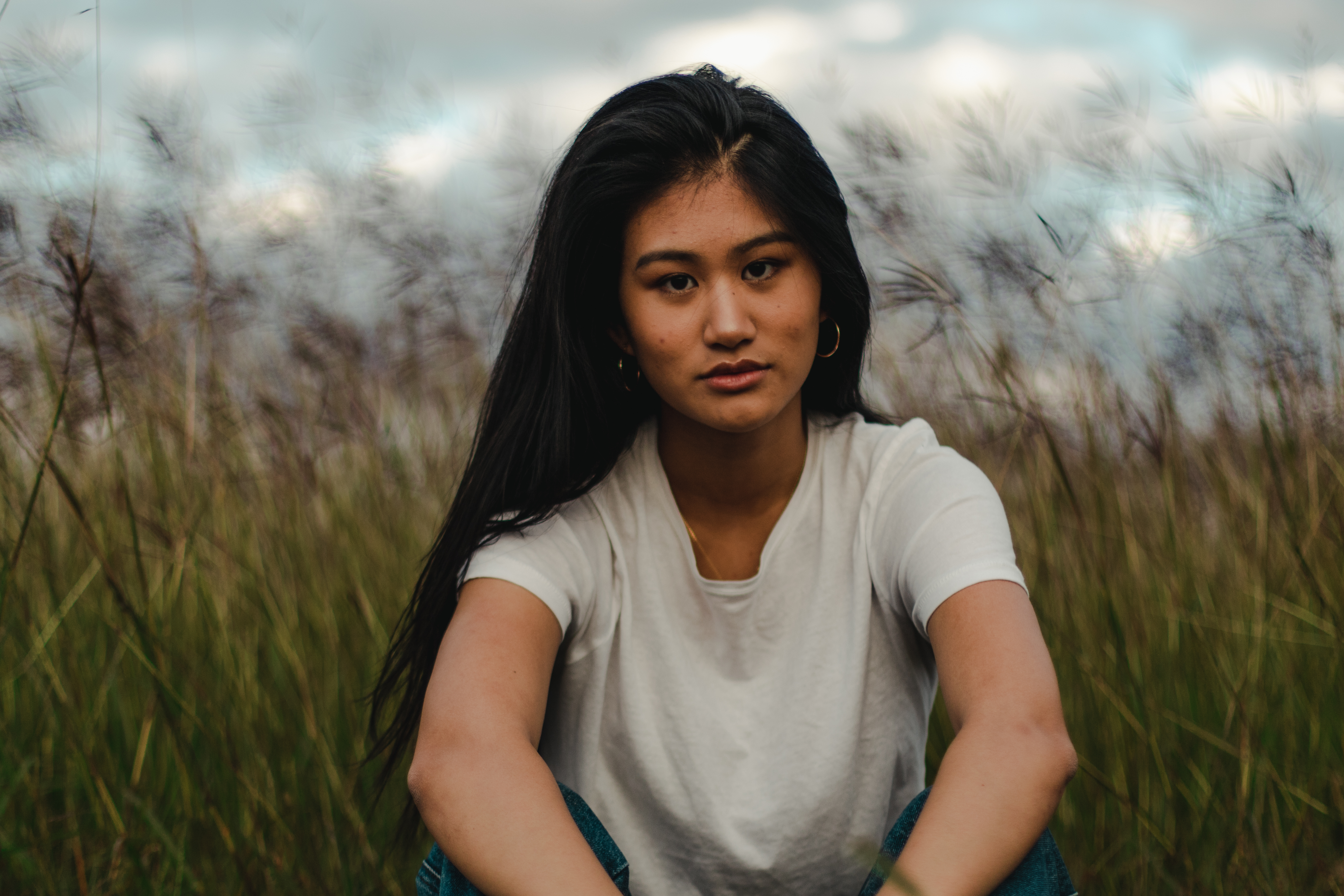
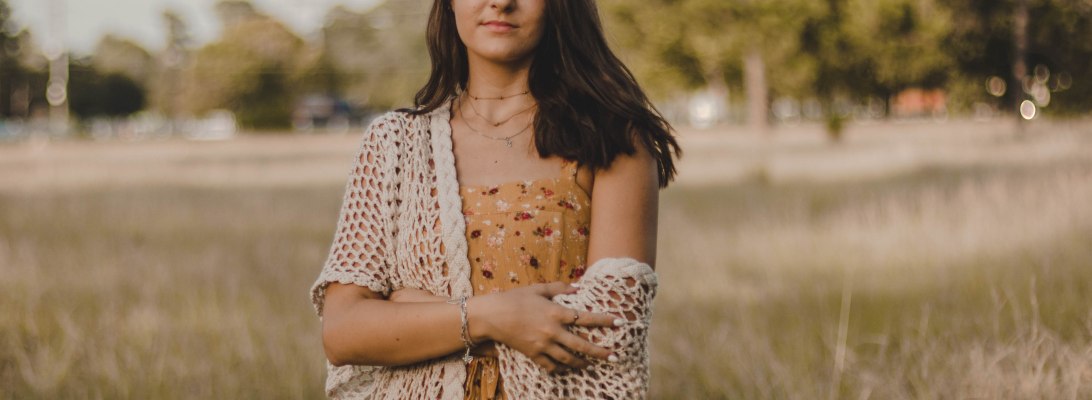
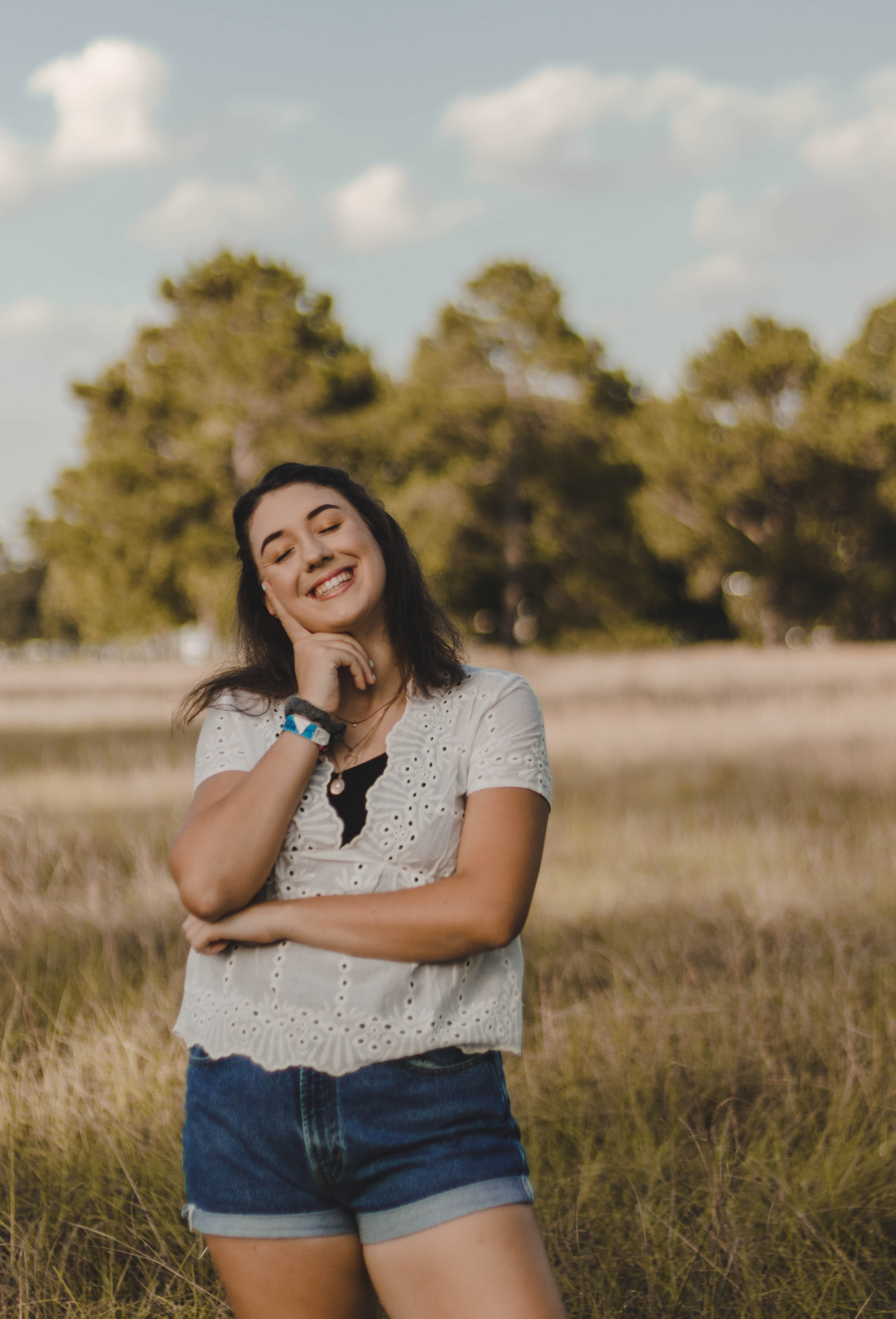
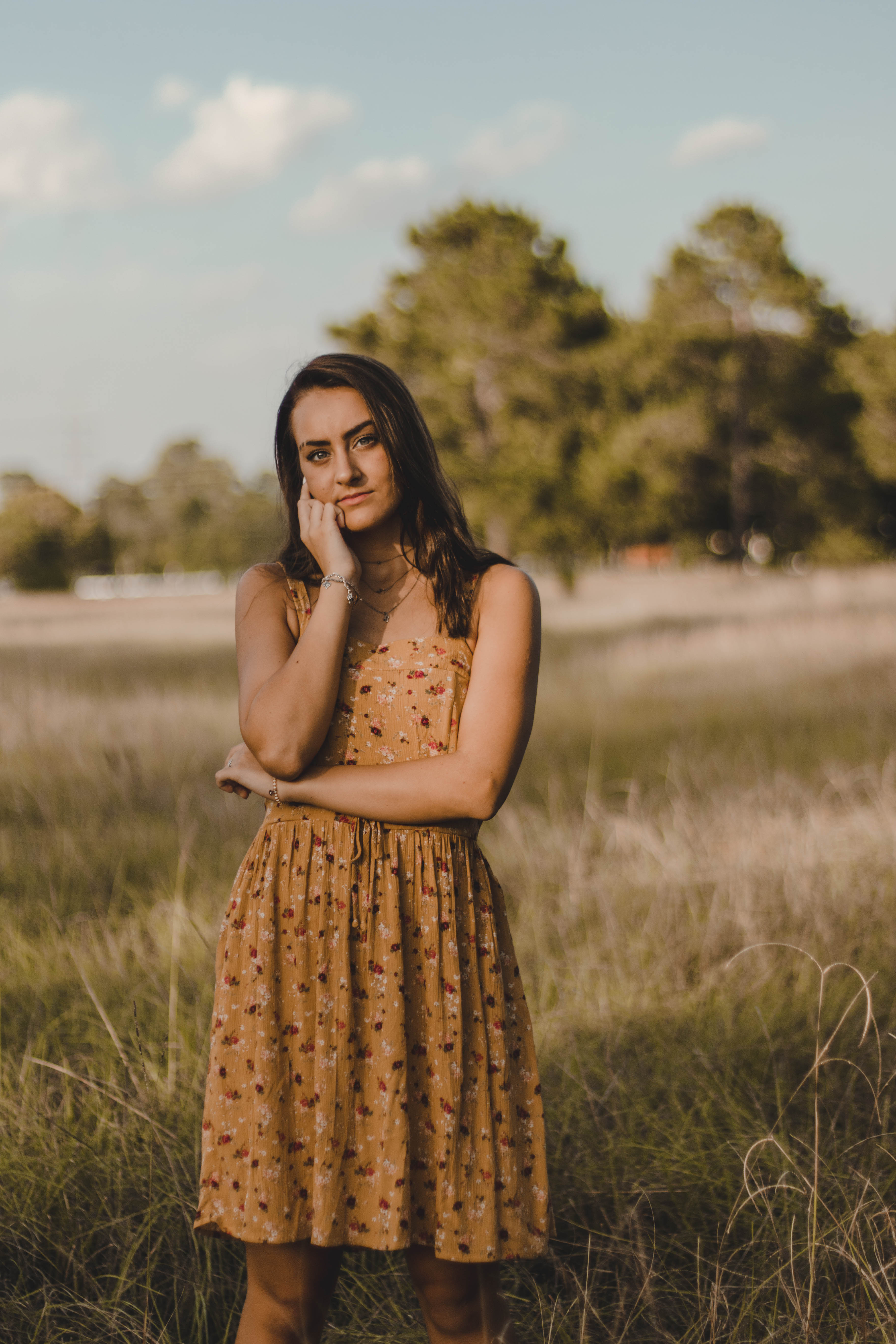
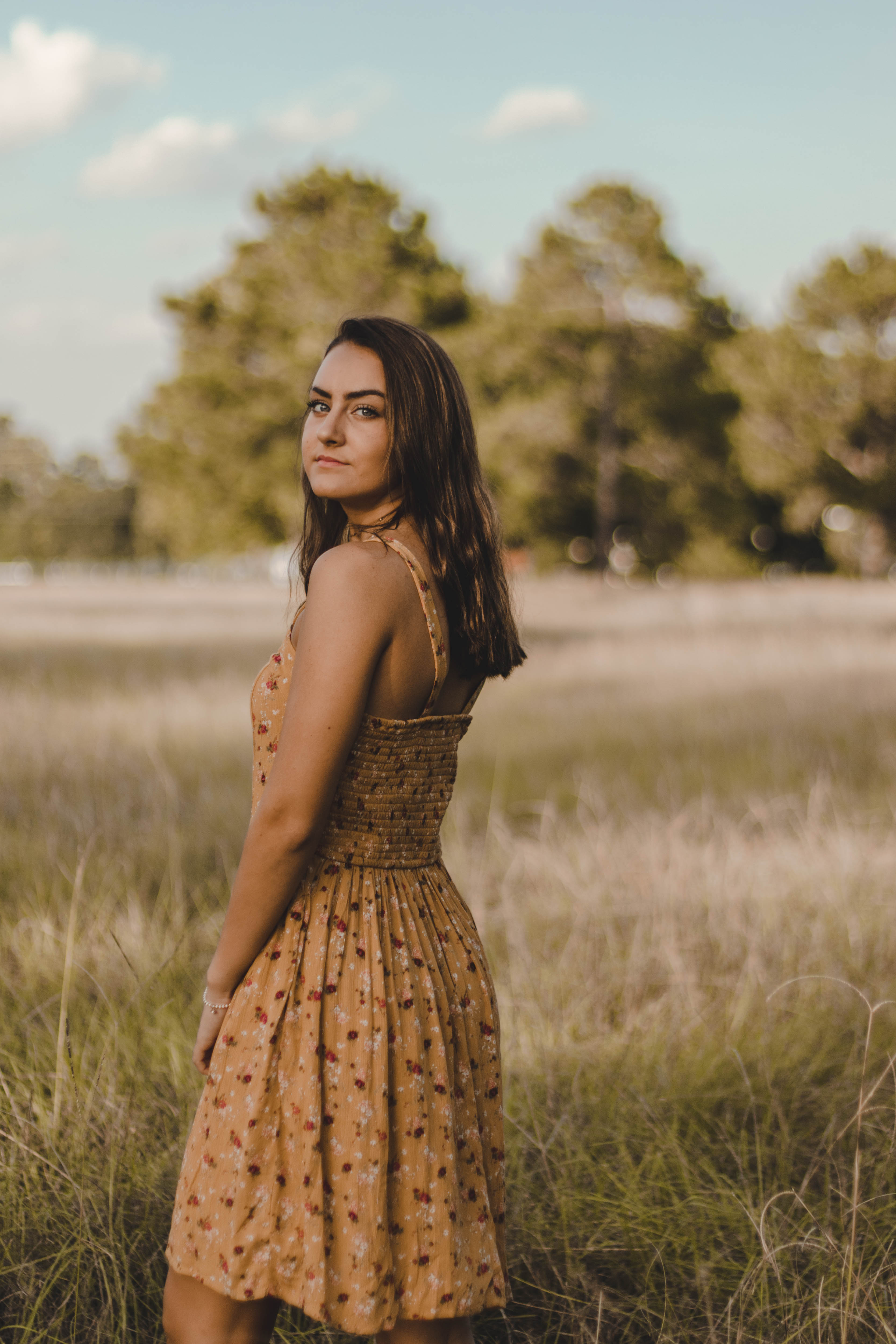
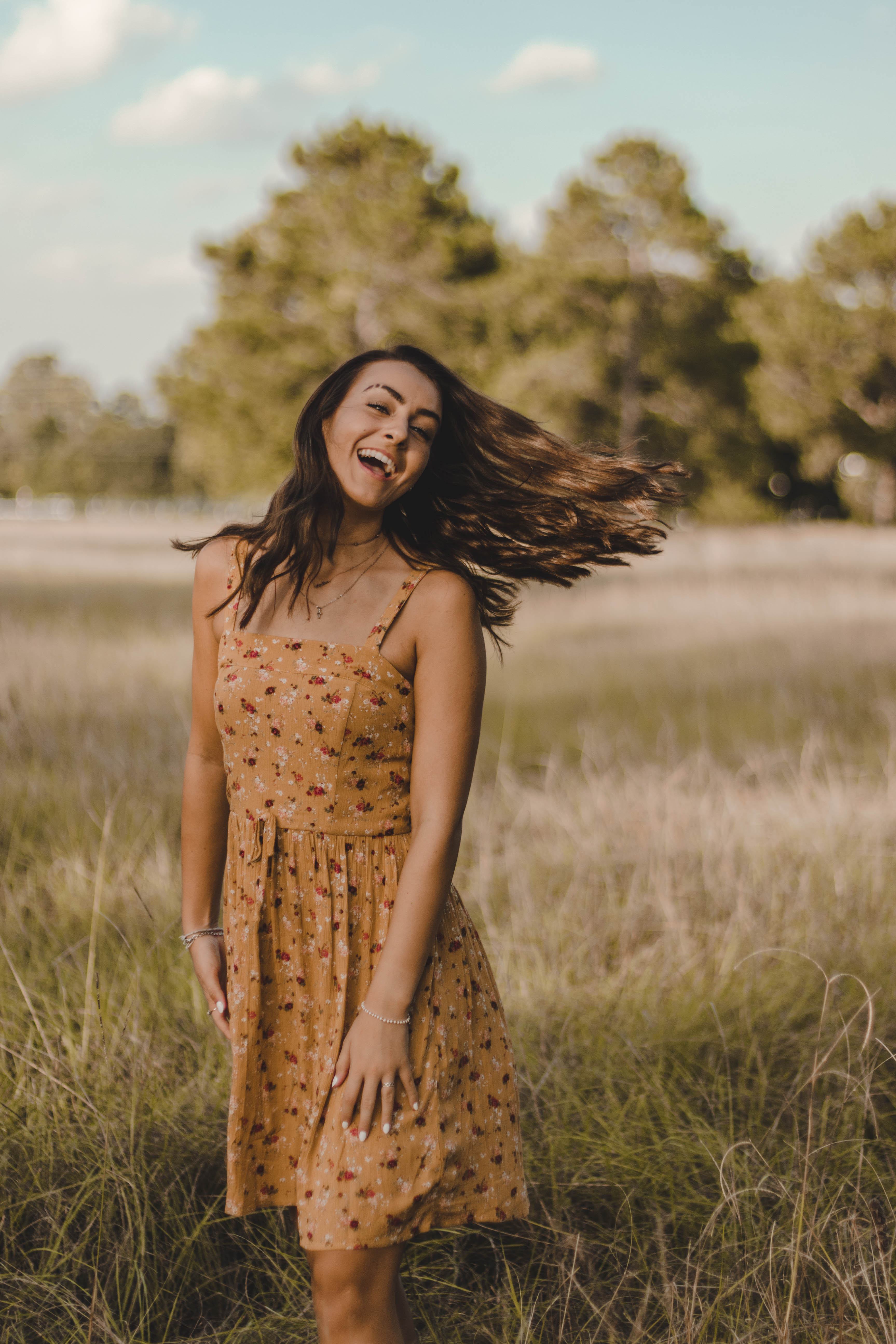
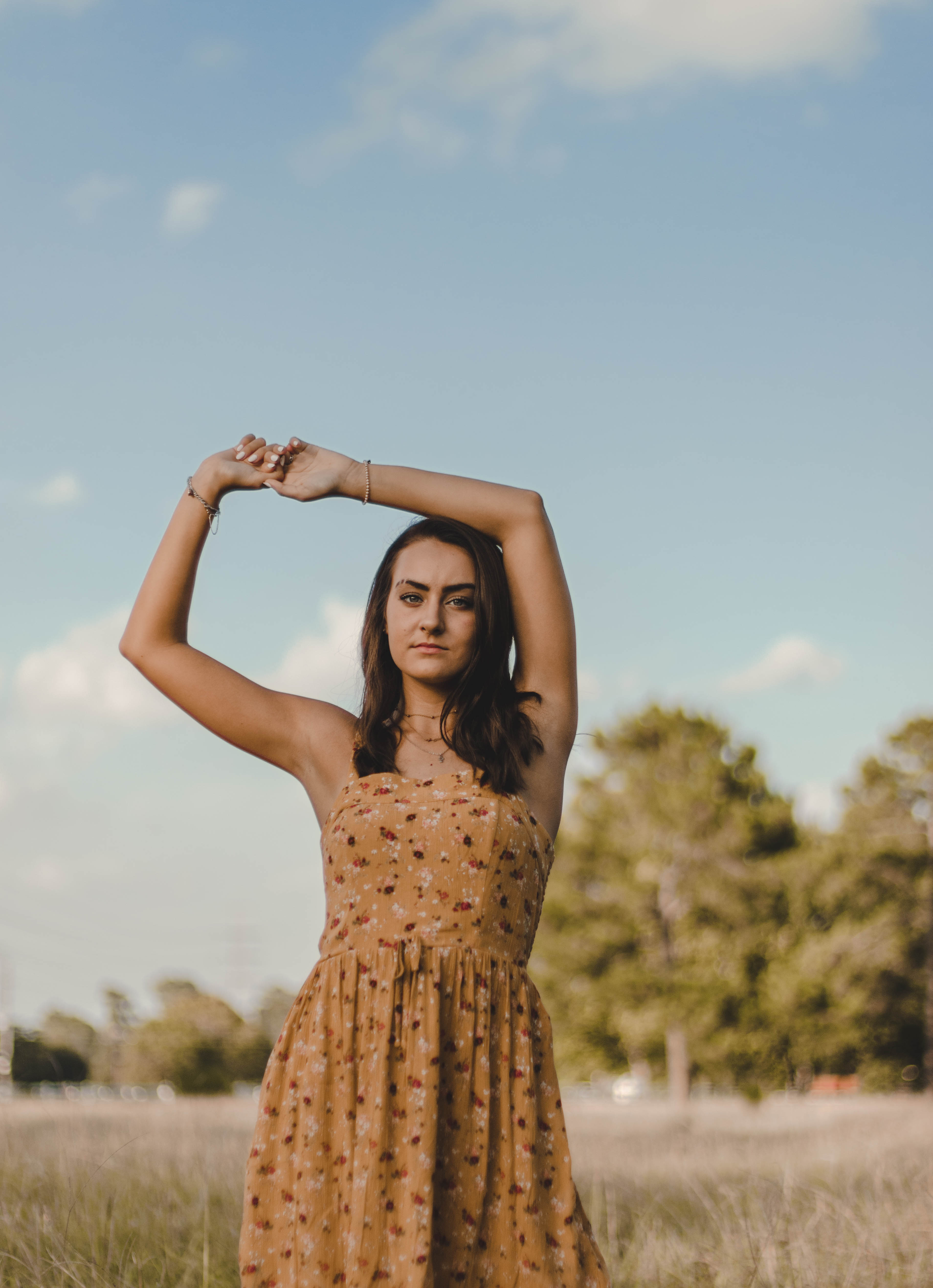
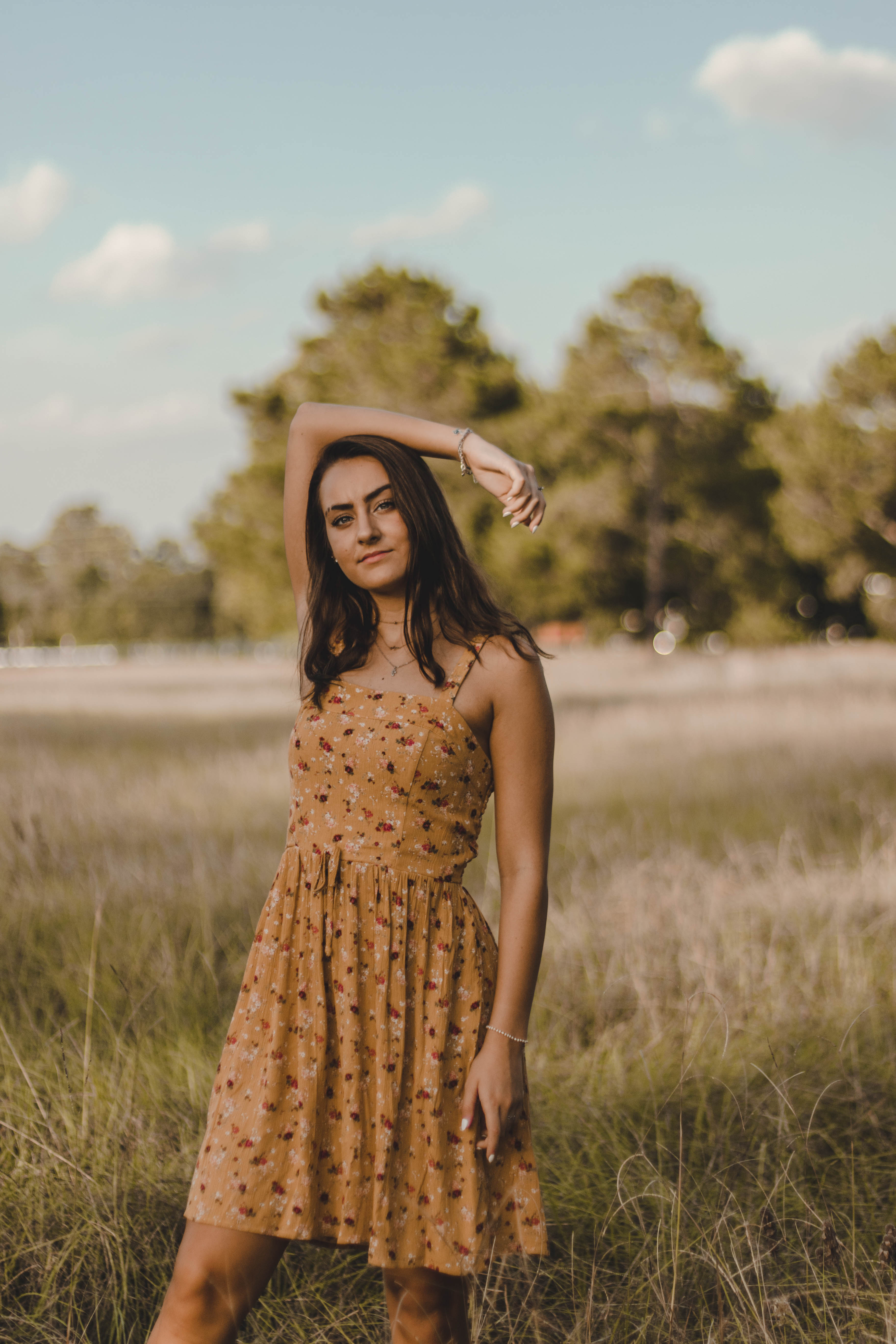
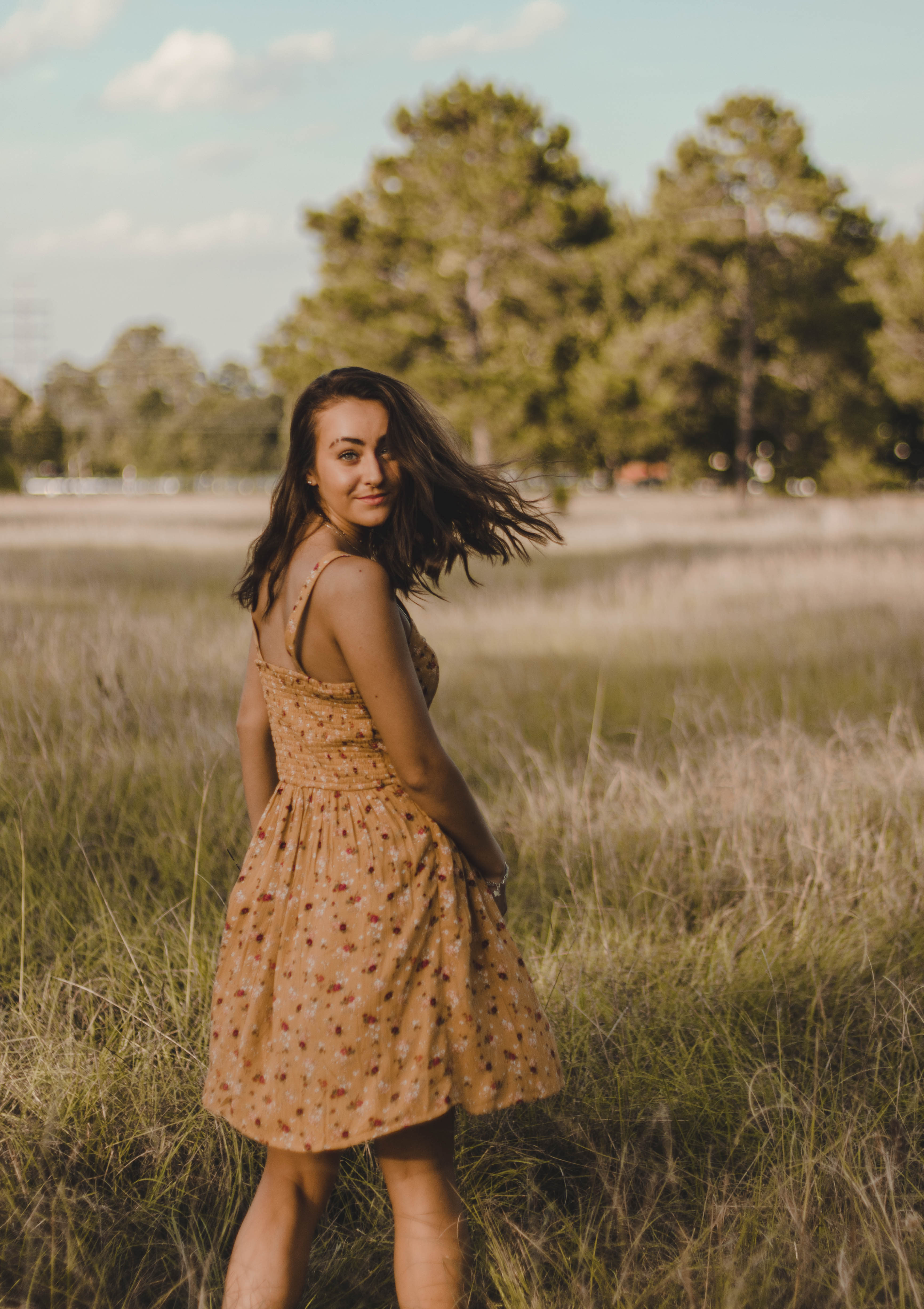
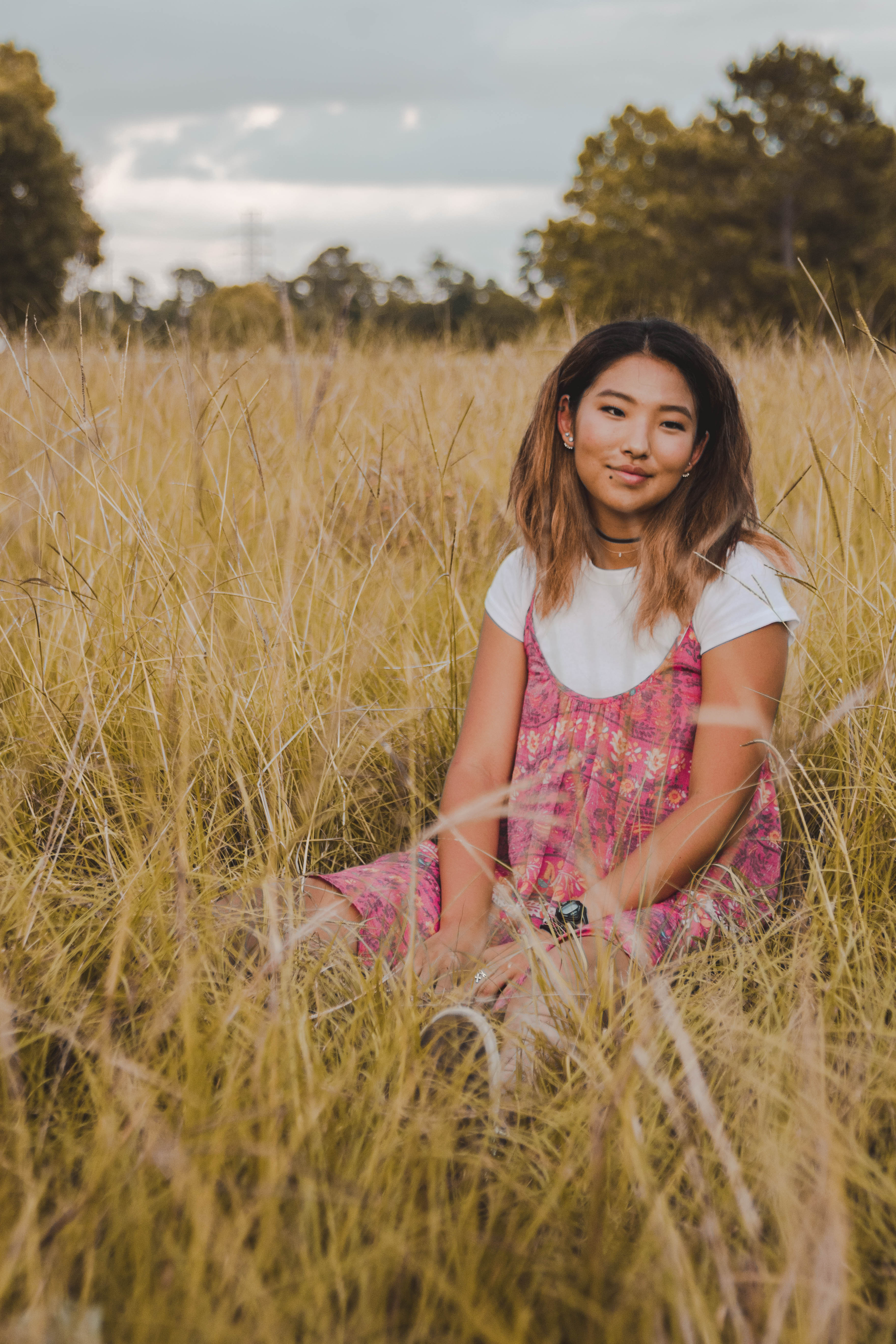
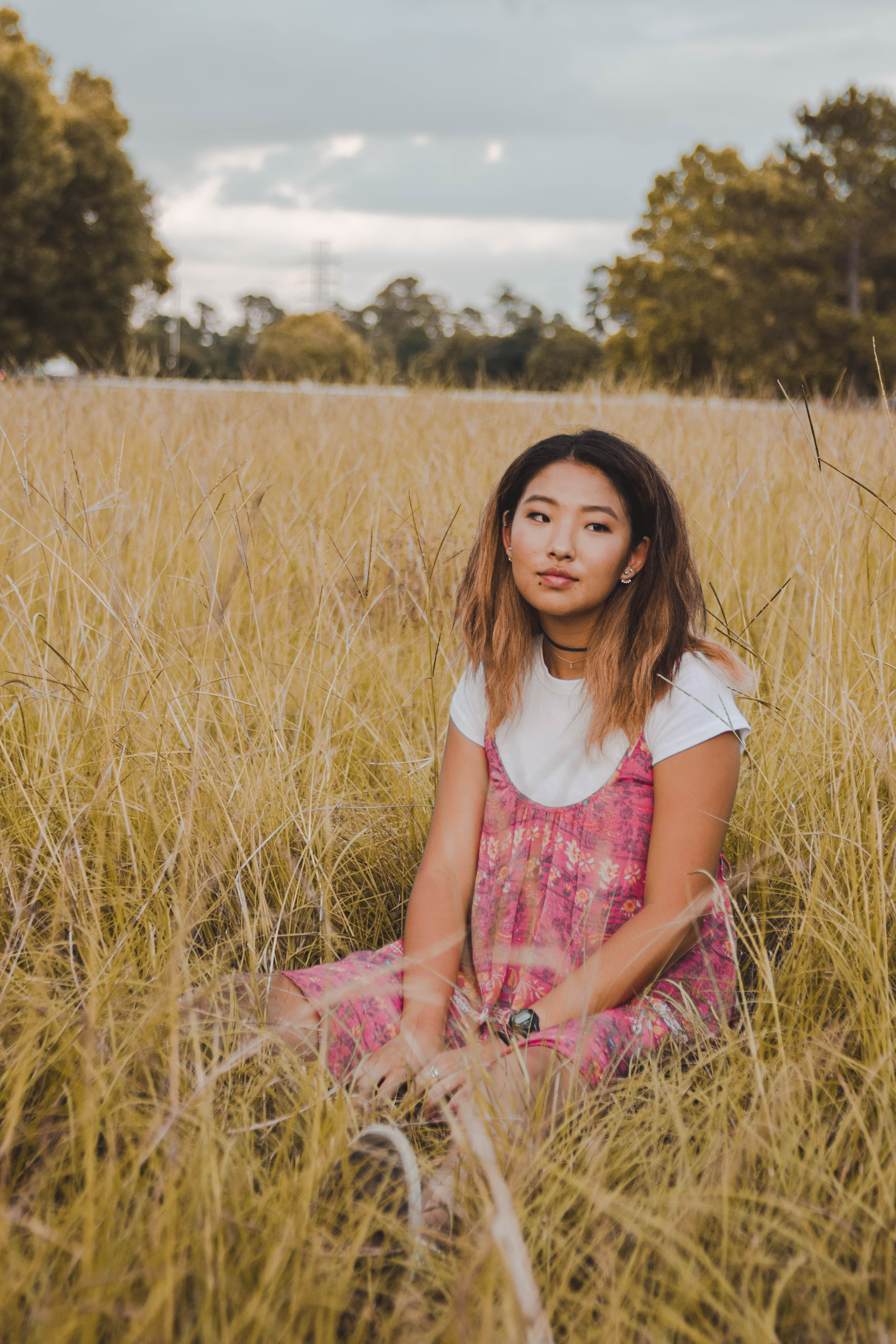
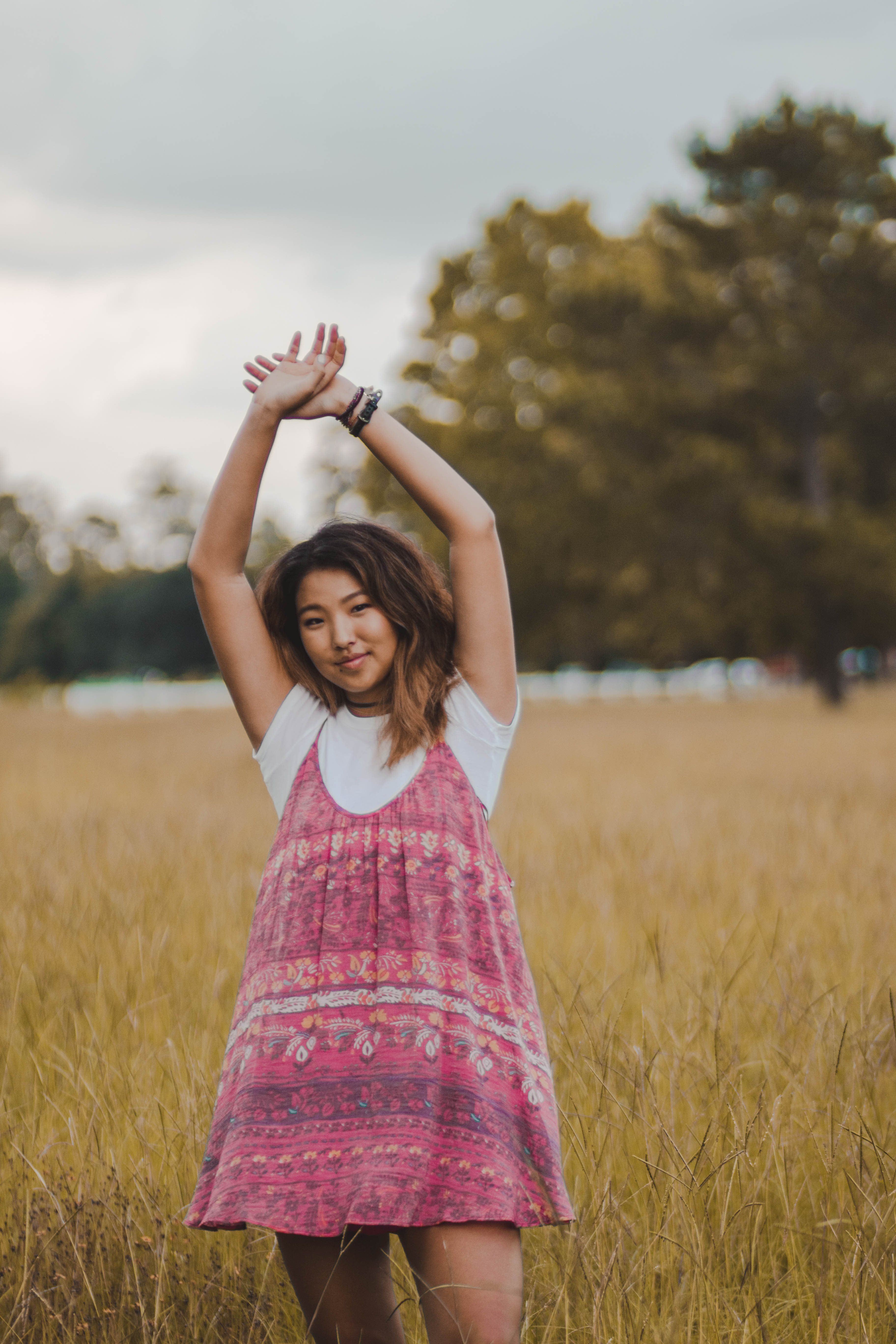
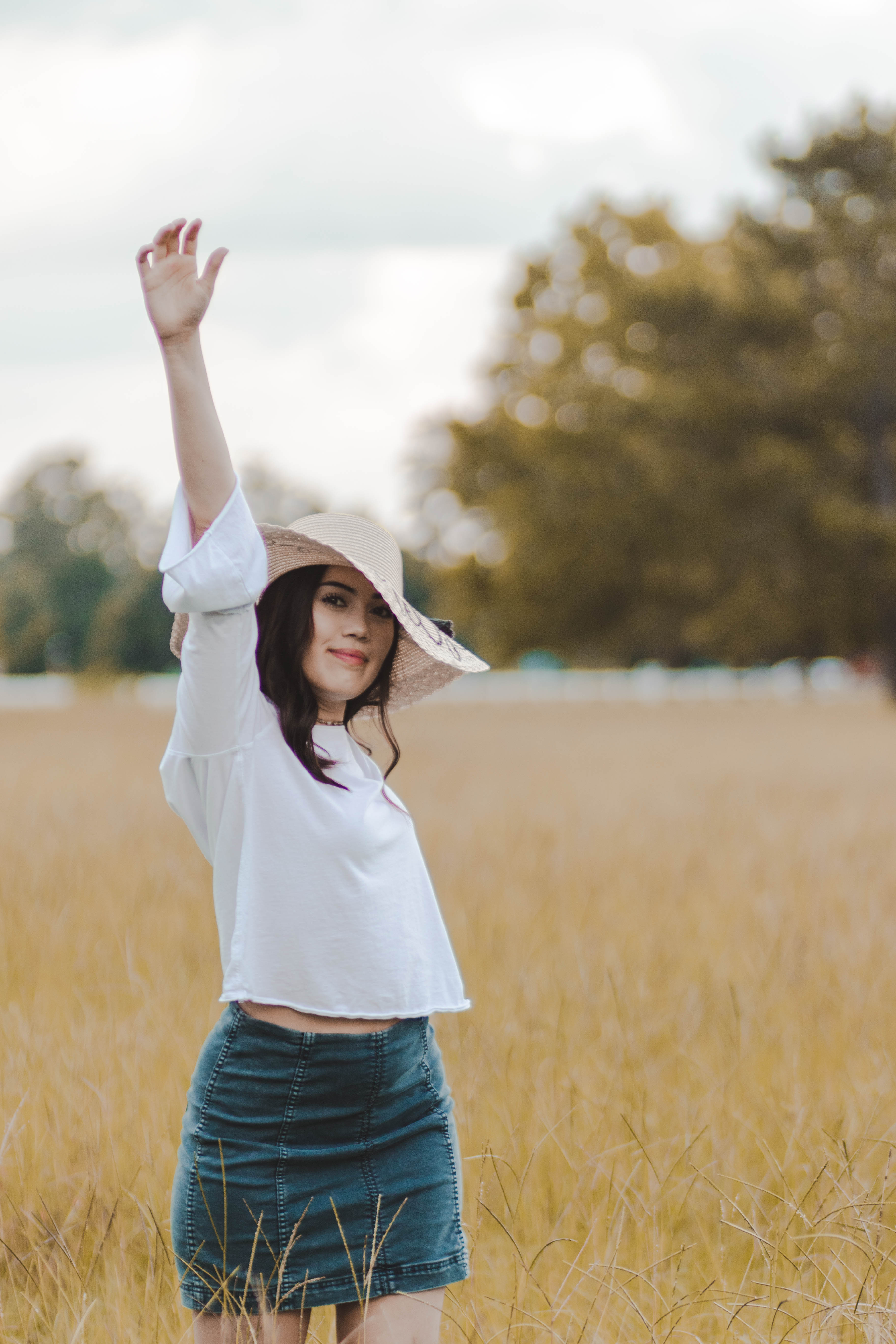
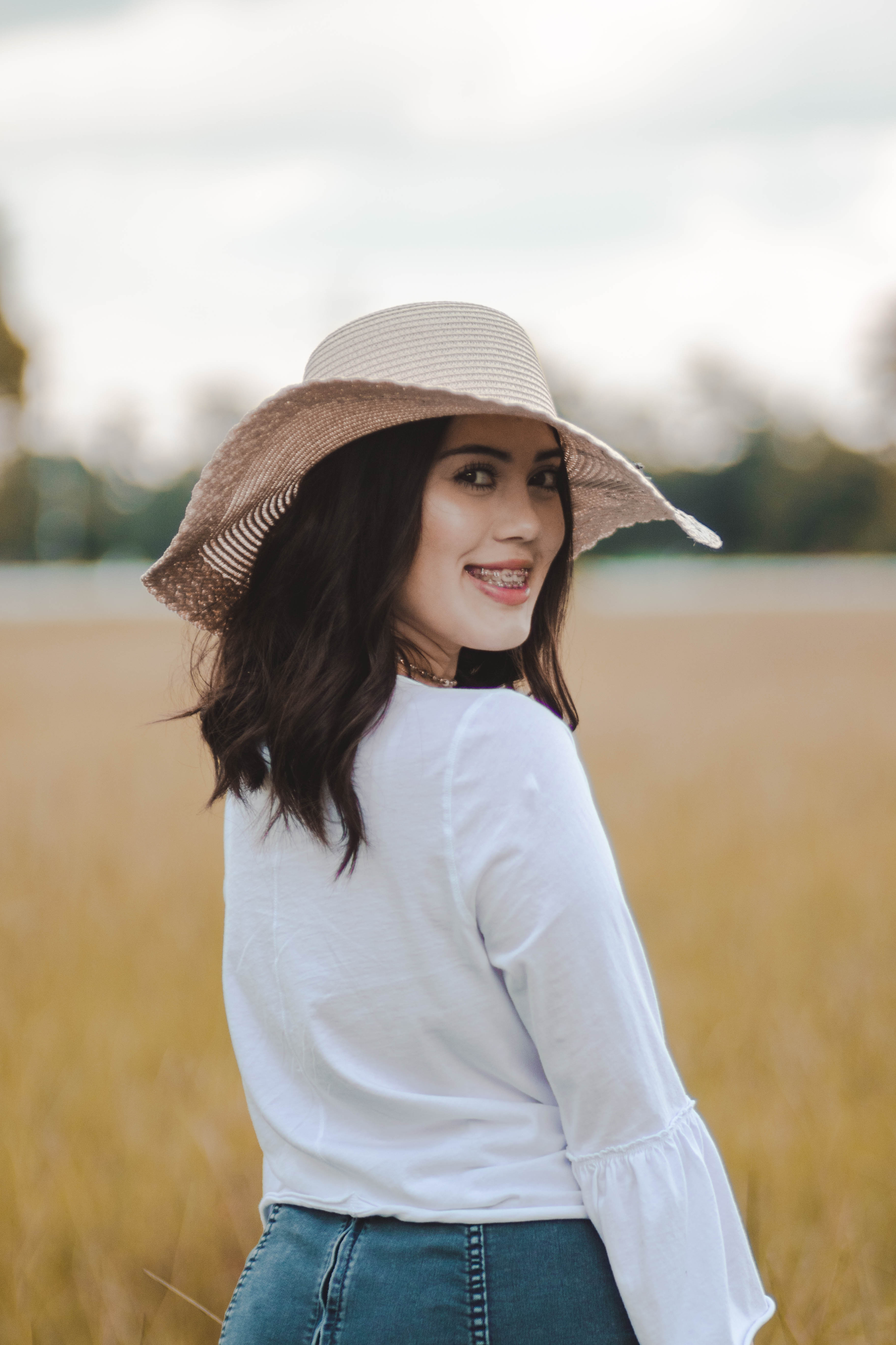
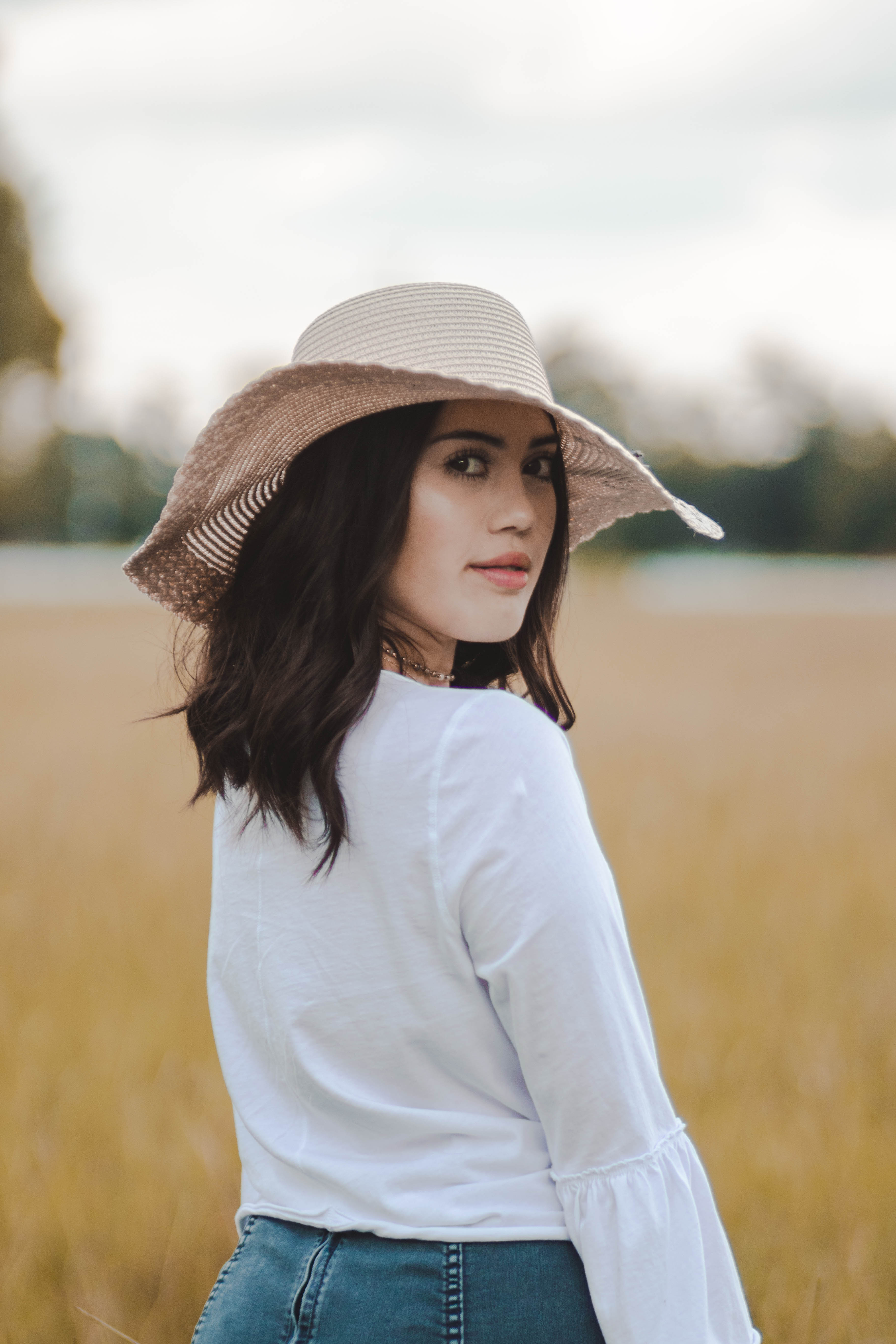
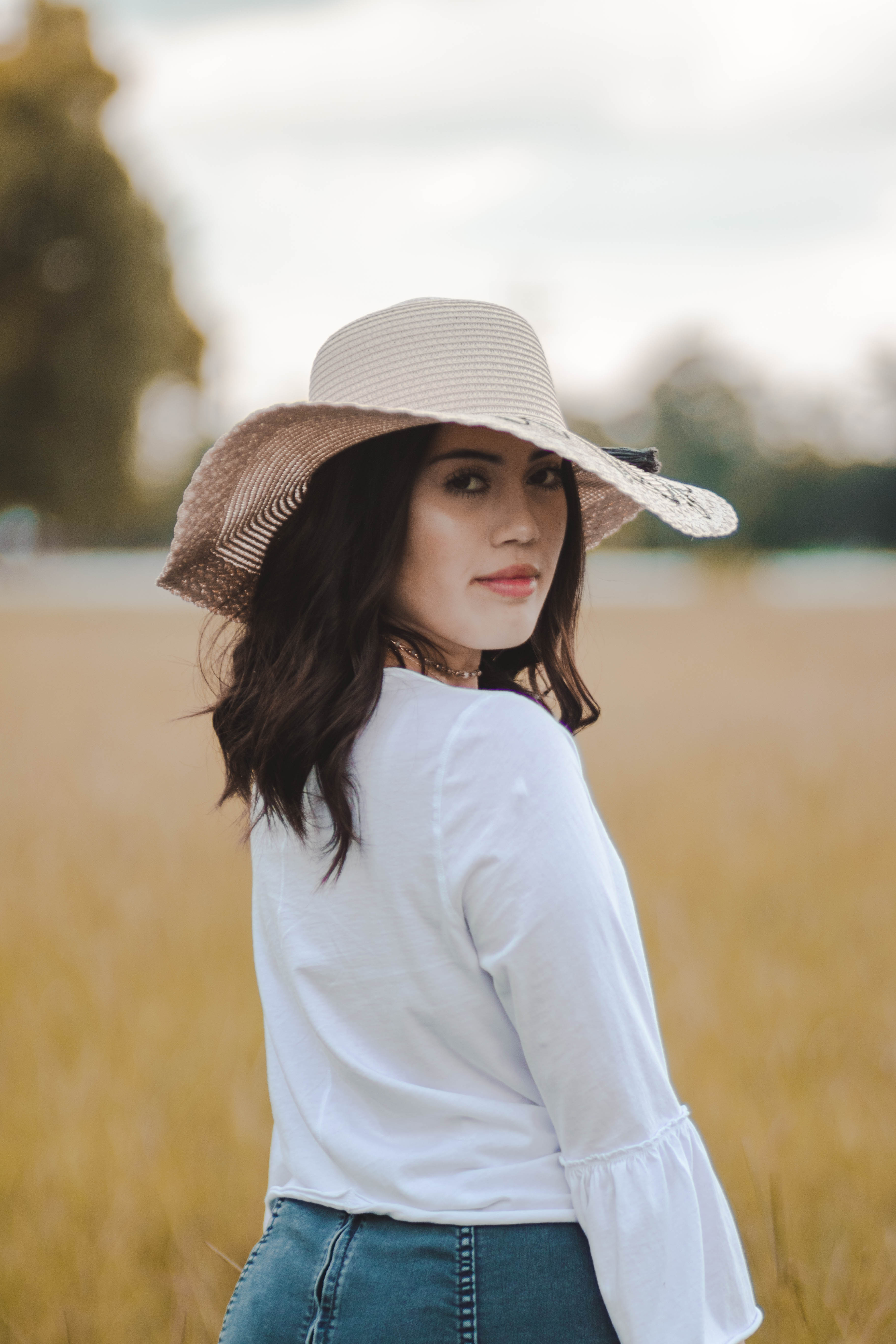
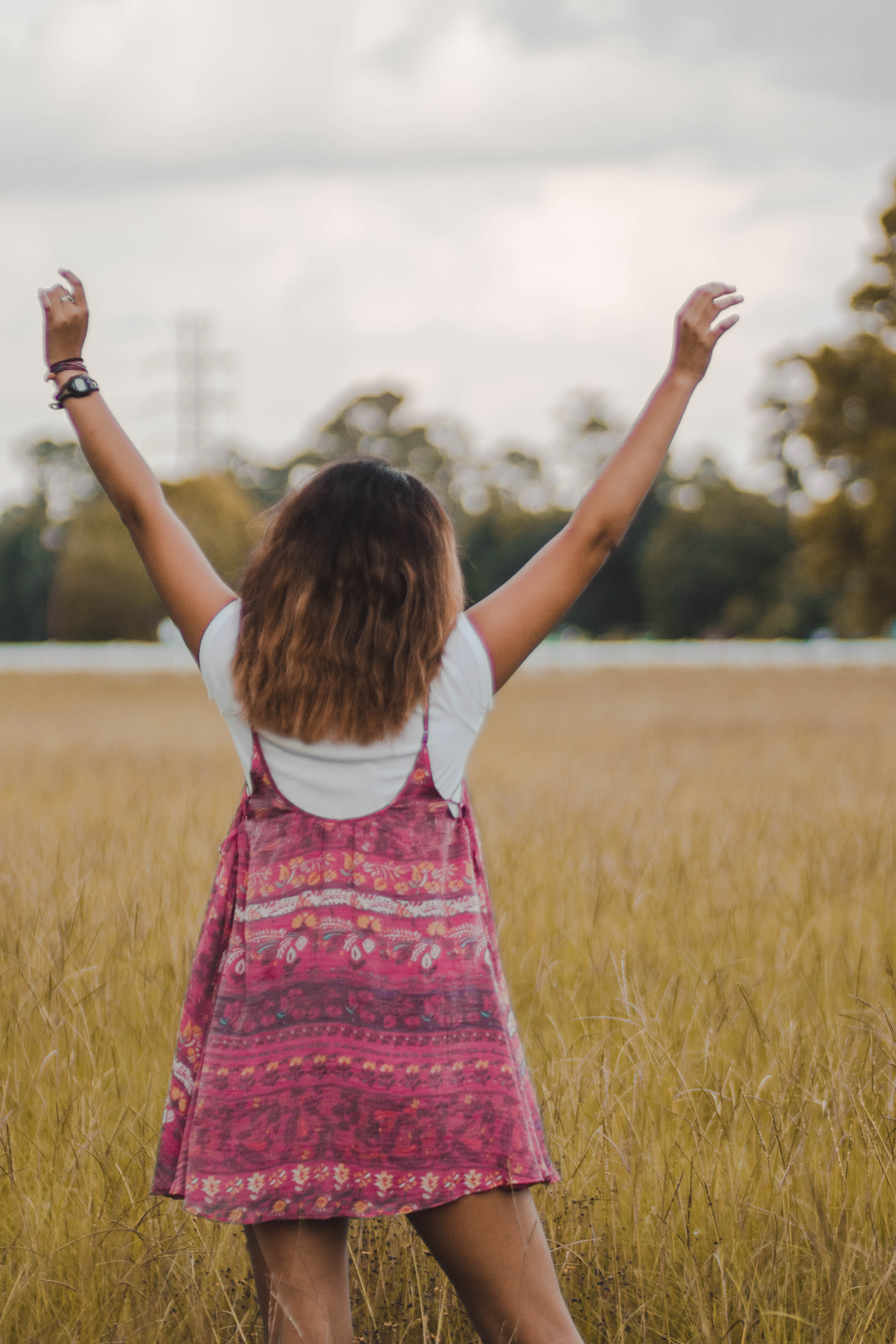
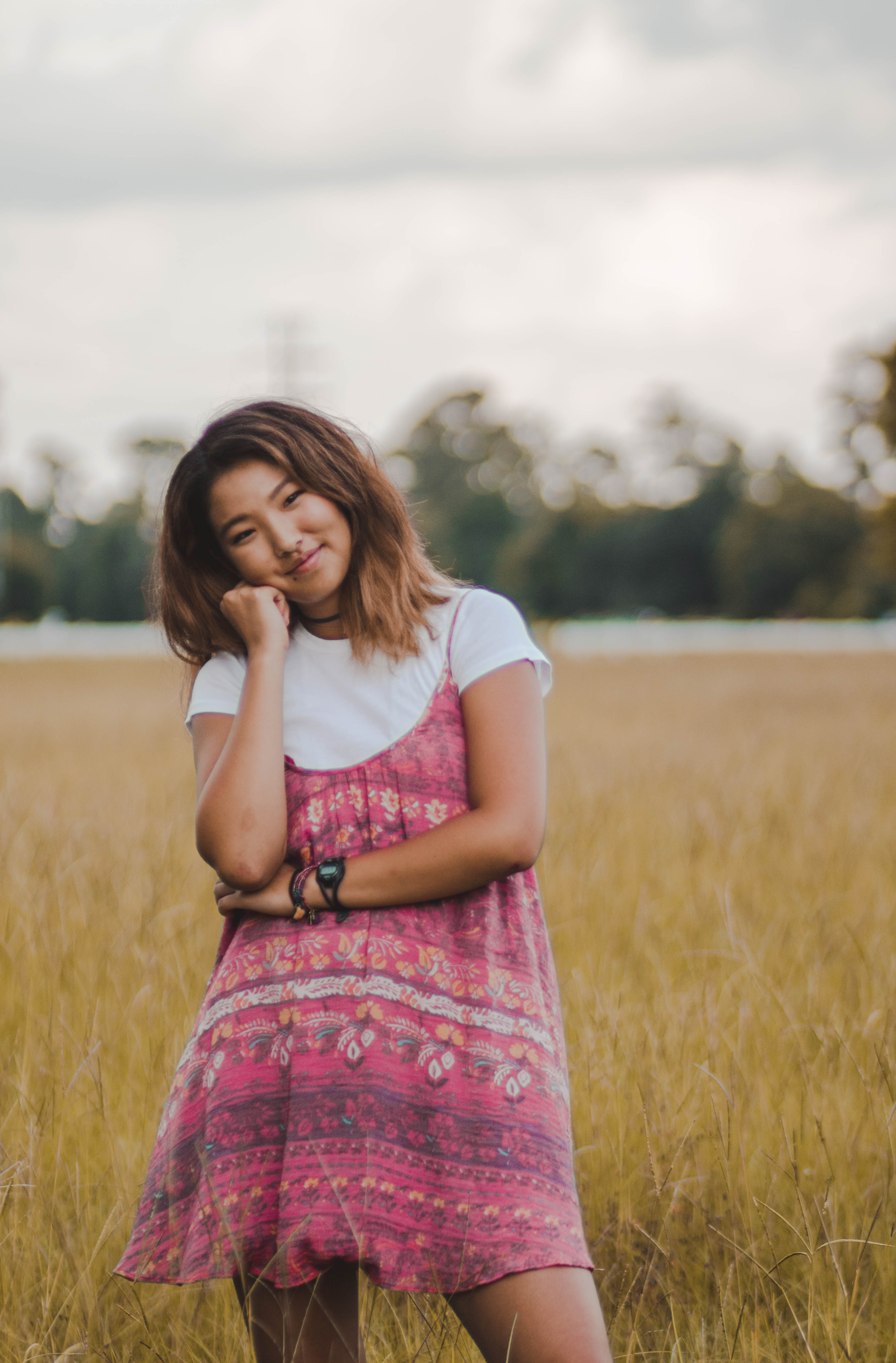
Warm tones evoke a more home-like and autumnal feel in your images. These images are often seen during the summer and fall months of the year because of the colors of nature. These colors such as red, orange, and yellow have been psychologically proven to evoke happier feelings in people.
Warm Colors
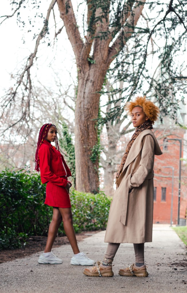
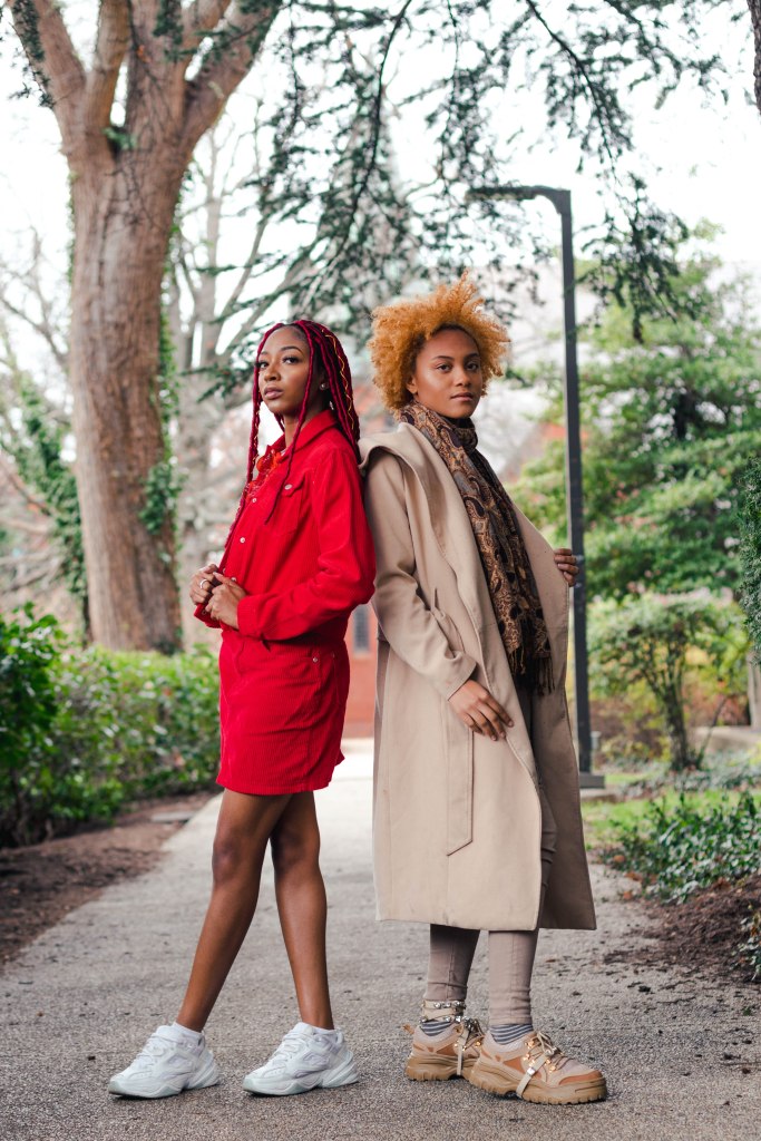
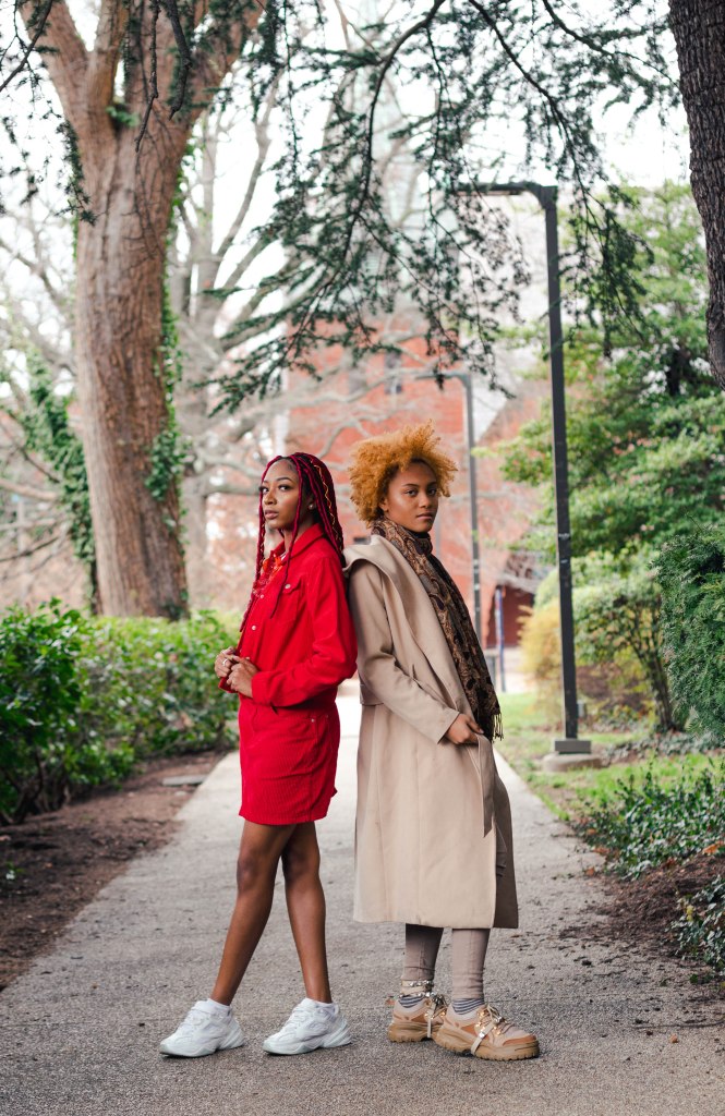
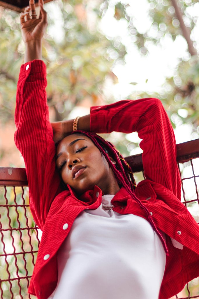
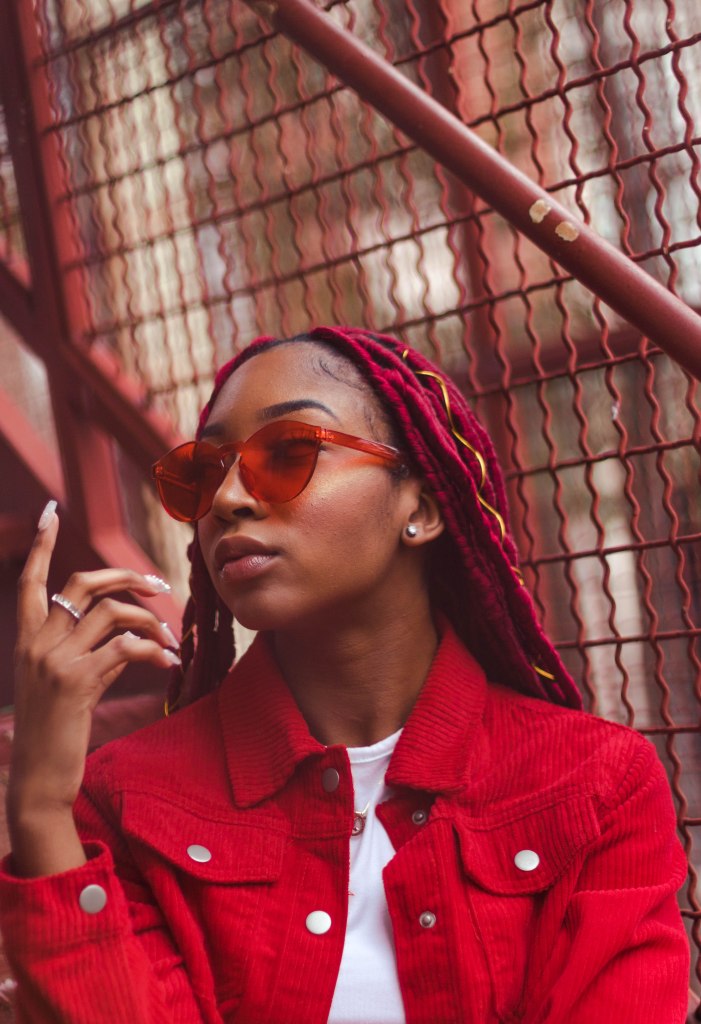
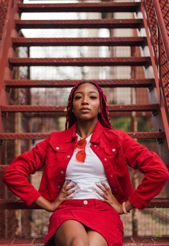
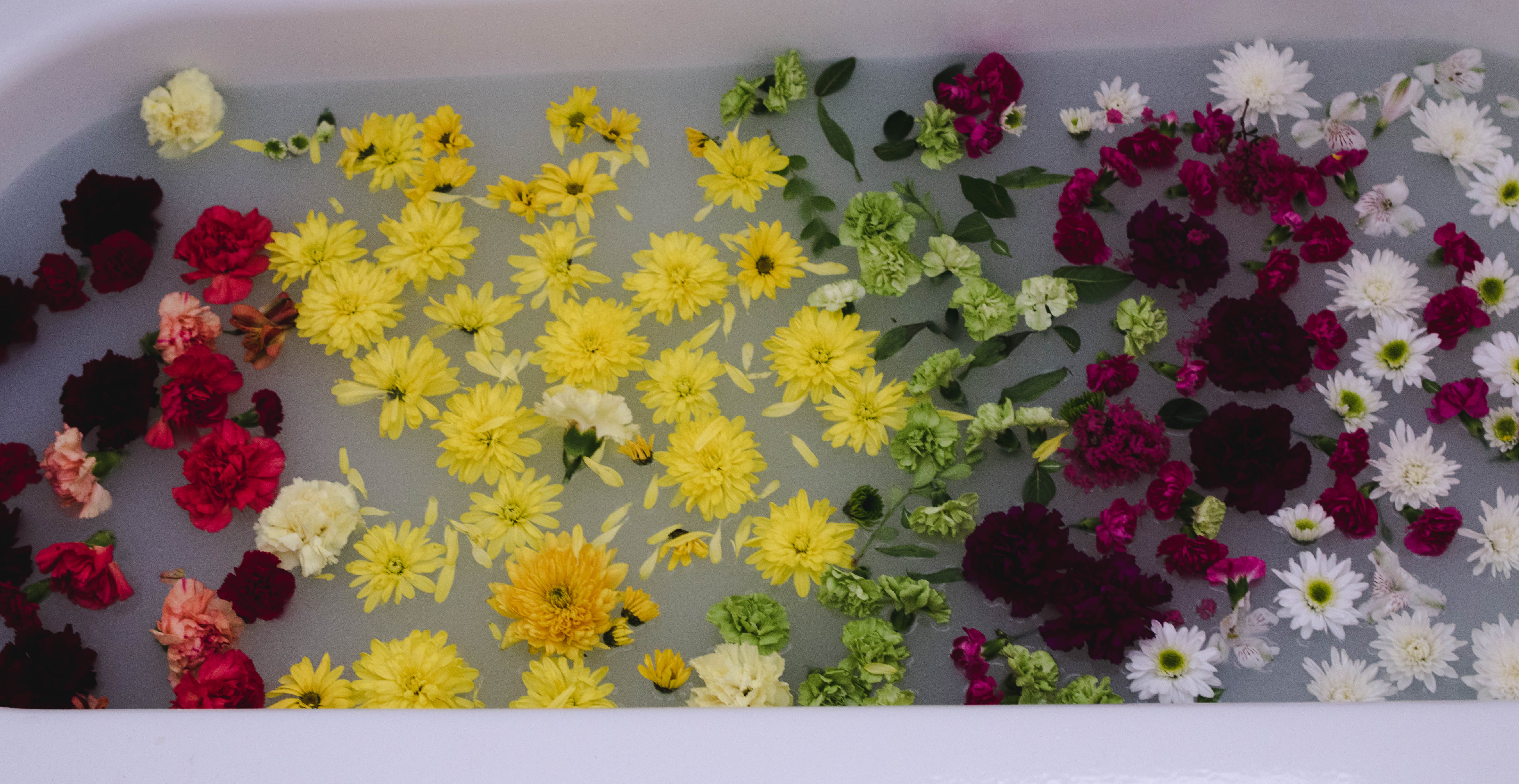
Red: Red has been seen as a very masculine and bold color that causes people to feel both romantic, angry and happy all in one color. Red is mostly used as an accent color because it is so dynamic. As a photographer, you want to stray from using a lot of red in your image along with other colors because red can easily distract the eye from your subject.

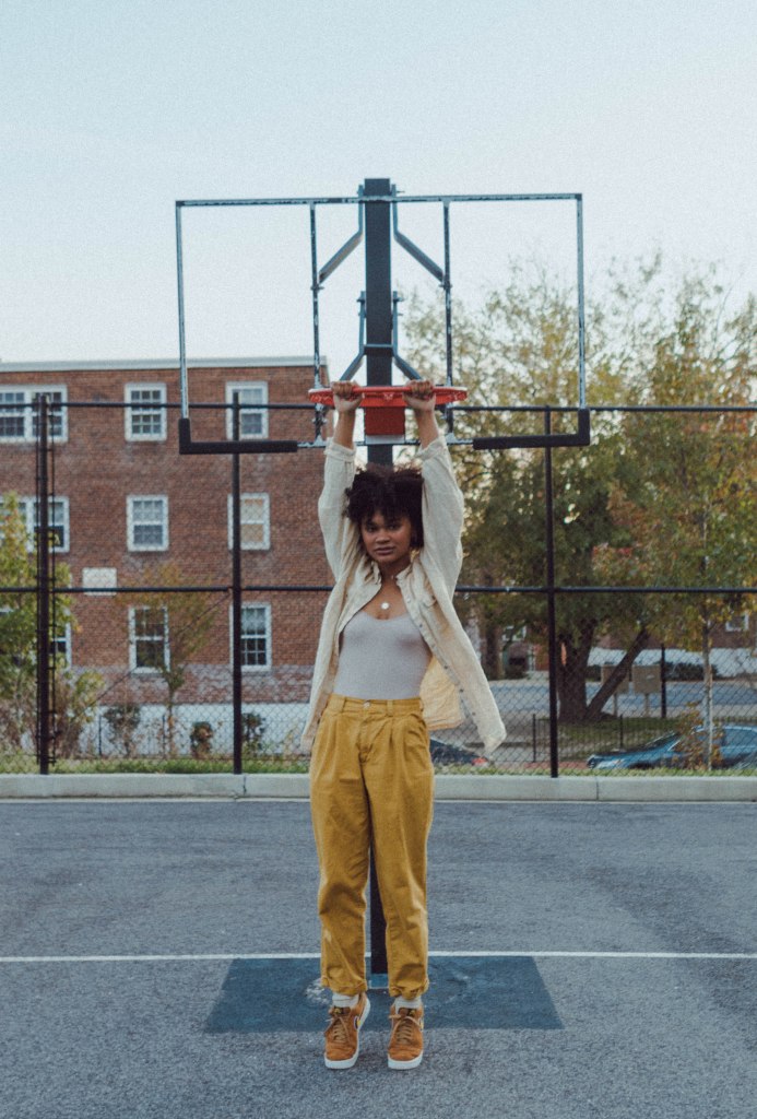
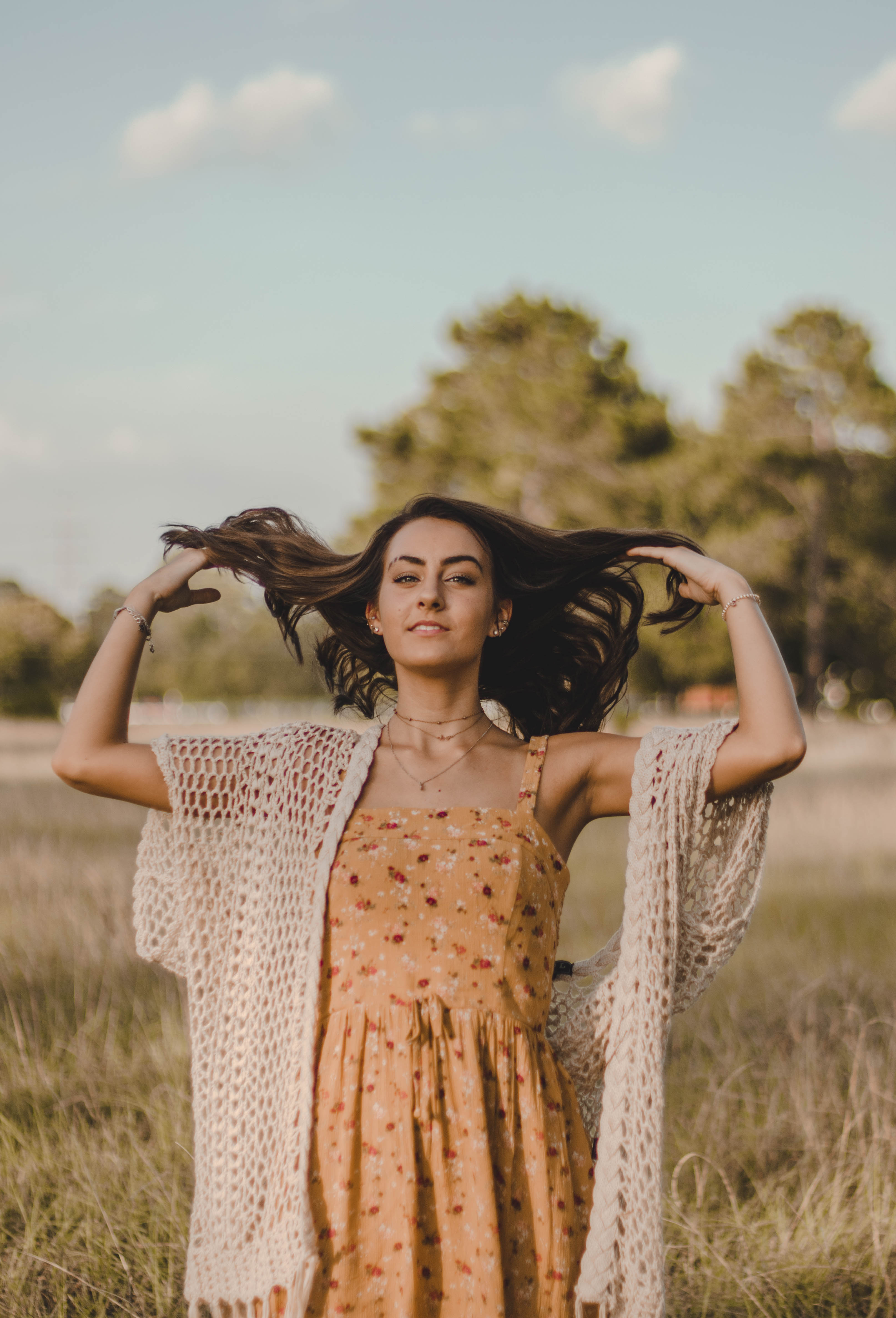
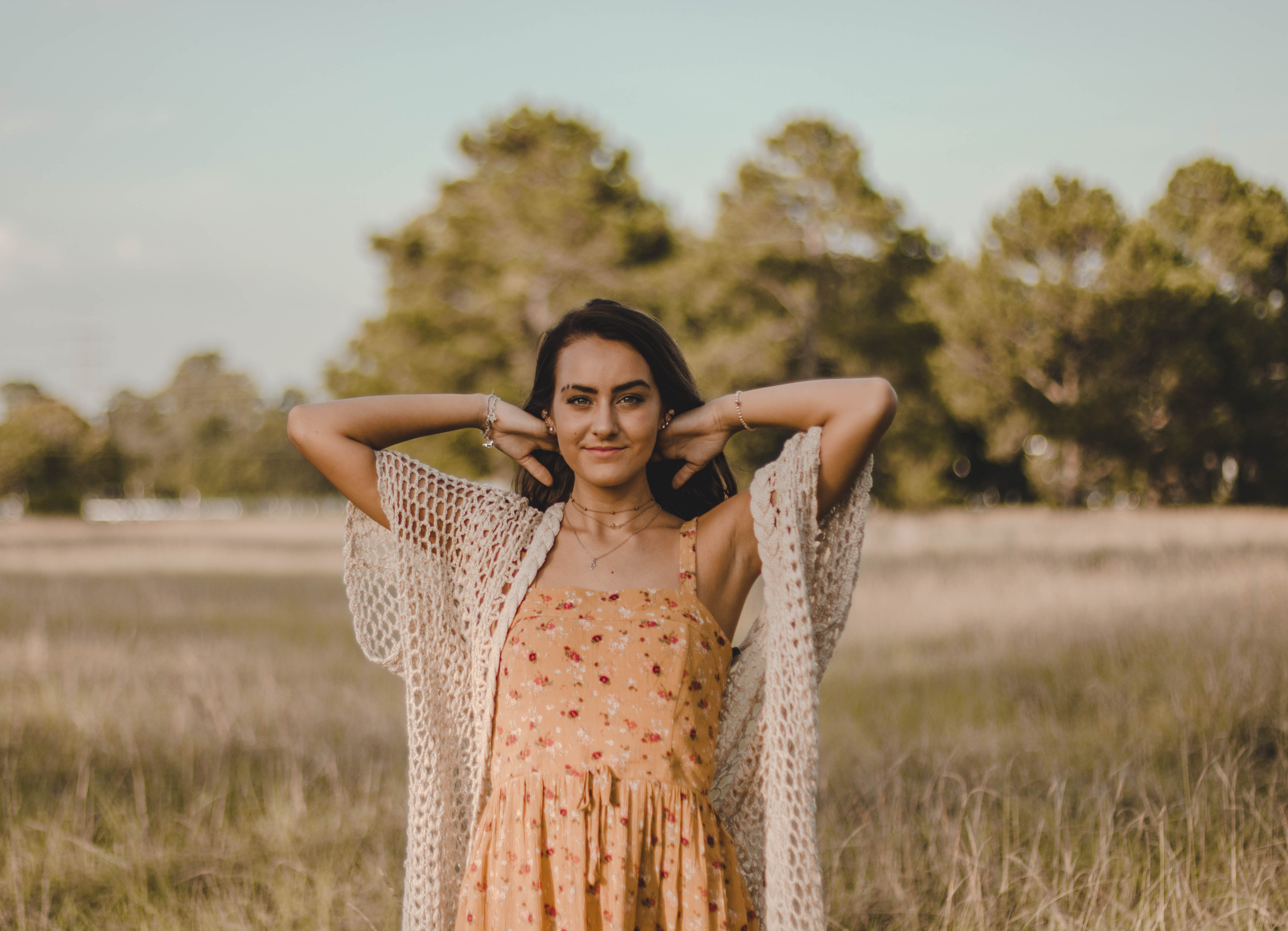
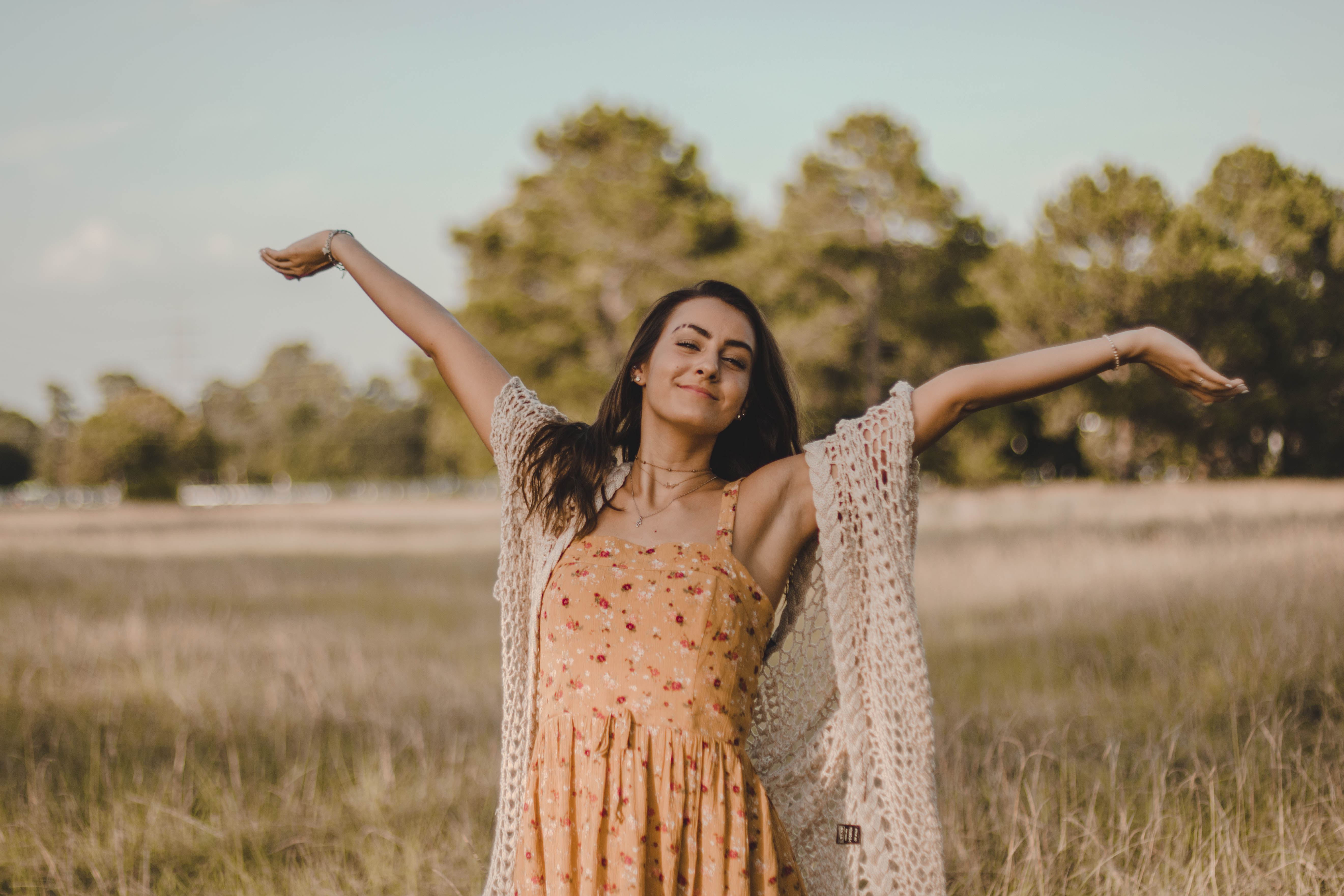
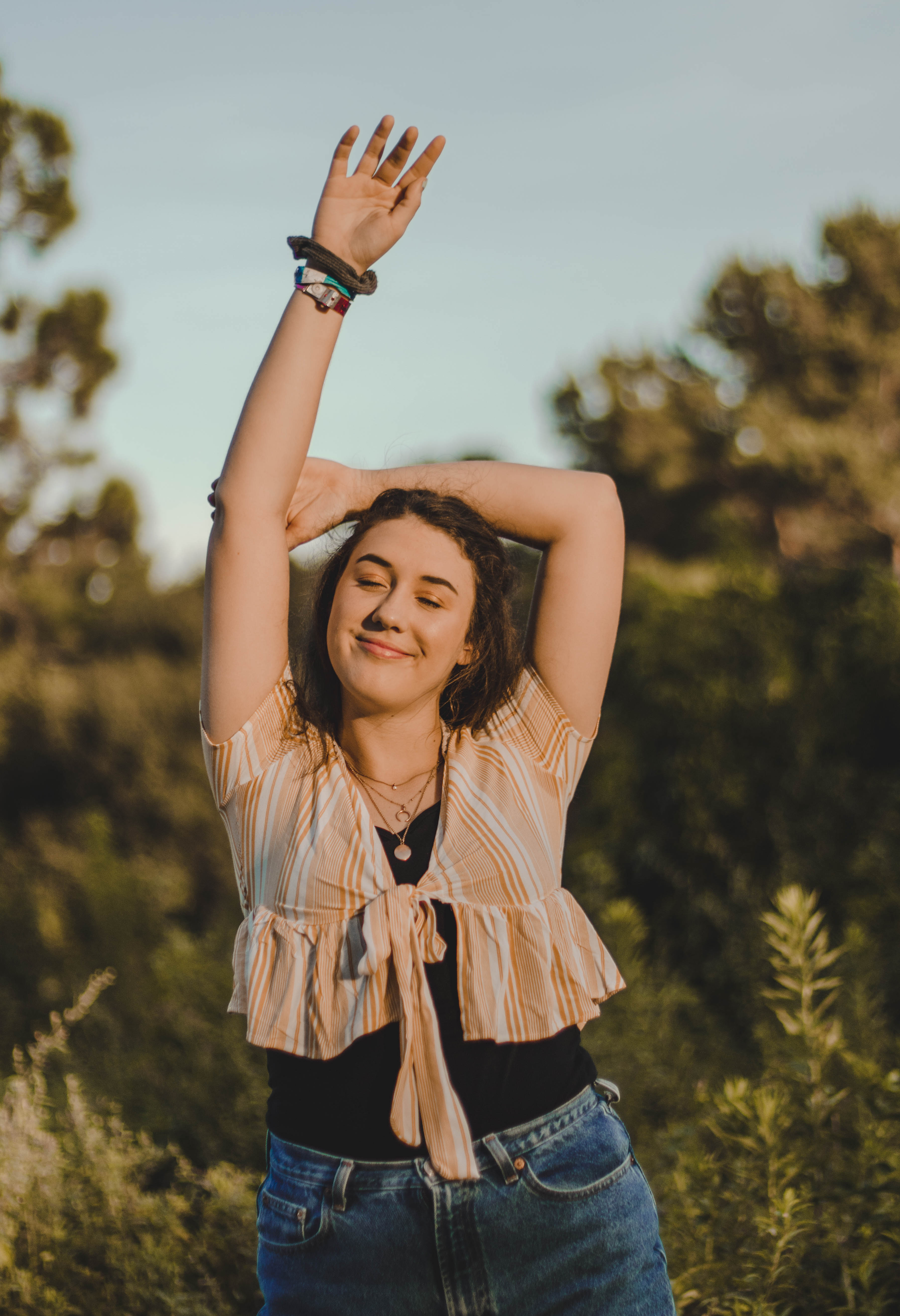
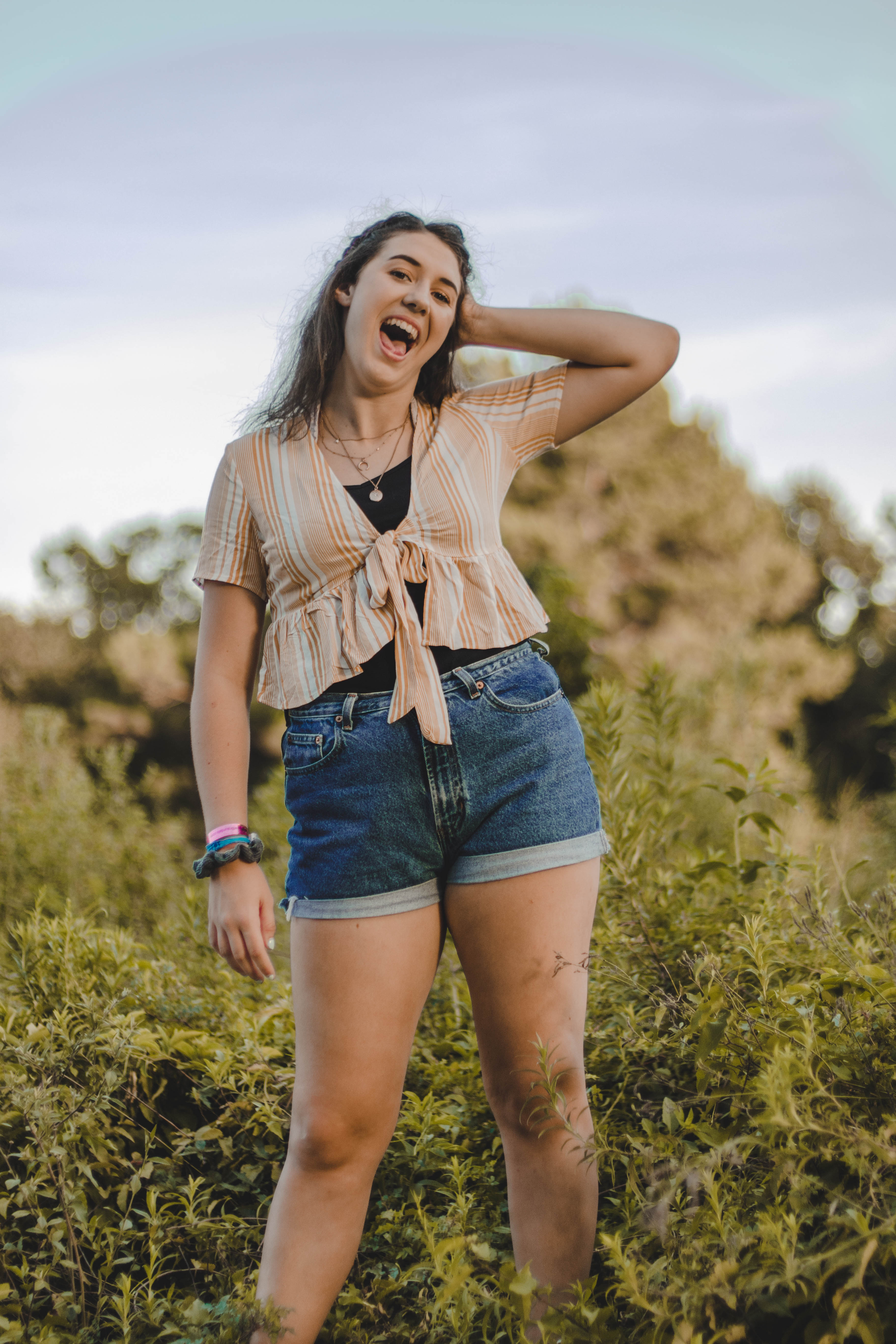
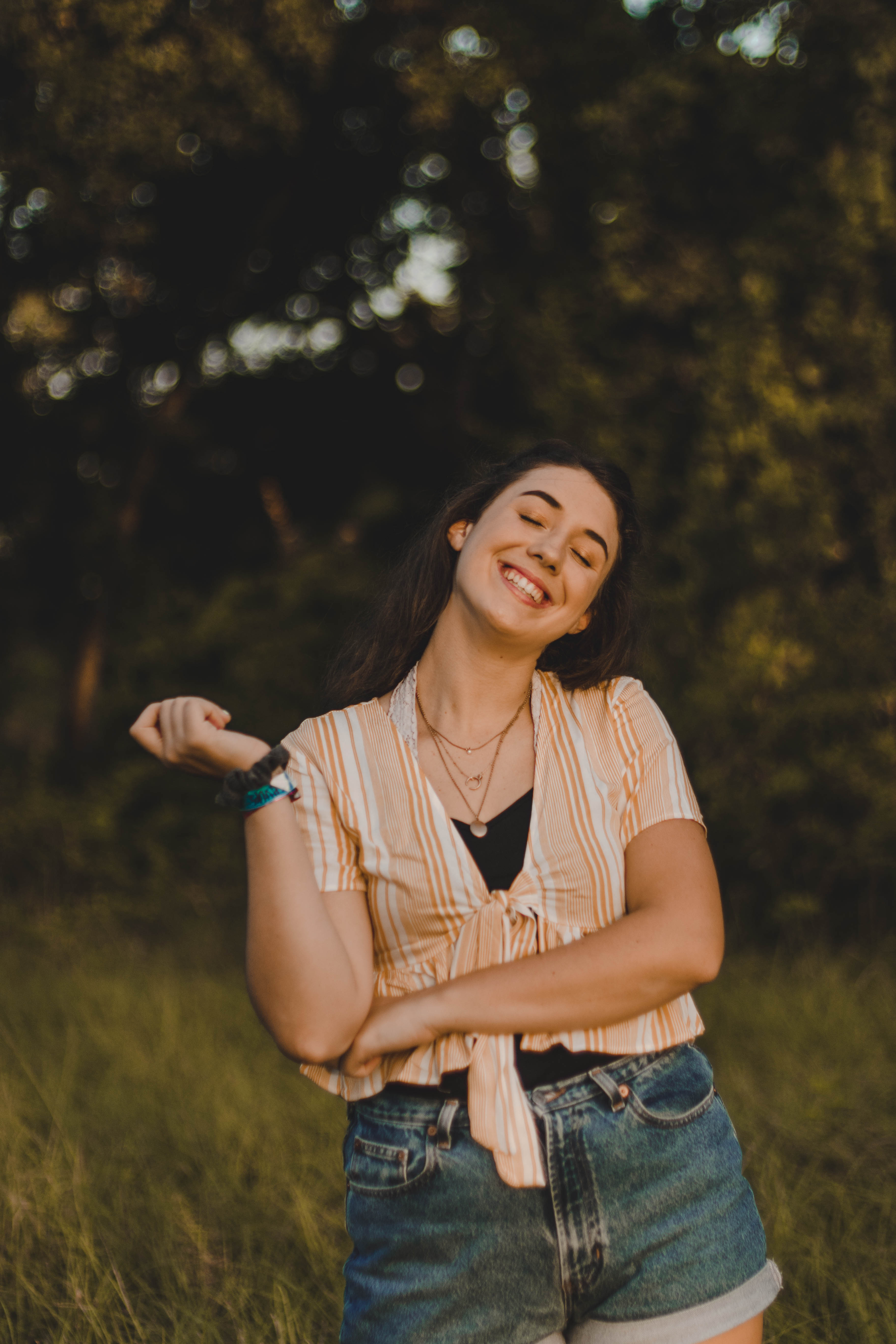
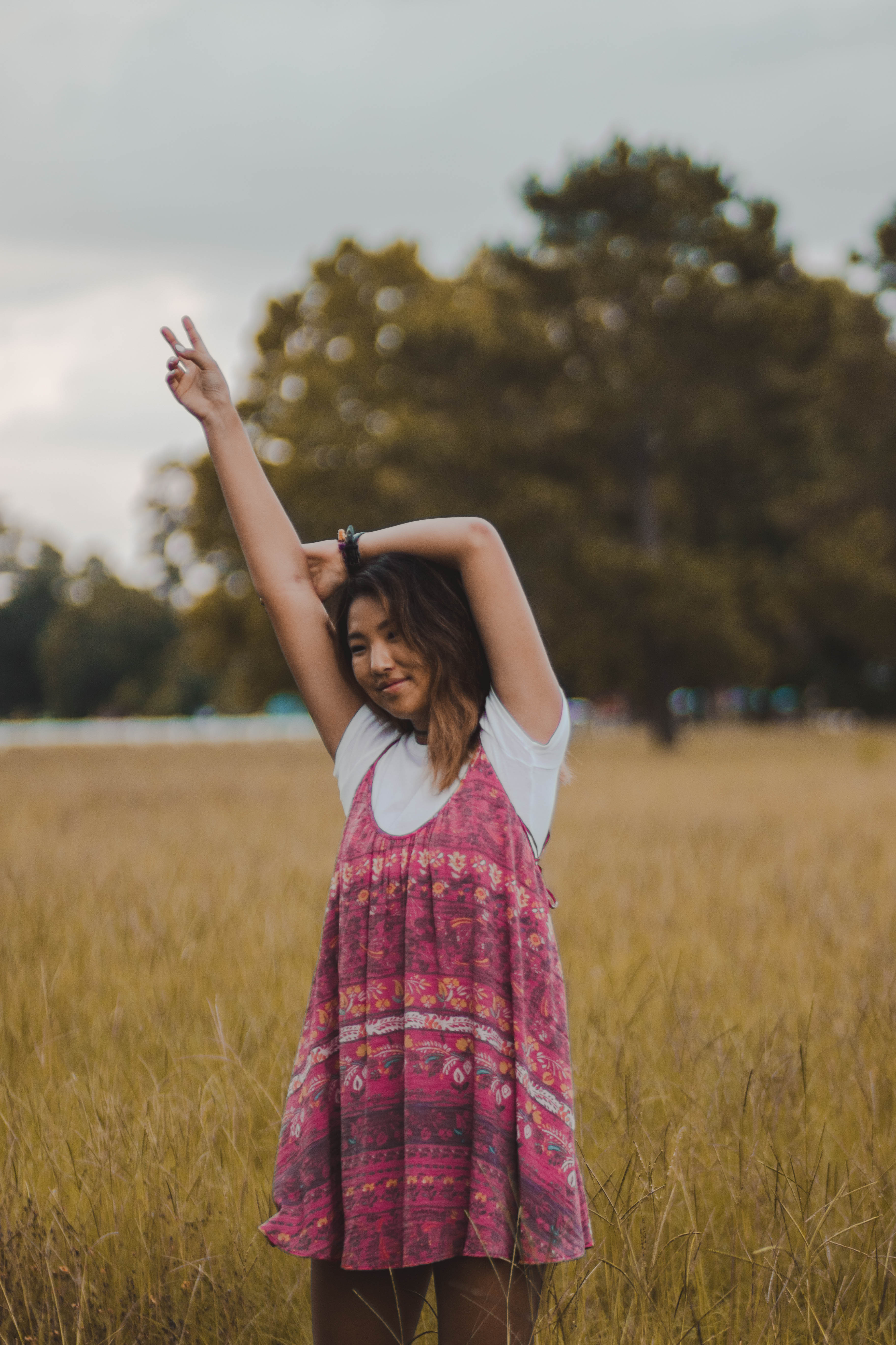
Orange: Orange is a color used in many Instagram themes because unlike red it is not overpowering but it still draws attention to the viewer. Orange evokes feelings of friendliness and kindness in the image and overall gives the image a very comforting feeling of being calm.

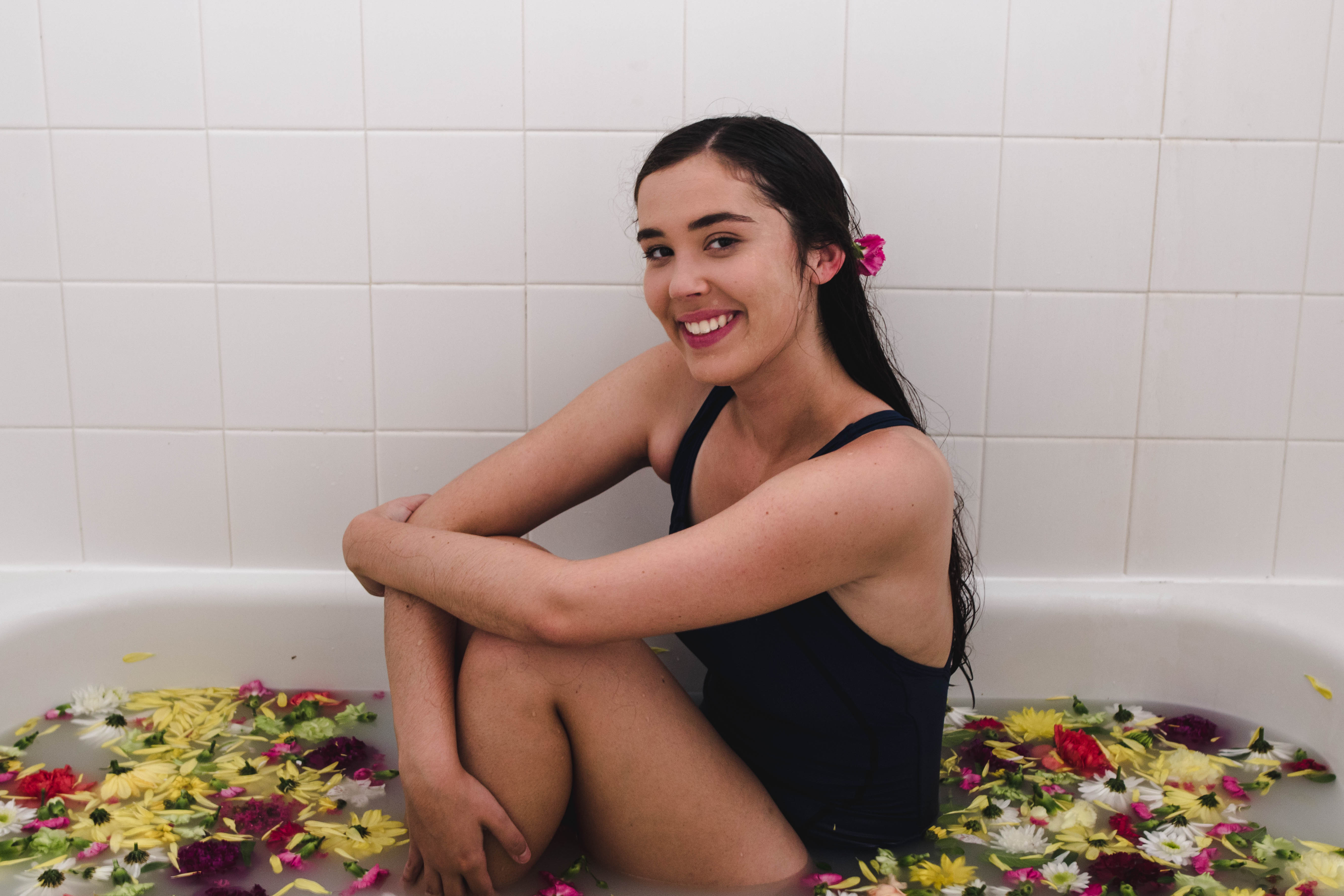
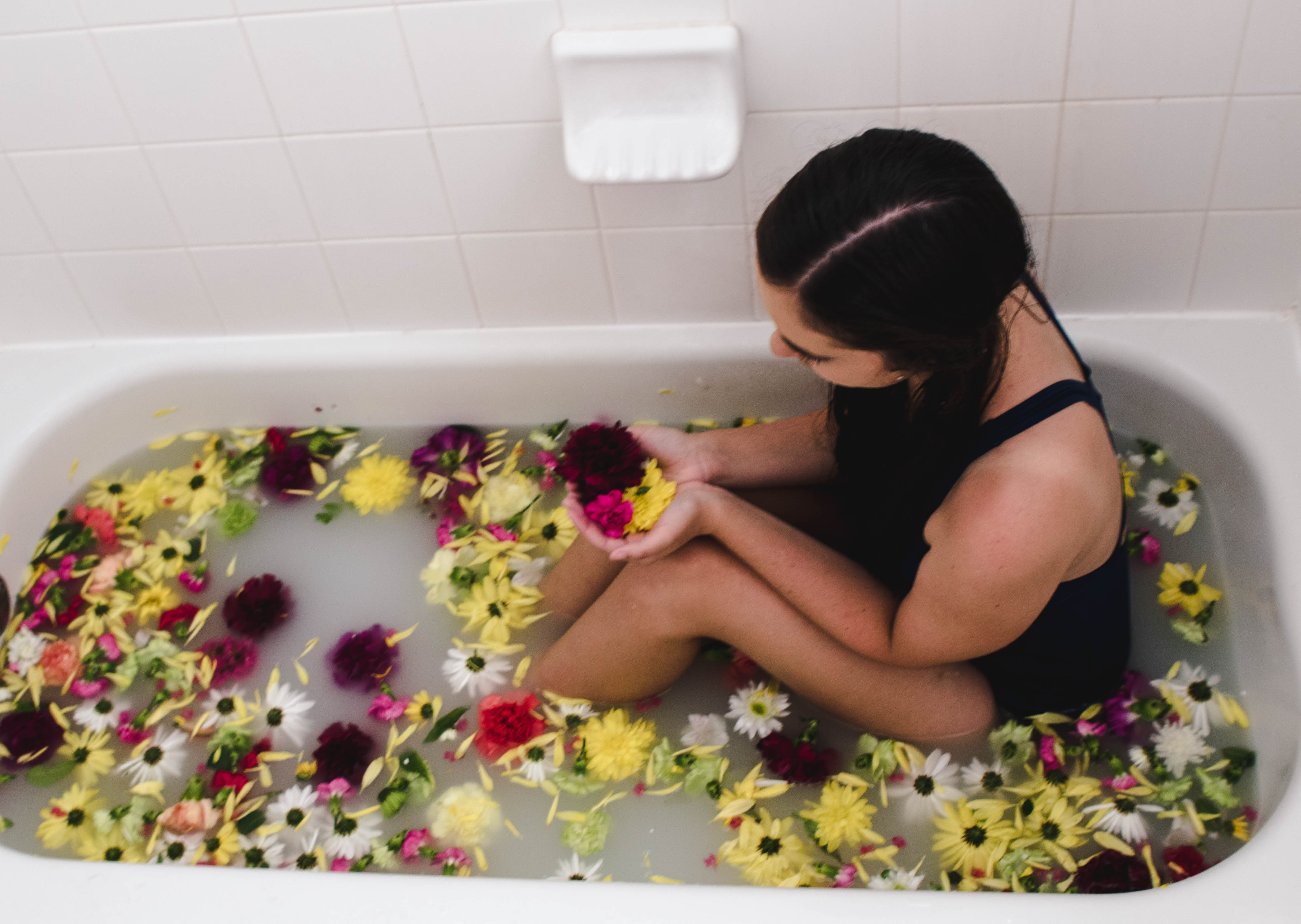
Yellow: Yellow is seen as the happiest color by many people. Yellow is associated with happiness, sunshine, laughter, and joy but too much bright yellow can be alarming to people. When working with the color yellow you as the photographer want to make sure you are working with a more subdued shade or simply limit the amount of bright yellow in your image.
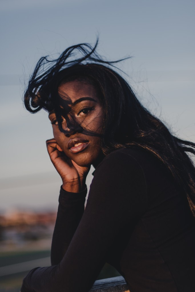
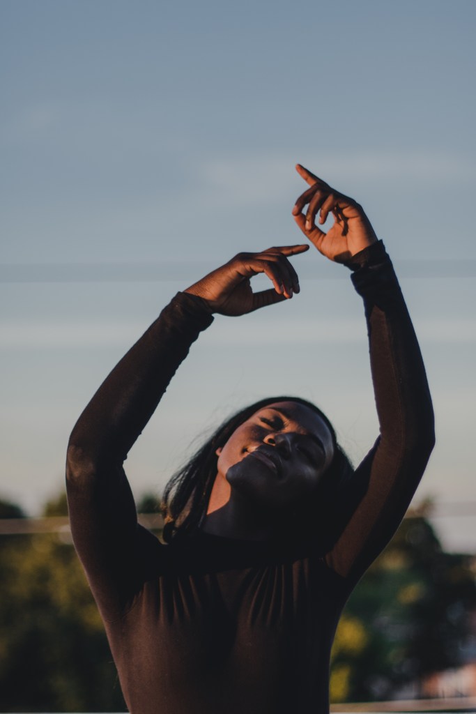
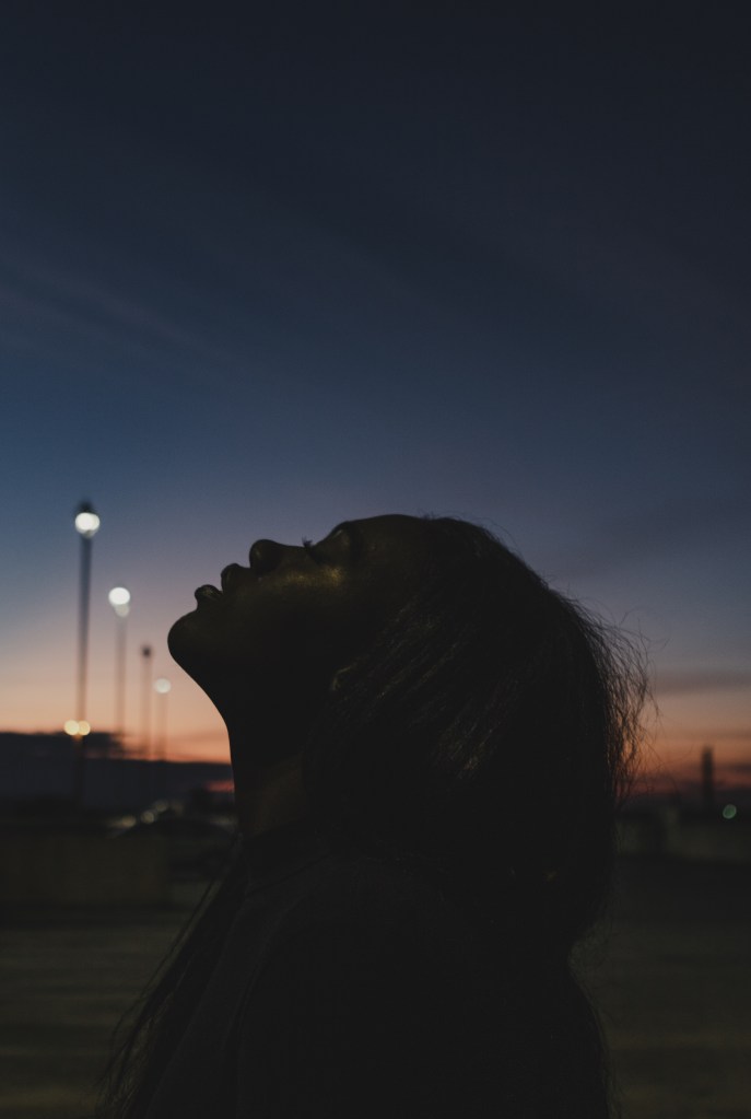
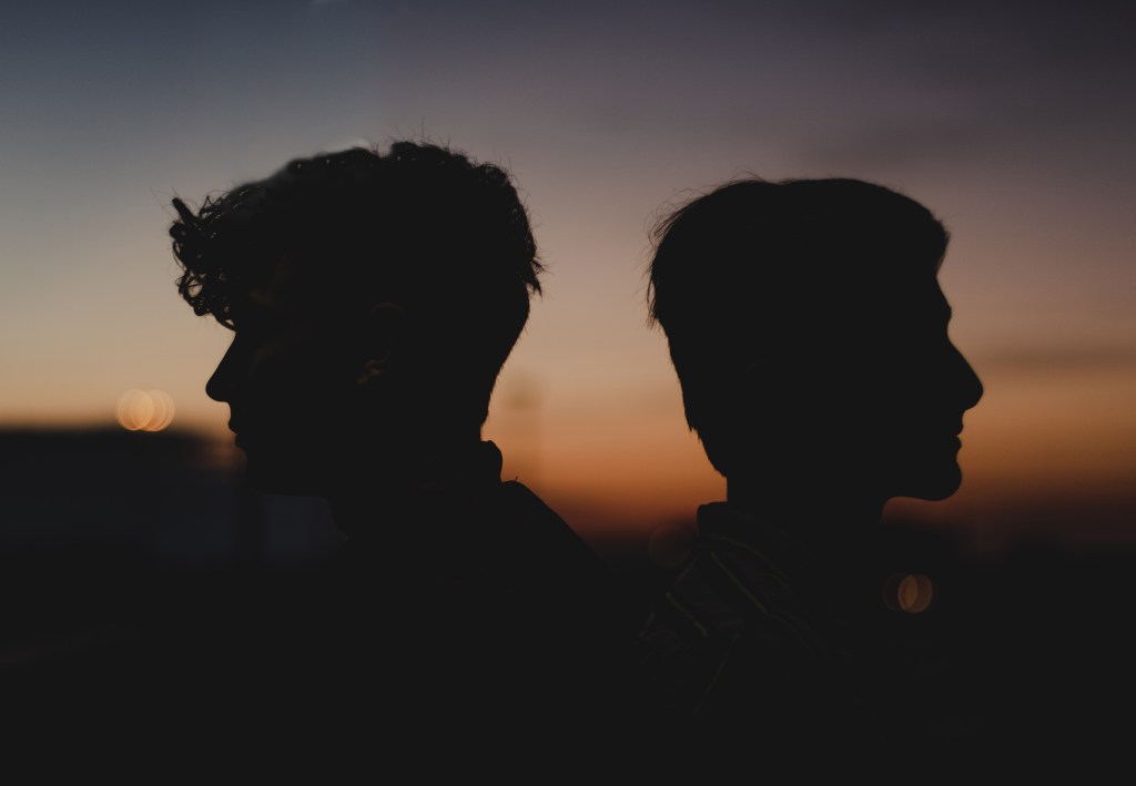
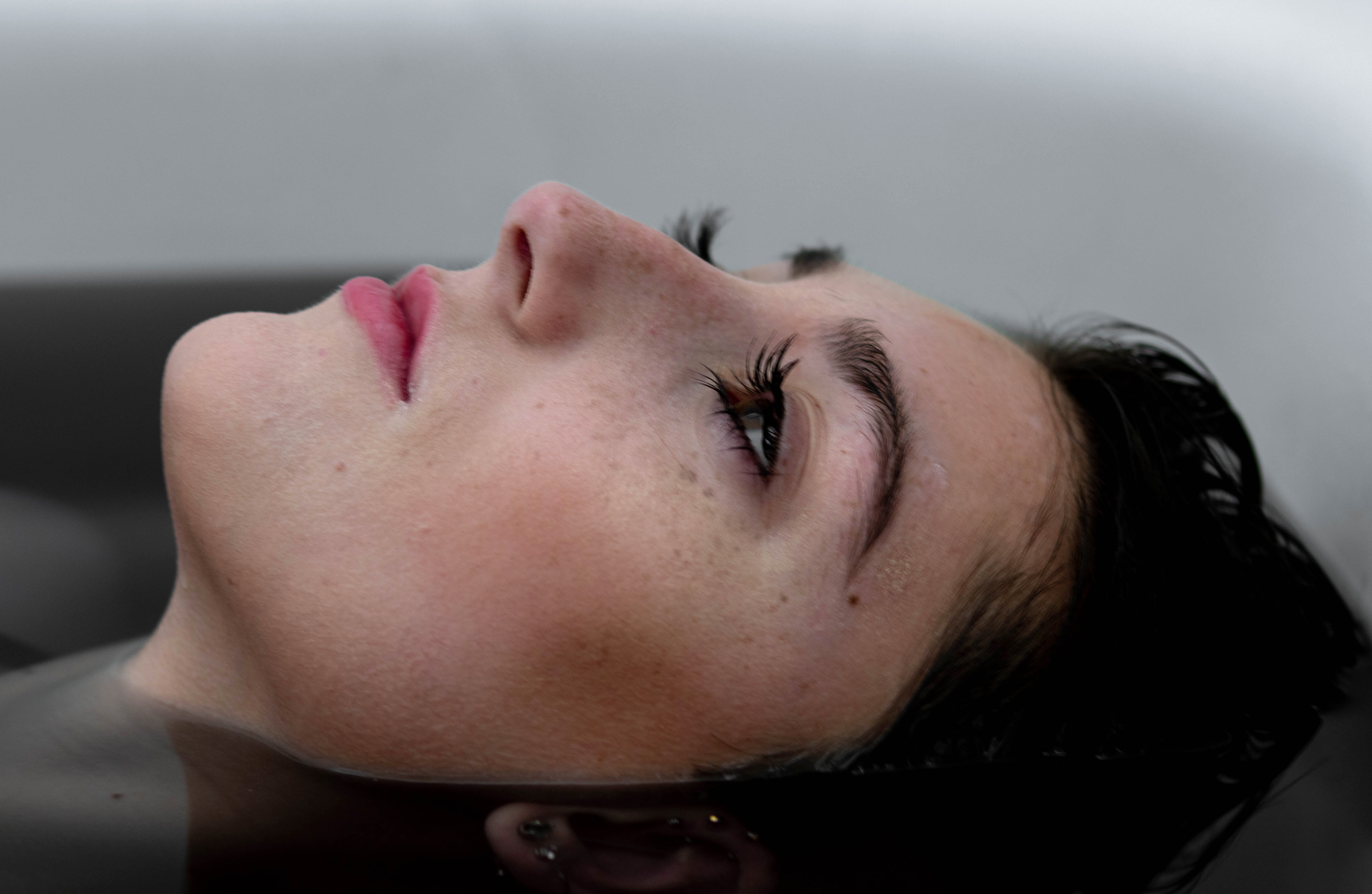
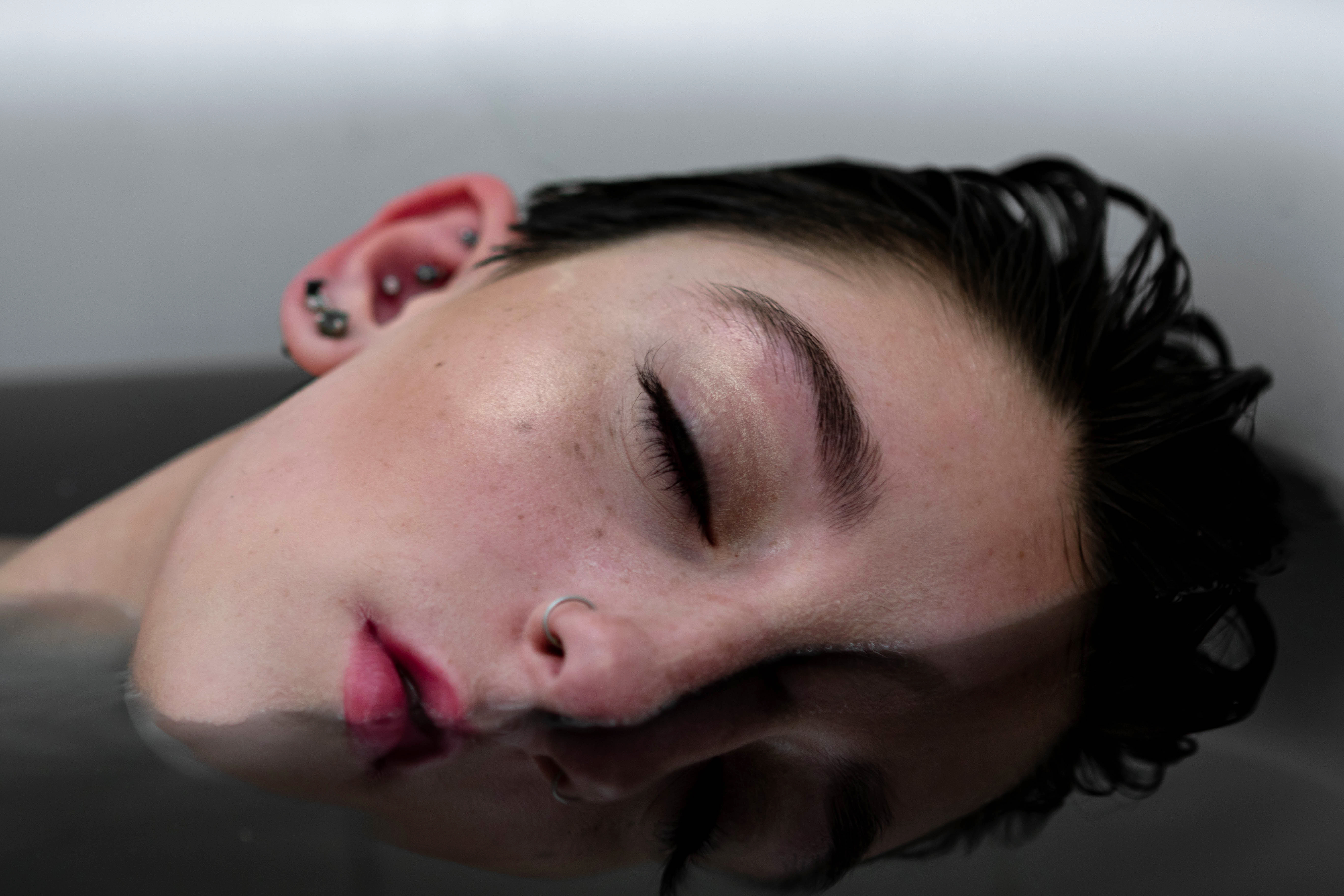
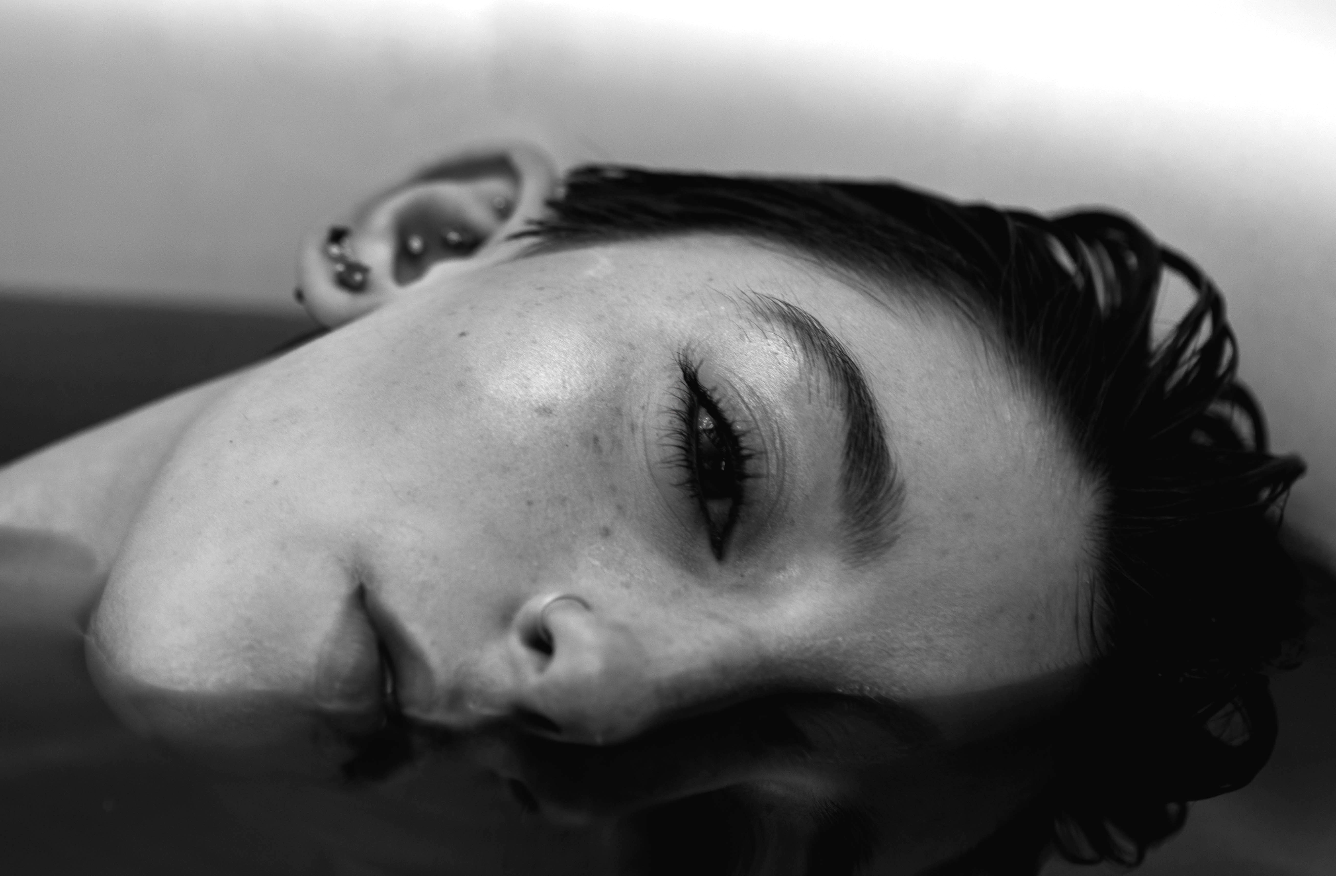
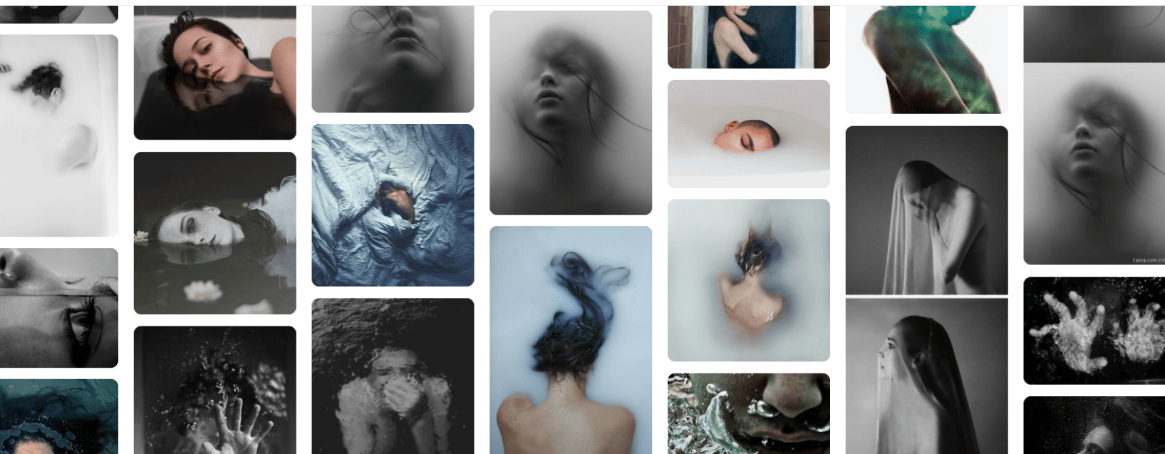
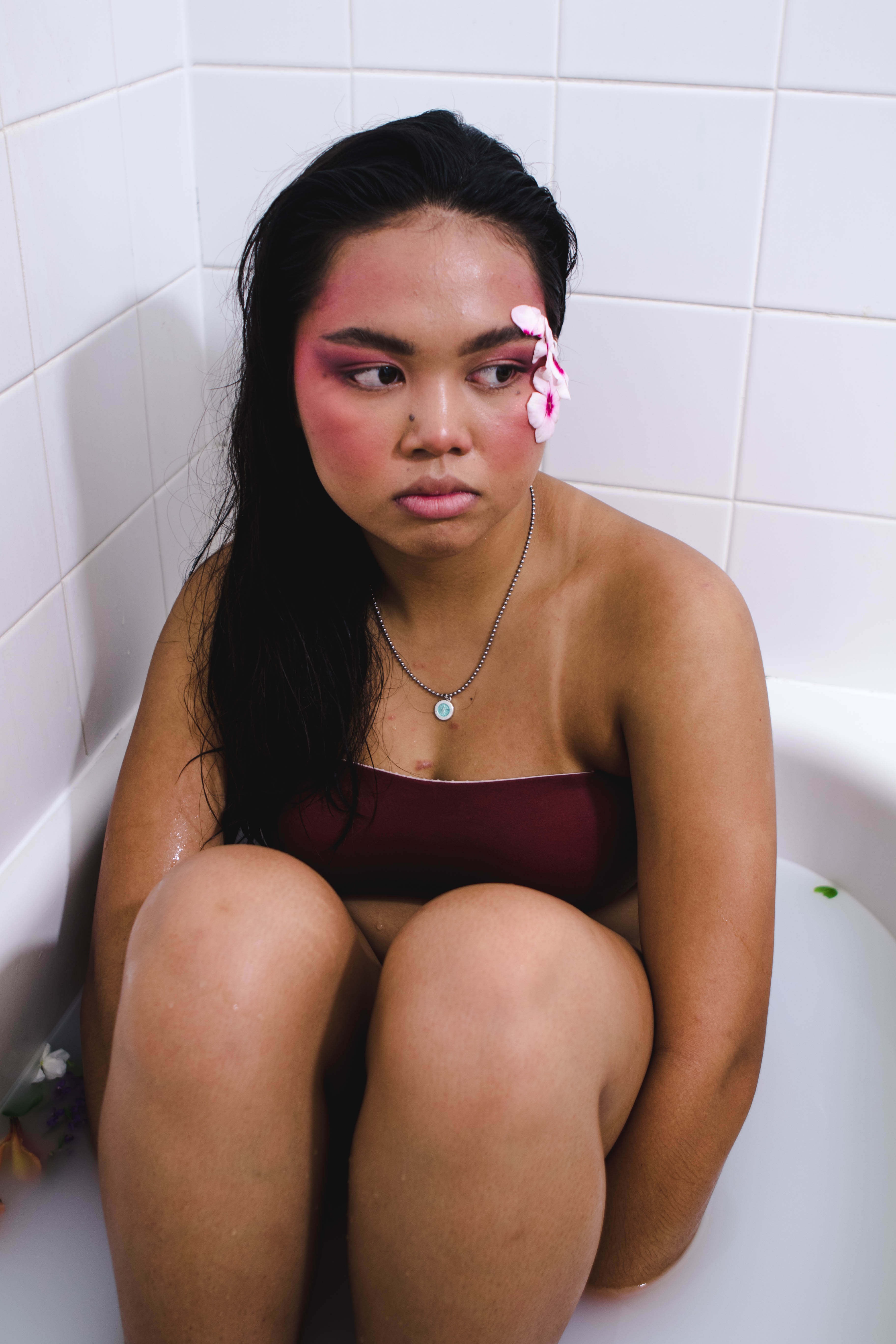
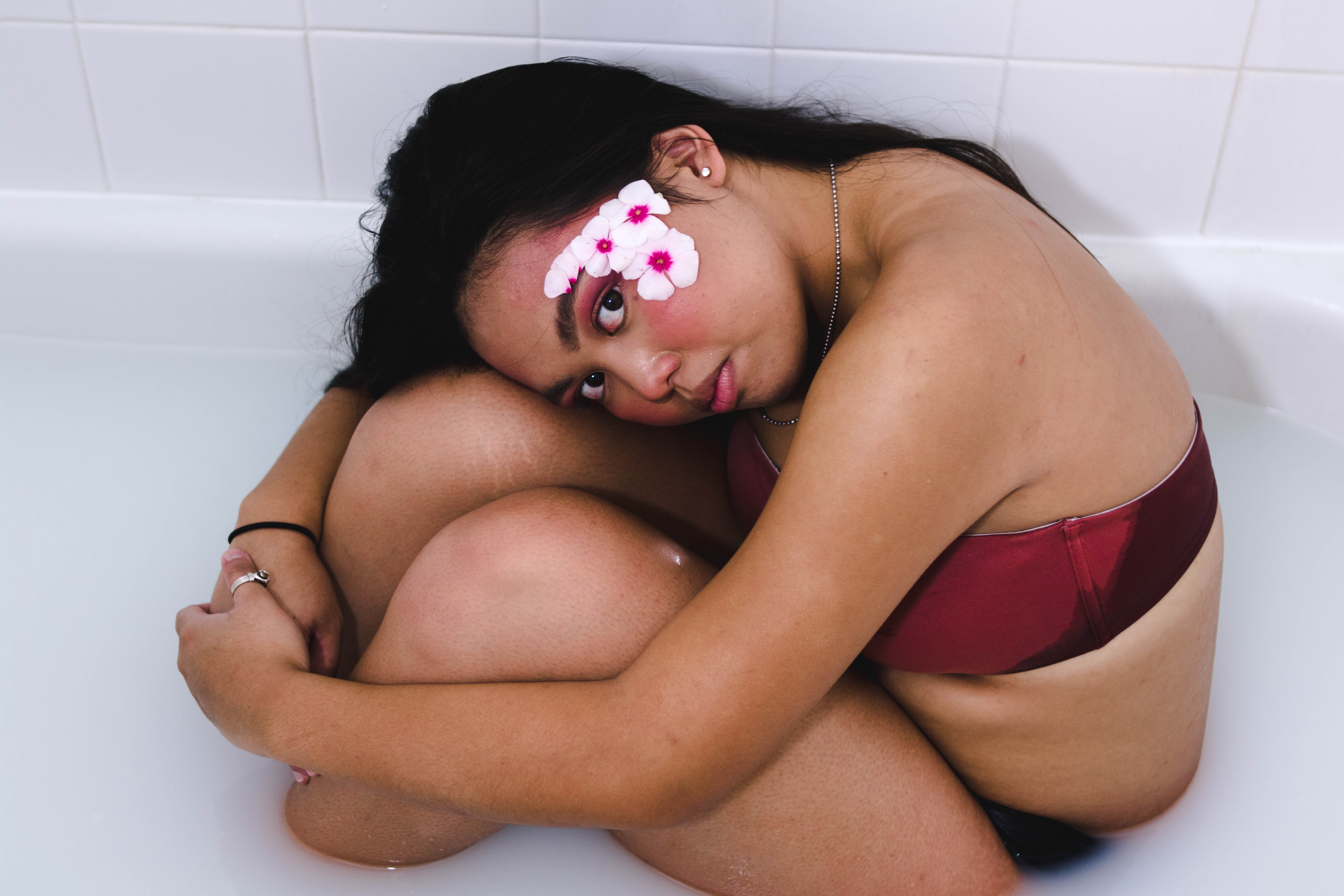
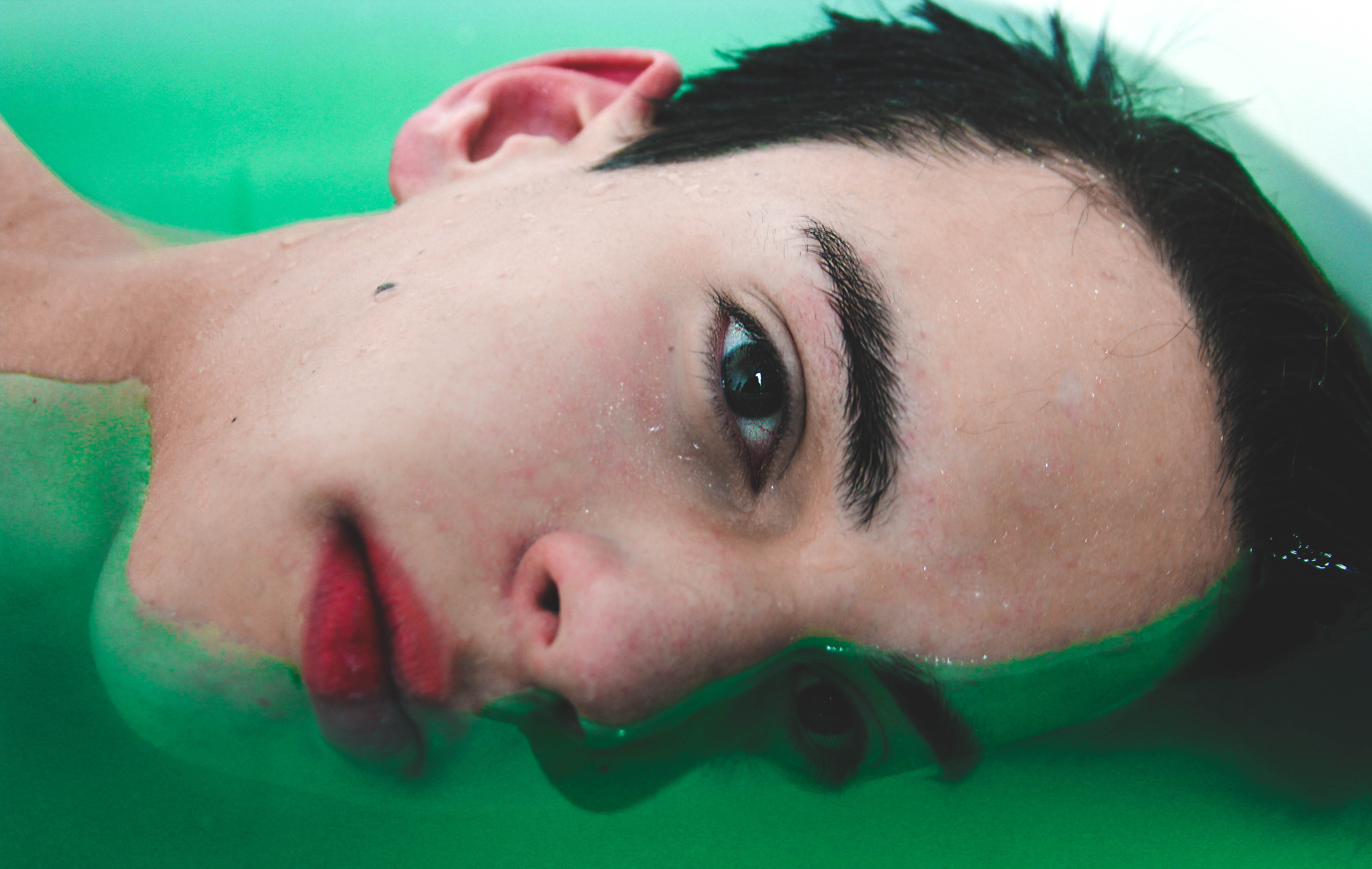
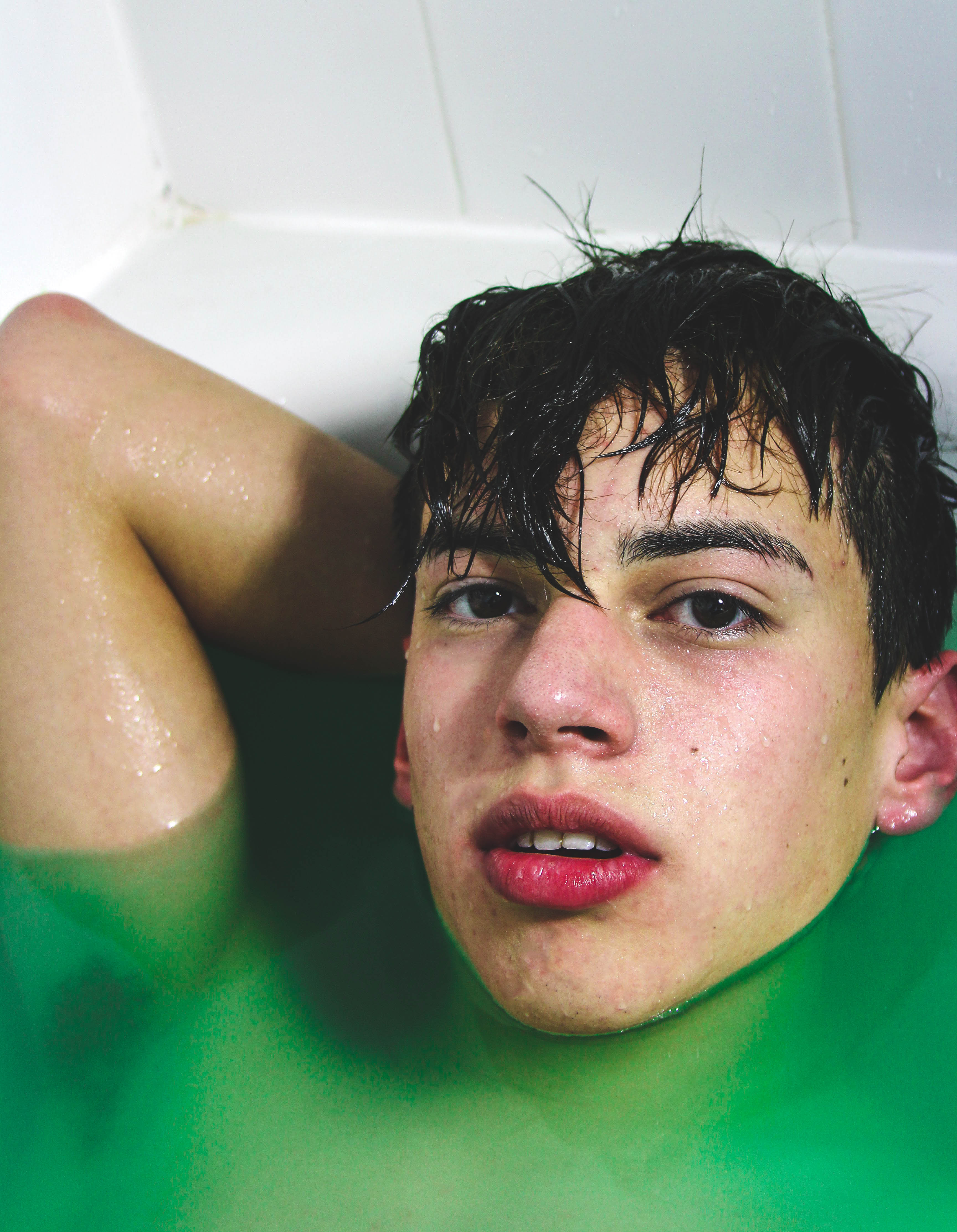
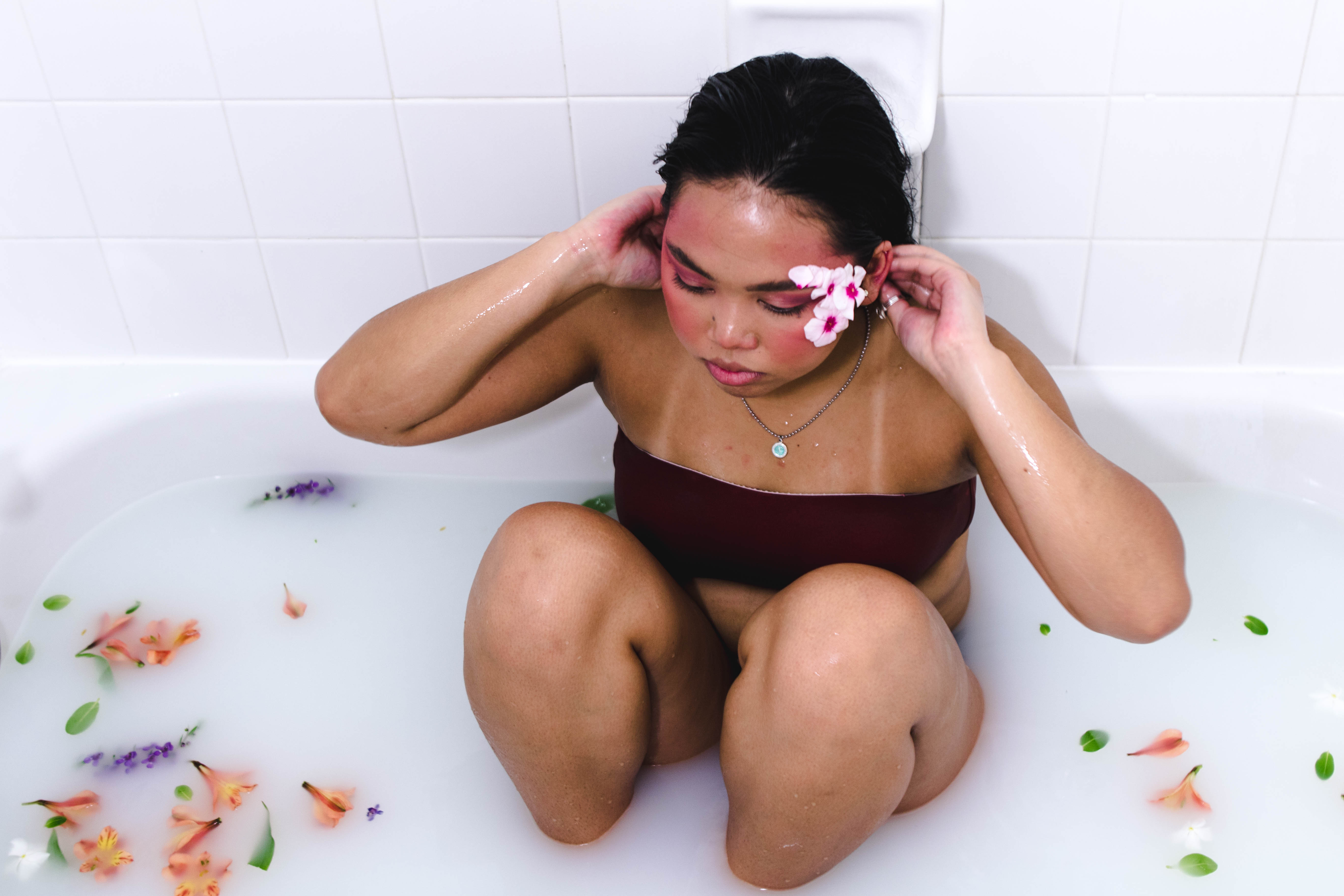
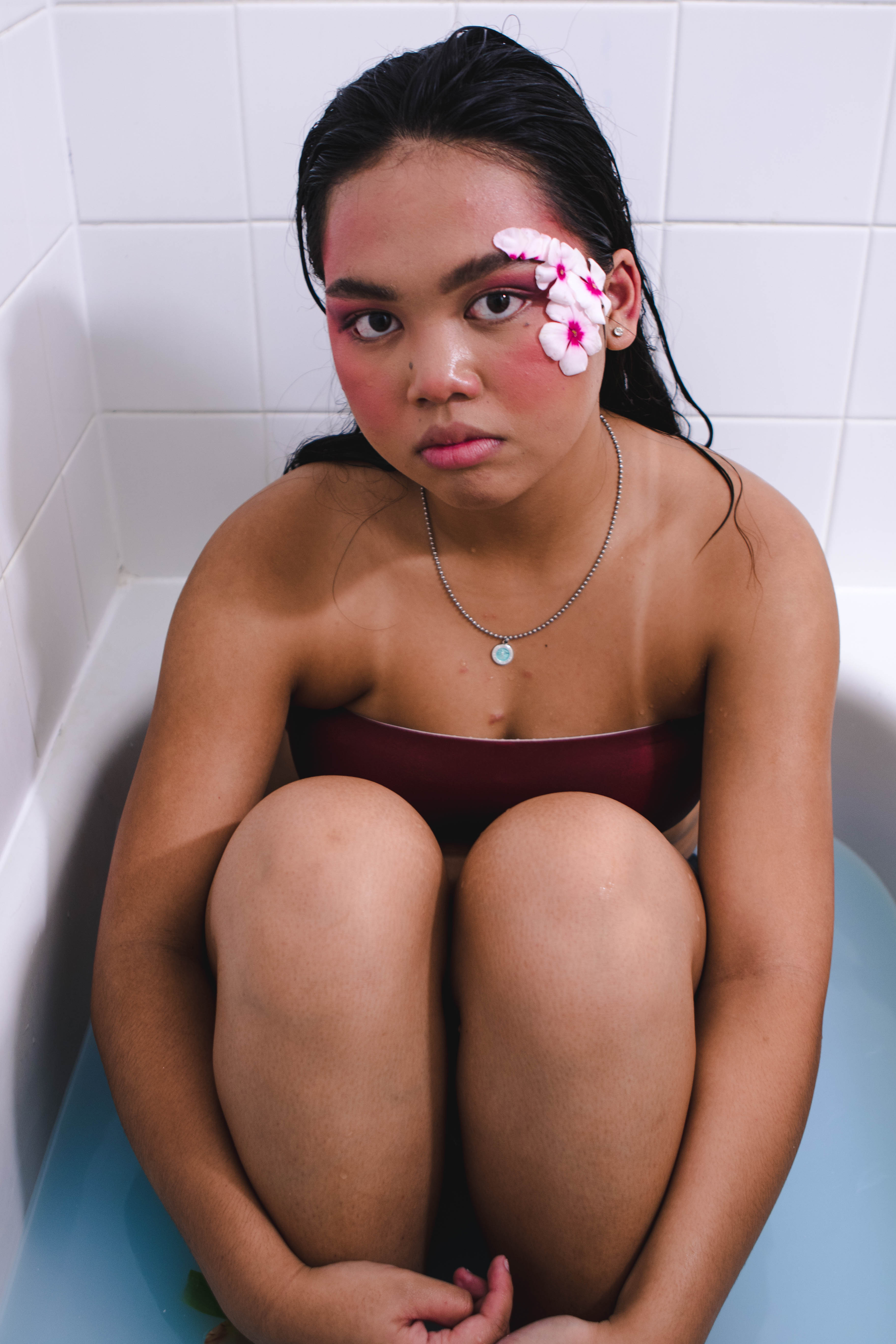
Cool Tones
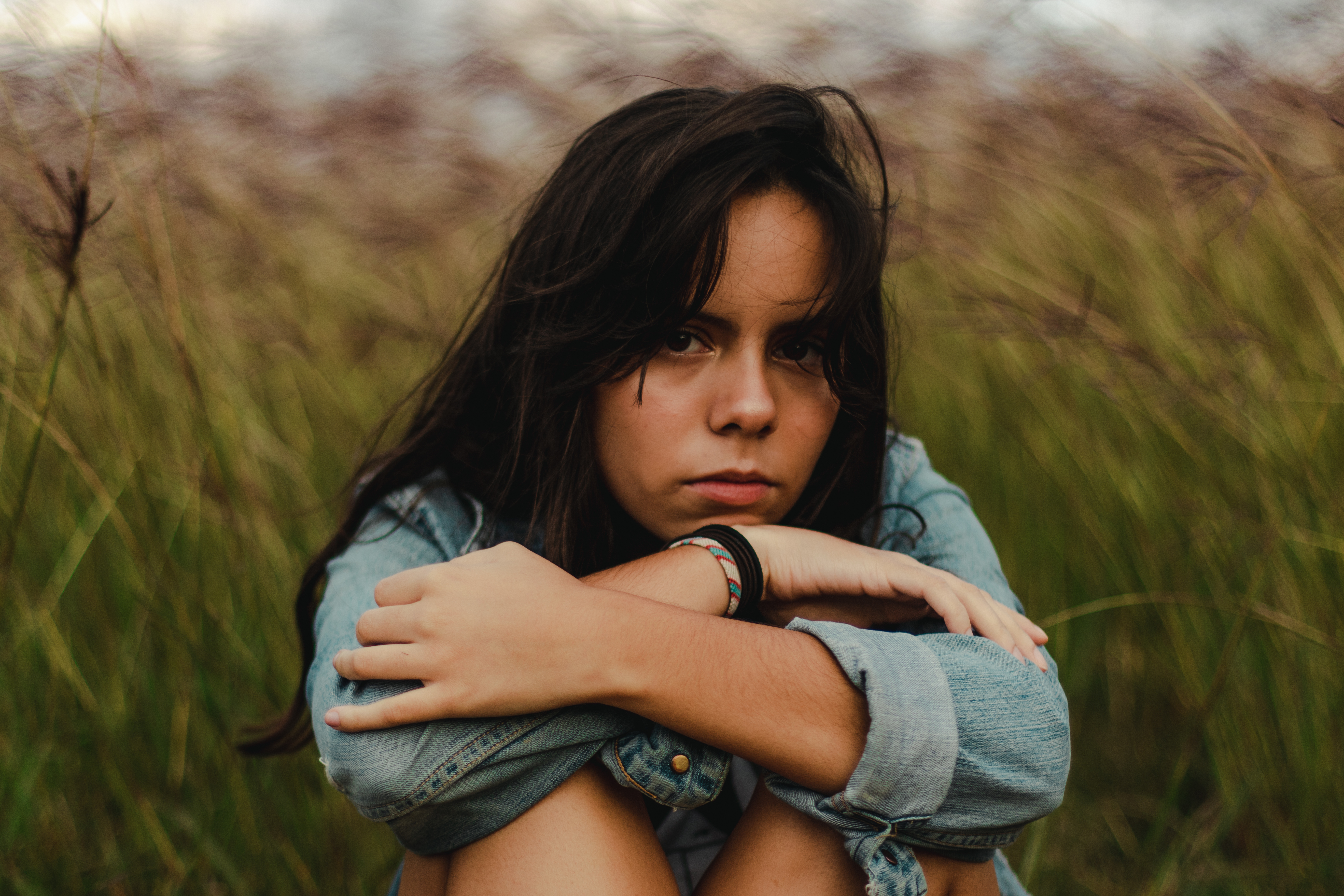
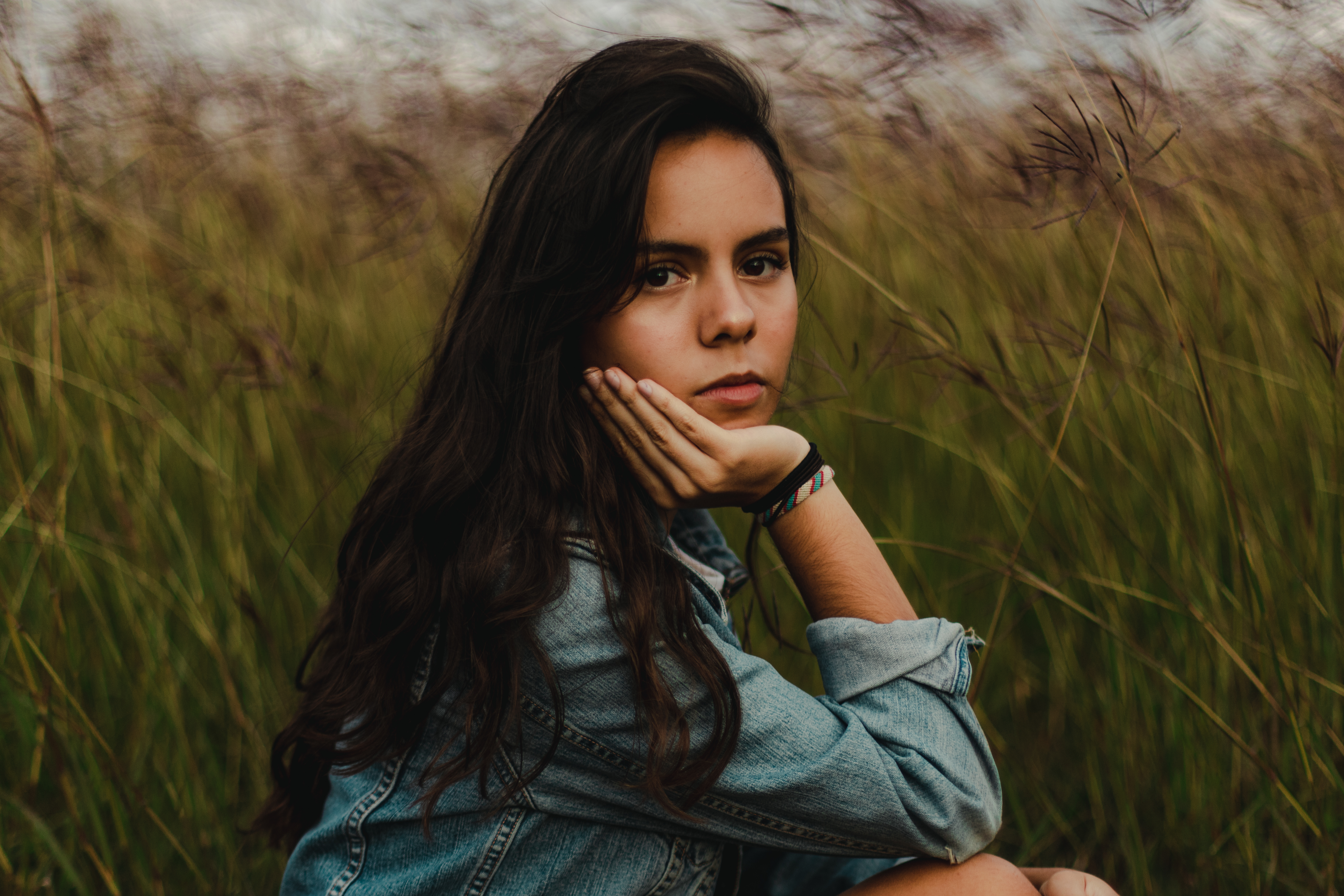
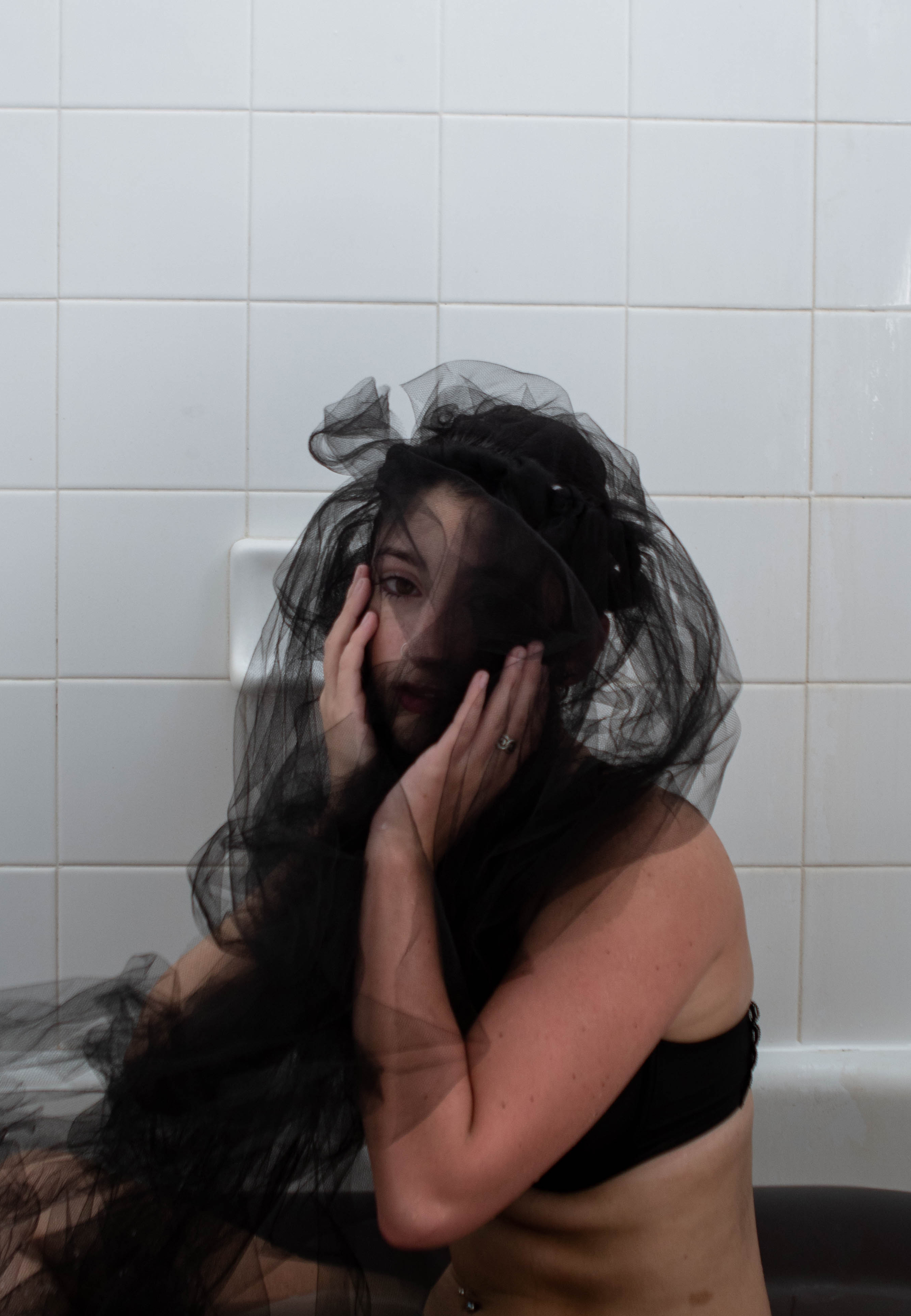
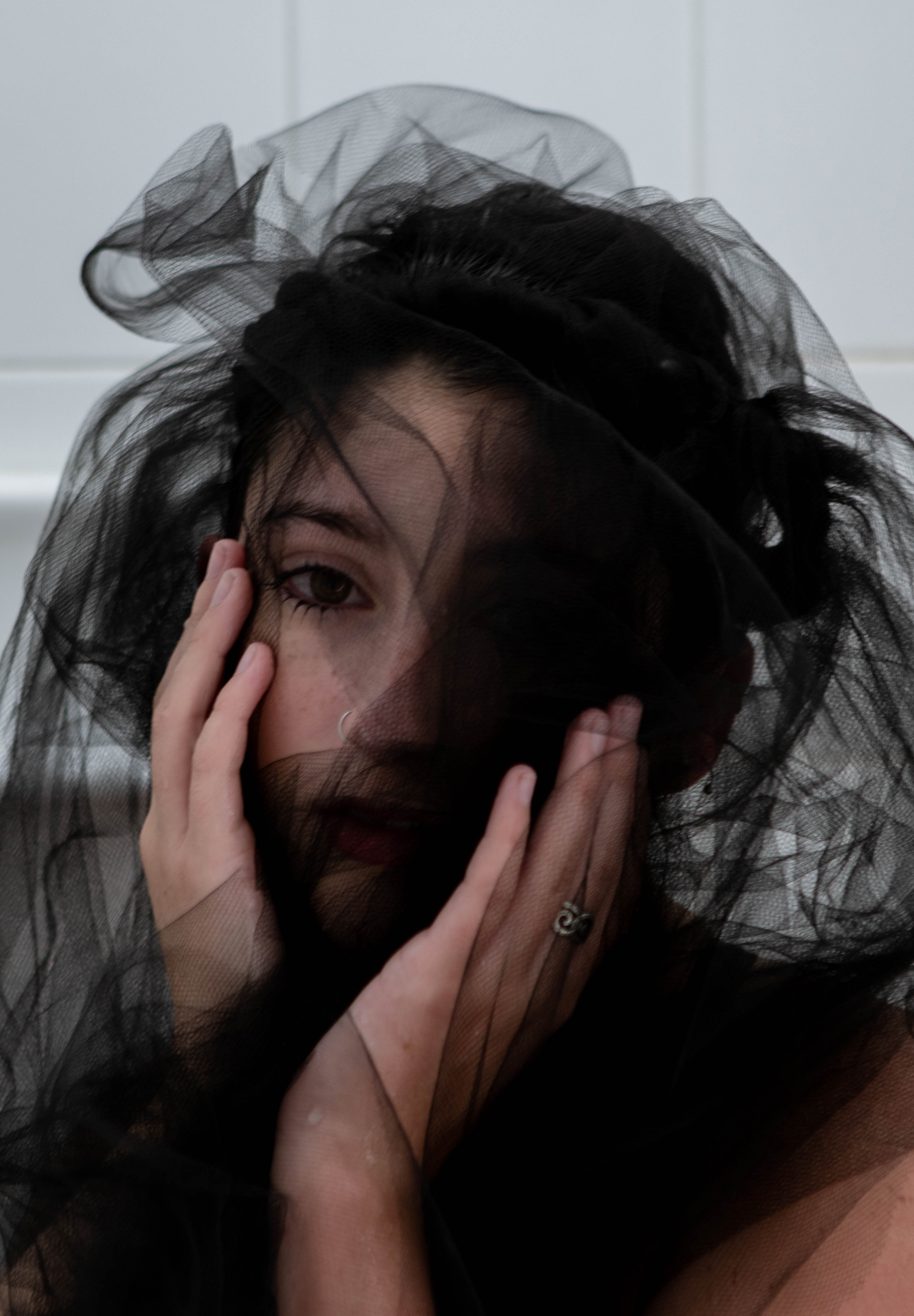
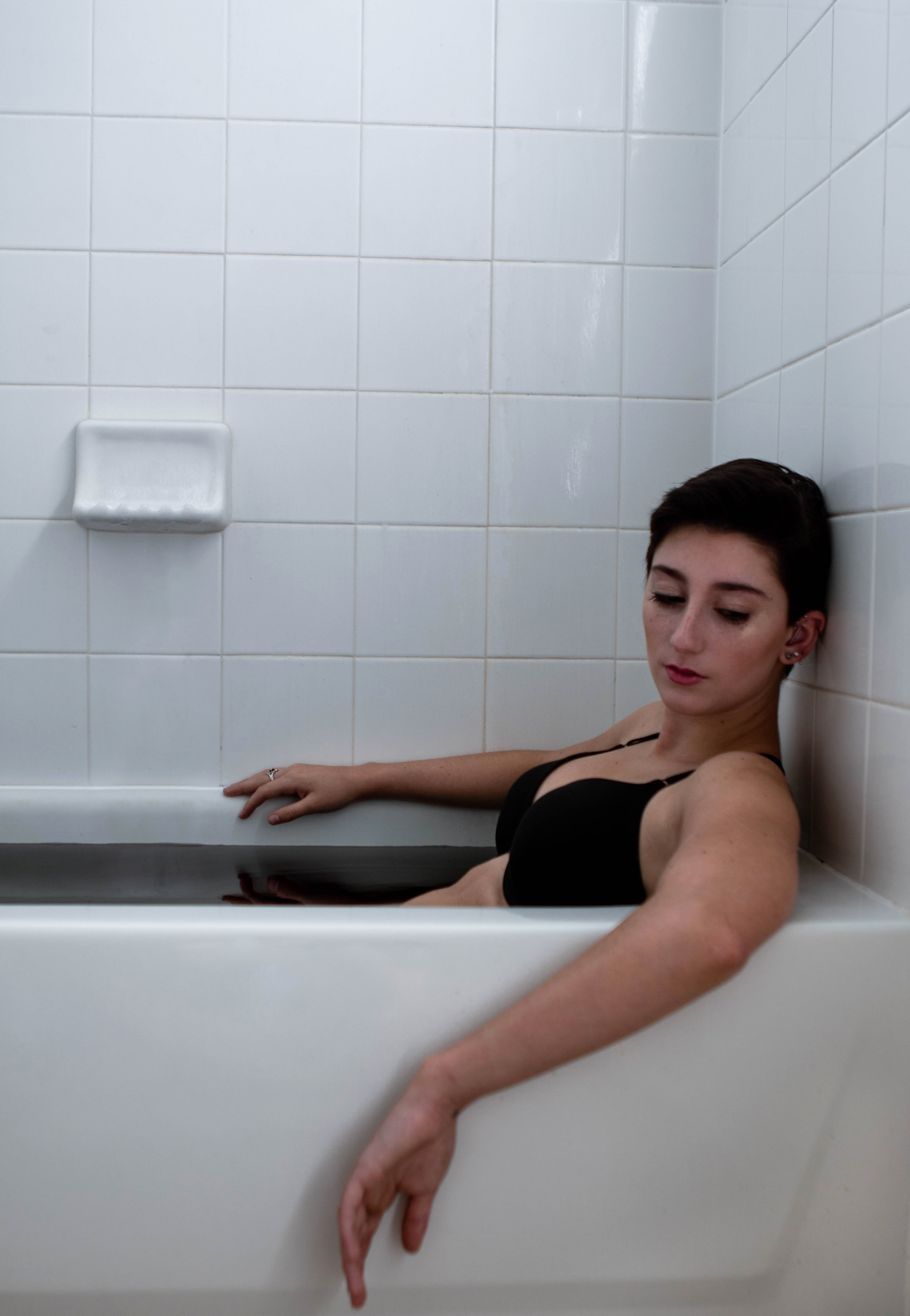
Cool toned colors have a very calming yet sad feeling to them. Cool toned colors are often seen as more feminine than warm-toned and have a varying spectrum of feelings surrounding them. Cool colors are also associated with winter and cleanliness.
Blue: Blue is the most common of the cool toned colors and the most widely liked by the public. The bluer your image is the higher chance you have of a person liking your image depending entirely on the color scheme. Blue is associated with calmness, spirituality, and trust which is why many companies use blue in their logos and most people’s favorite color is blue.
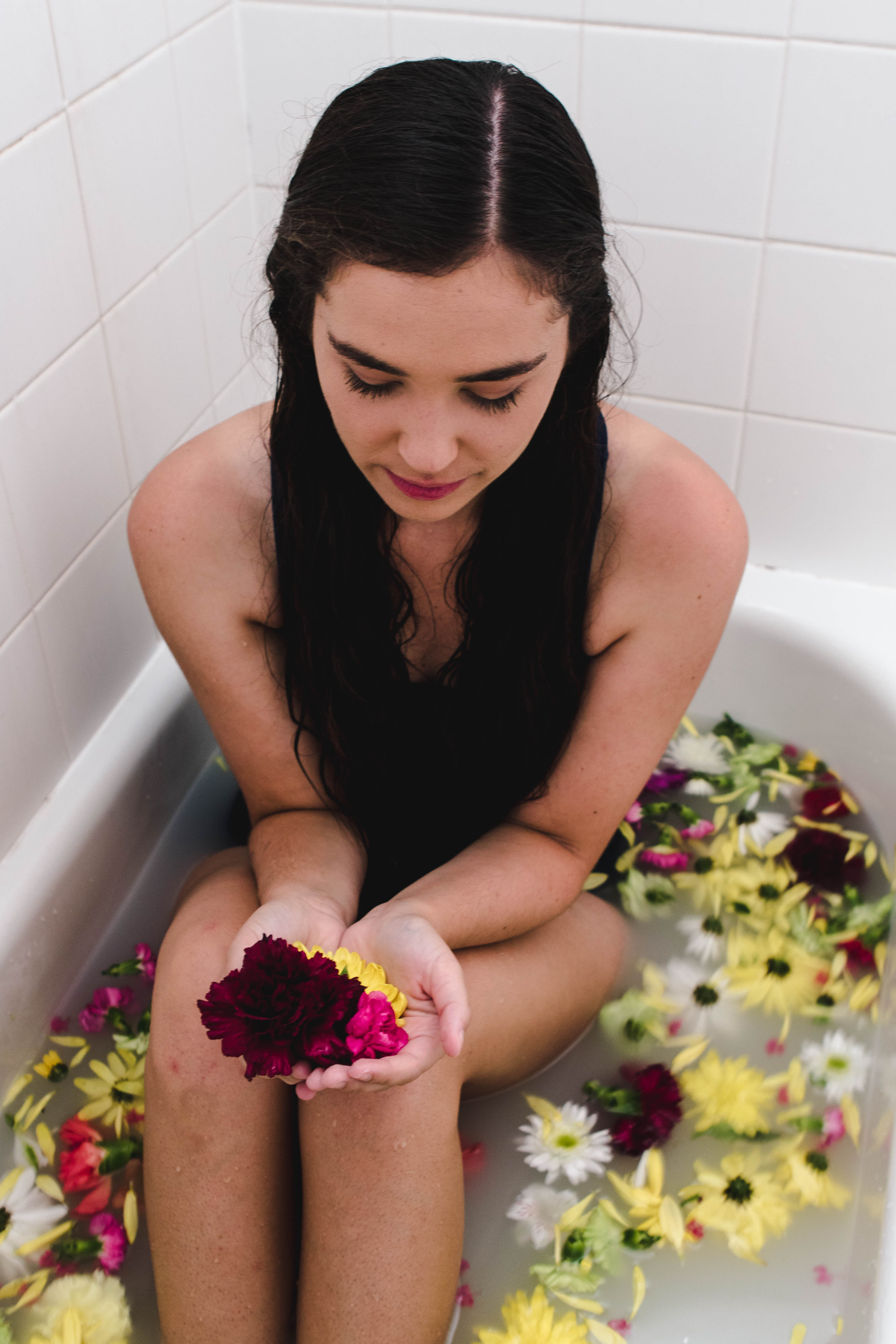
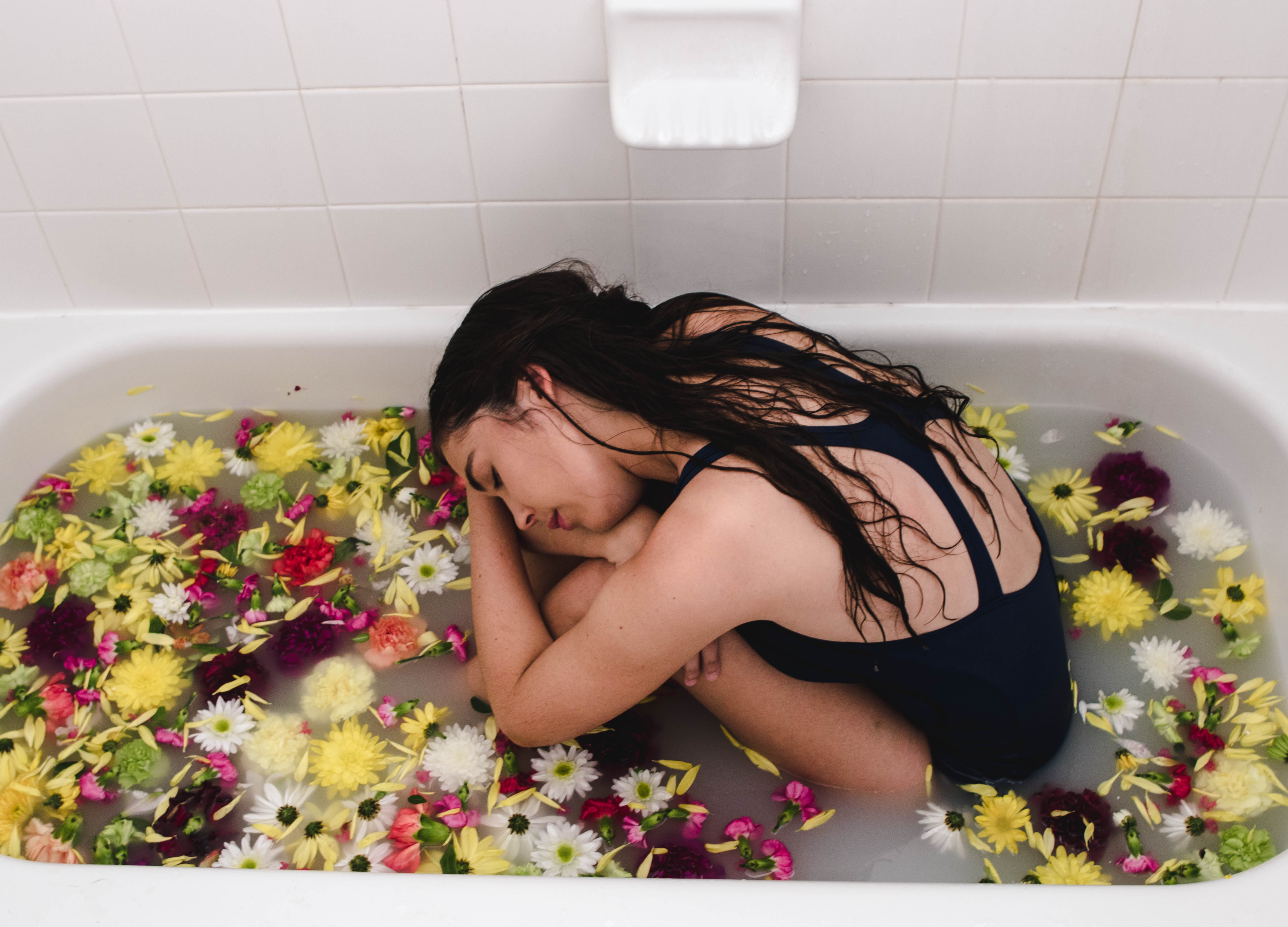
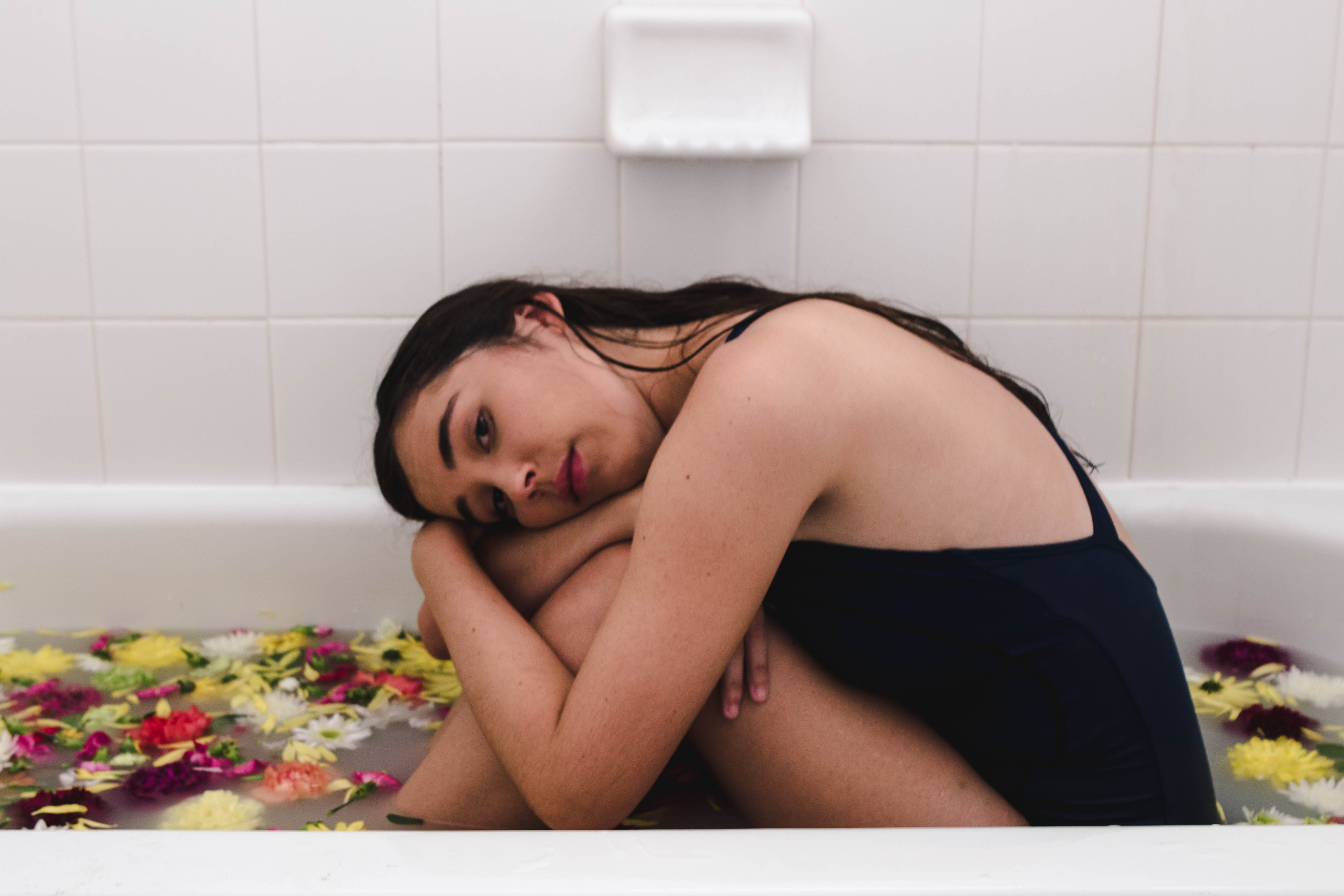
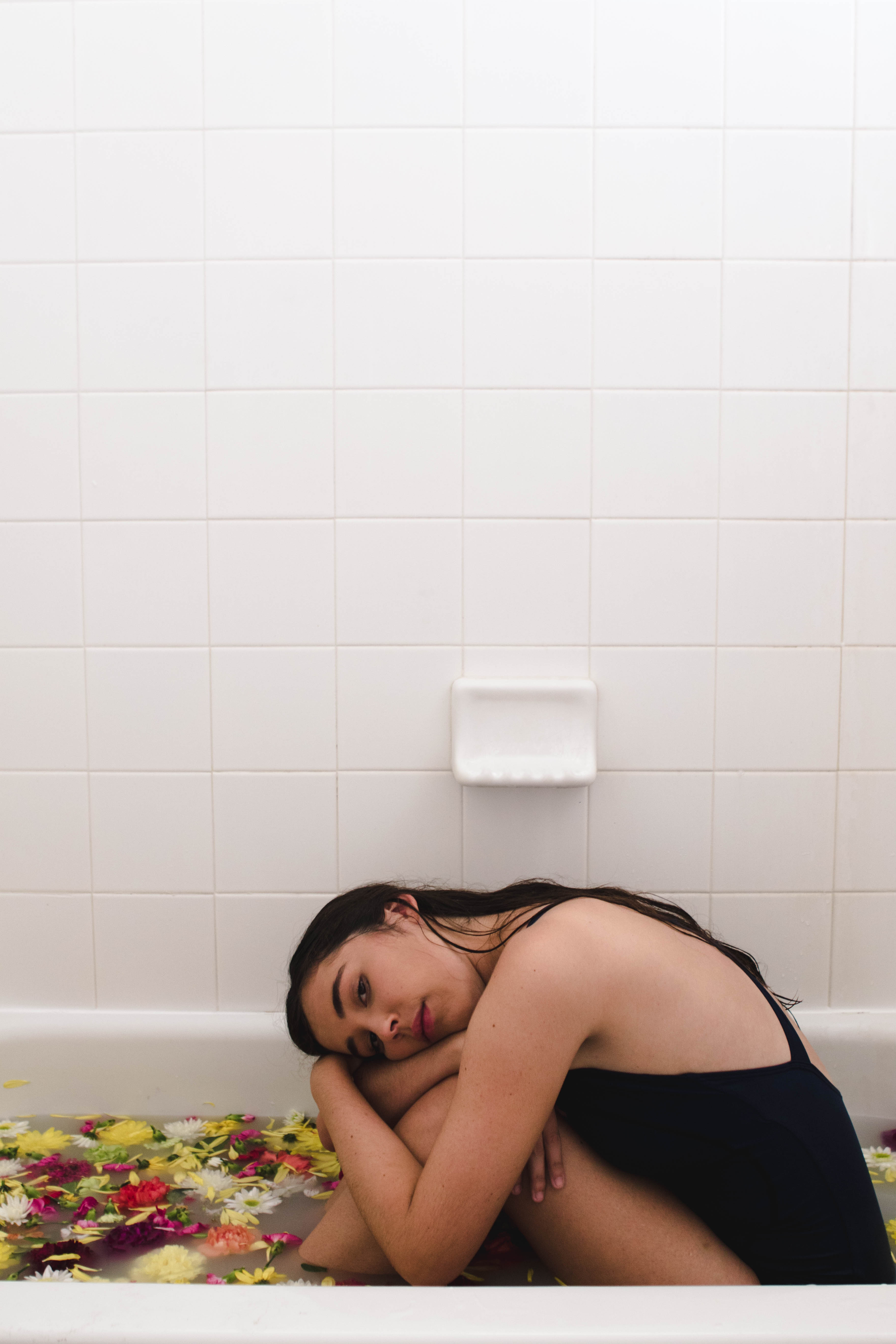
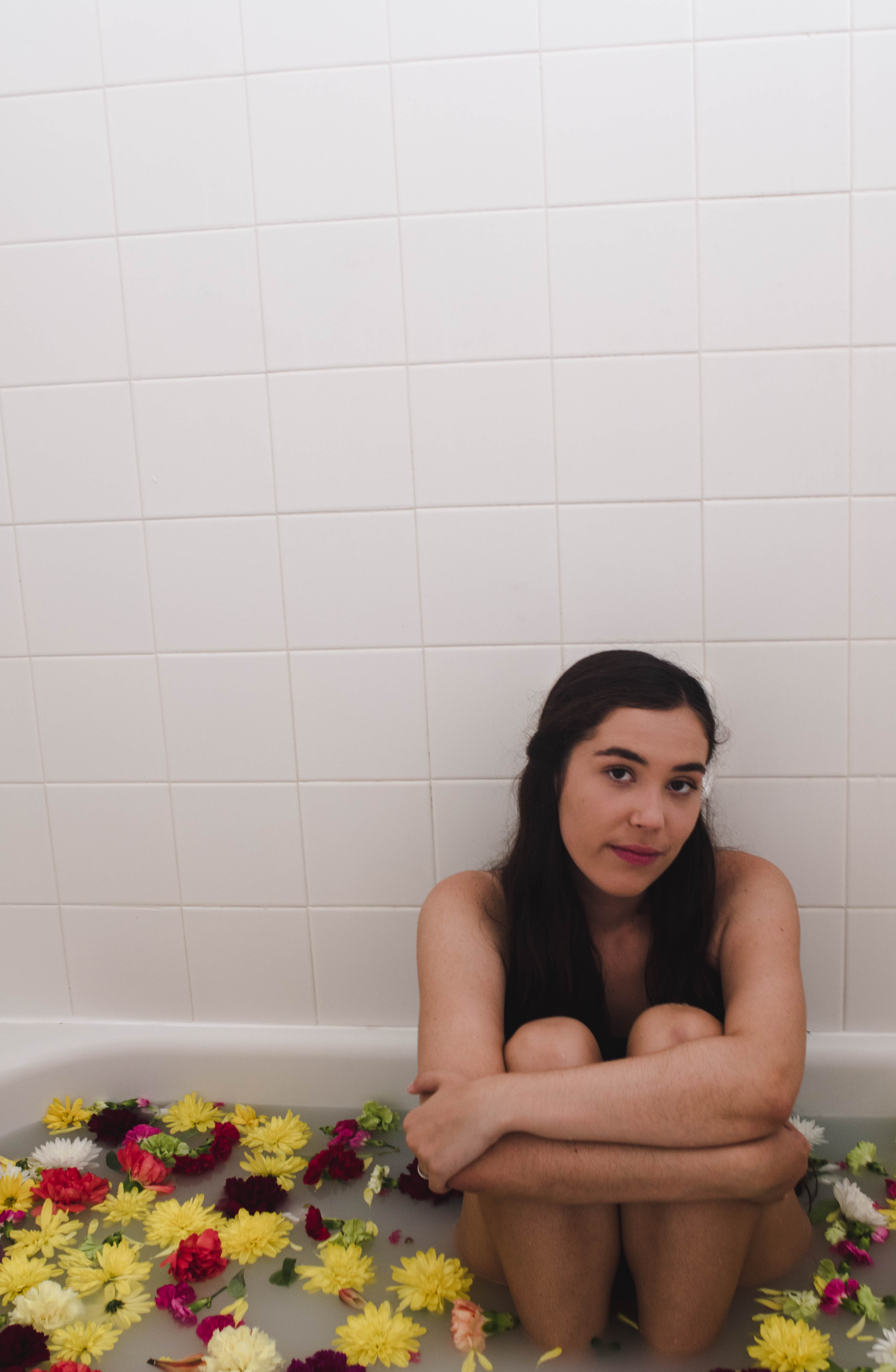
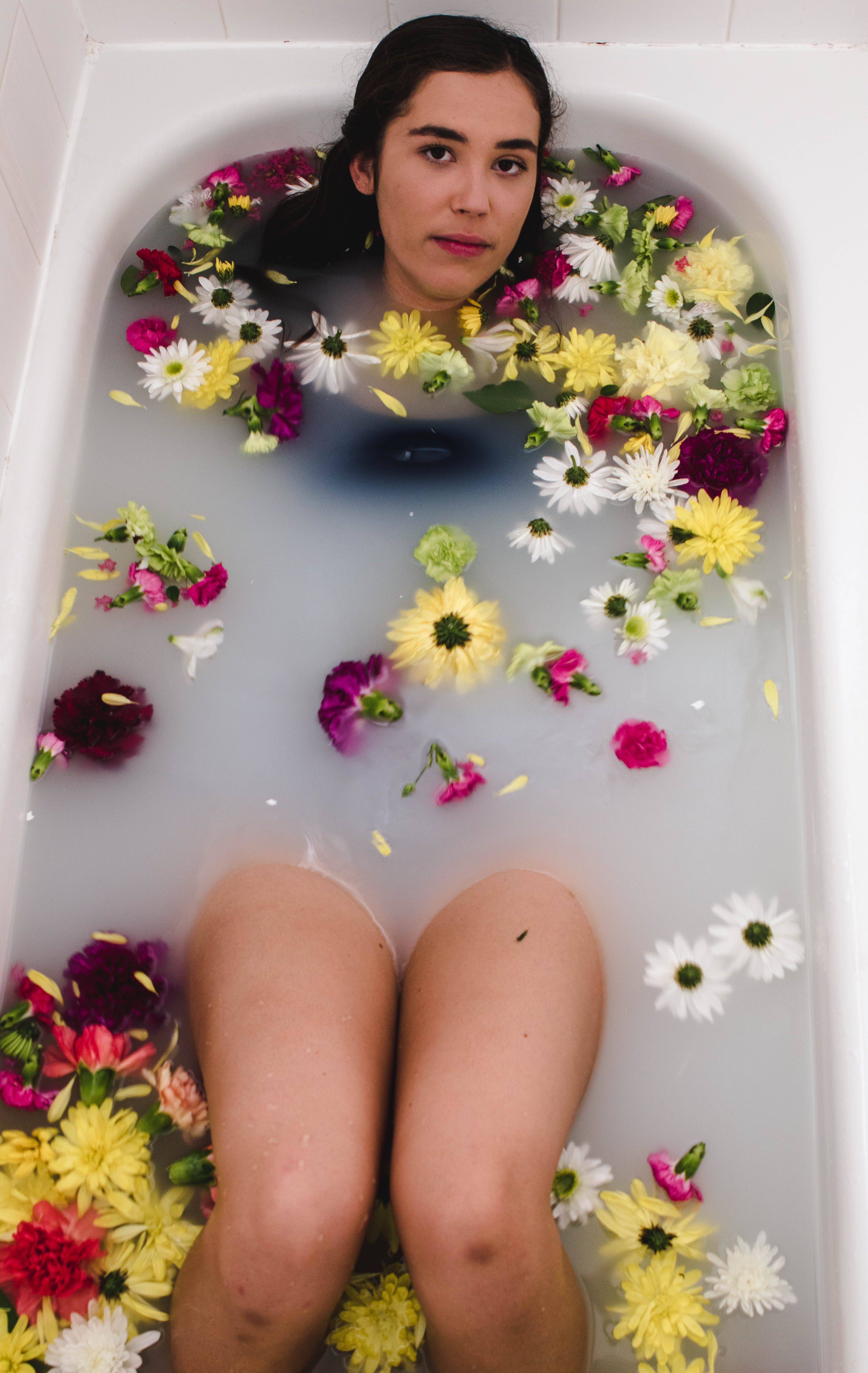
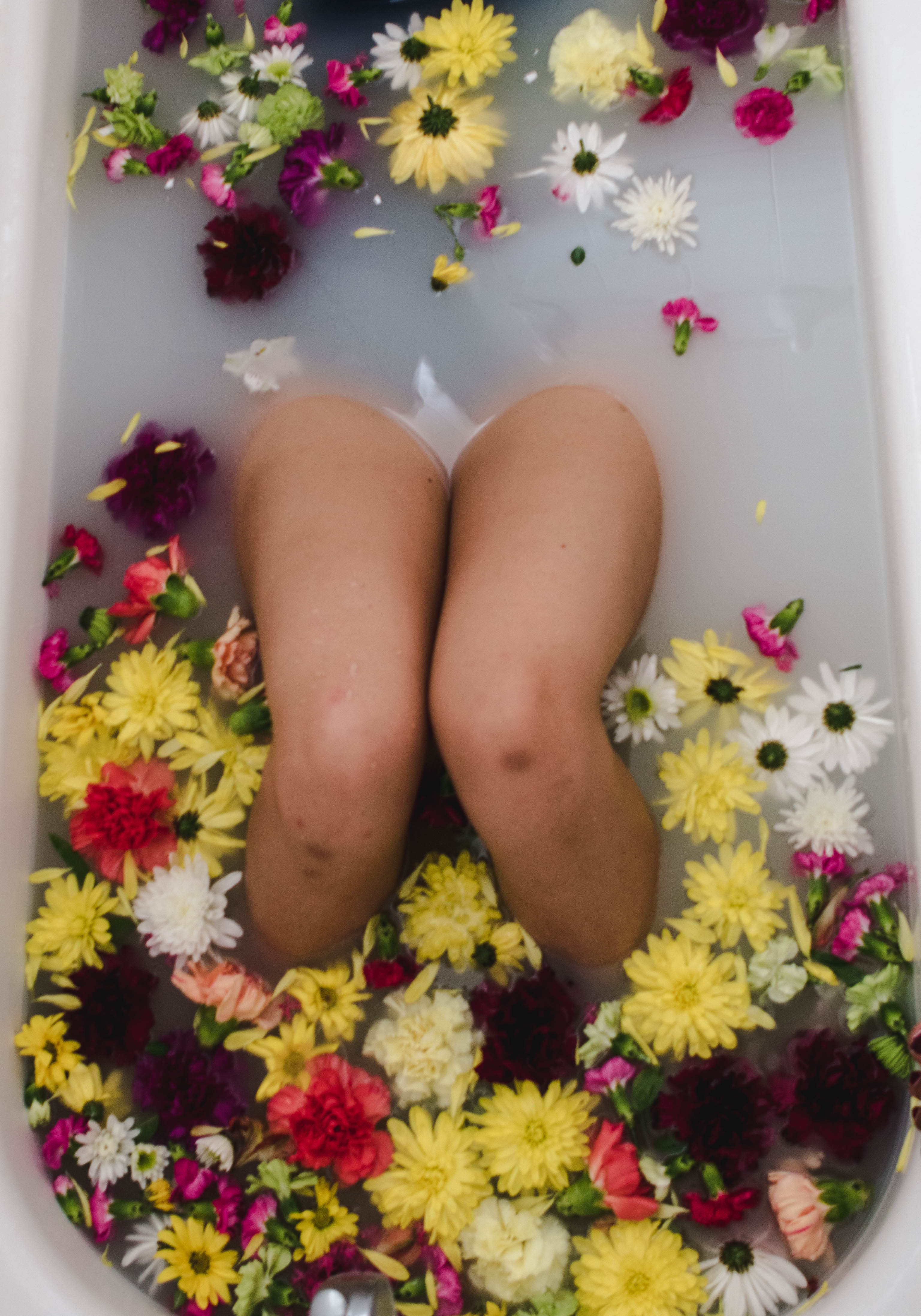
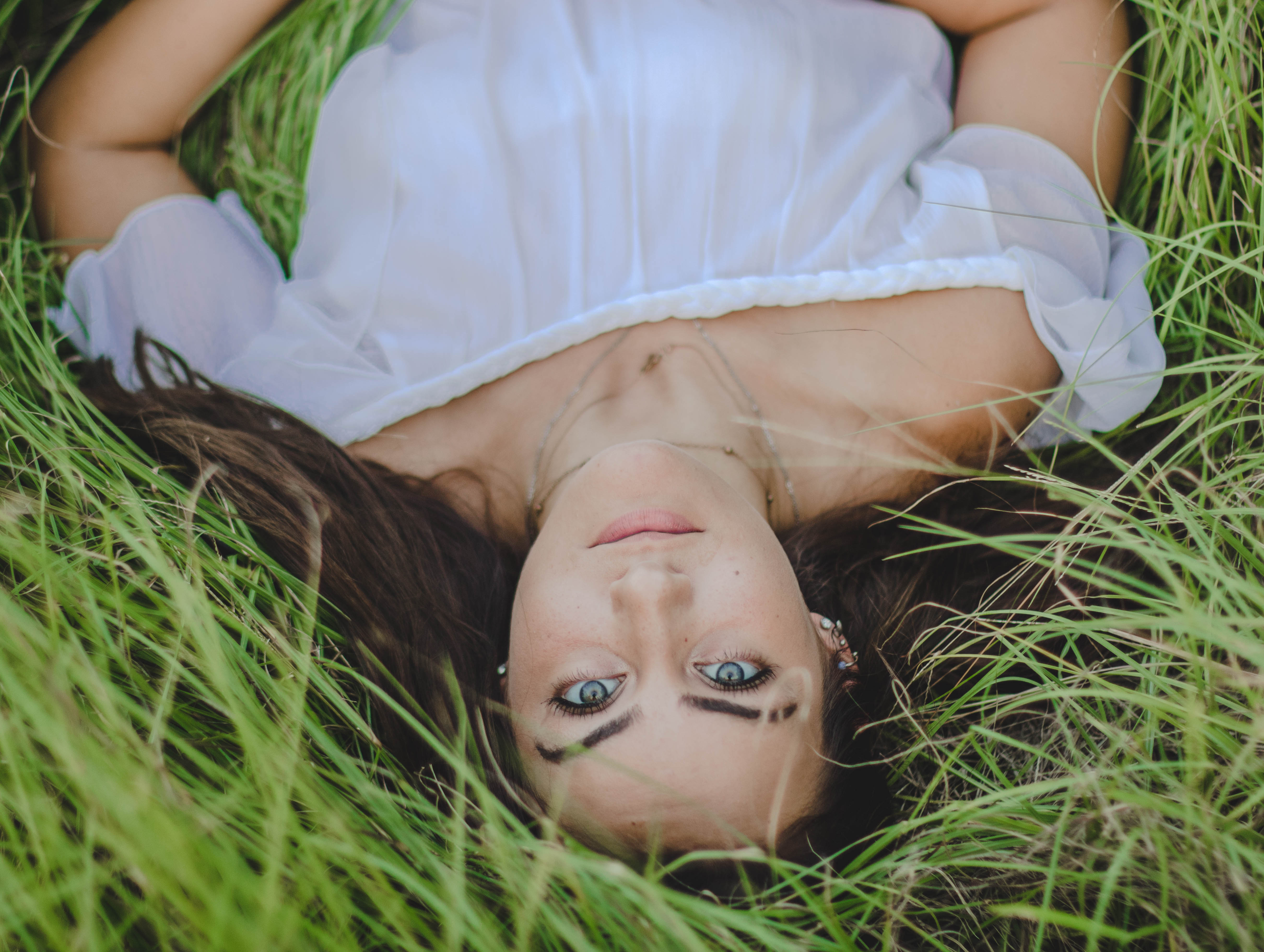
Green: Green symbolizes health, nature and new beginnings and it is also seen as the color easiest on one’s eyes because it is so prevalent in nature. Green is mostly used as a background color for your image in the trees or grass and is rarely used on a model. Incorporating a lot of green is amazing in landscape photography but lots of green in portraits can lead to feelings of anxiety or stress and cause the viewer to not focus on the subject.

Purple: Purple is the last of the main cool colors and is often associated with love, feminity, and royalty. Purple is often used as a soothing color because it is seen in sunsets and flowers. Purple is another color that should be used with a light touch because too much purple can be seen as overwhelming to the eye.
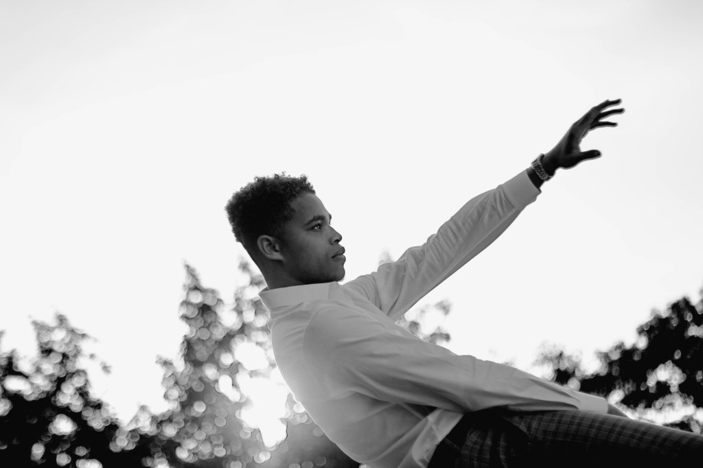
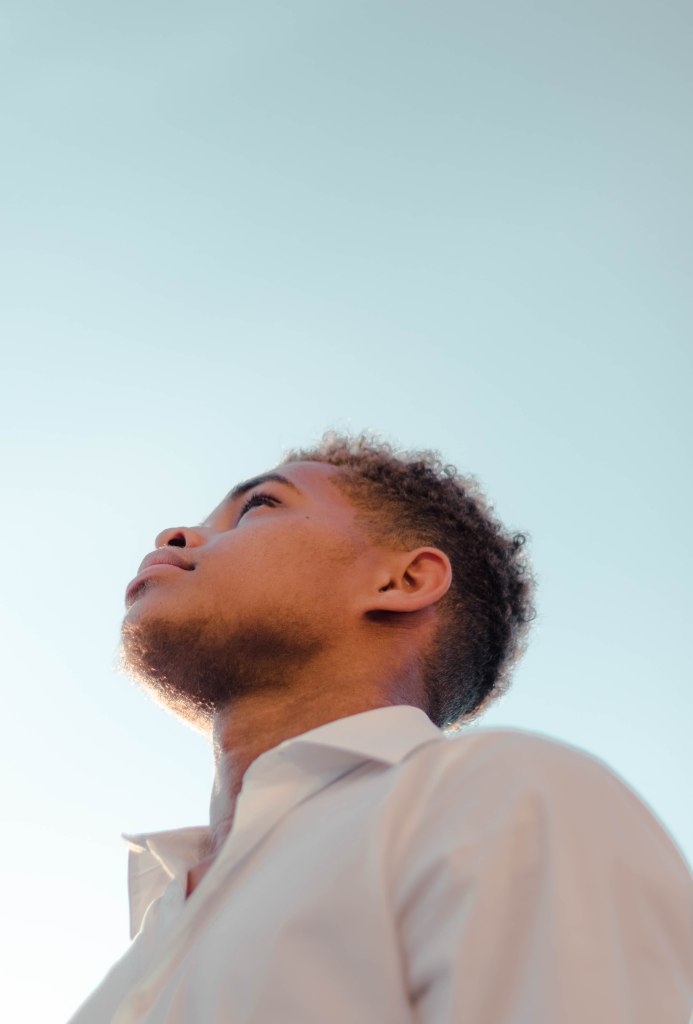
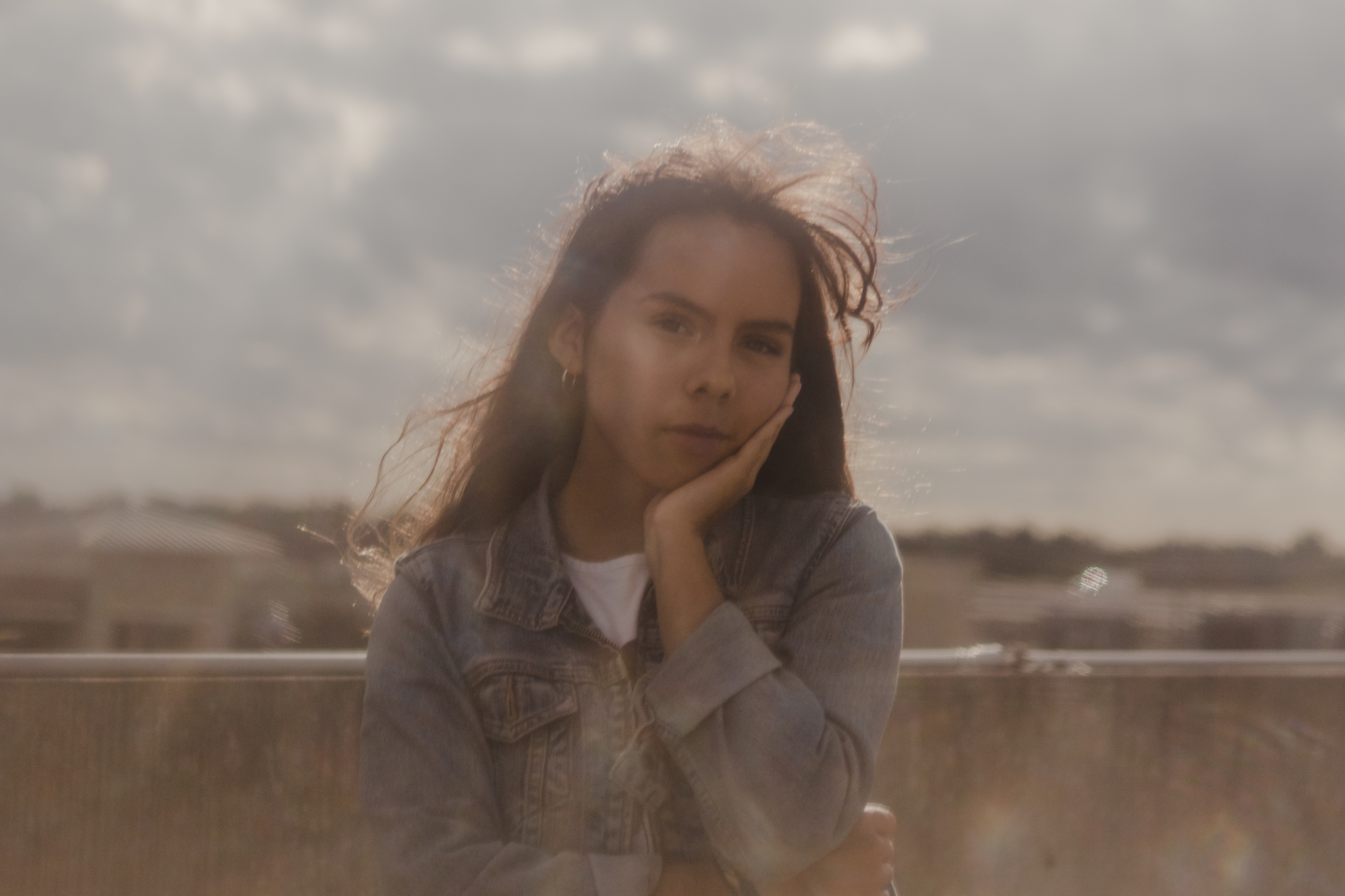
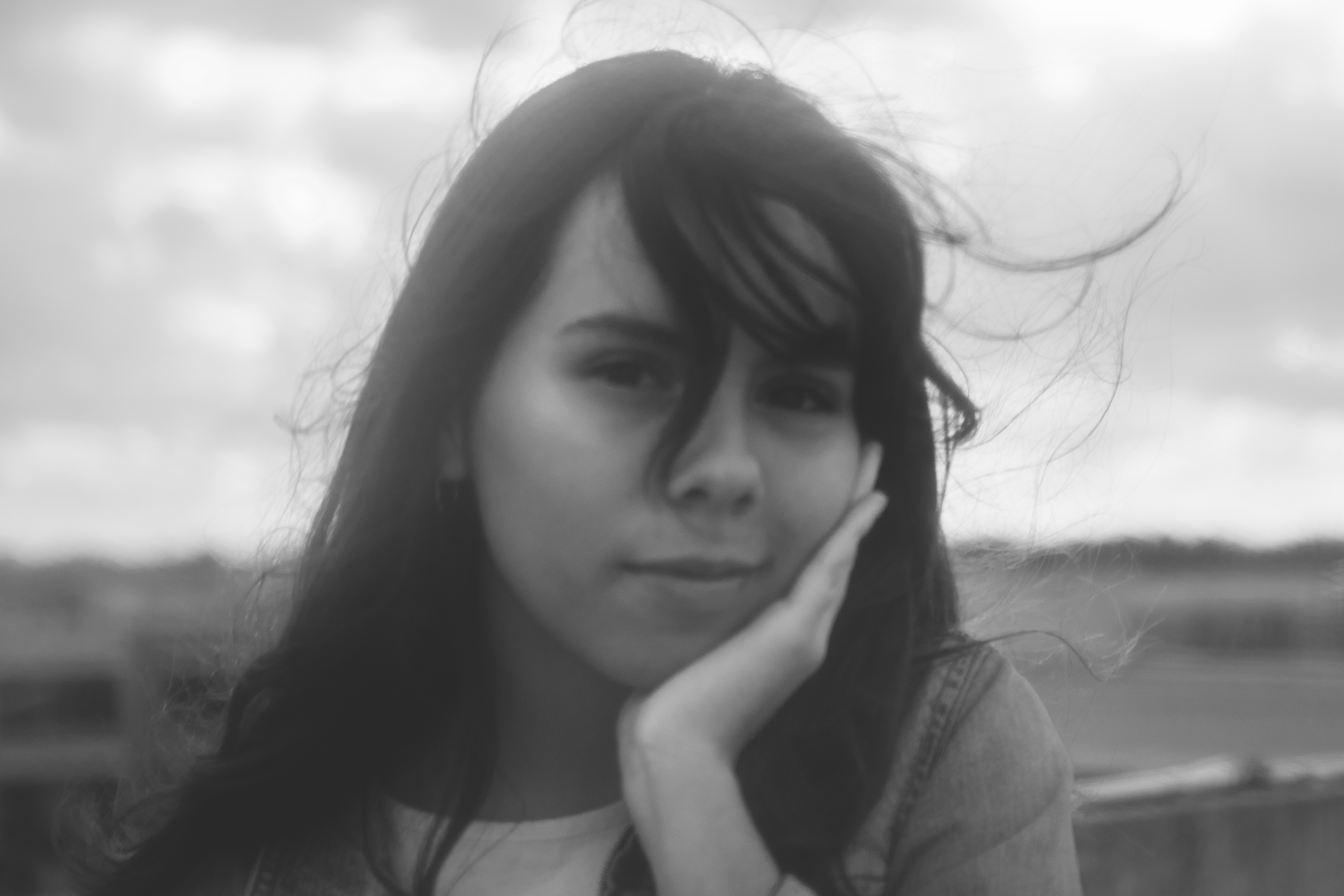
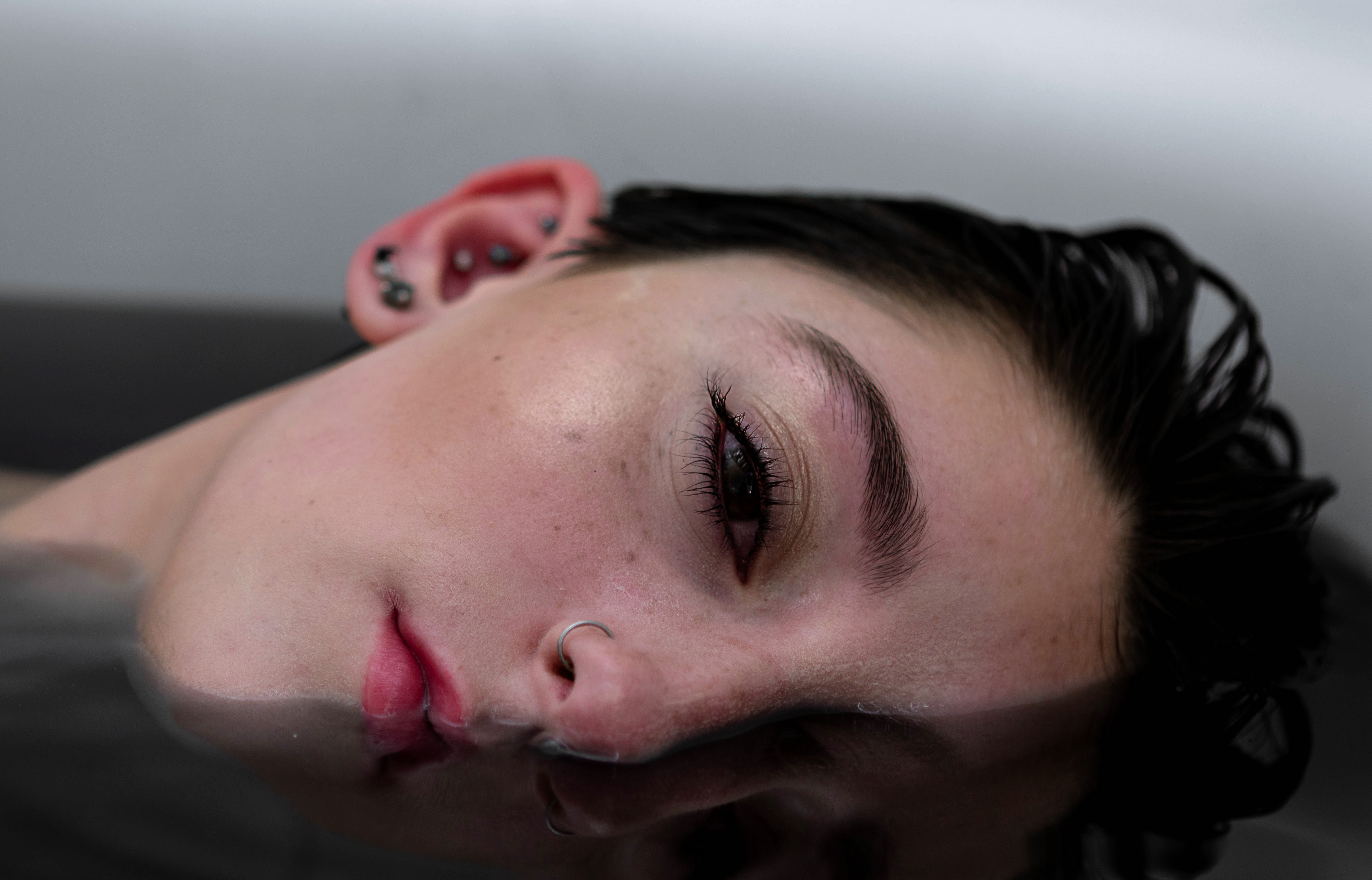
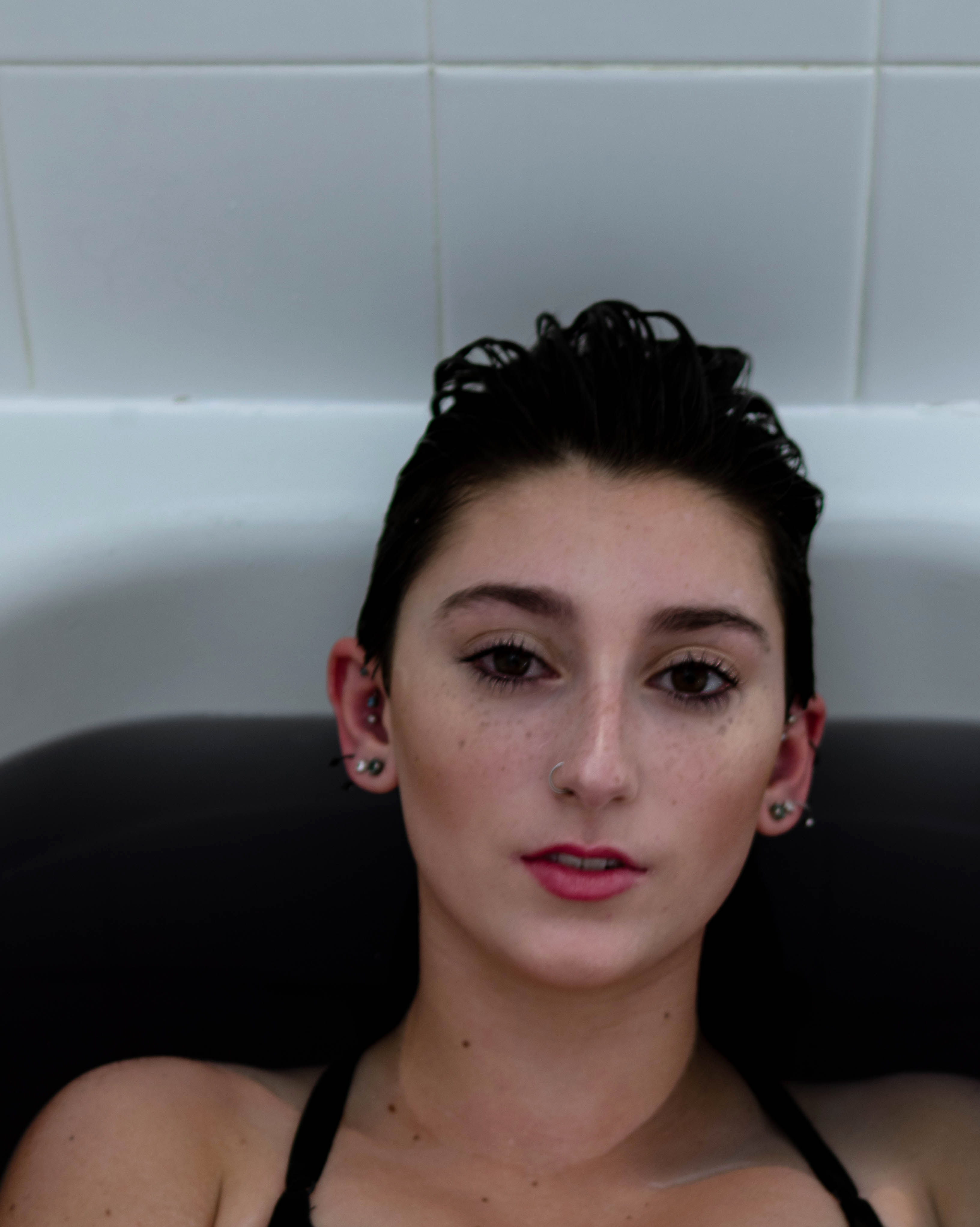
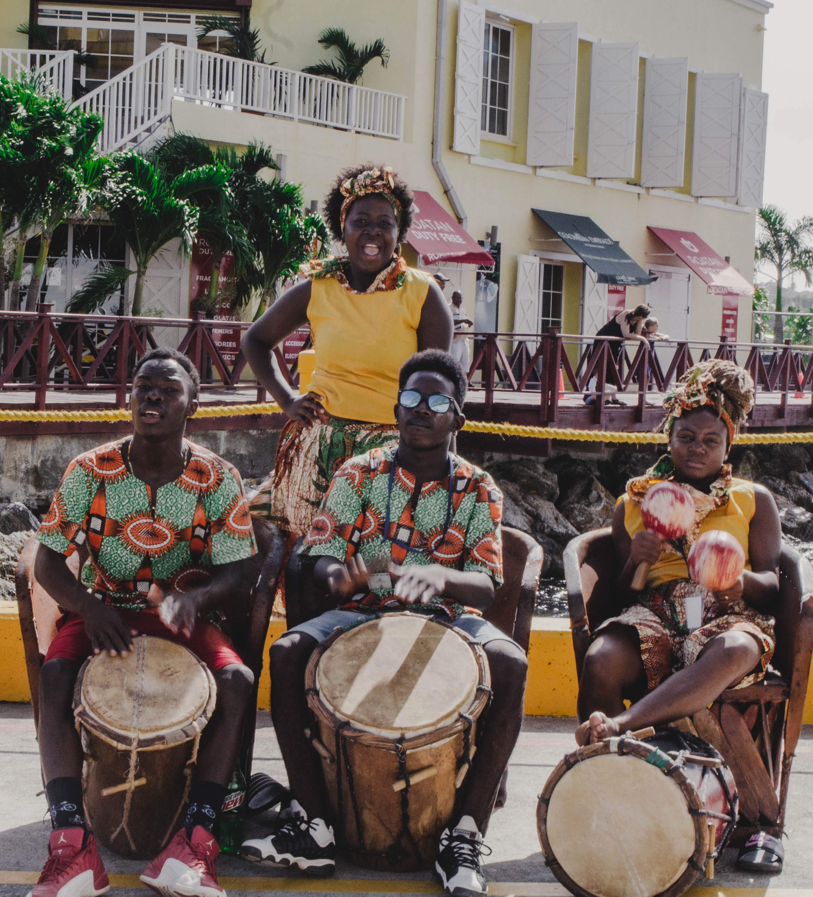
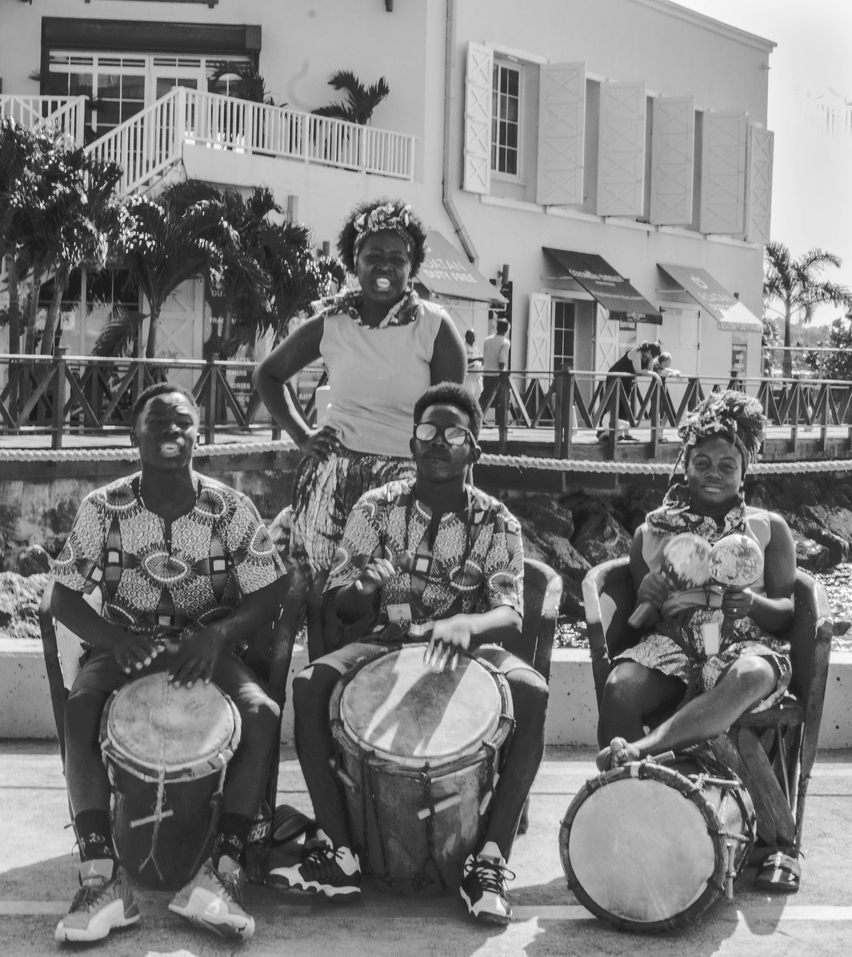
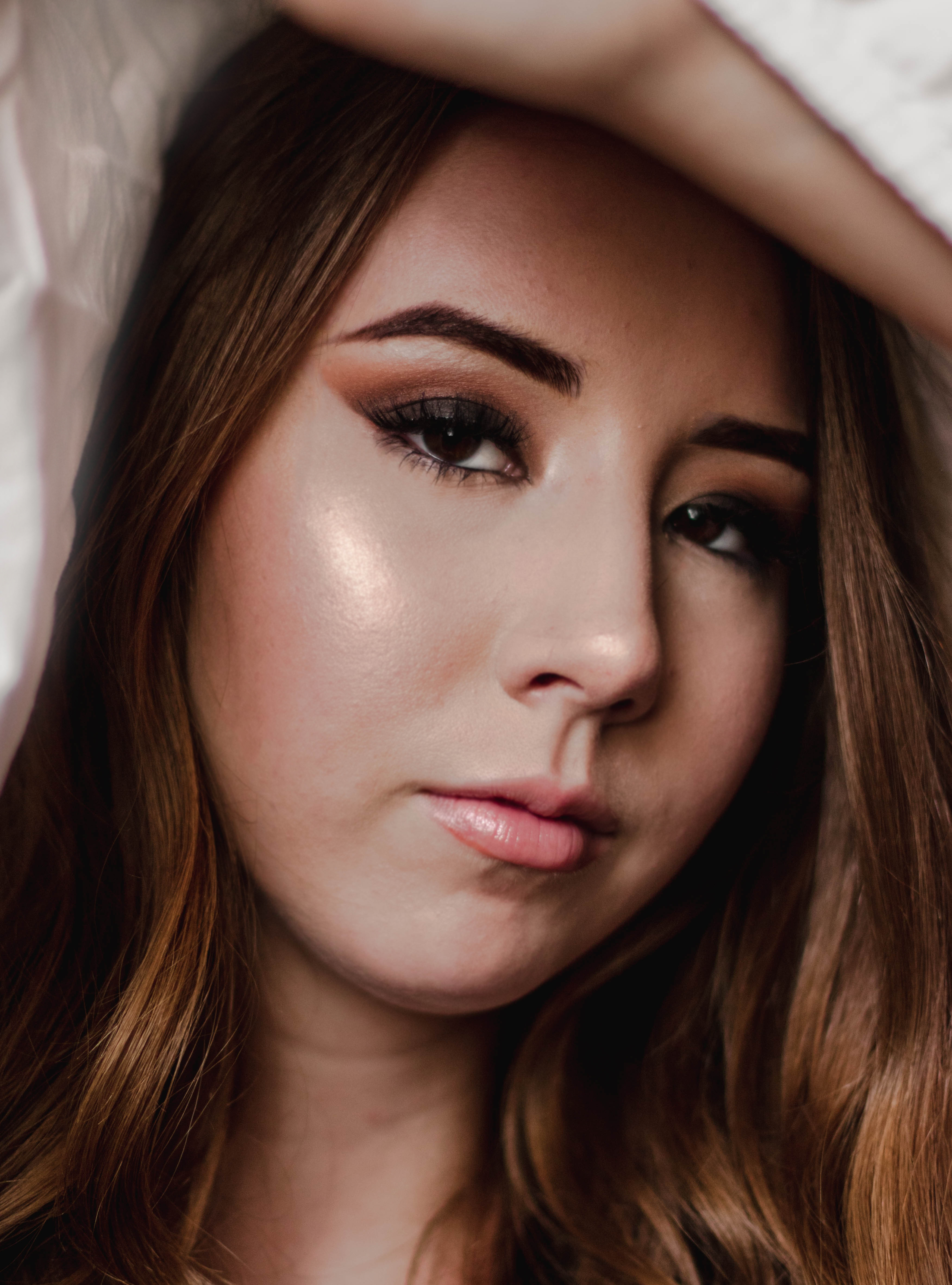
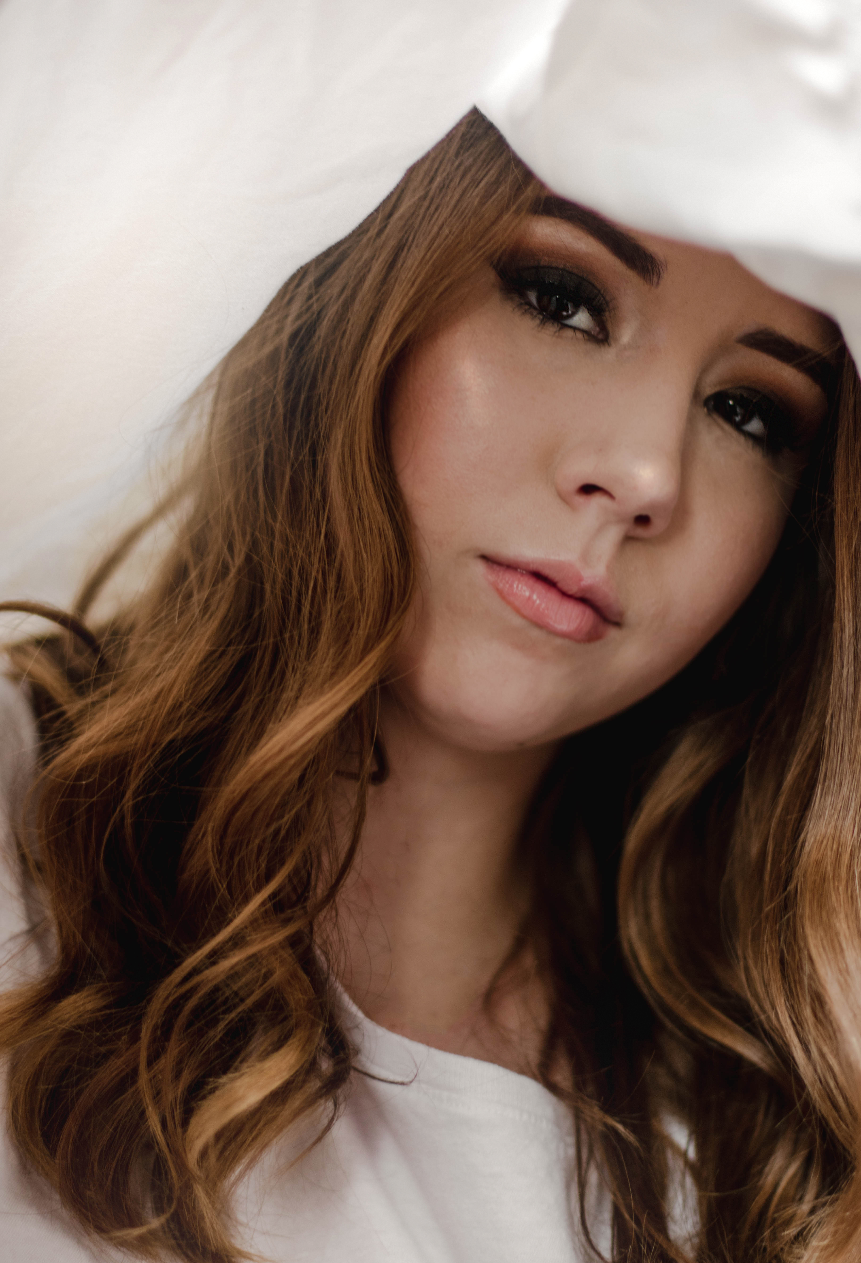
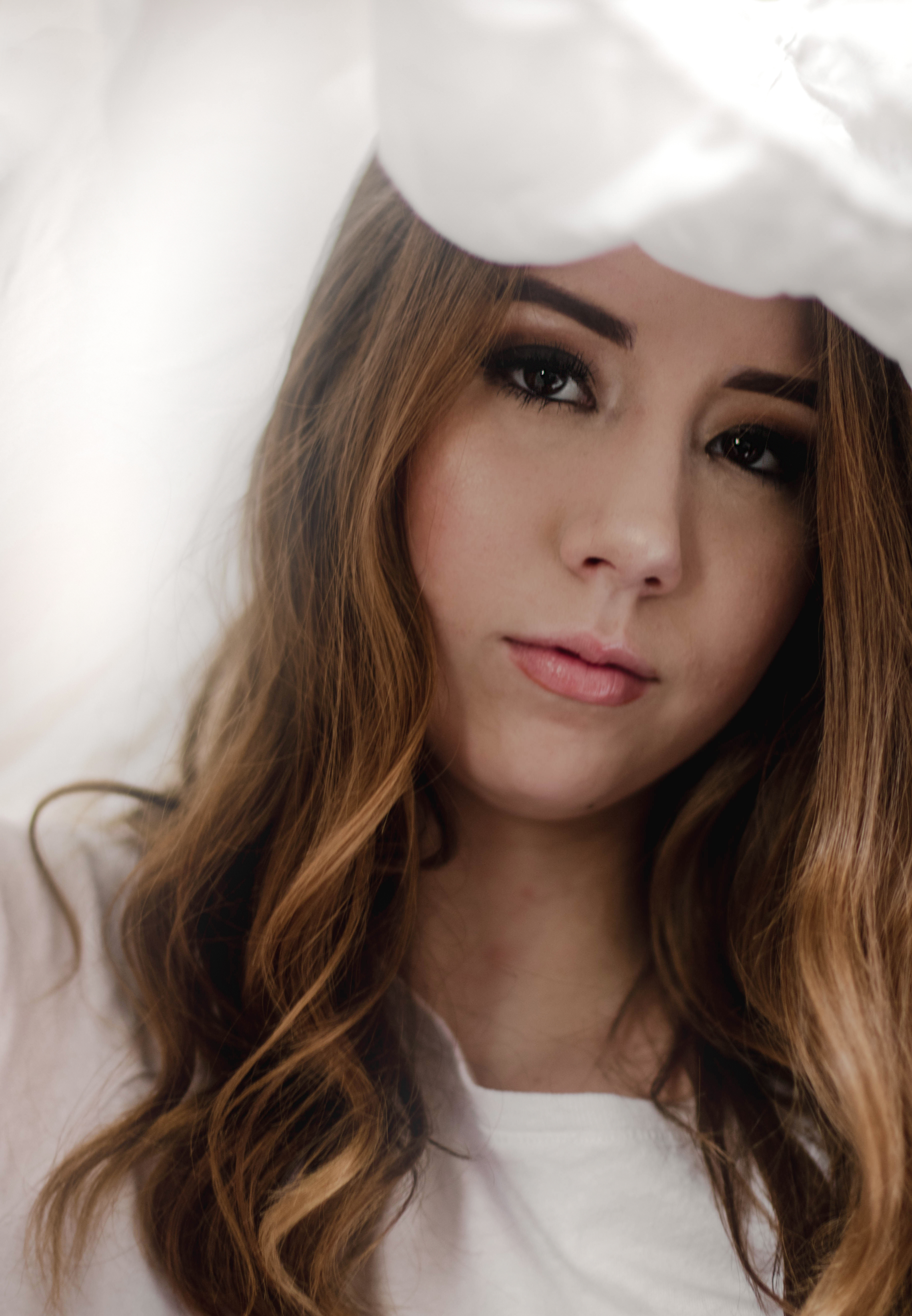
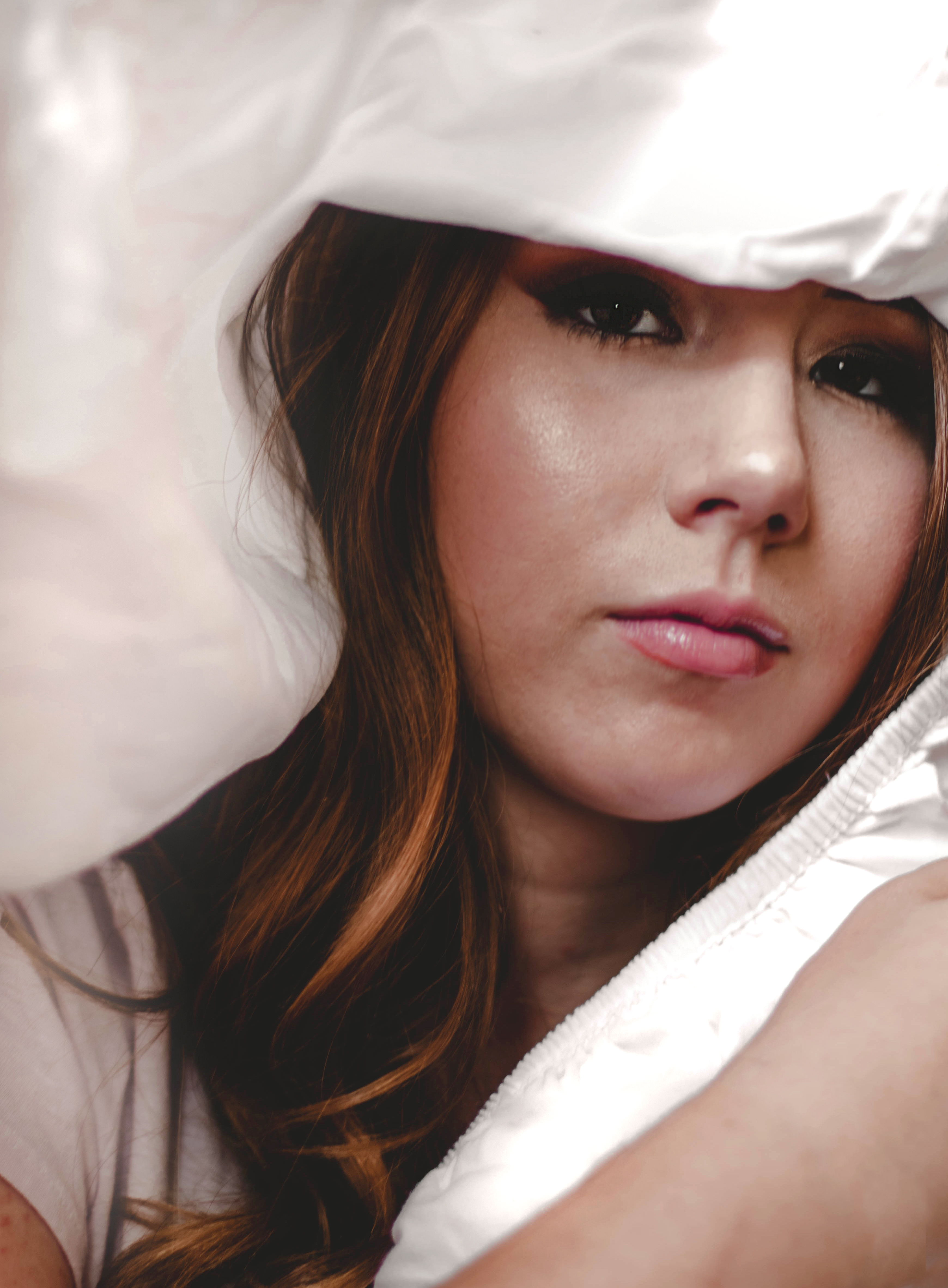
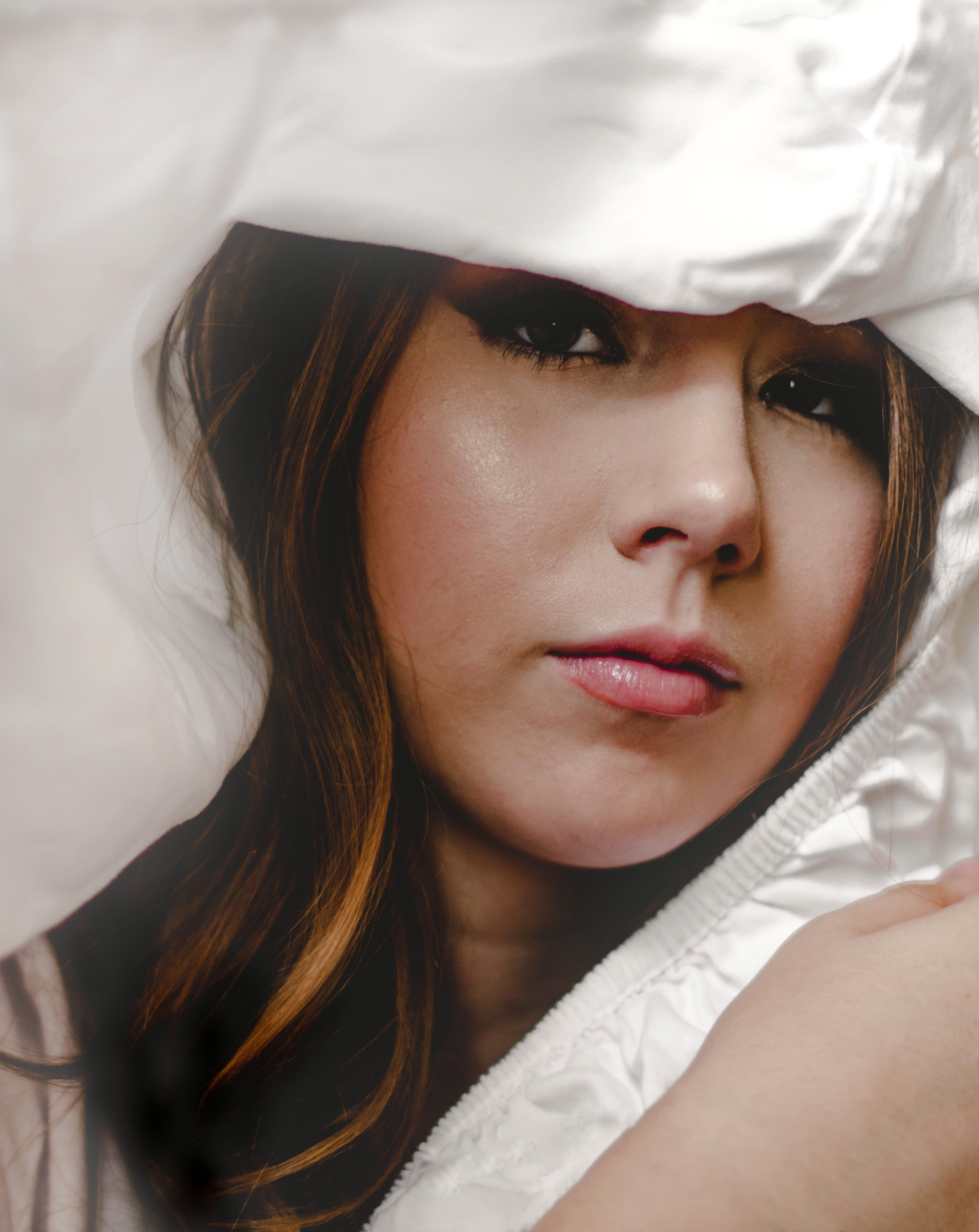
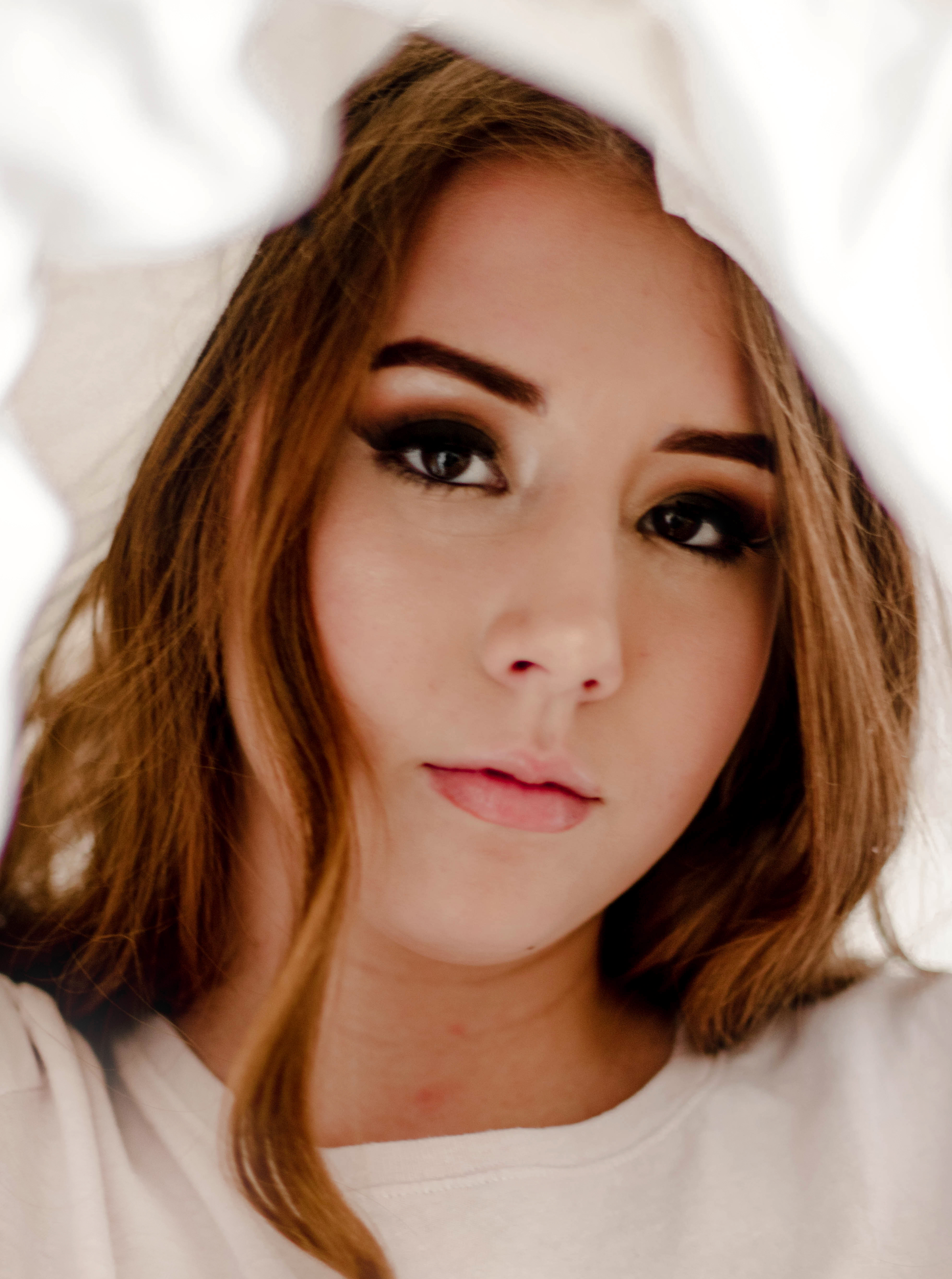
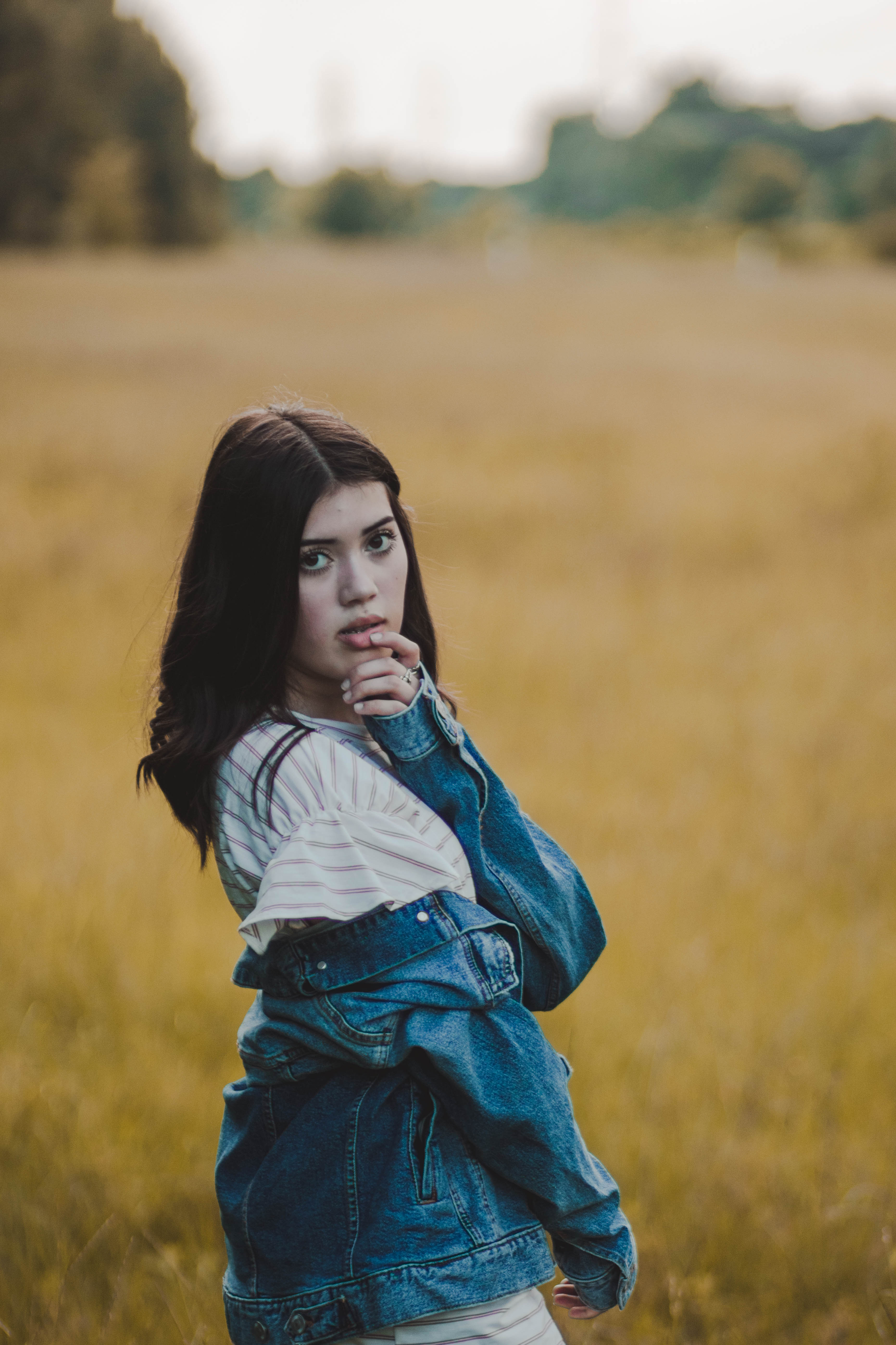
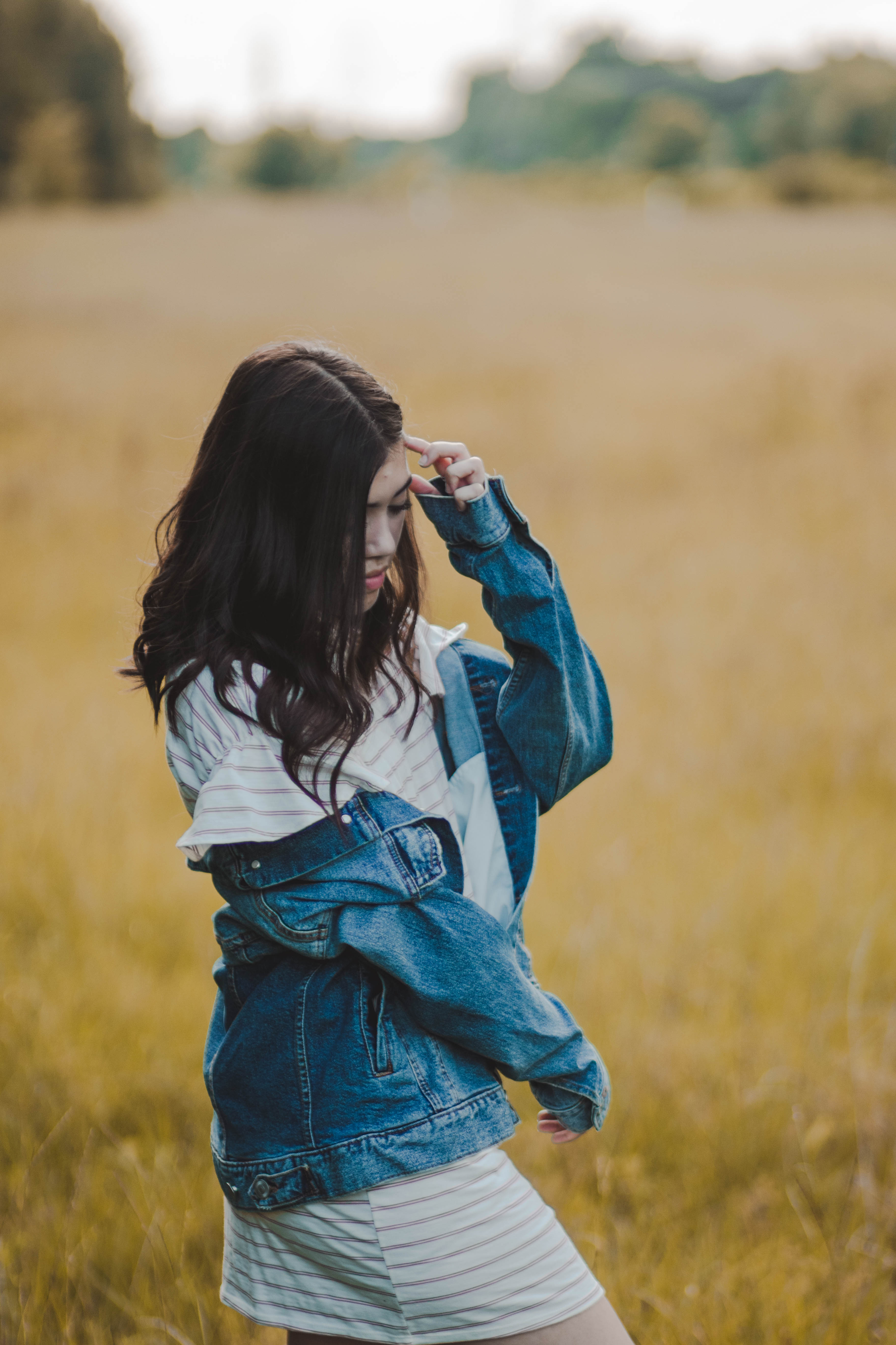
To further show this I edited this image with both cool and warm tones. As you can see the one with warmer tones has a more autumnal feel than the cooler toned image.
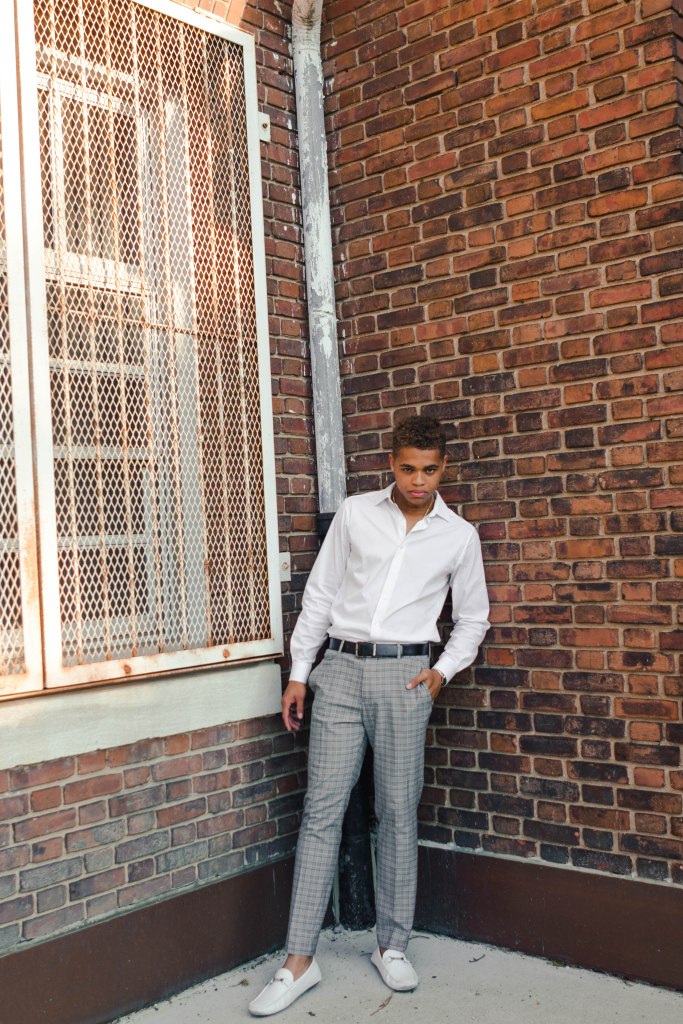
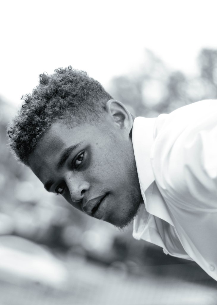
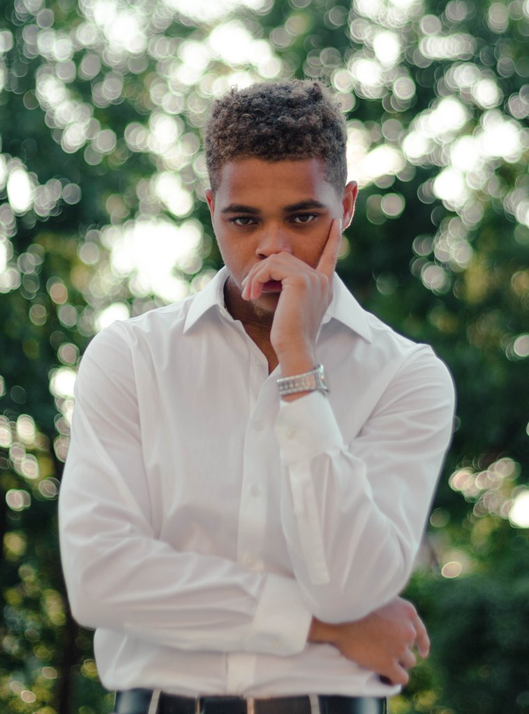
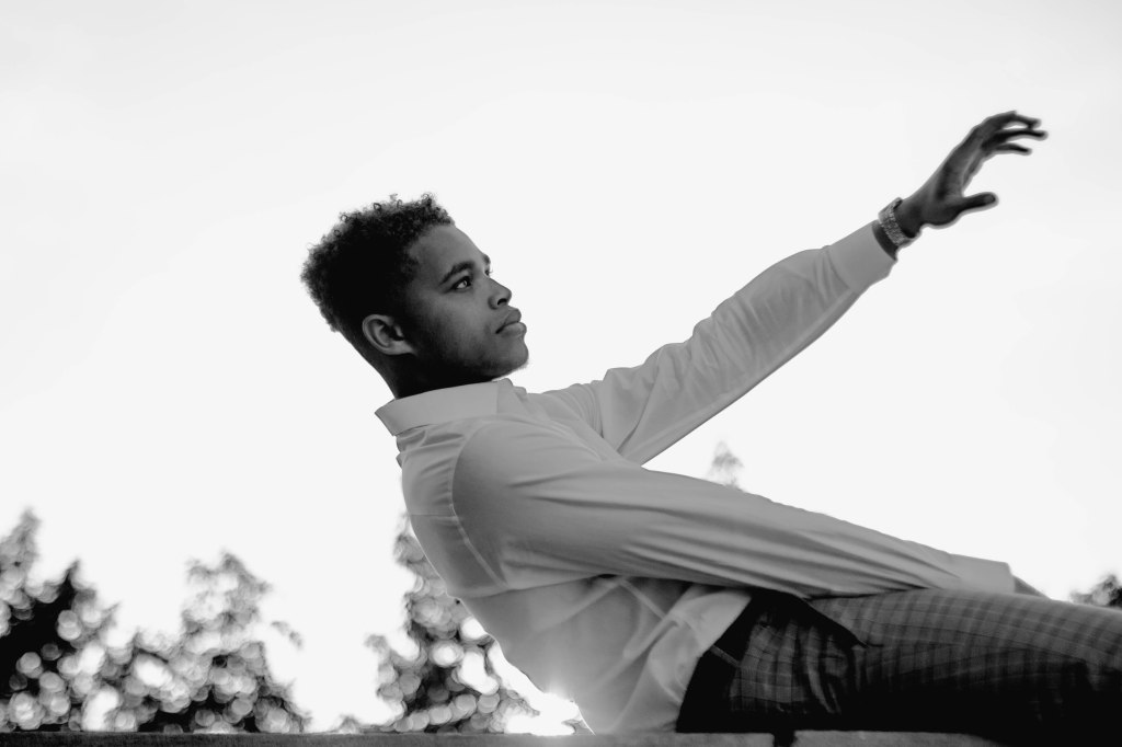
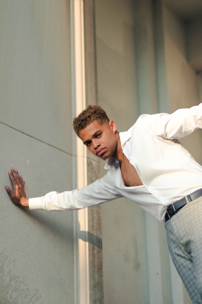
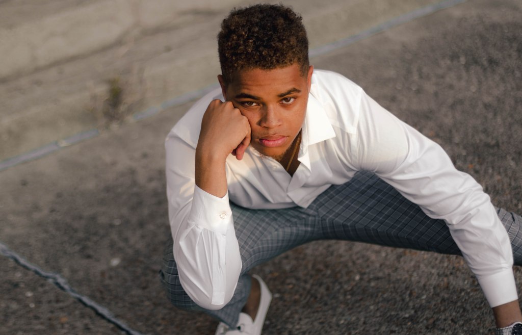
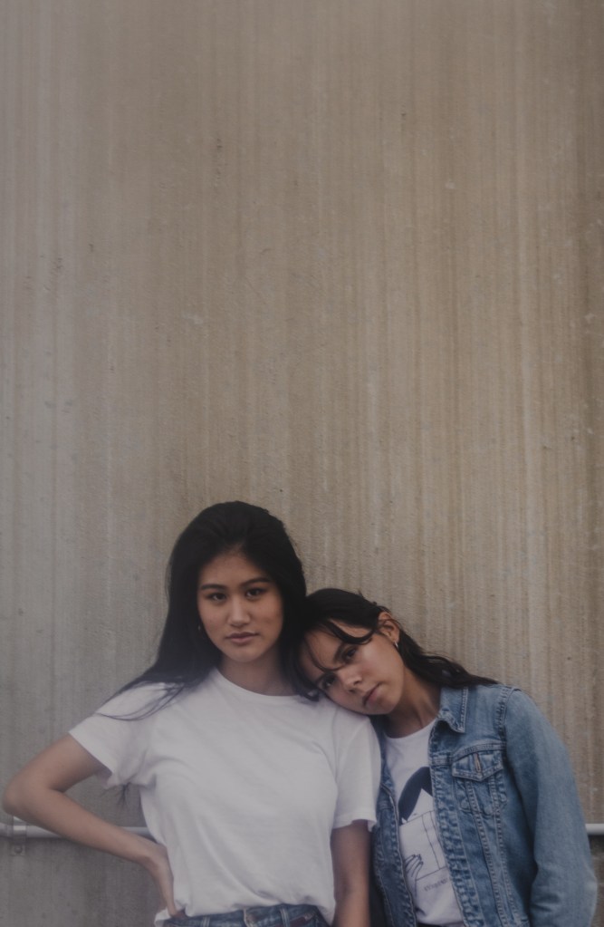
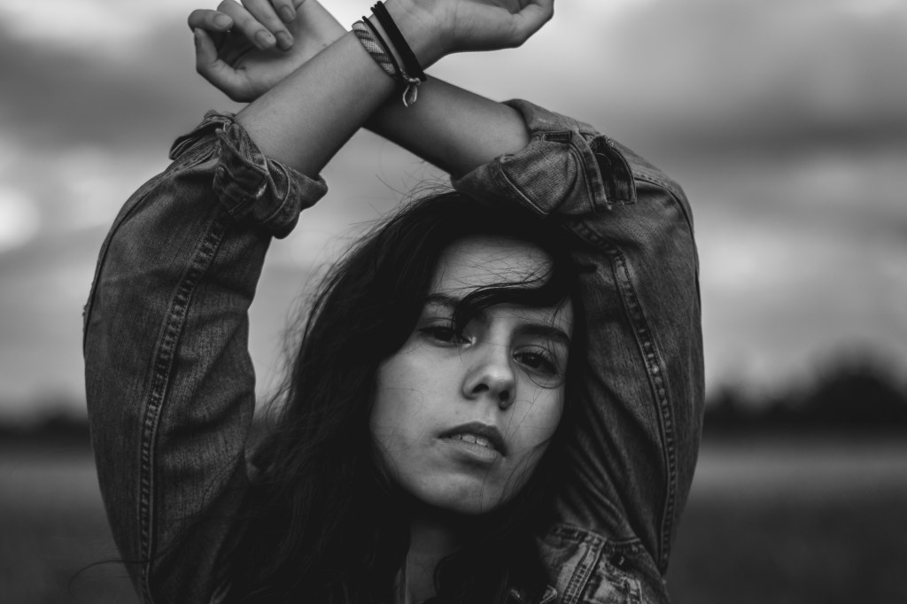
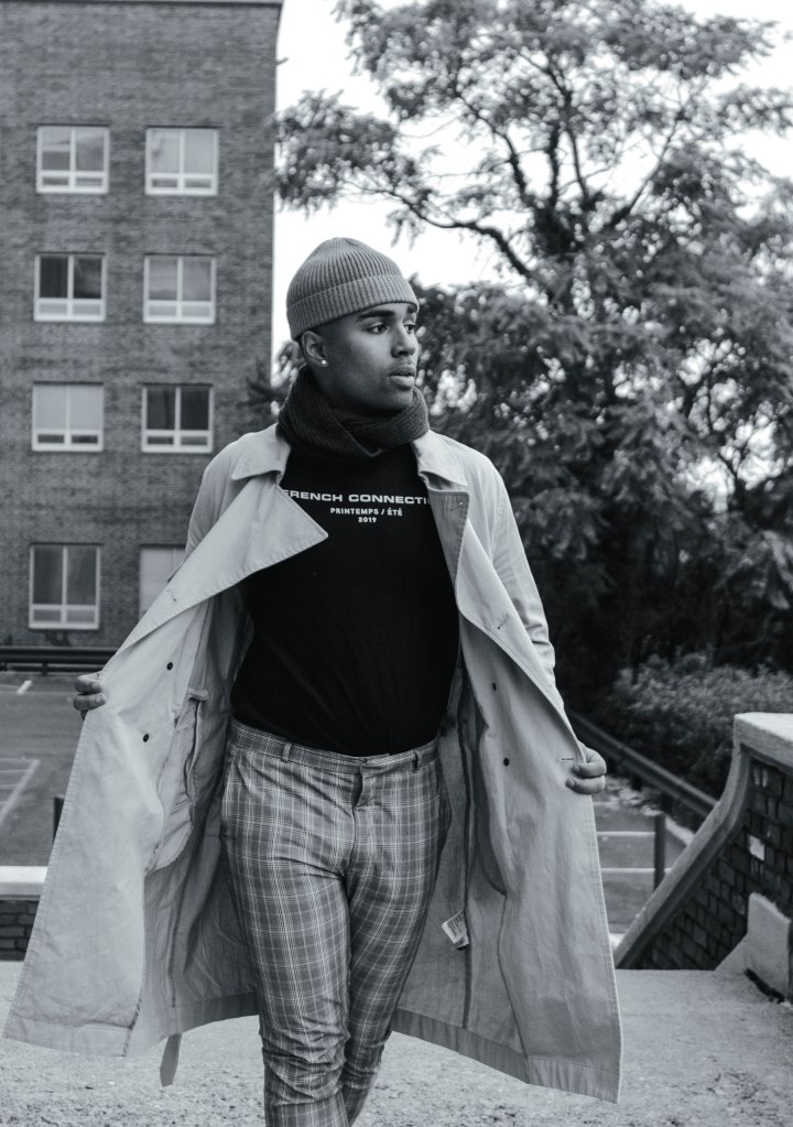
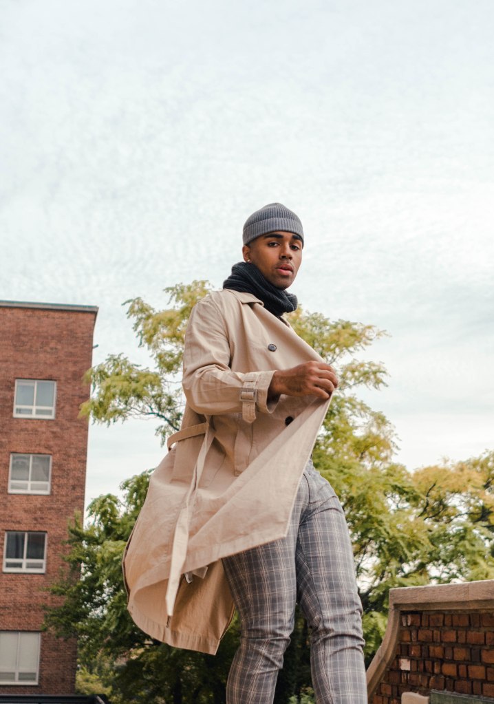
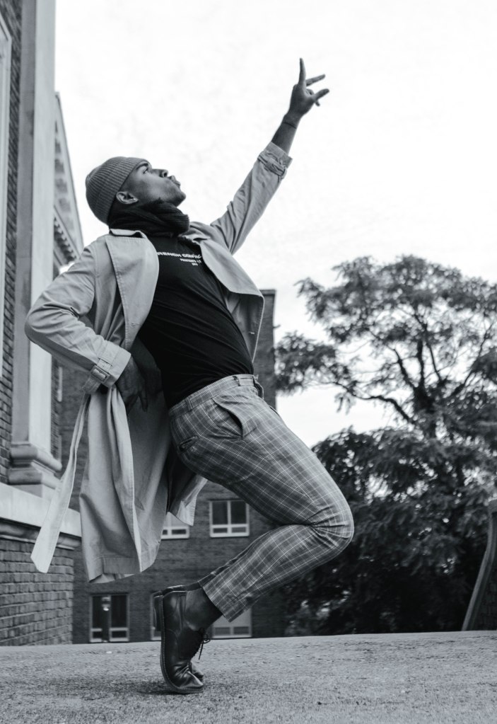
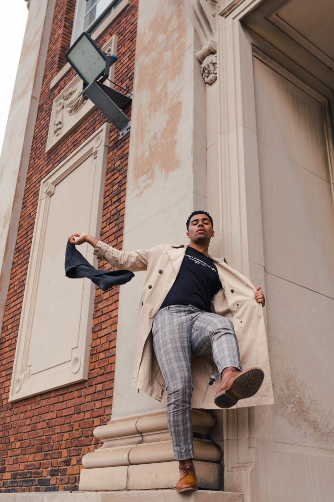
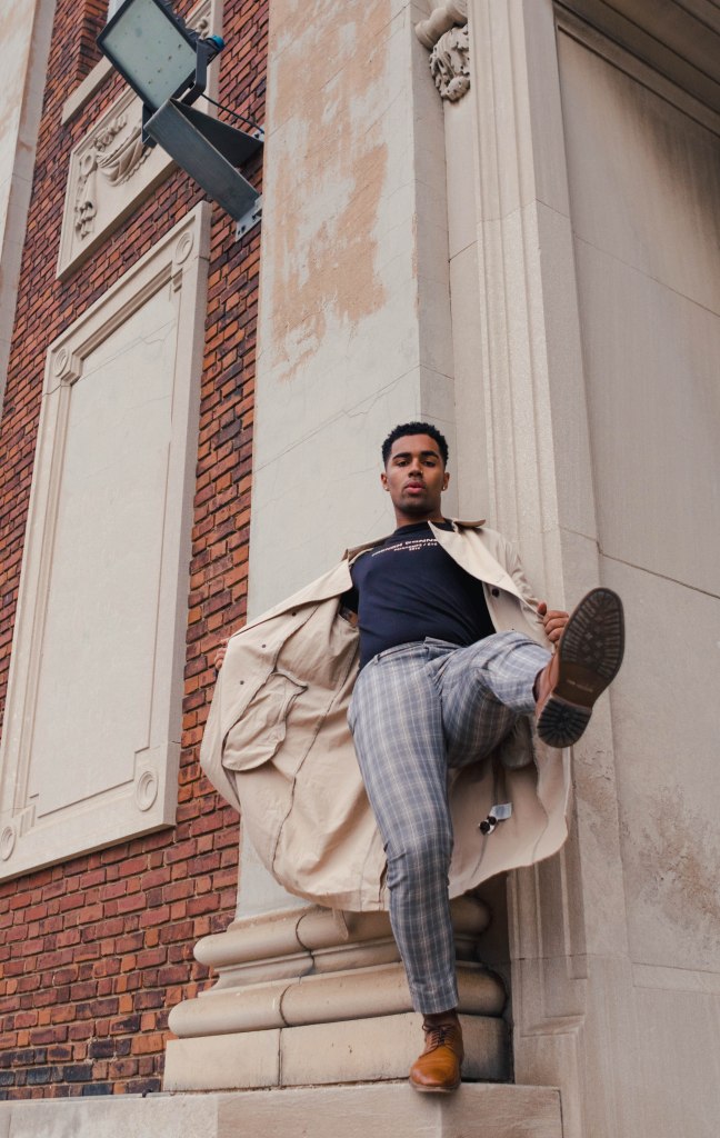
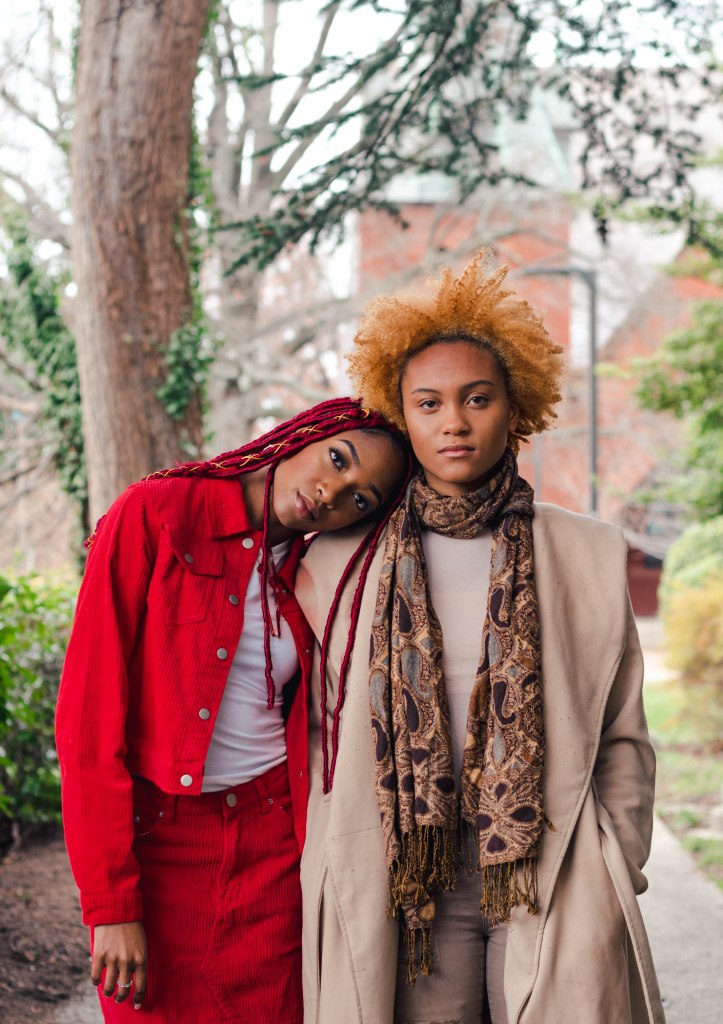
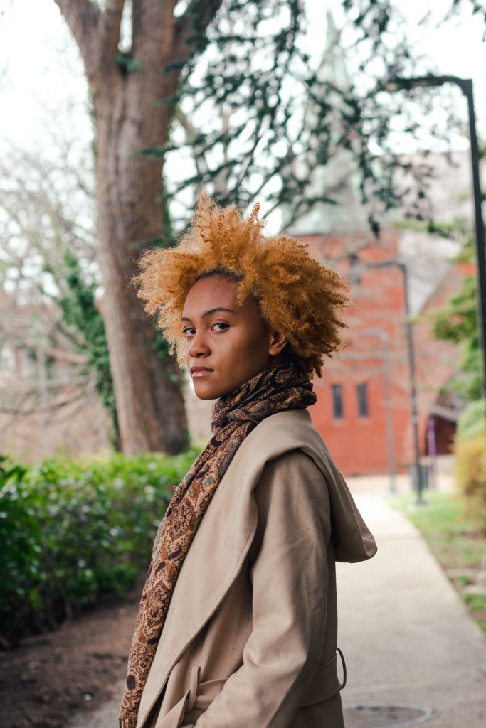
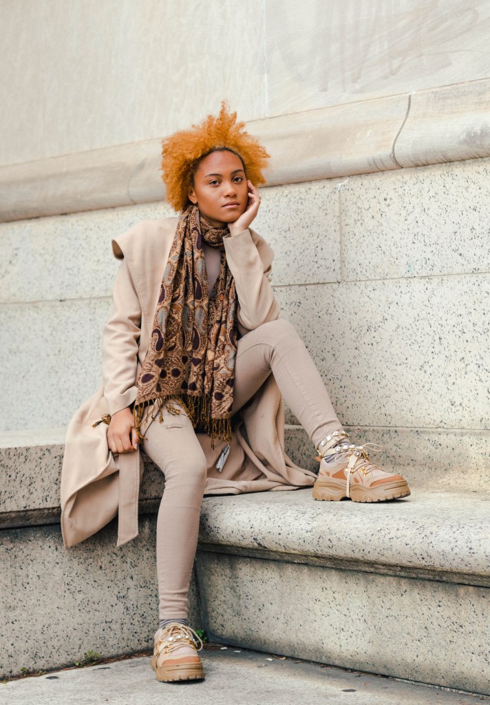
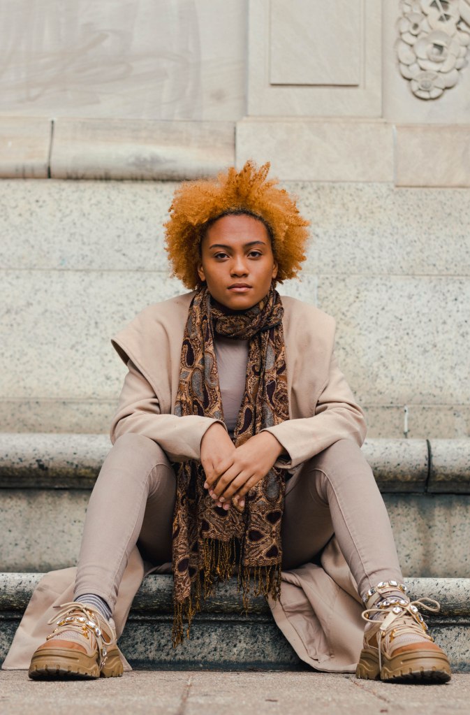
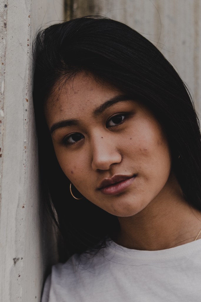
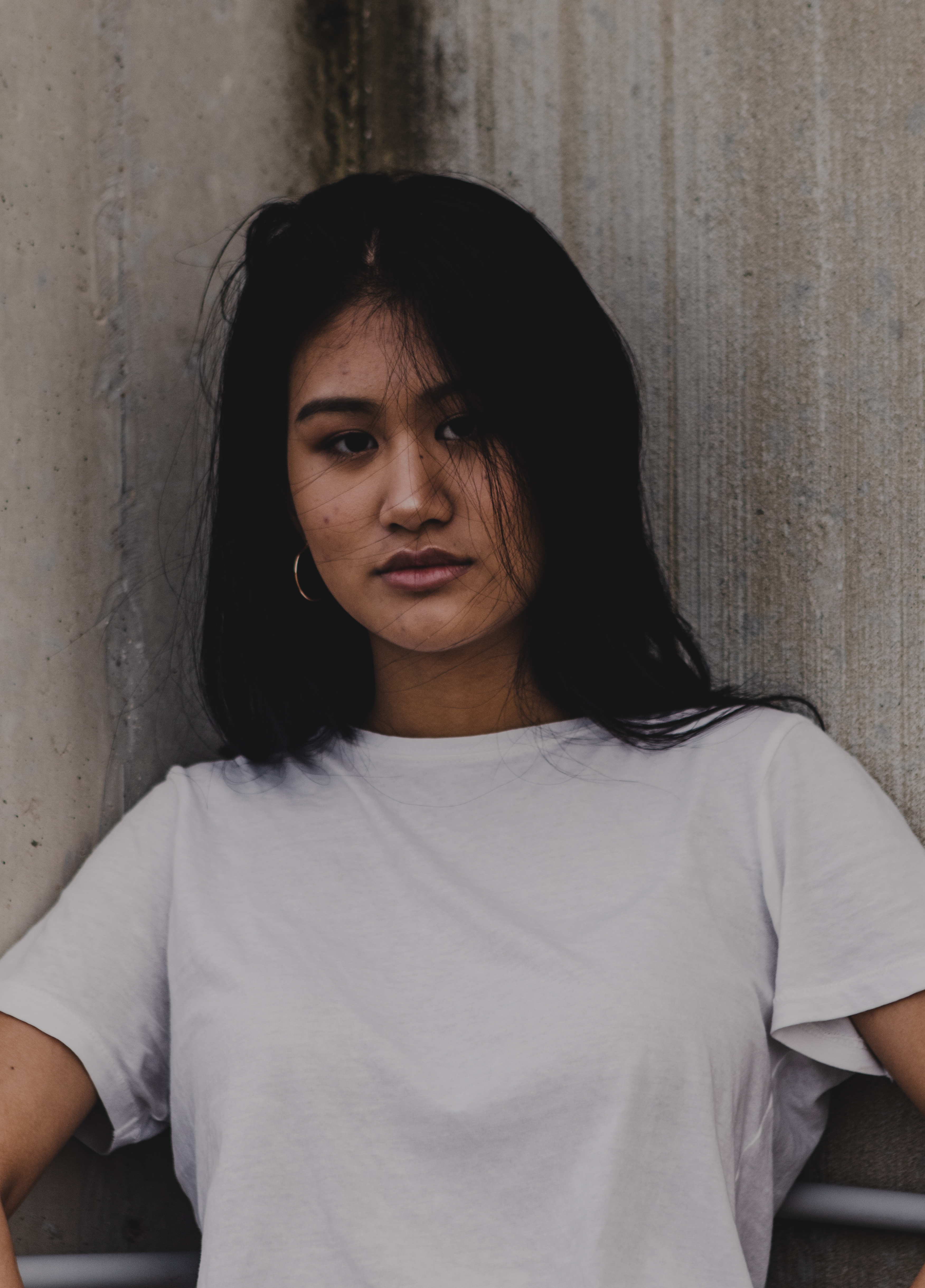
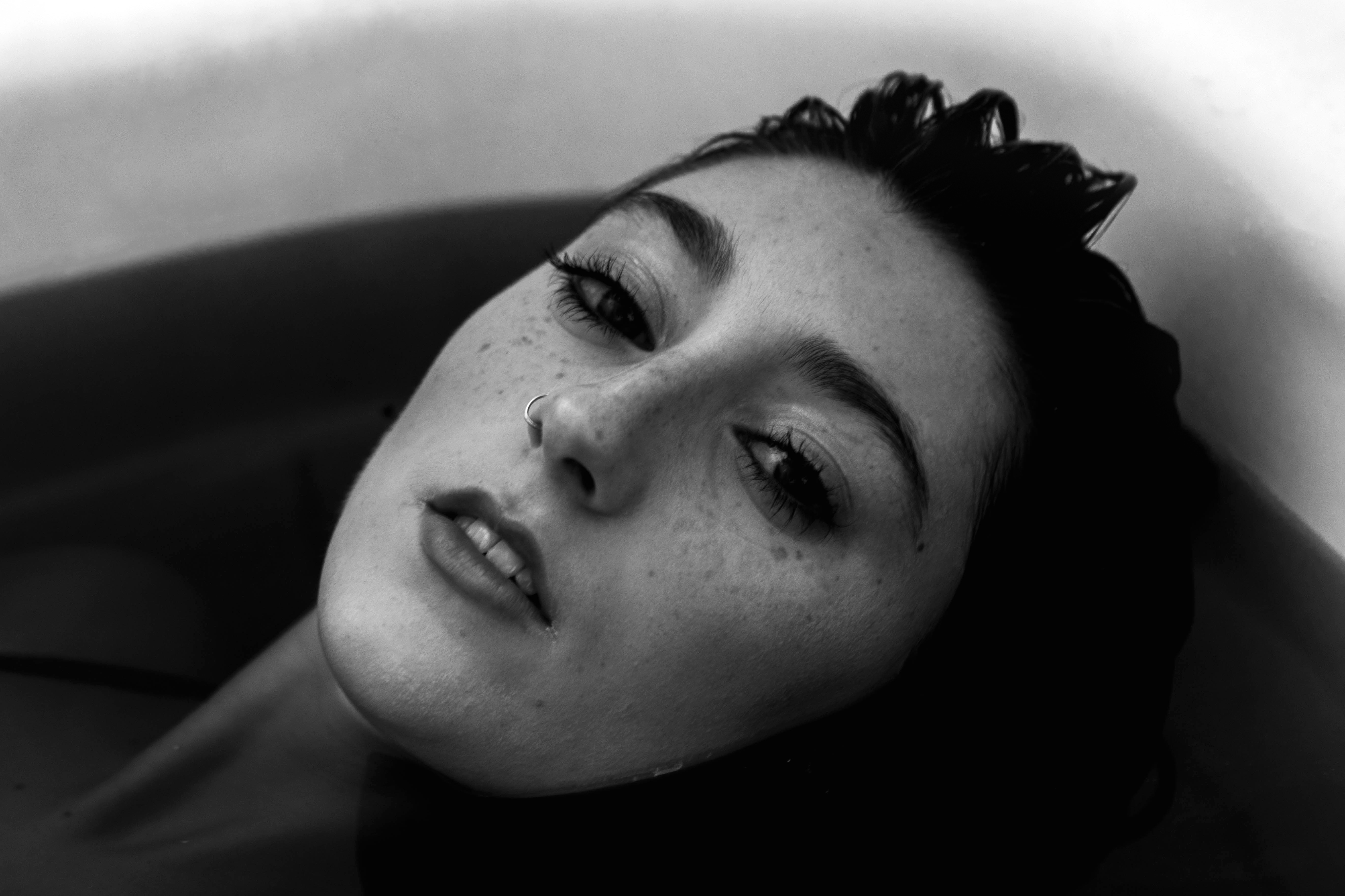
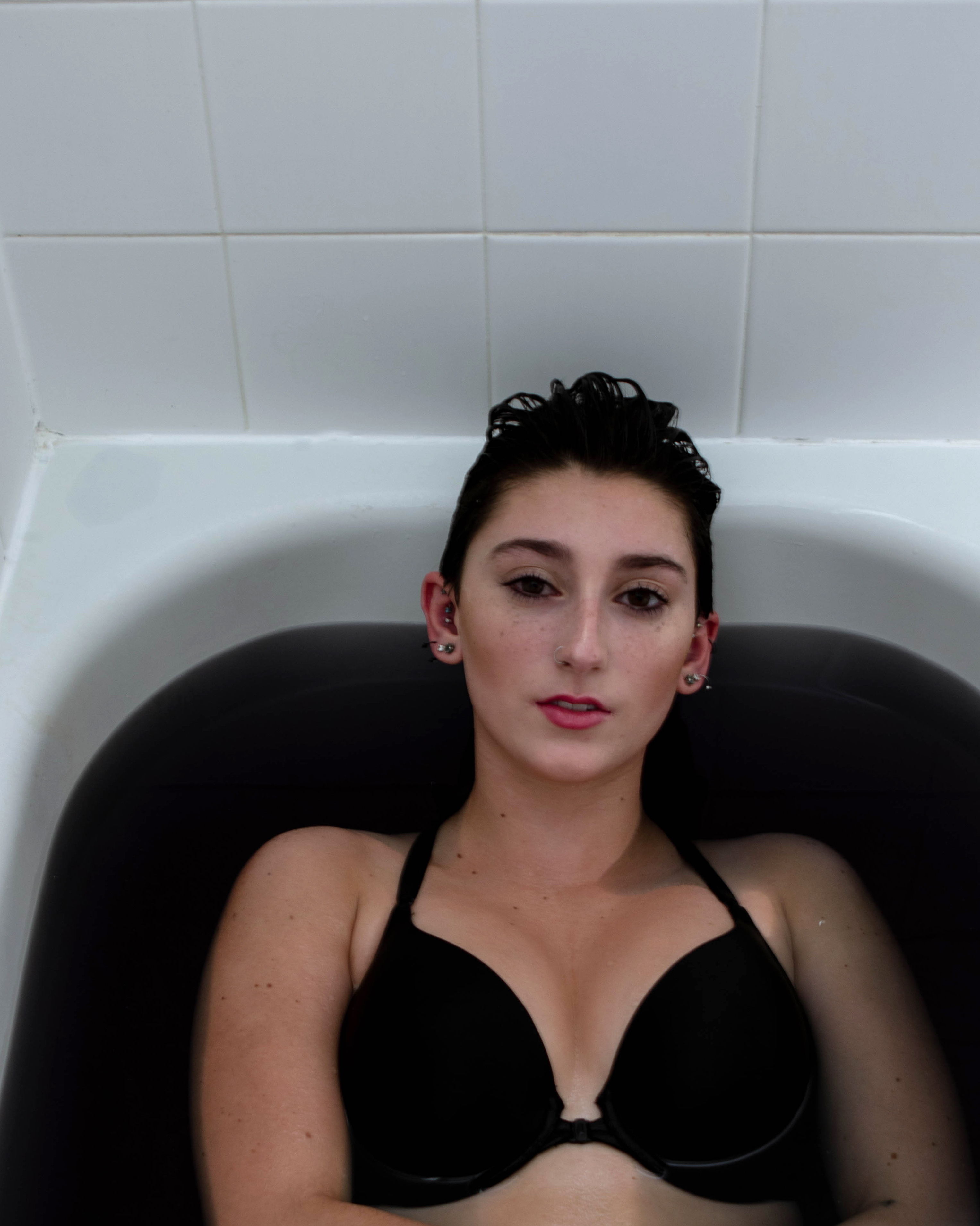
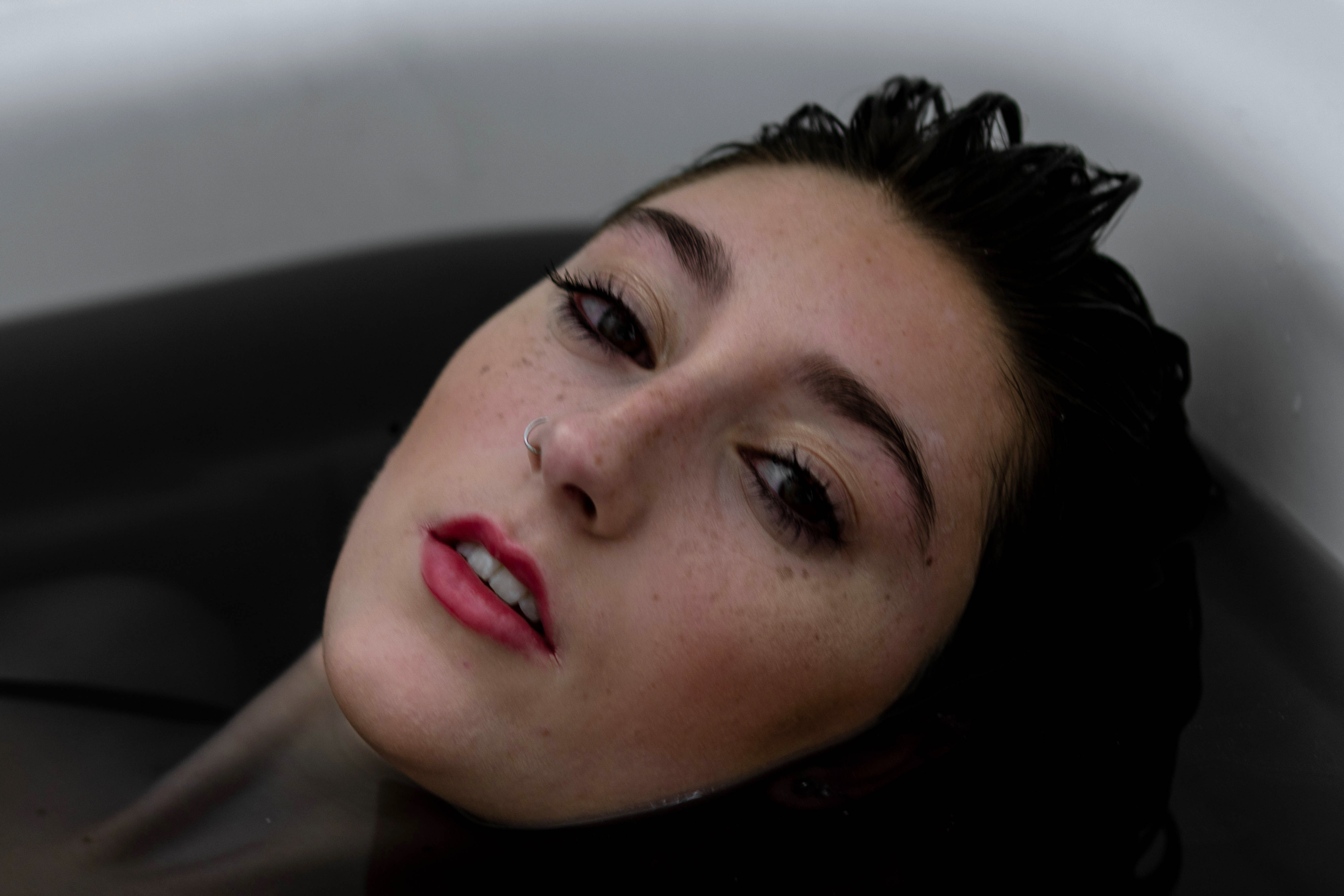
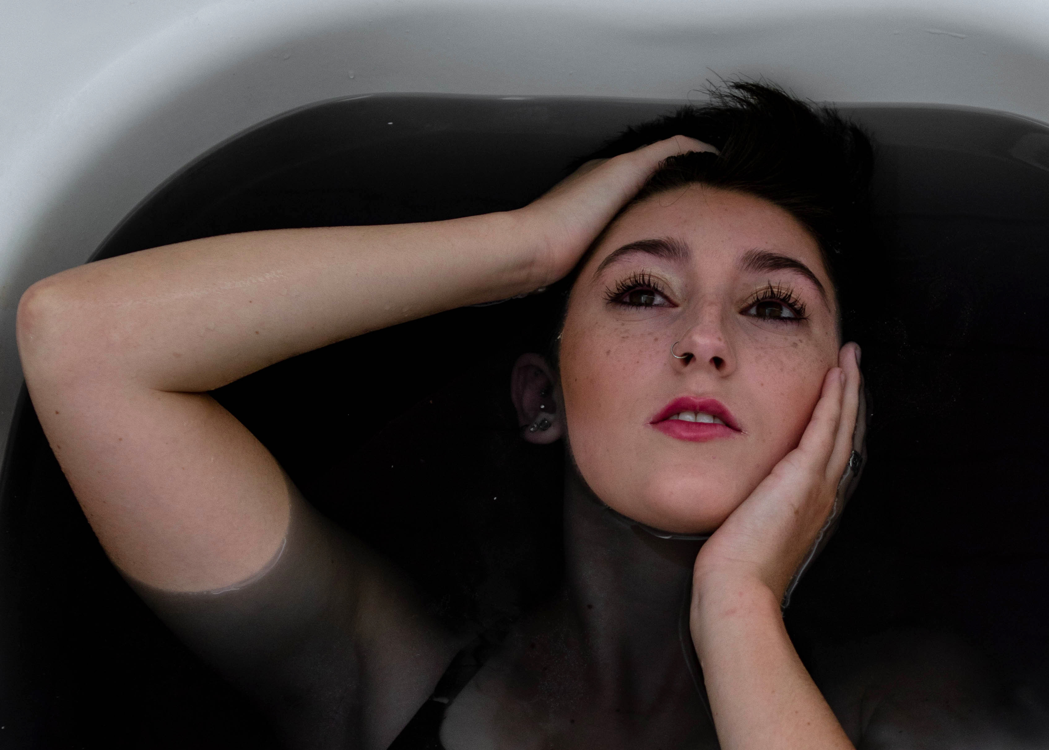
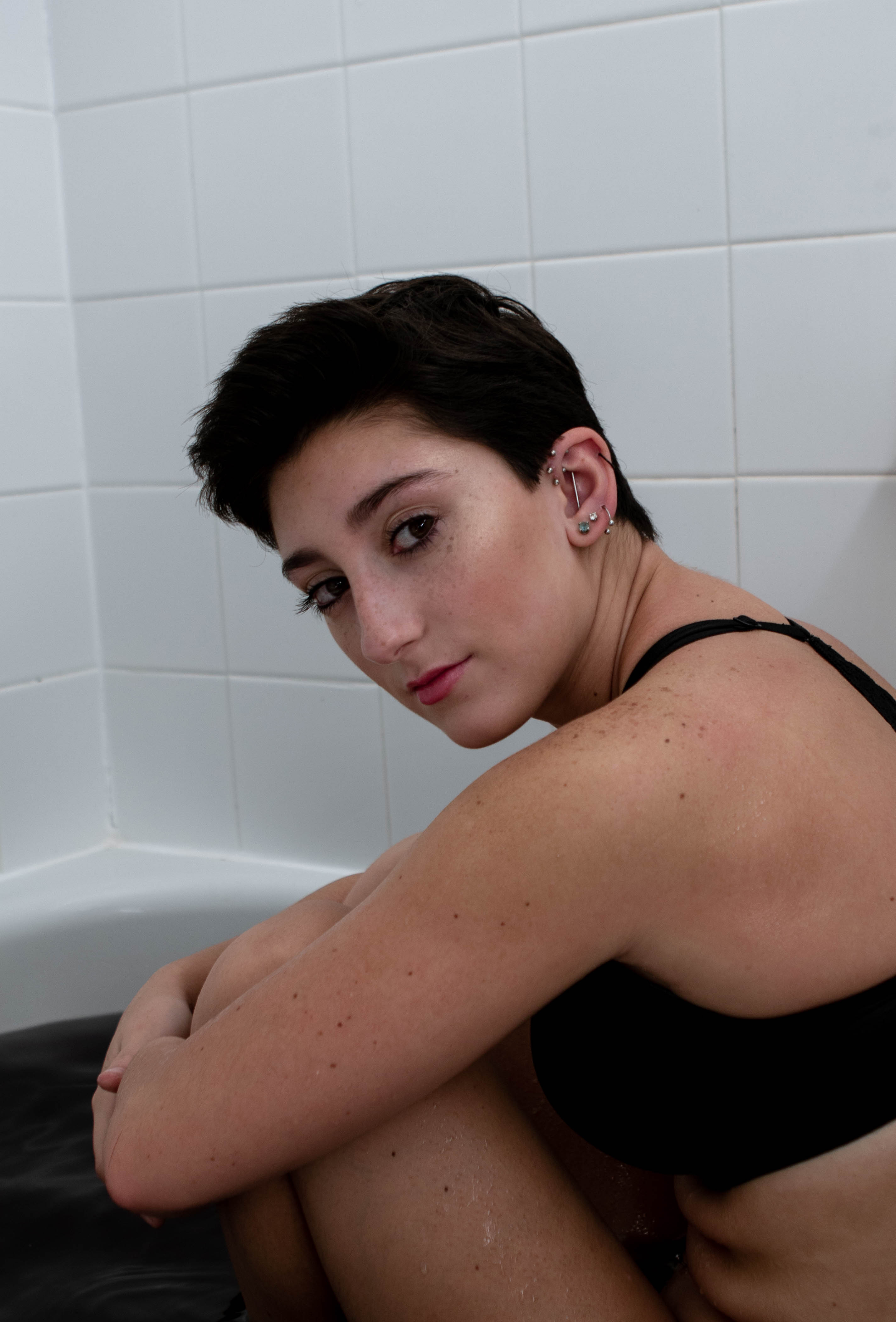
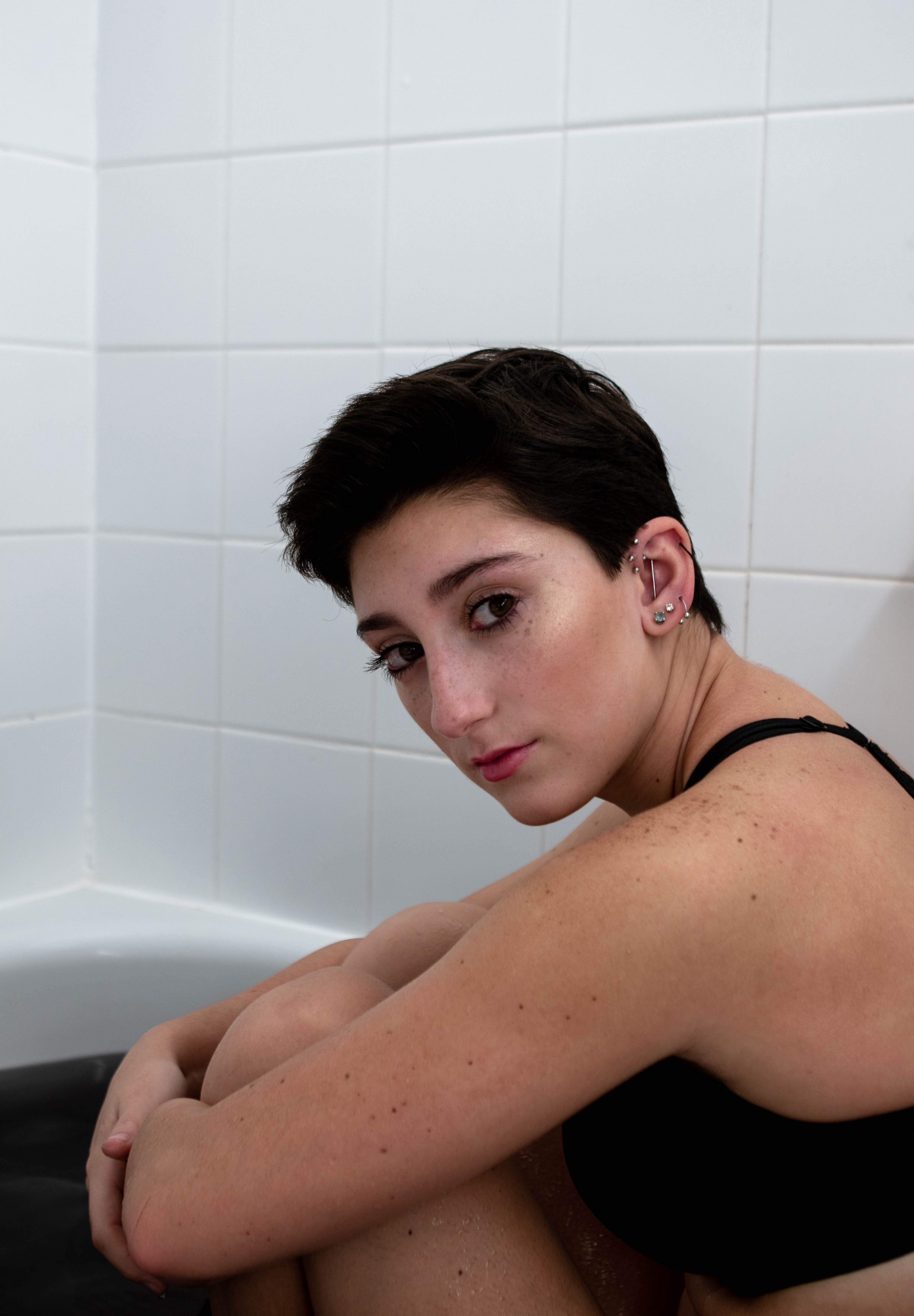
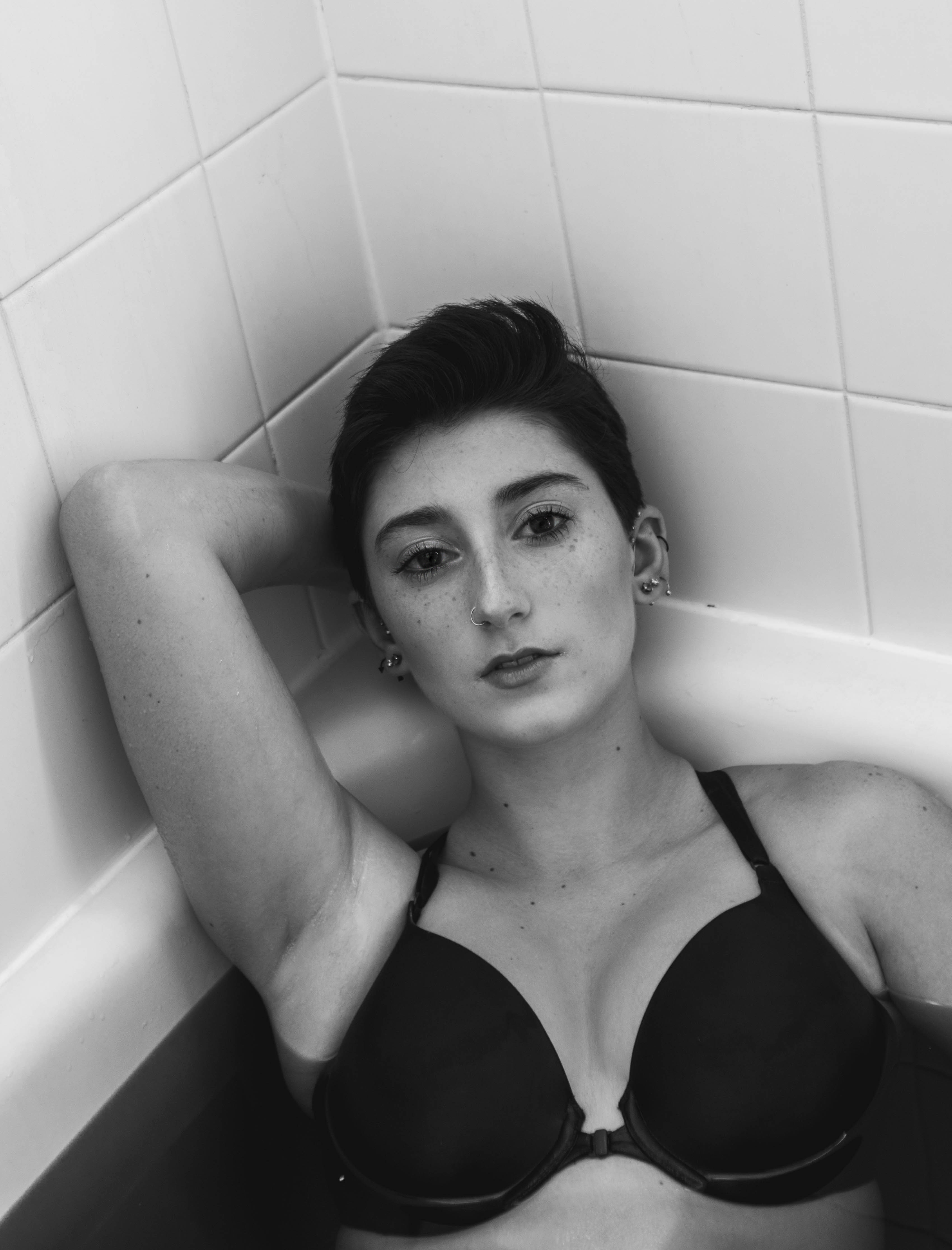
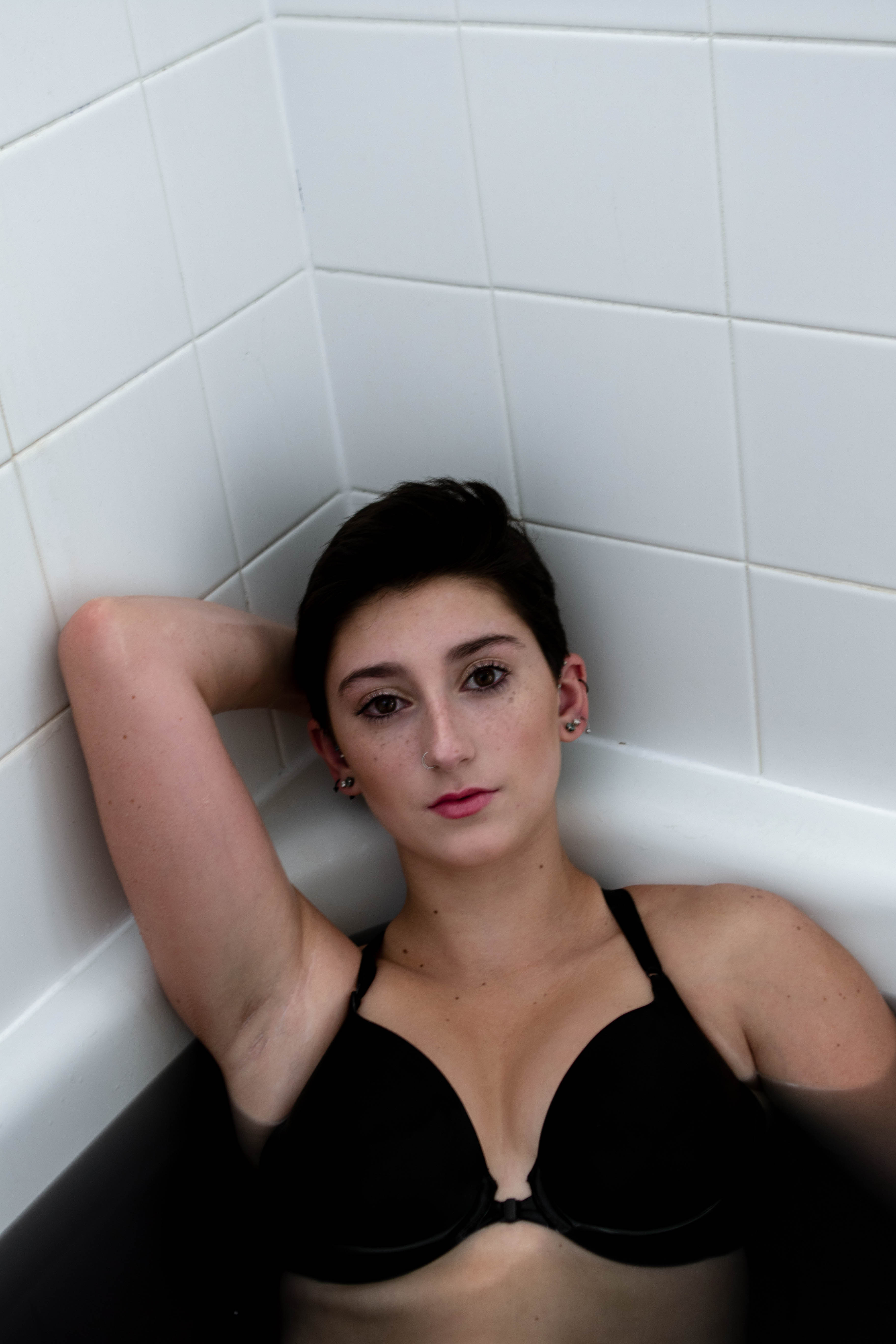
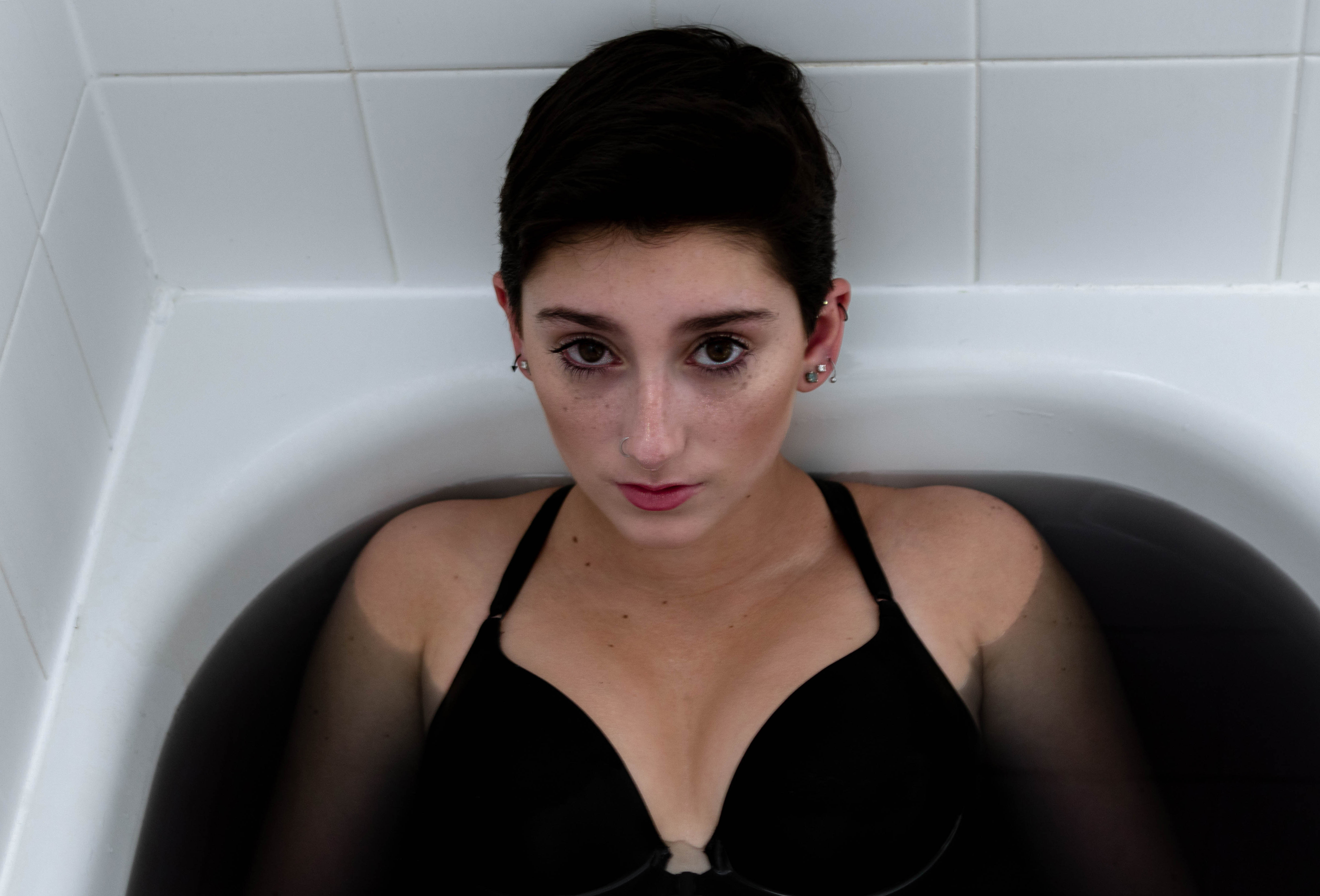
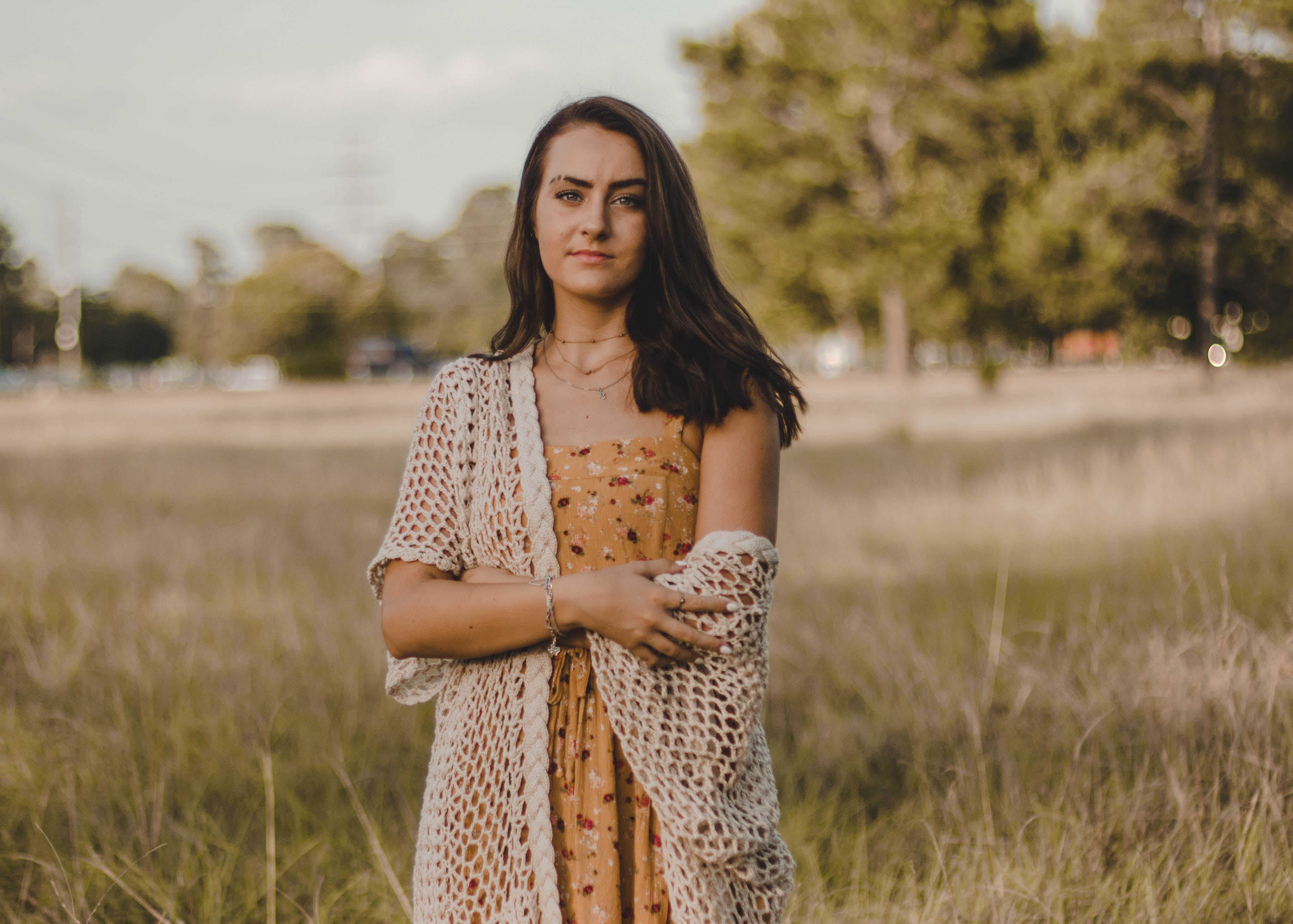
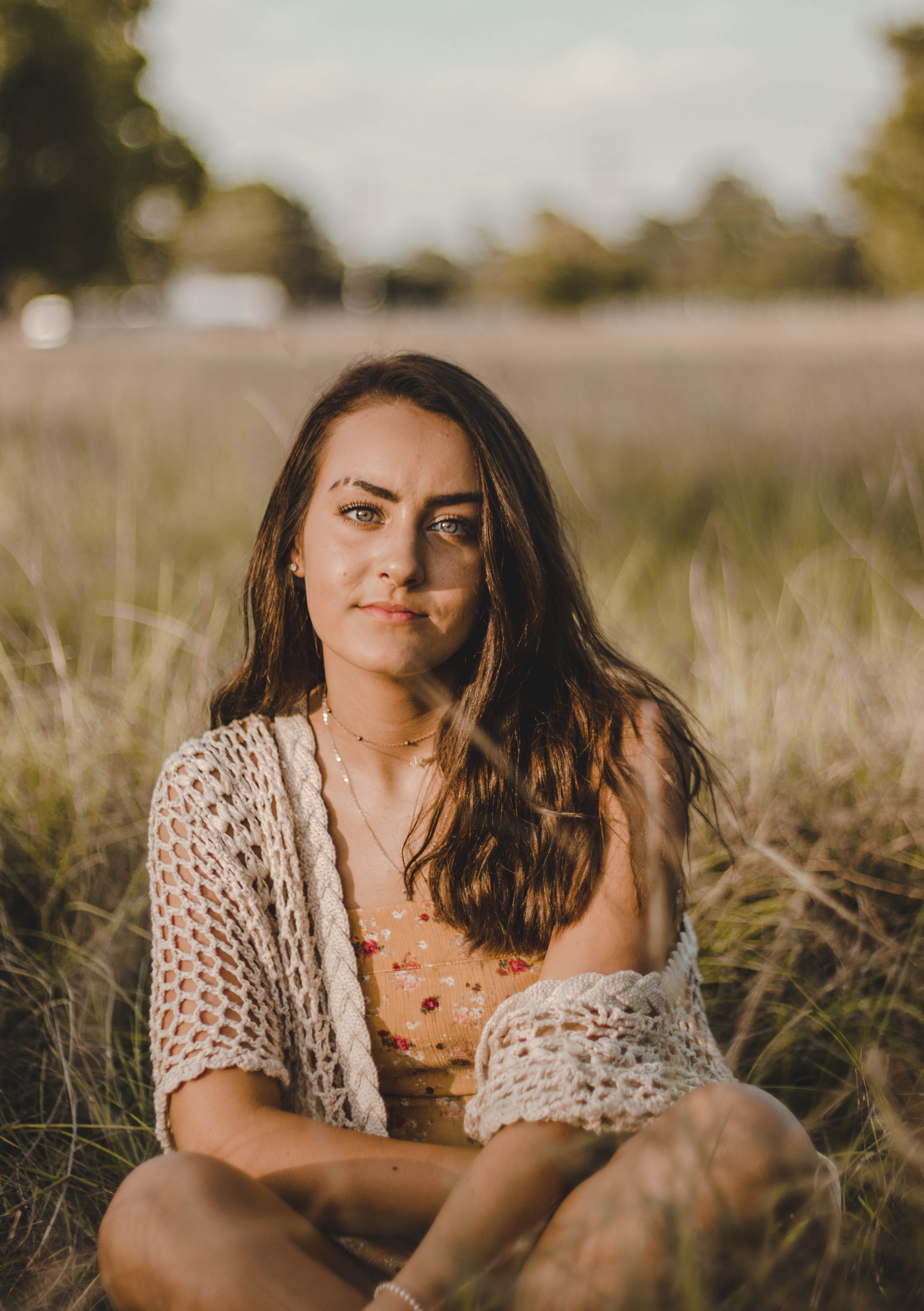
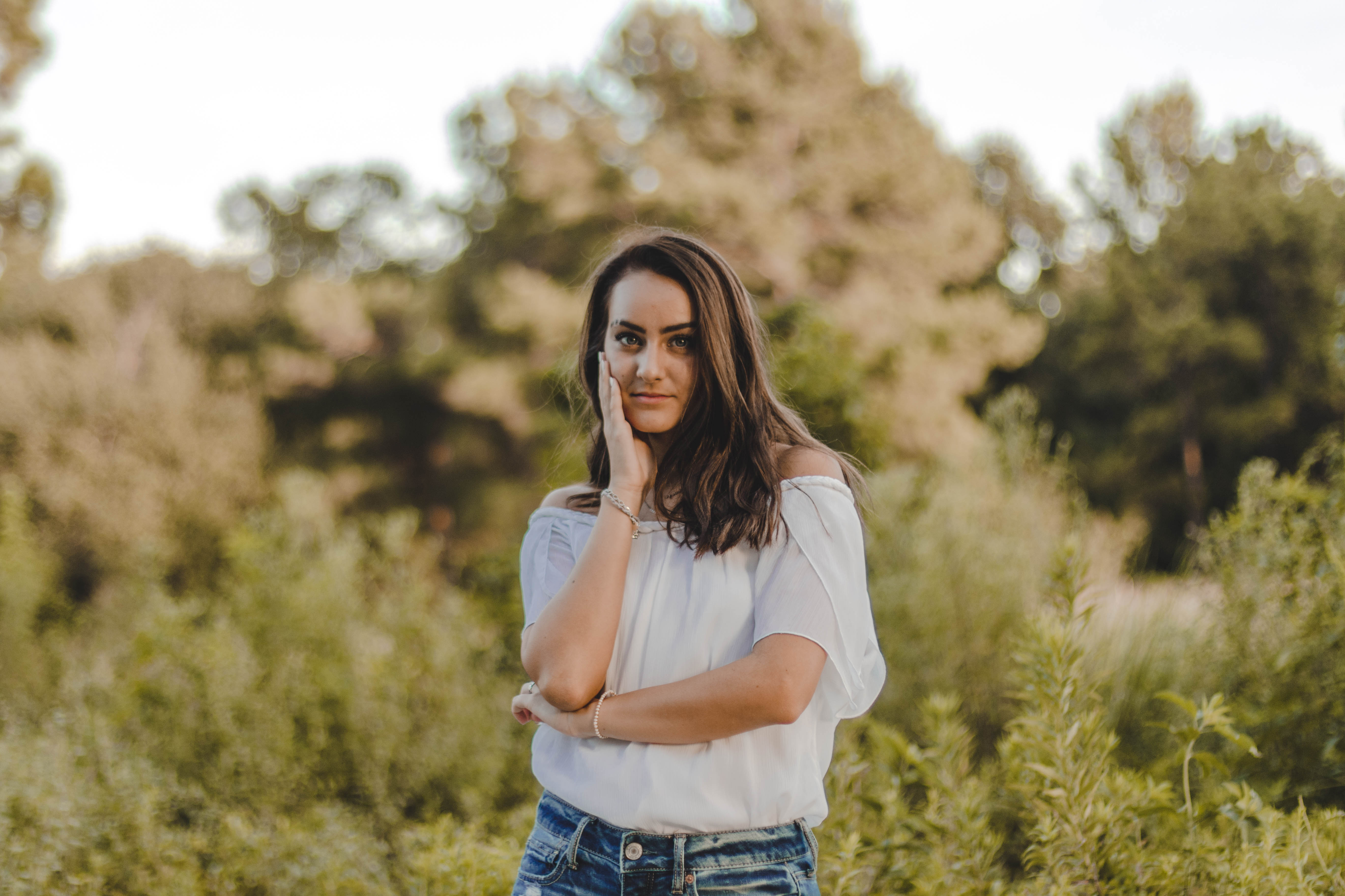
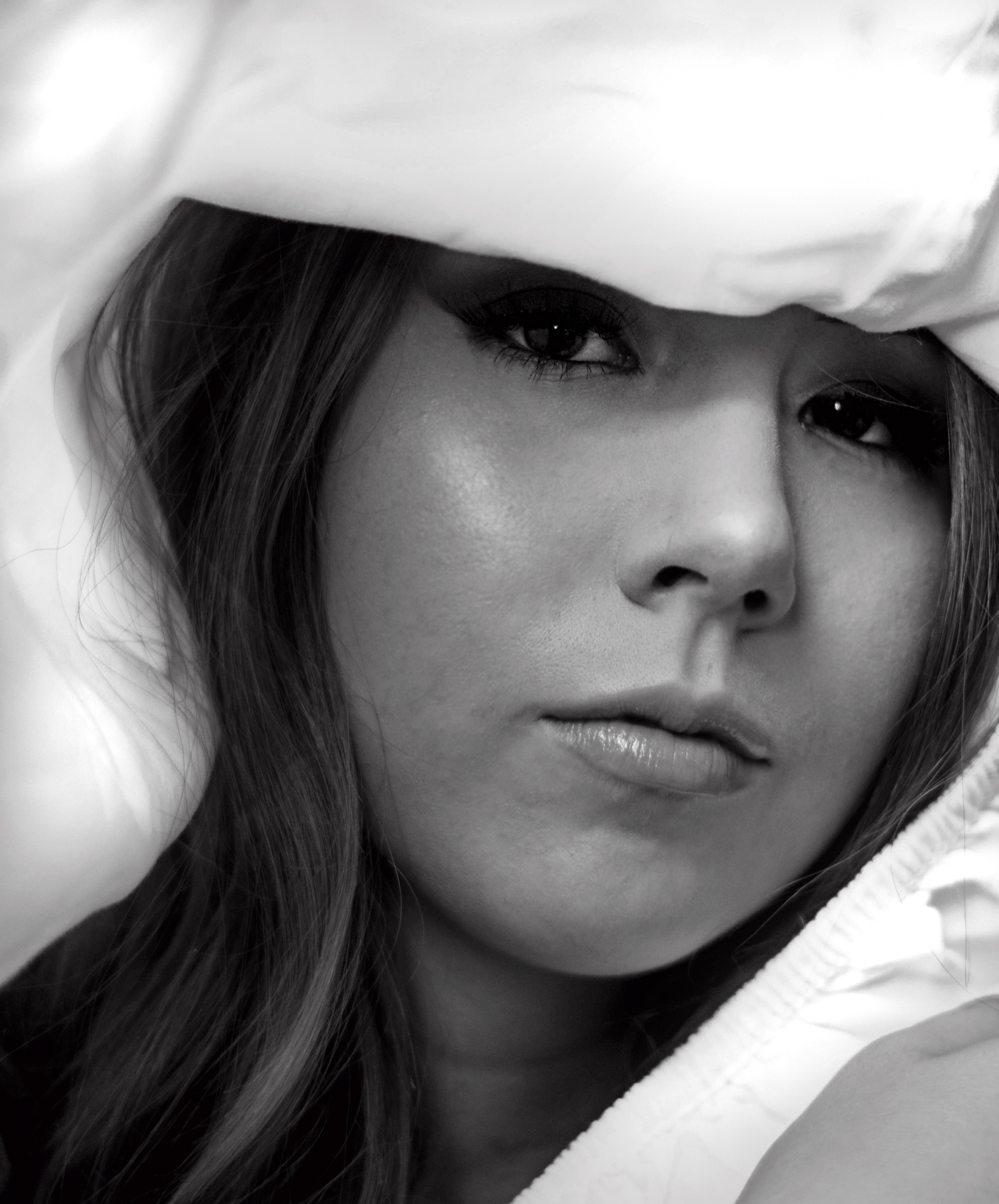
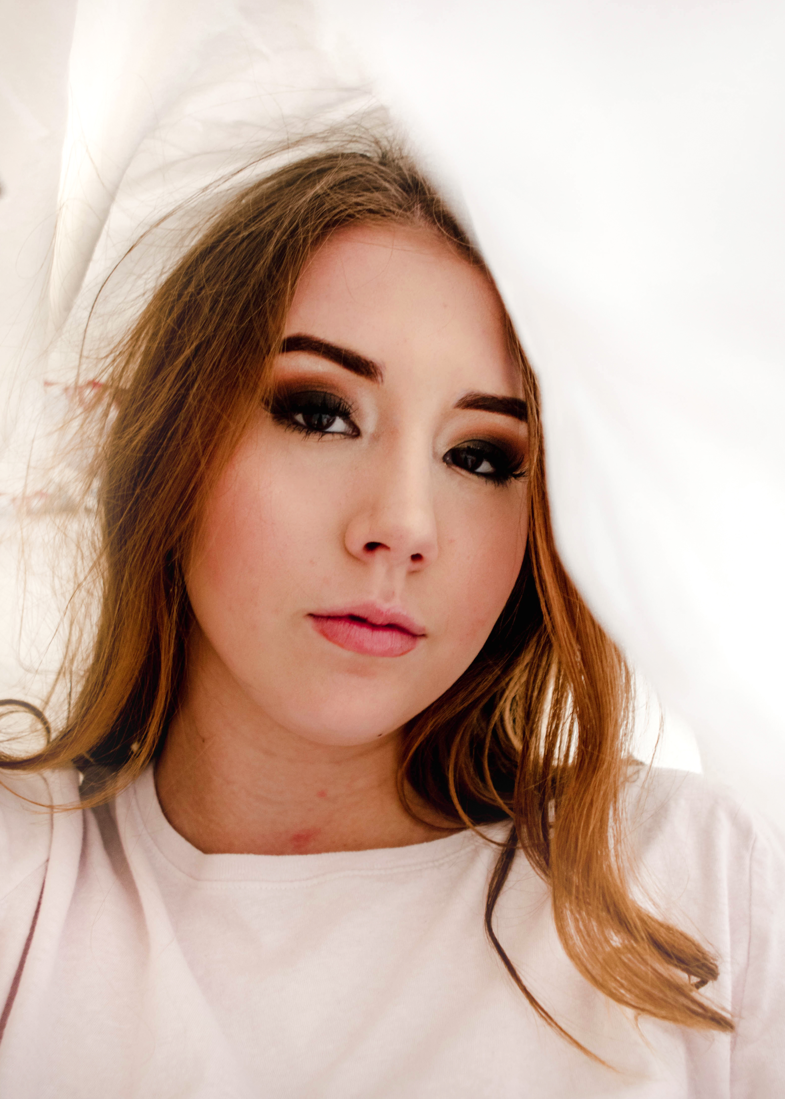
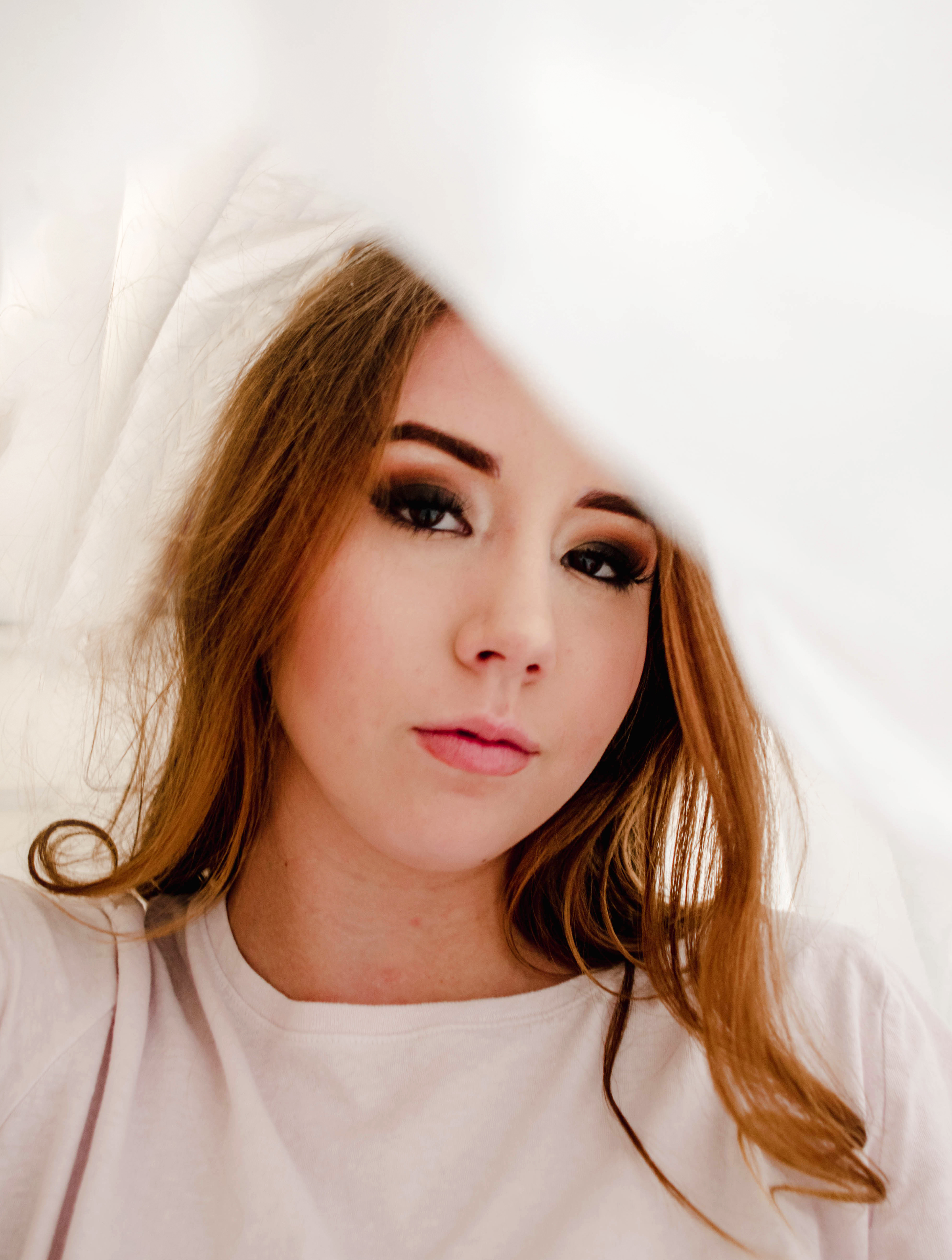
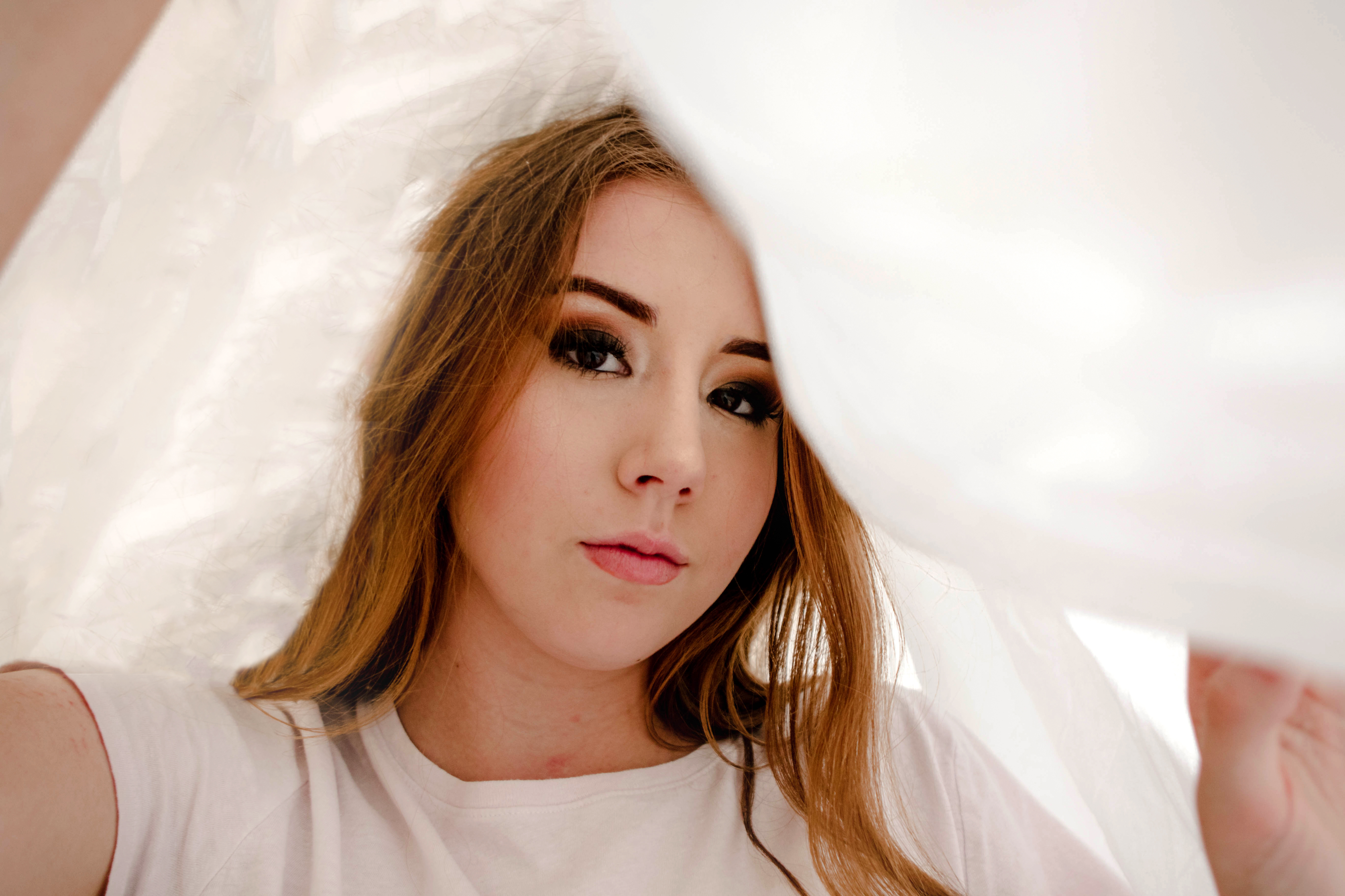
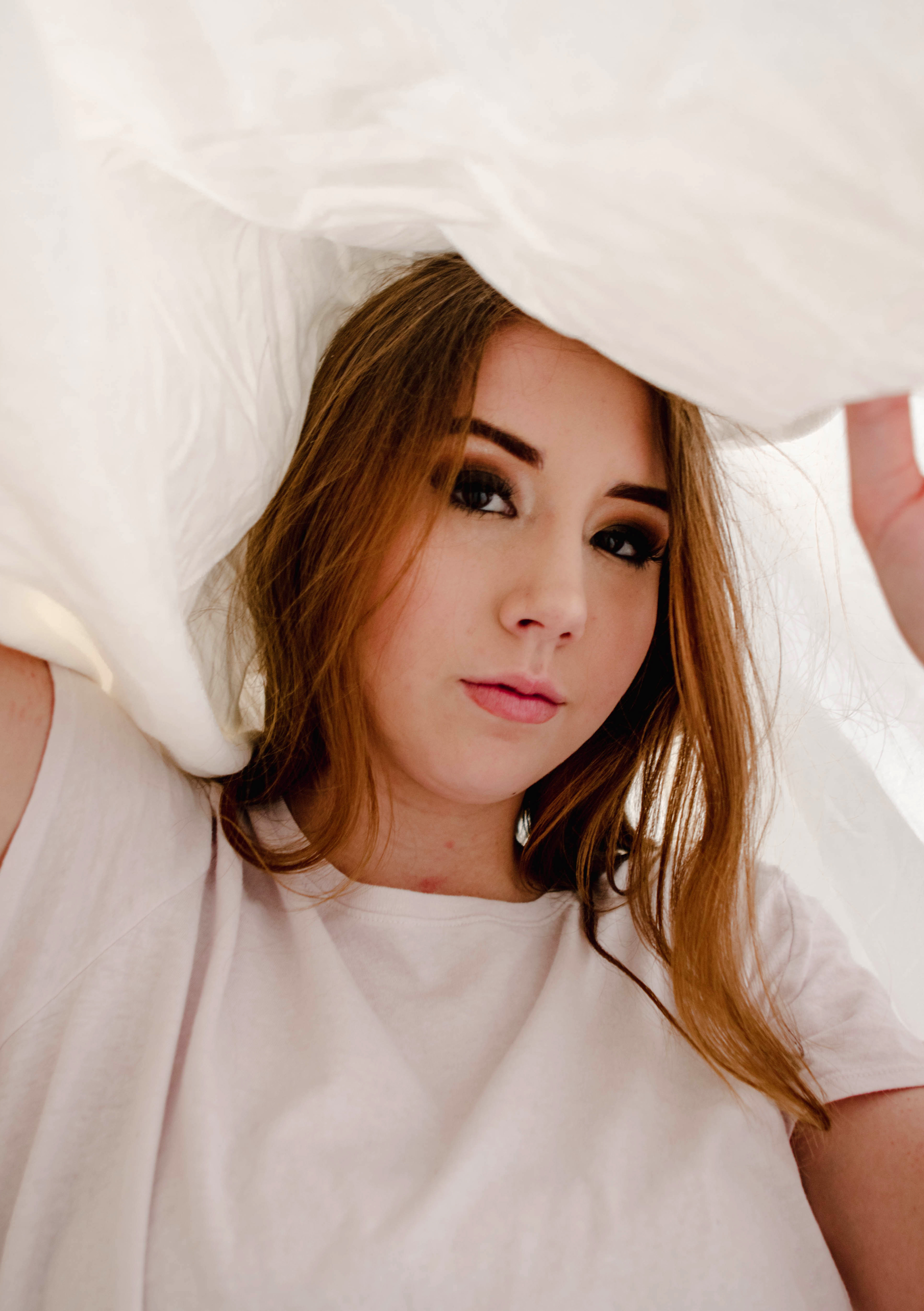
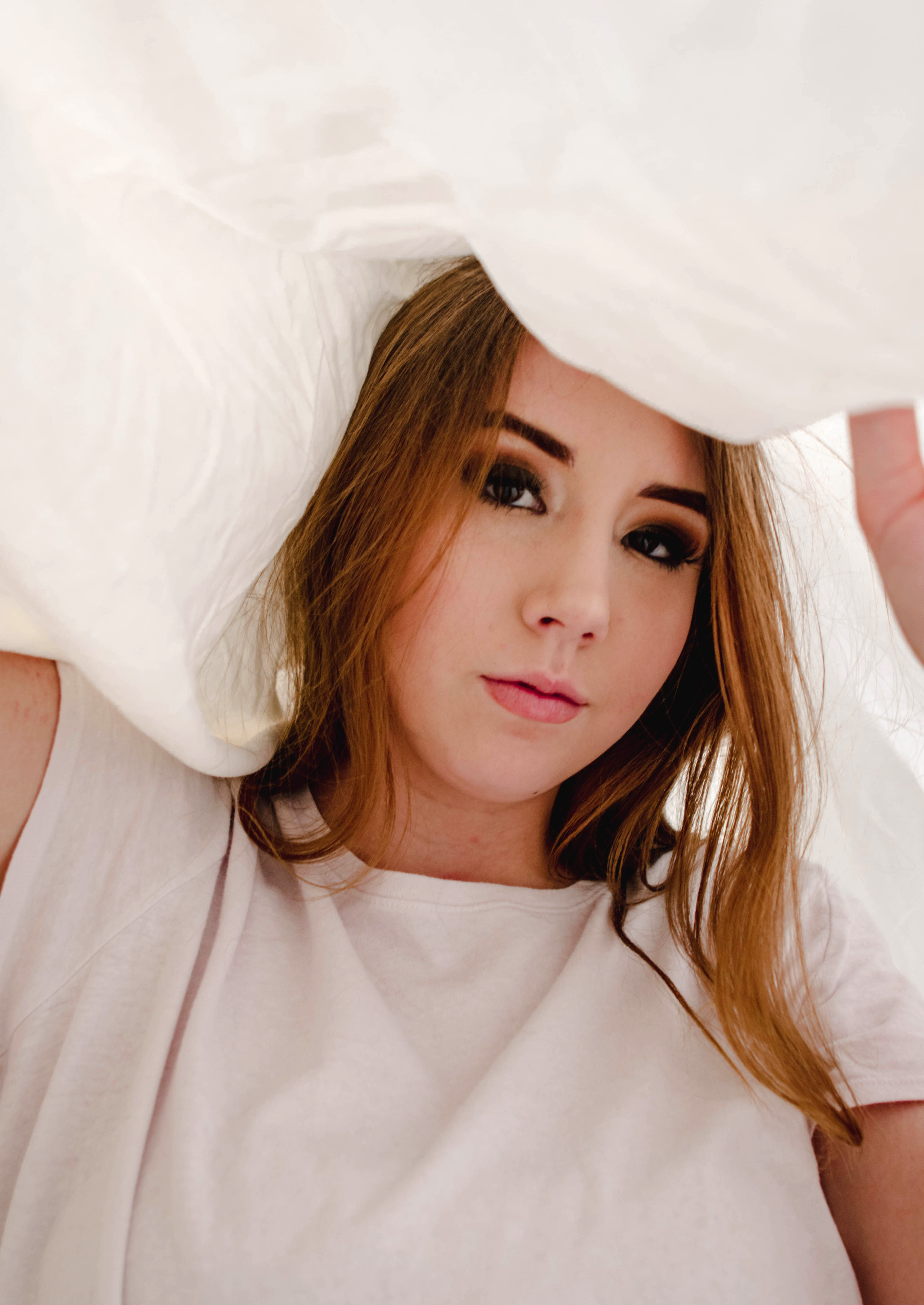
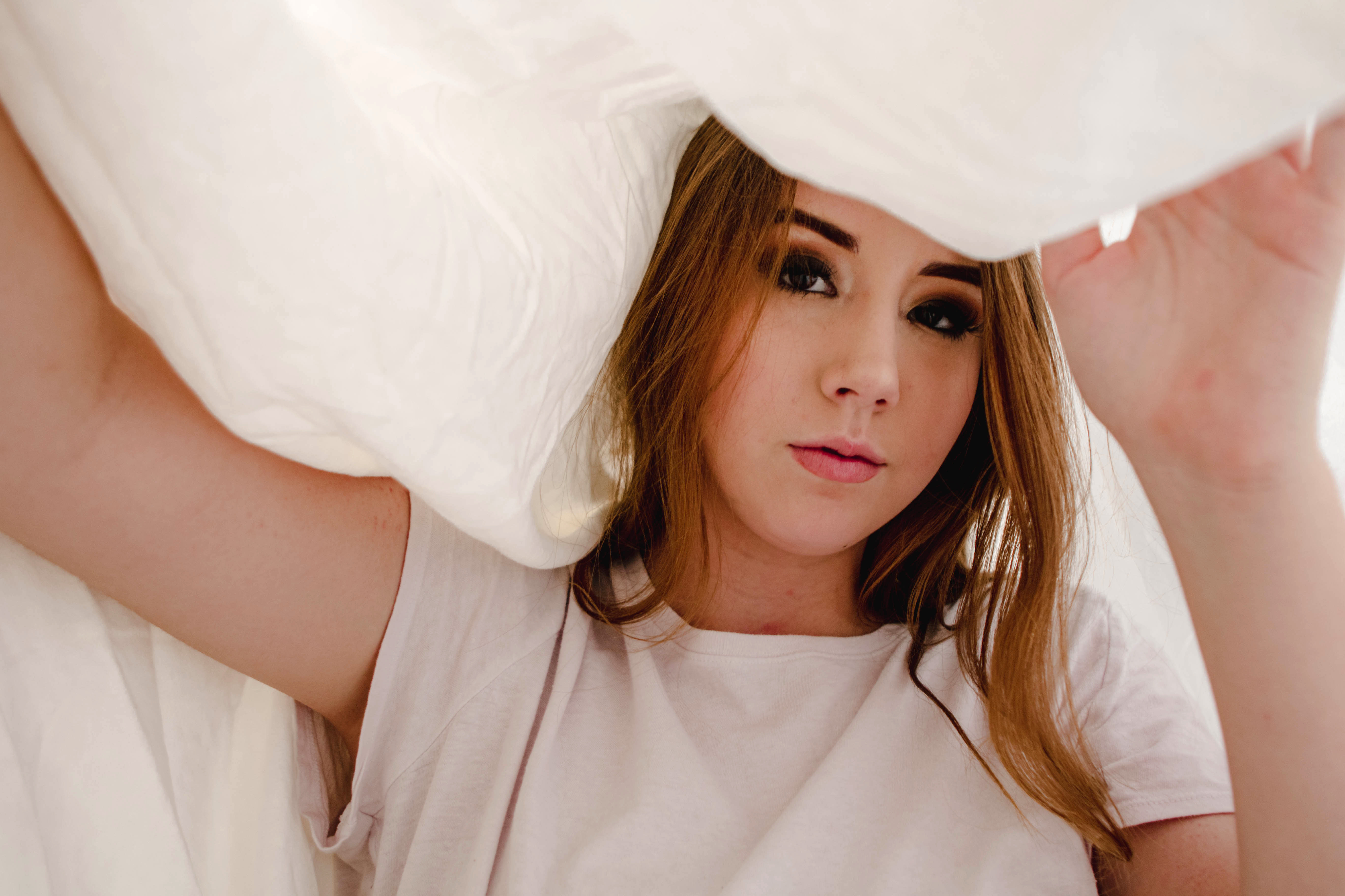
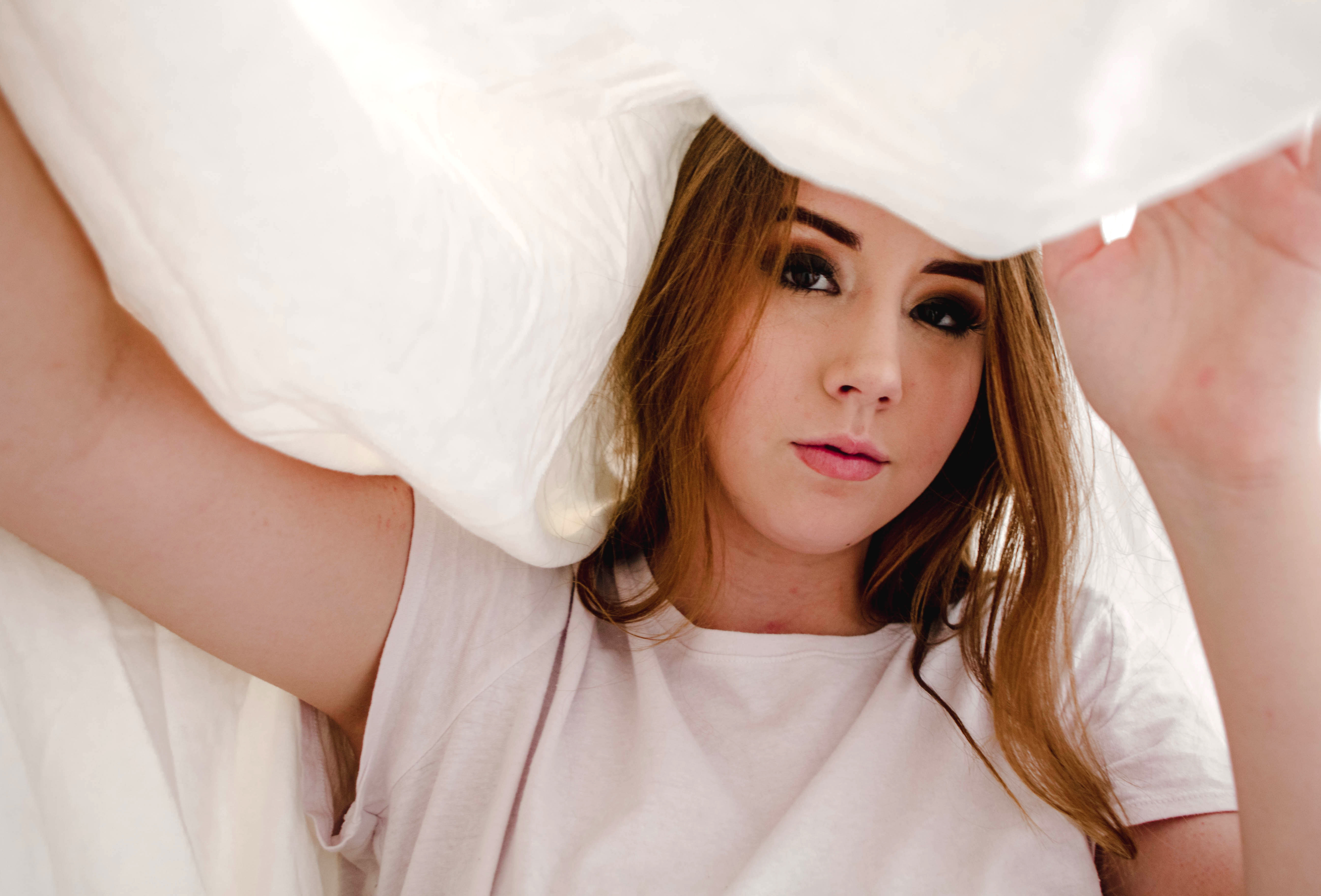
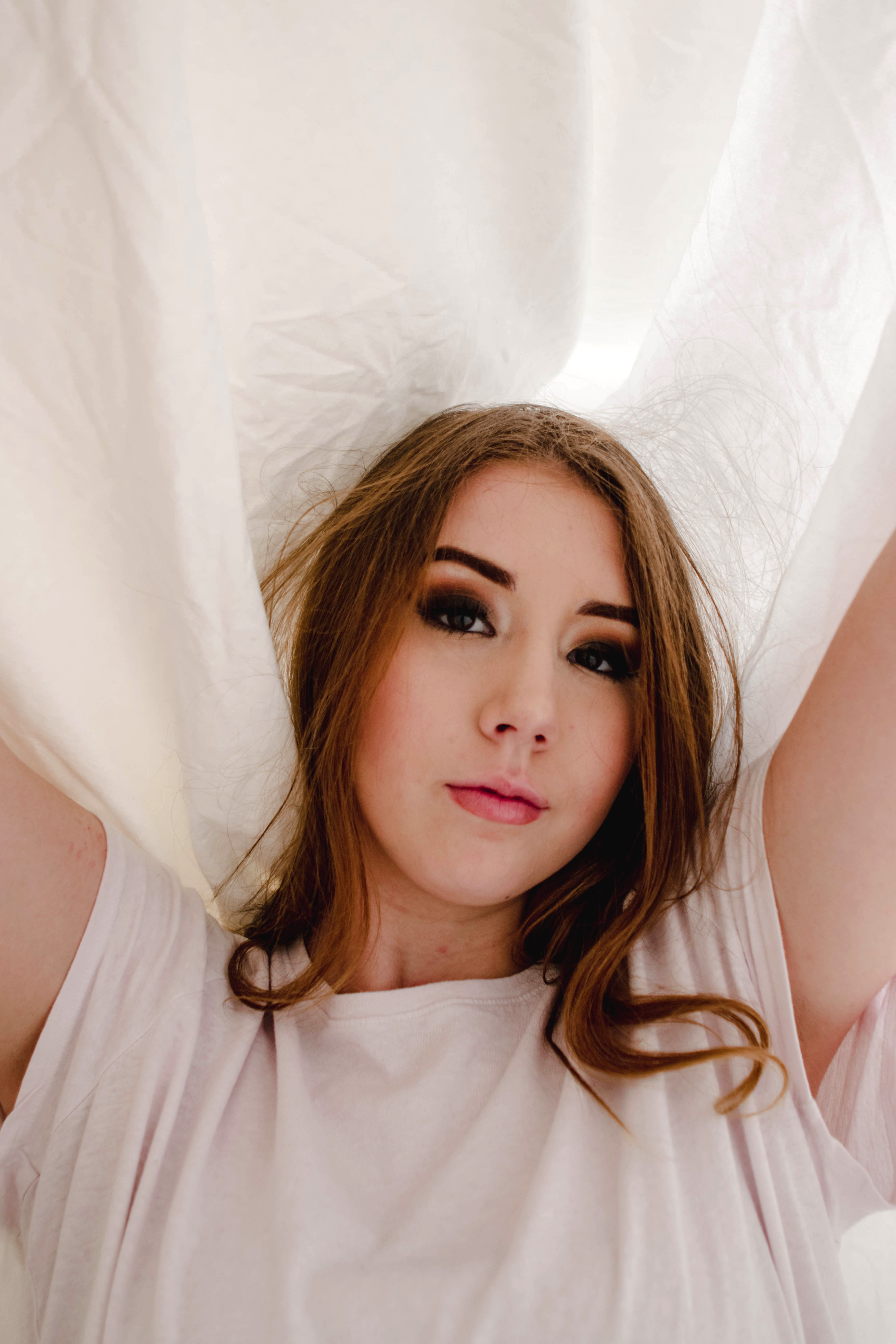
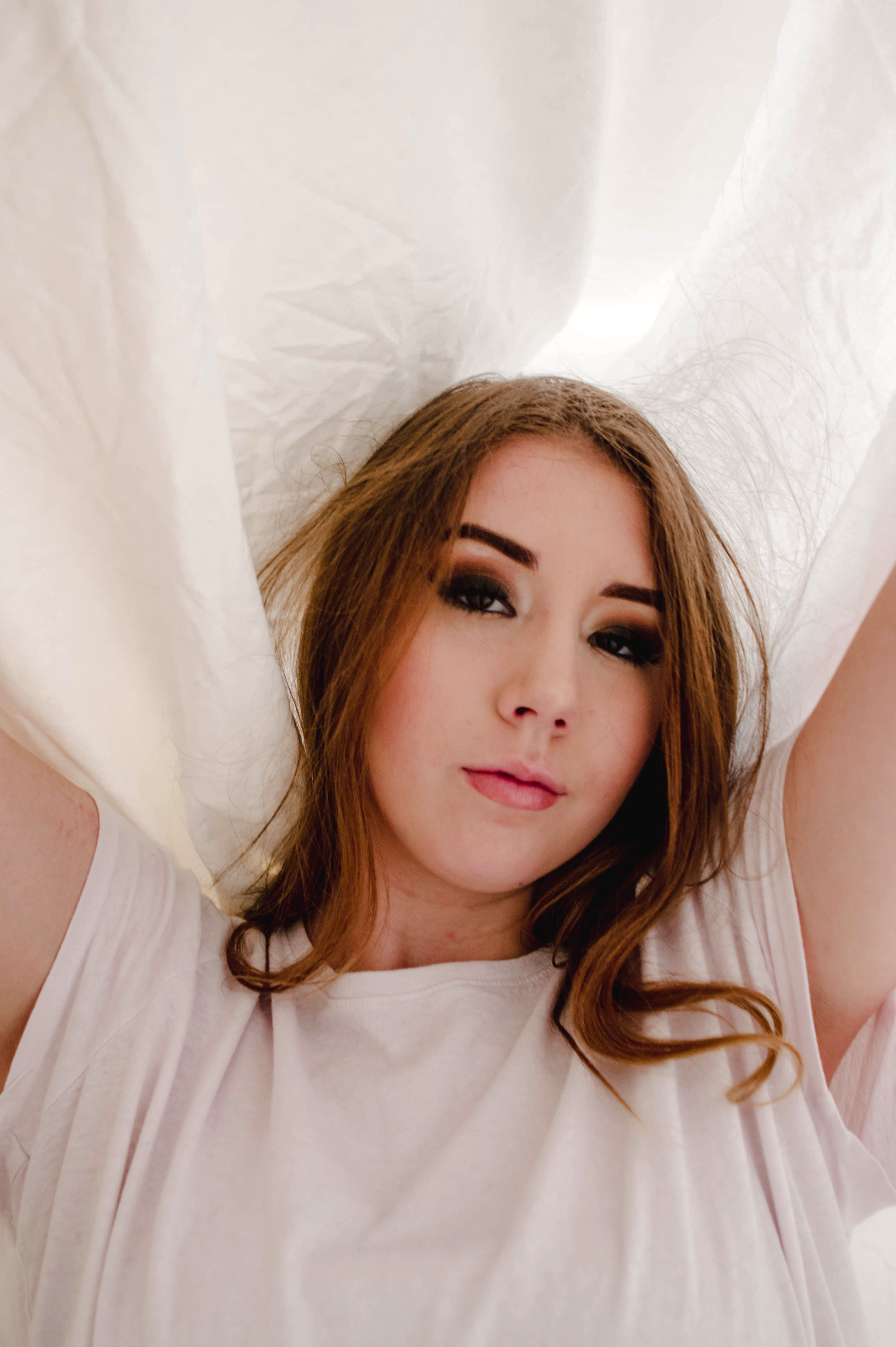
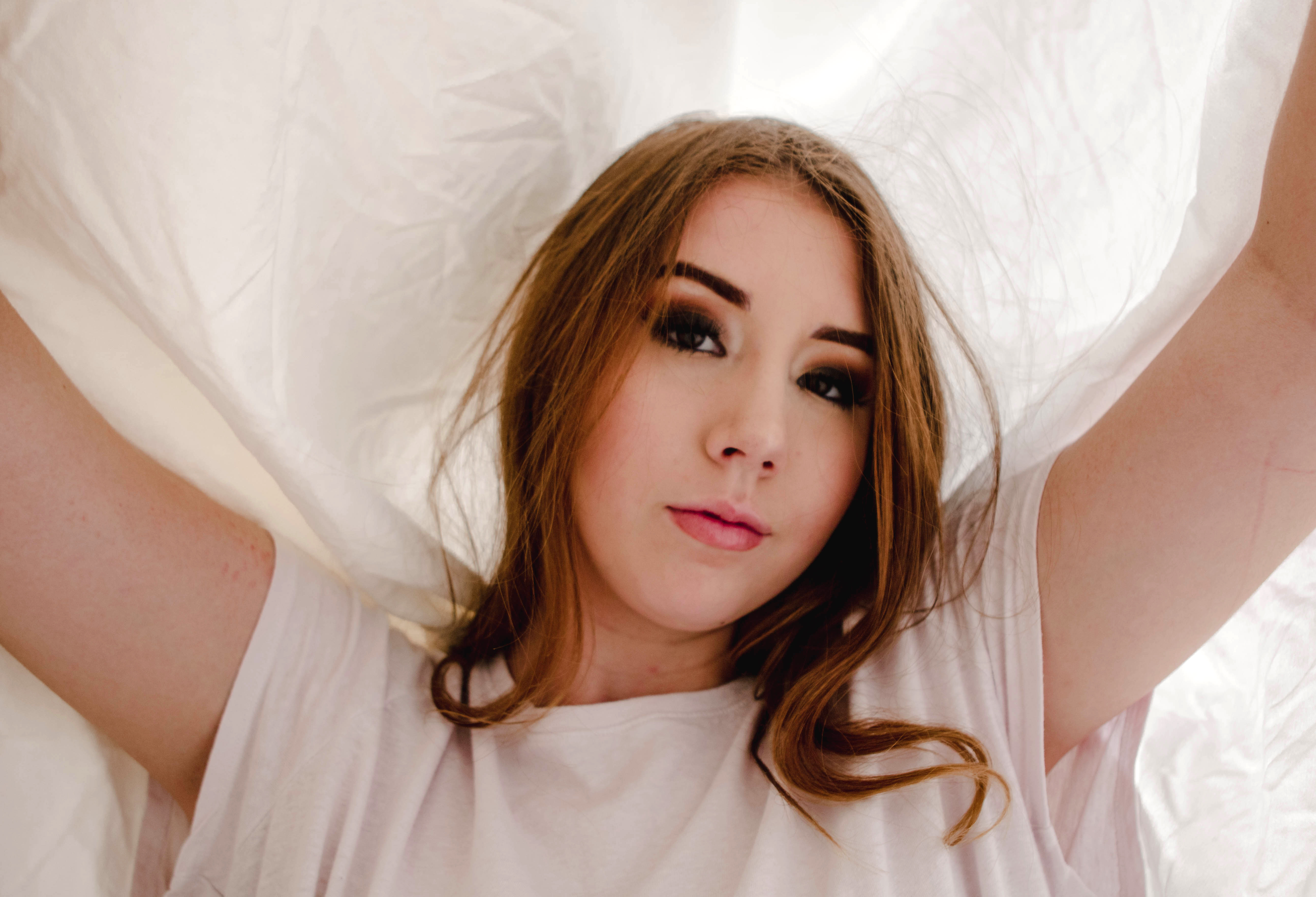
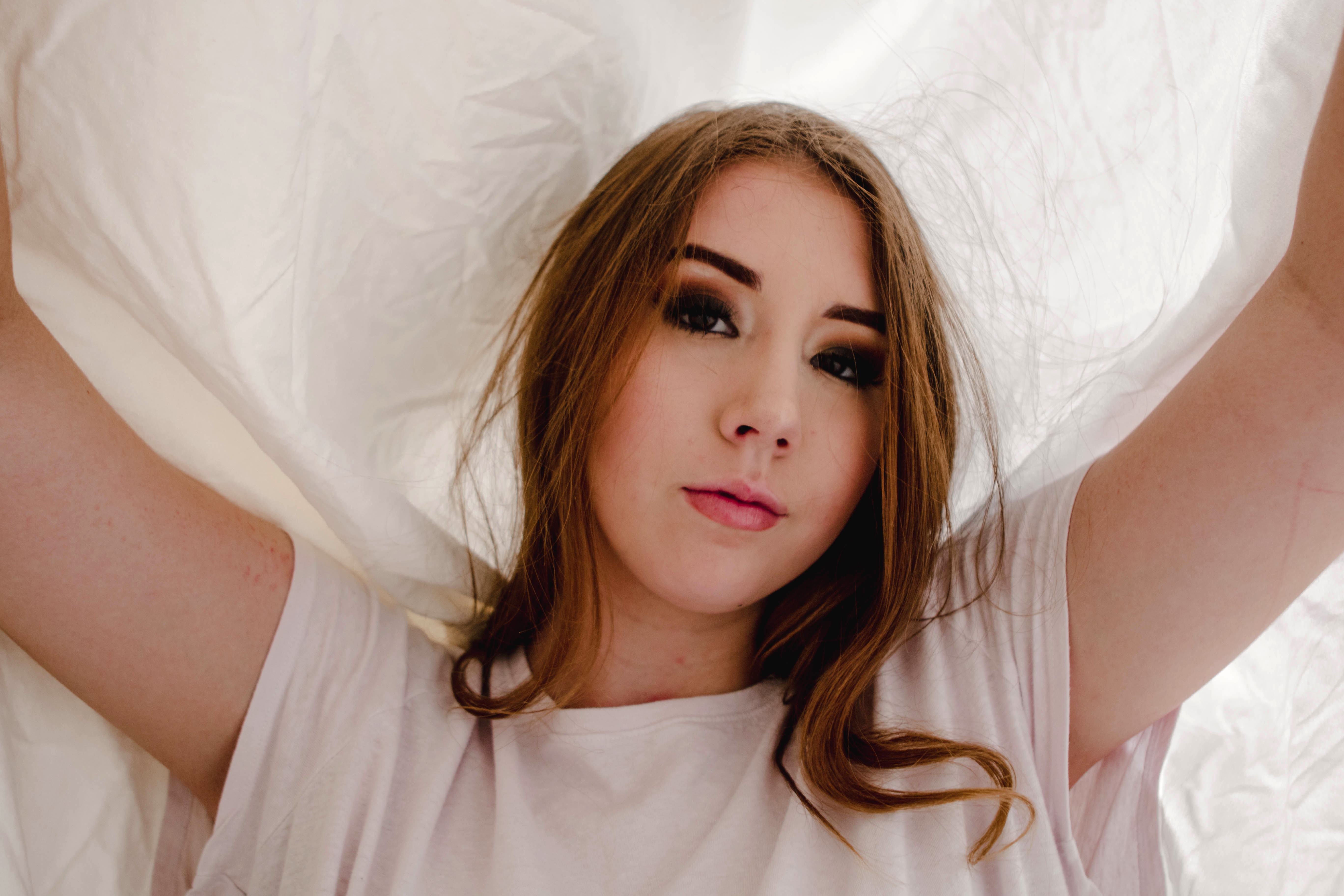
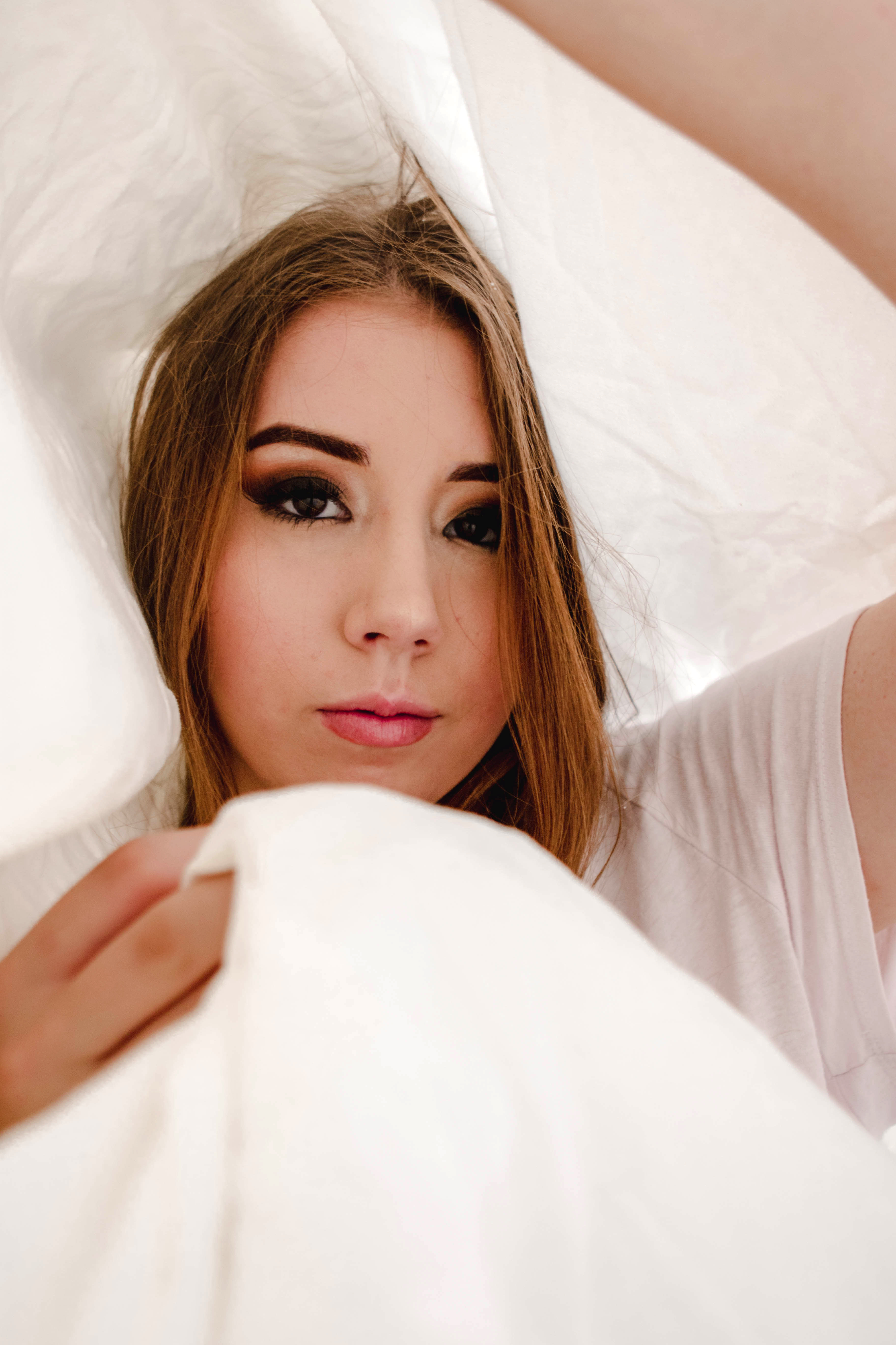
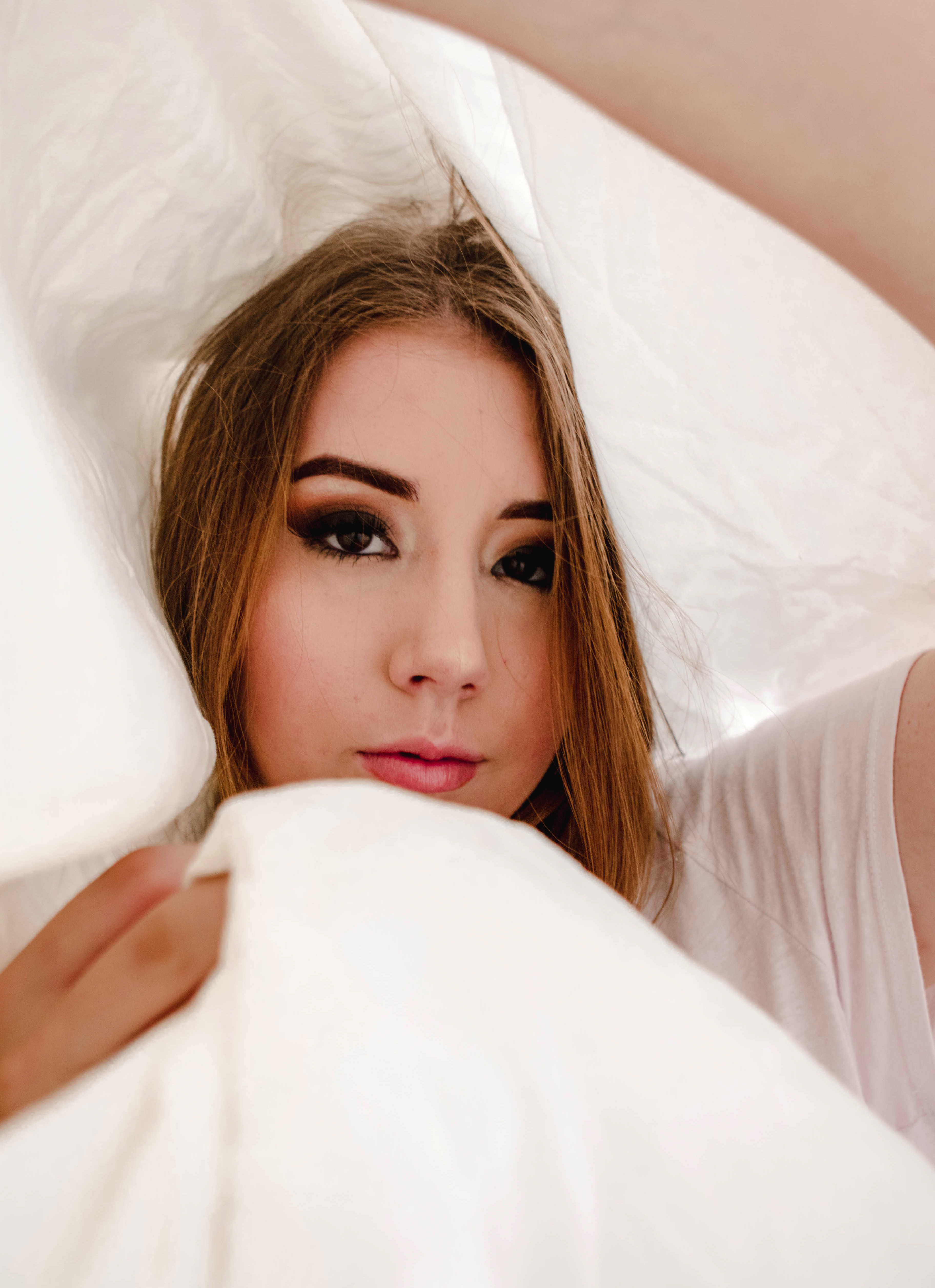
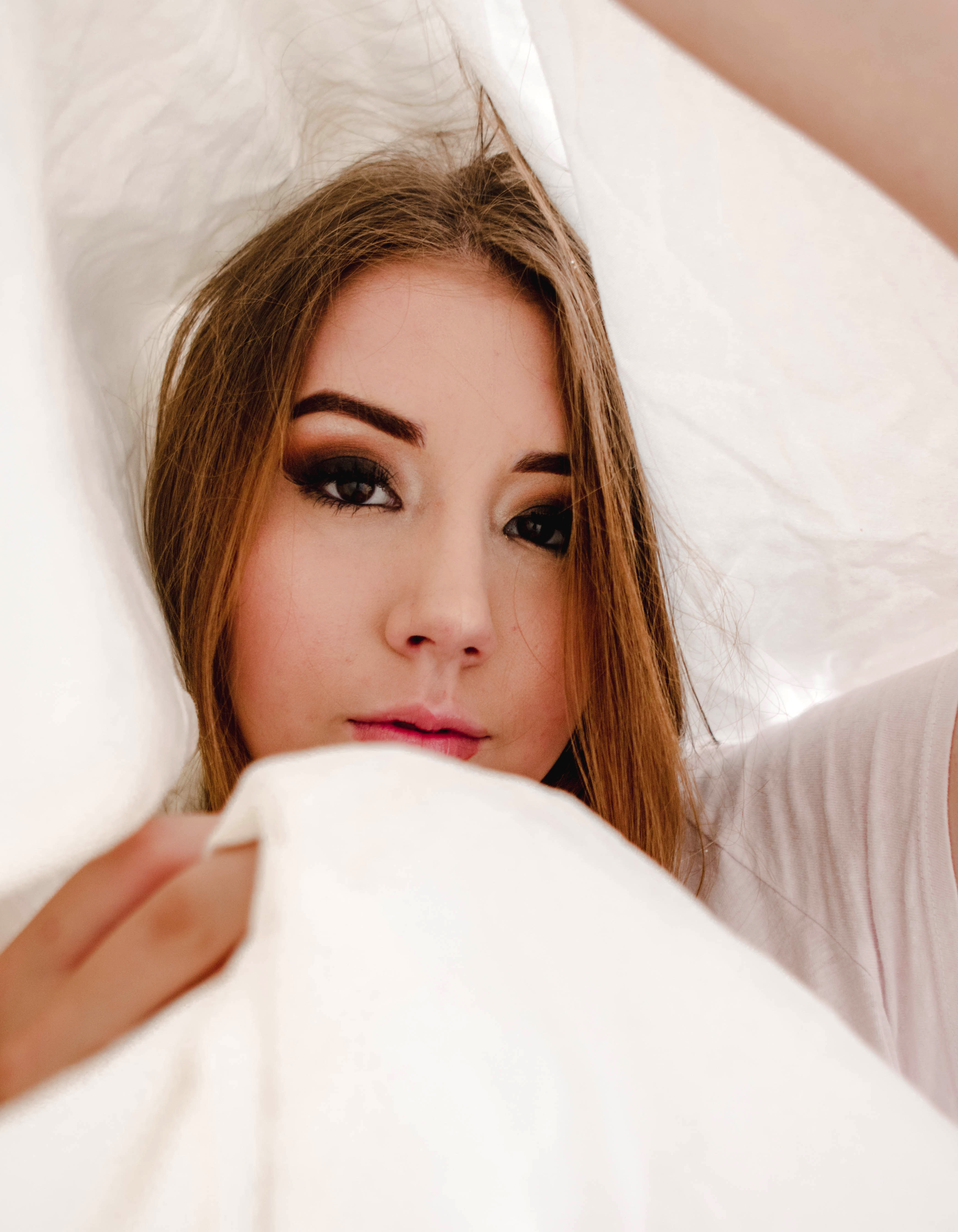
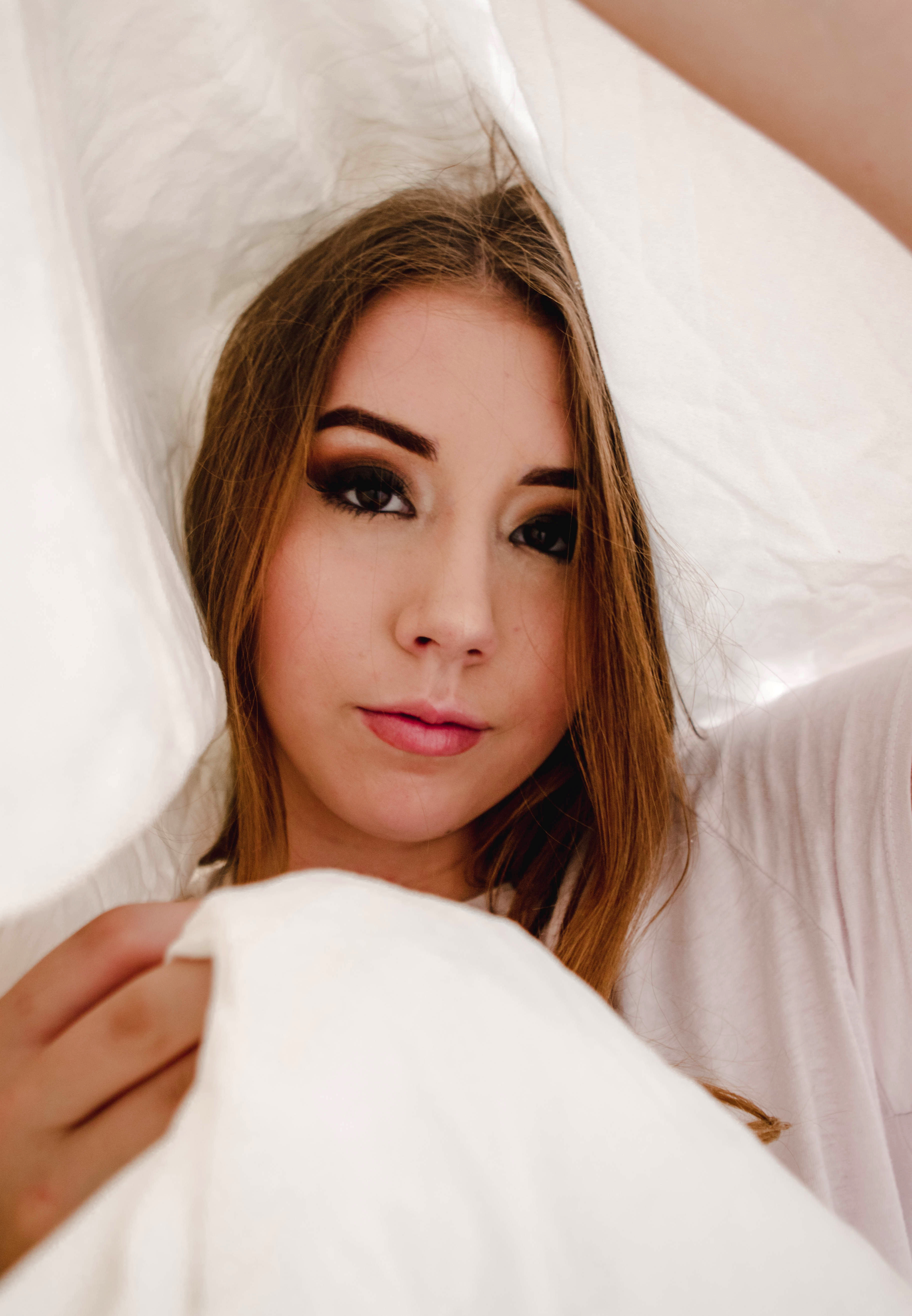
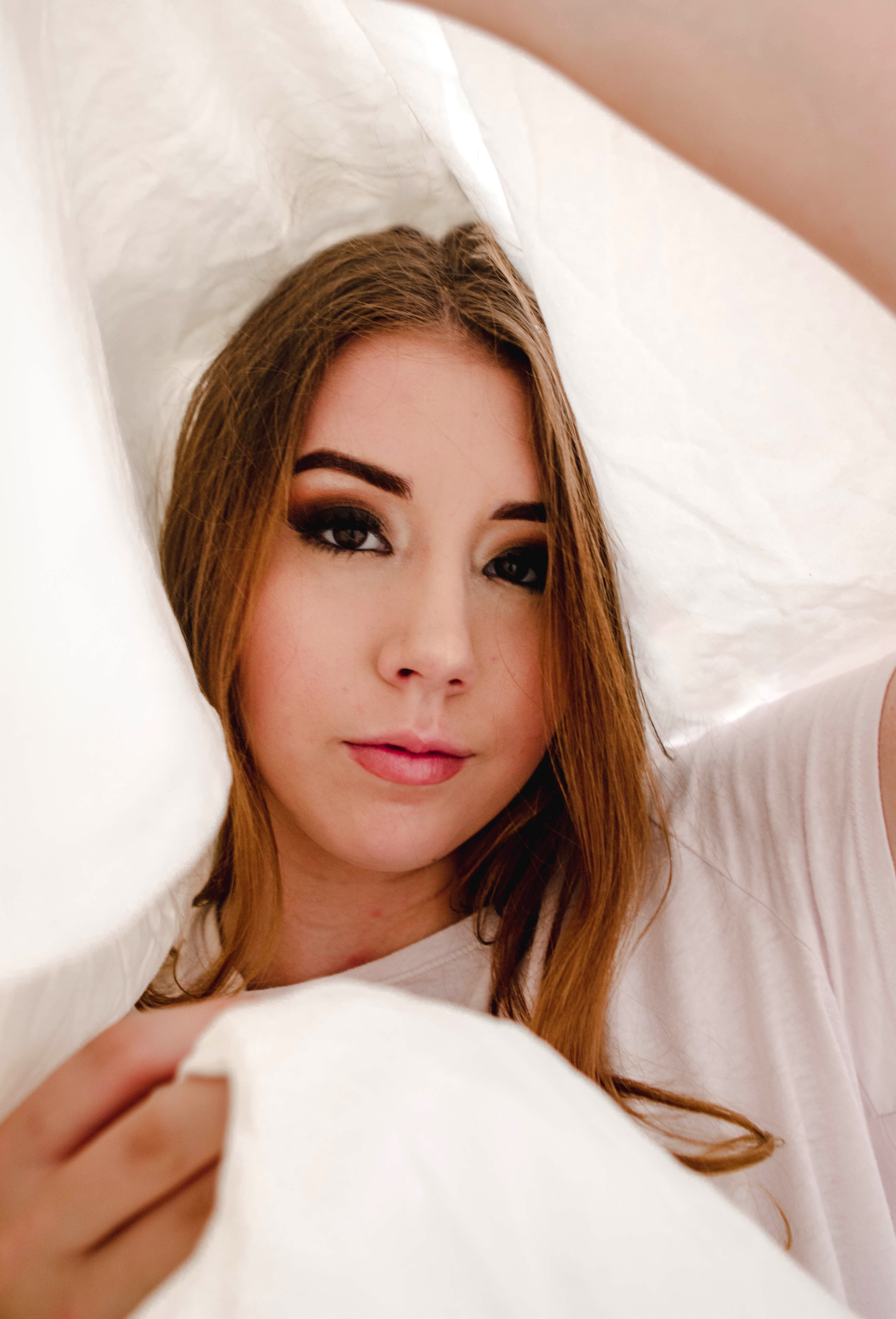
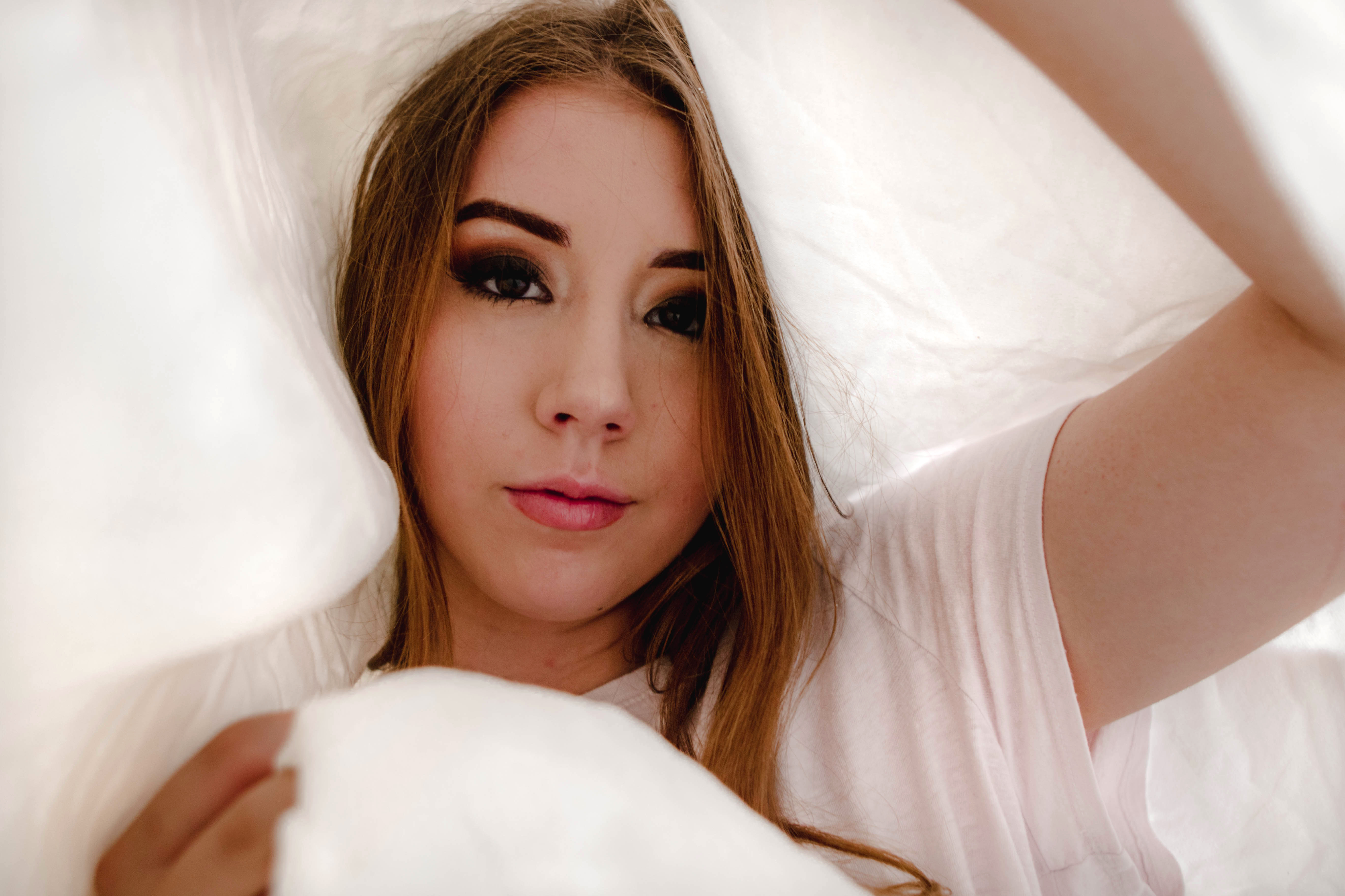
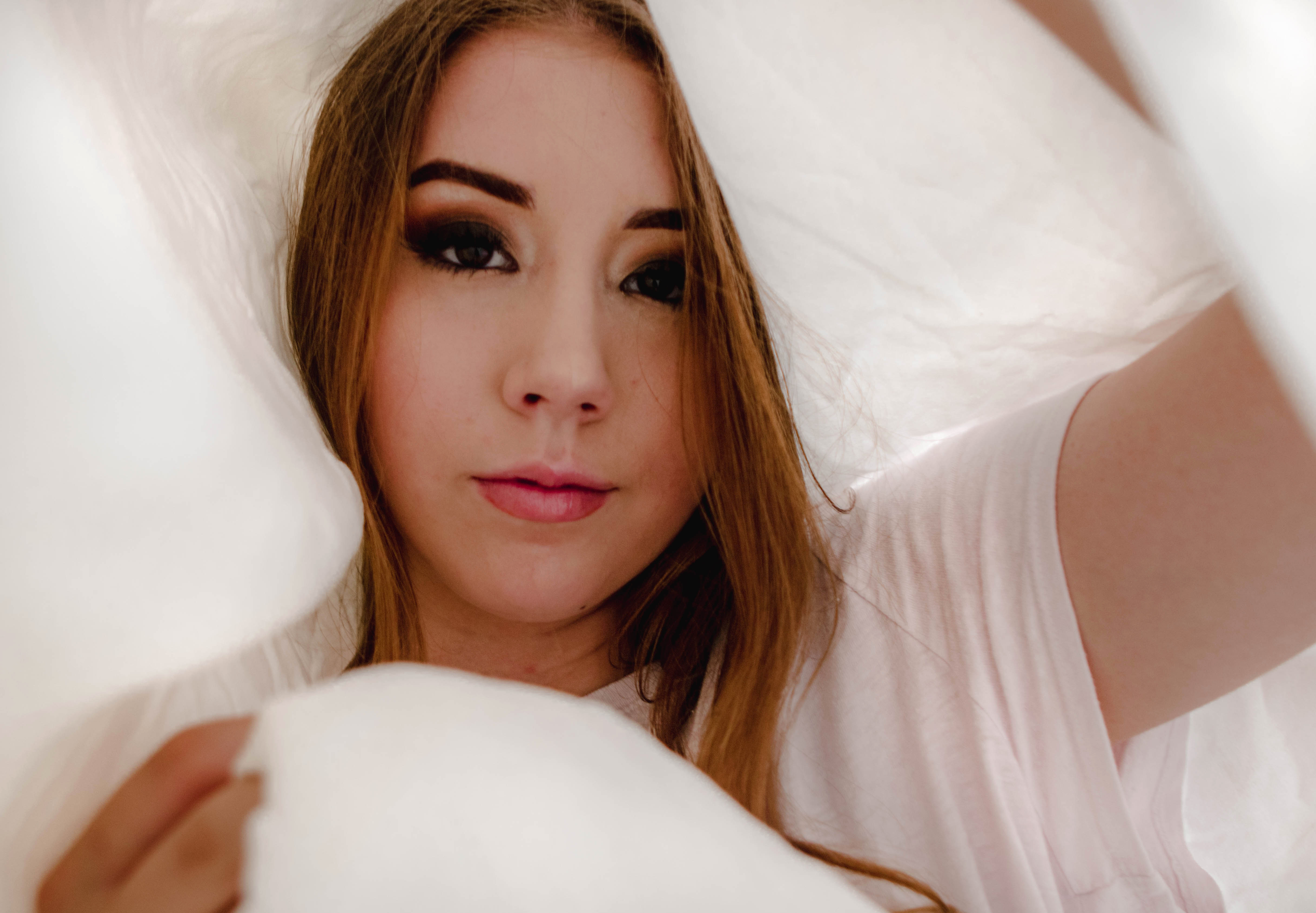
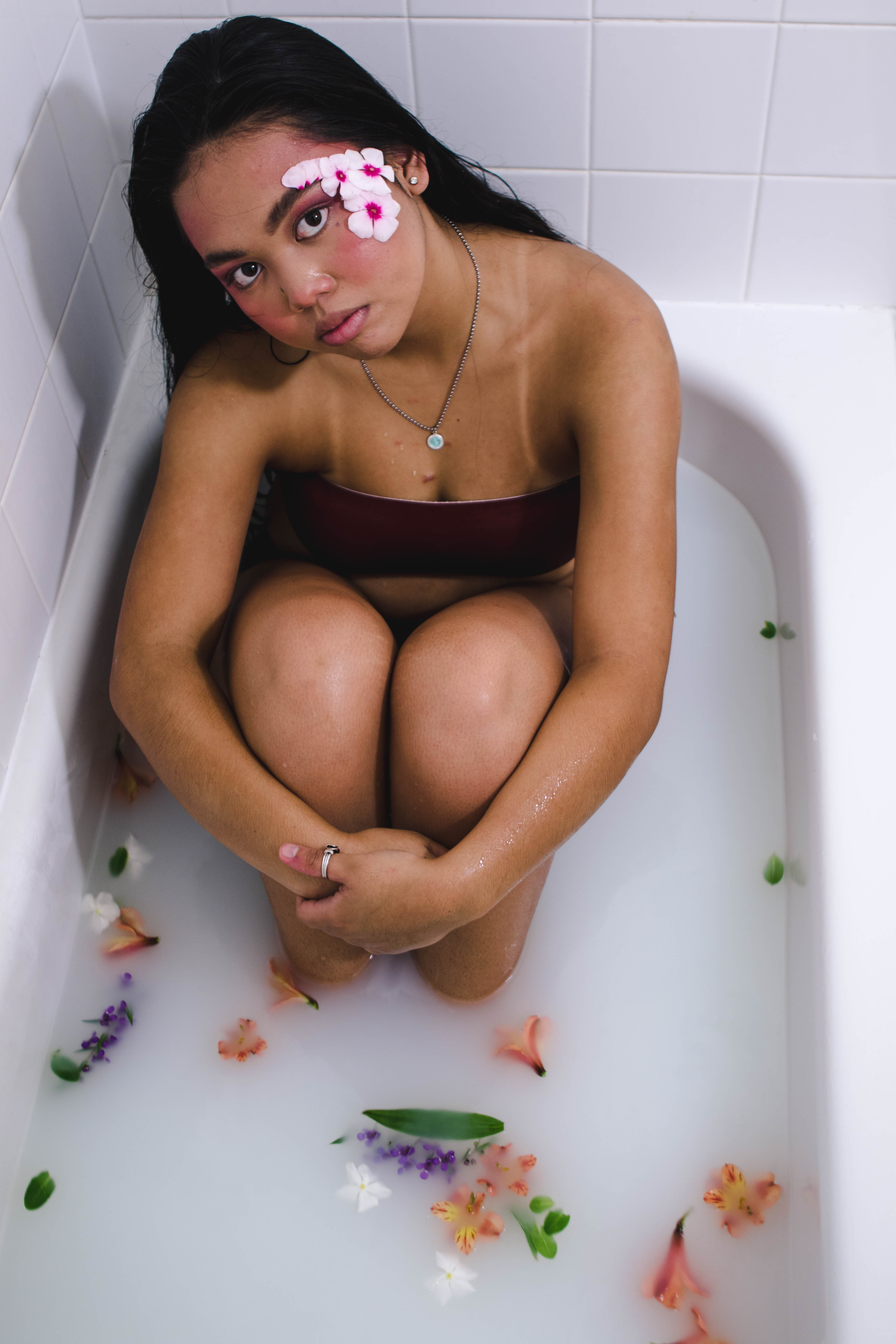
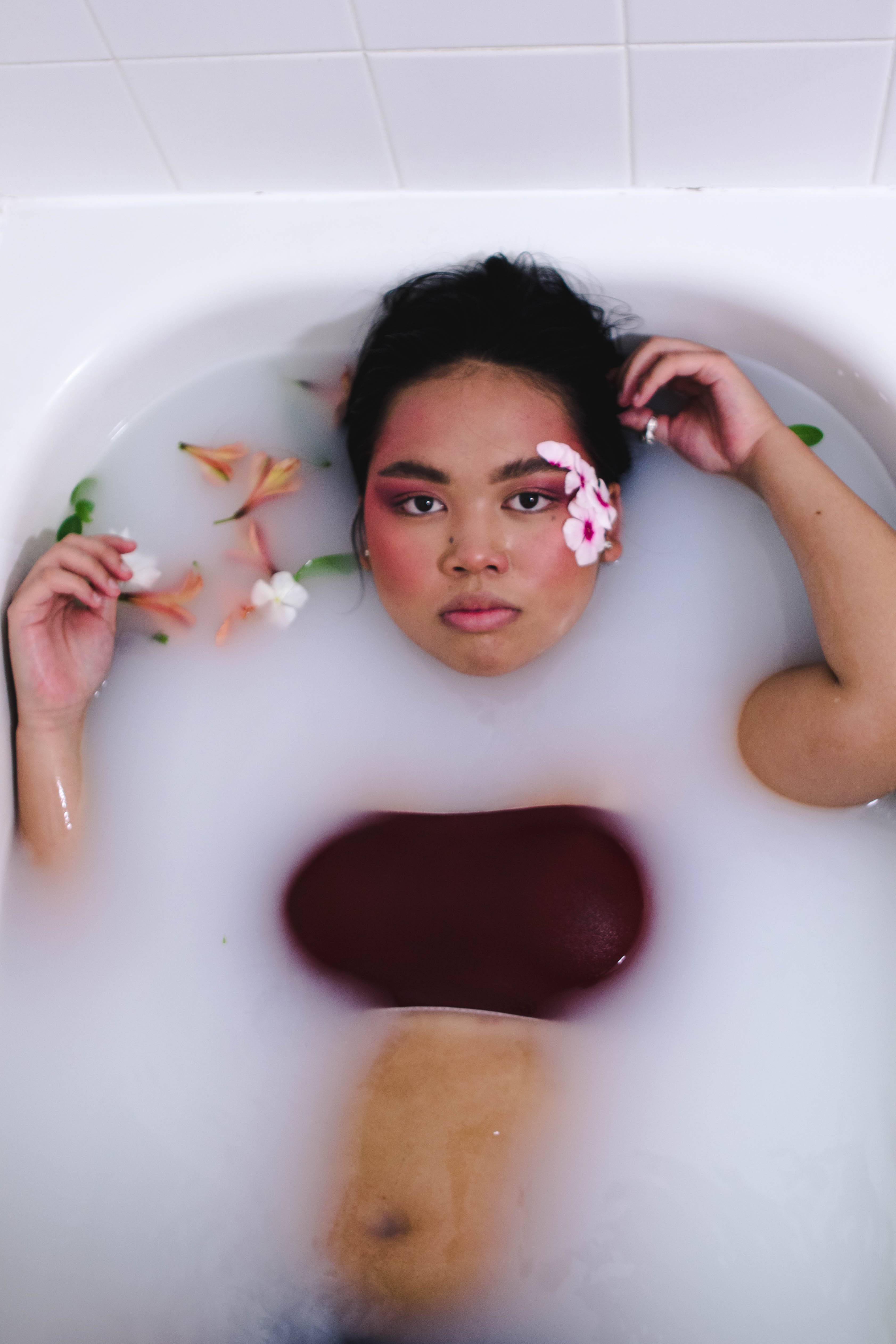
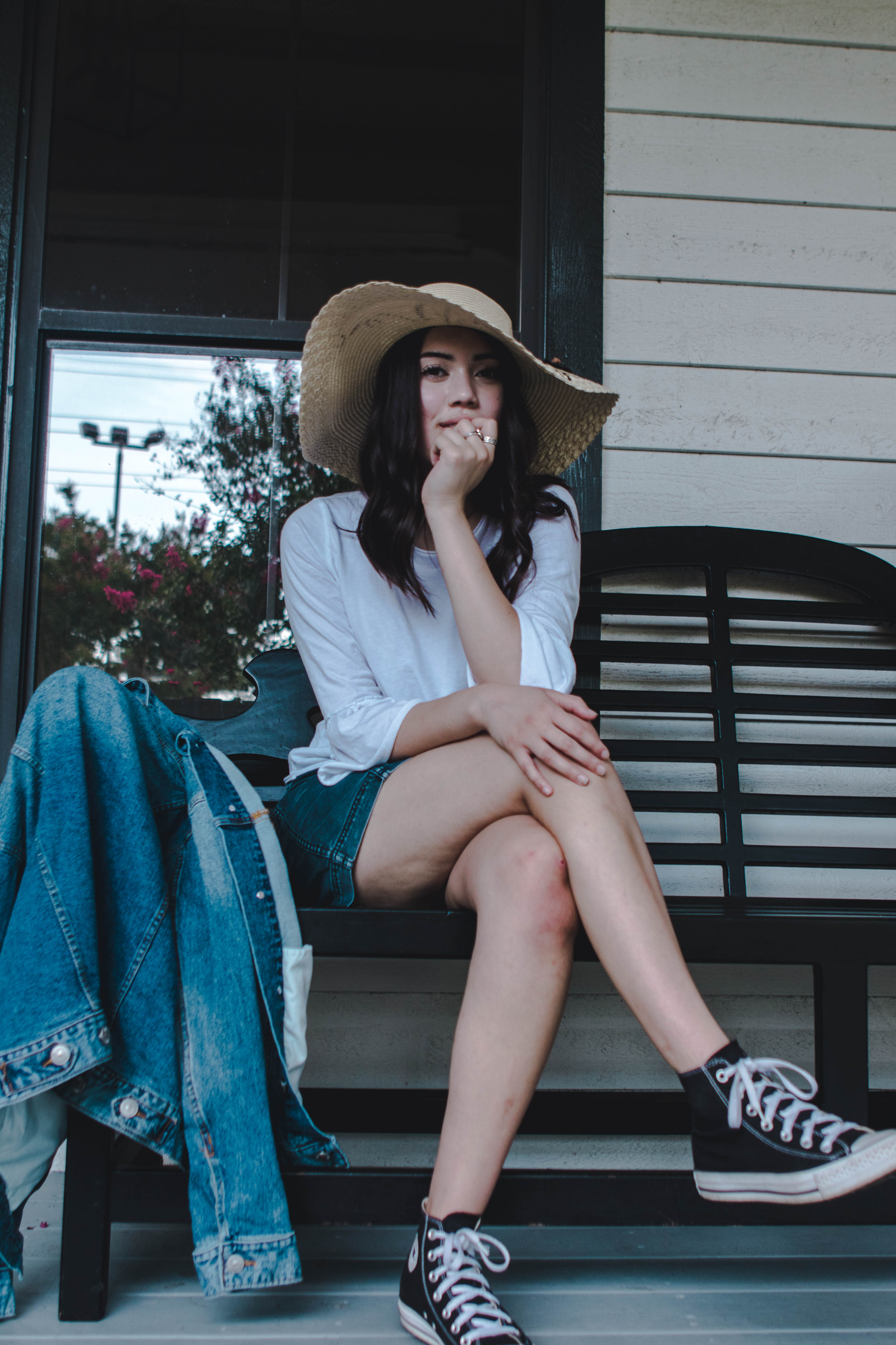
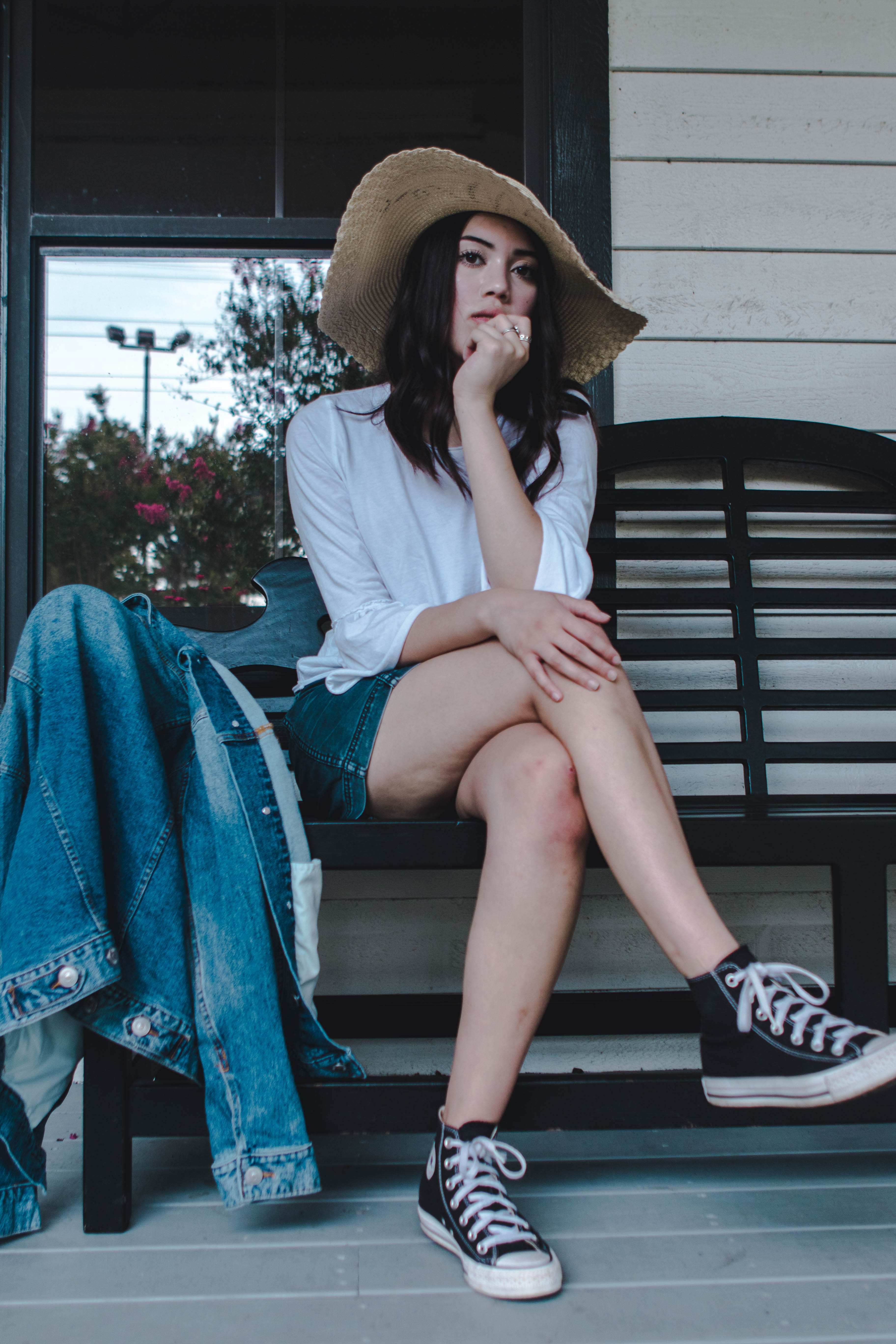
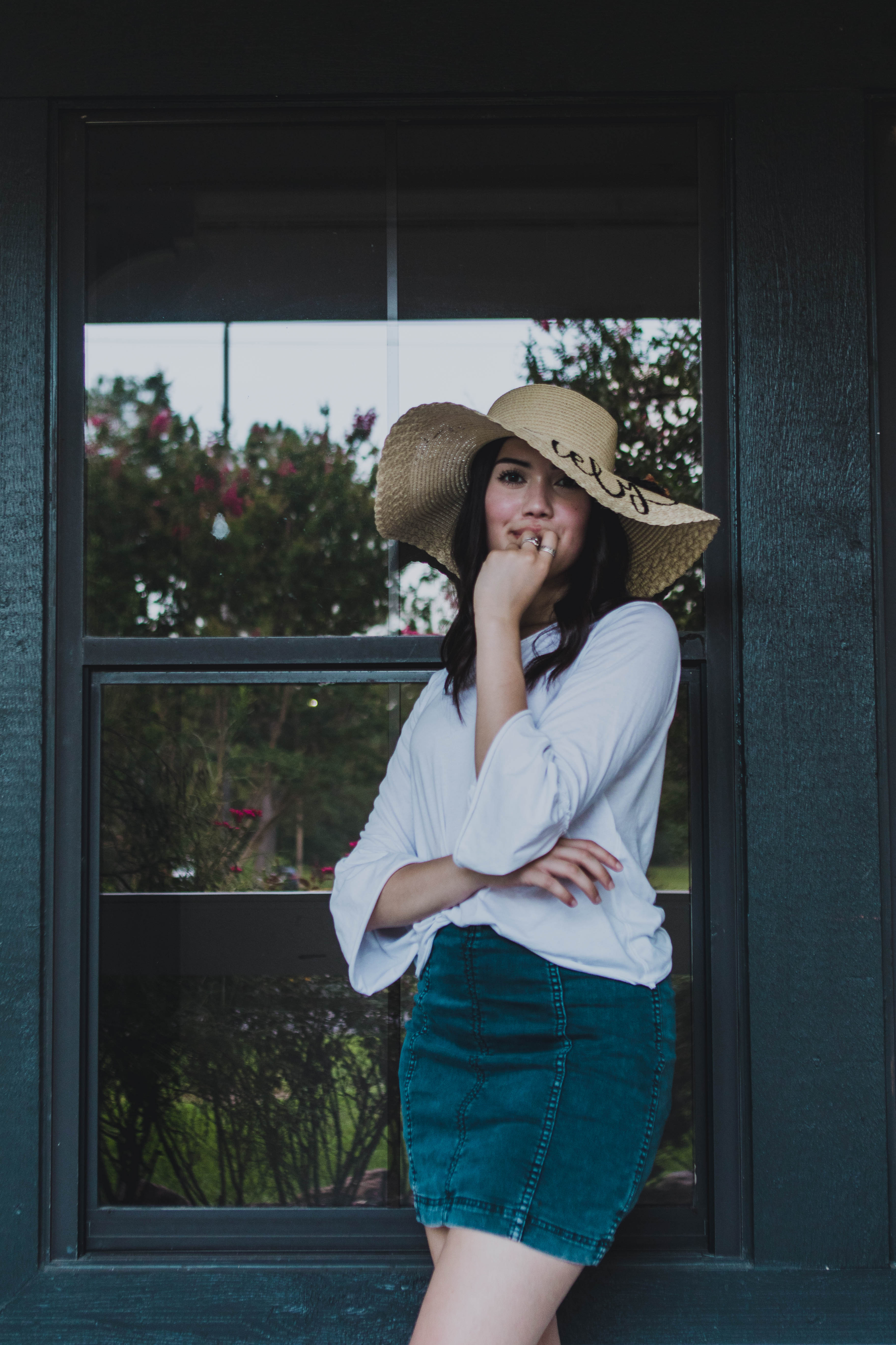
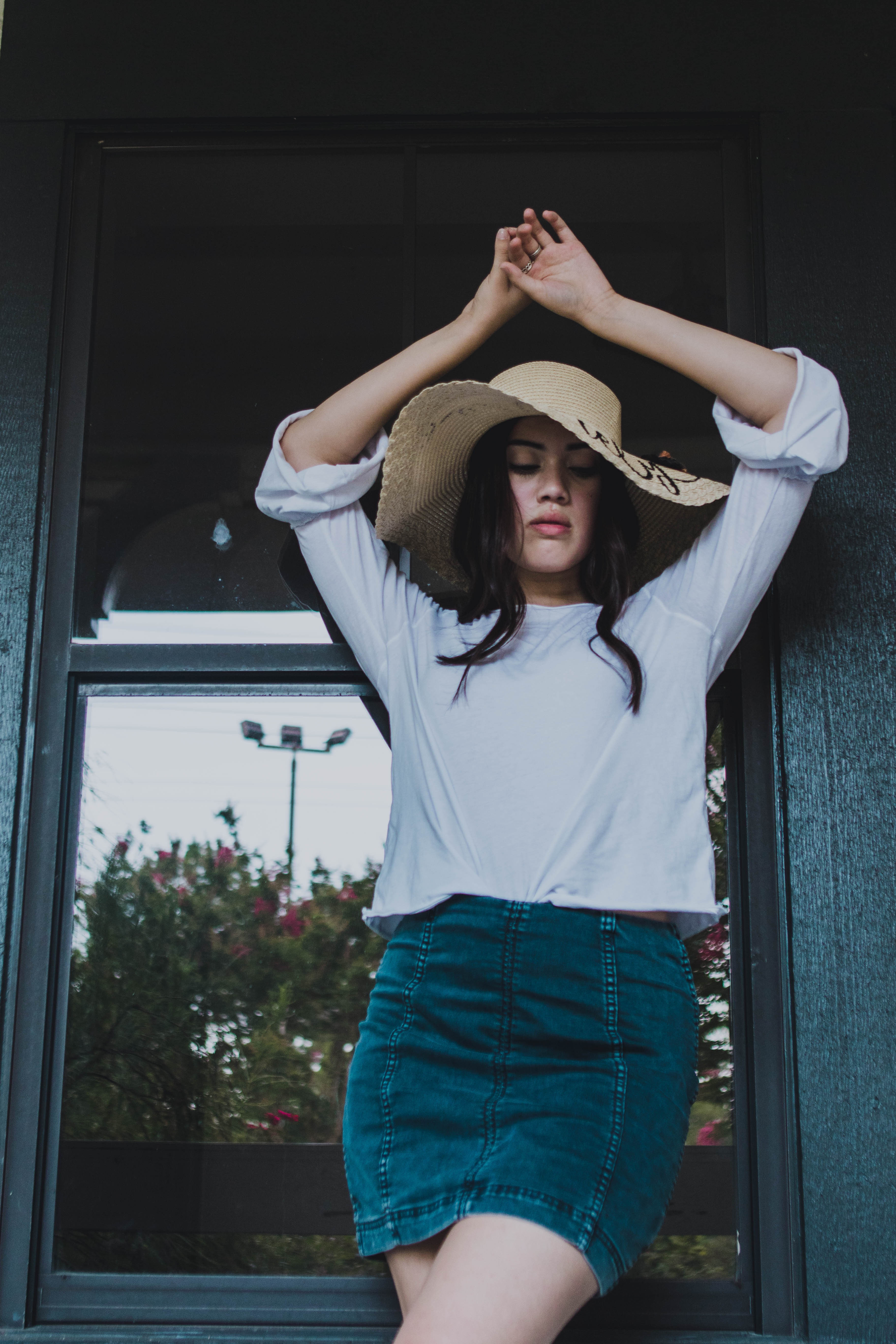
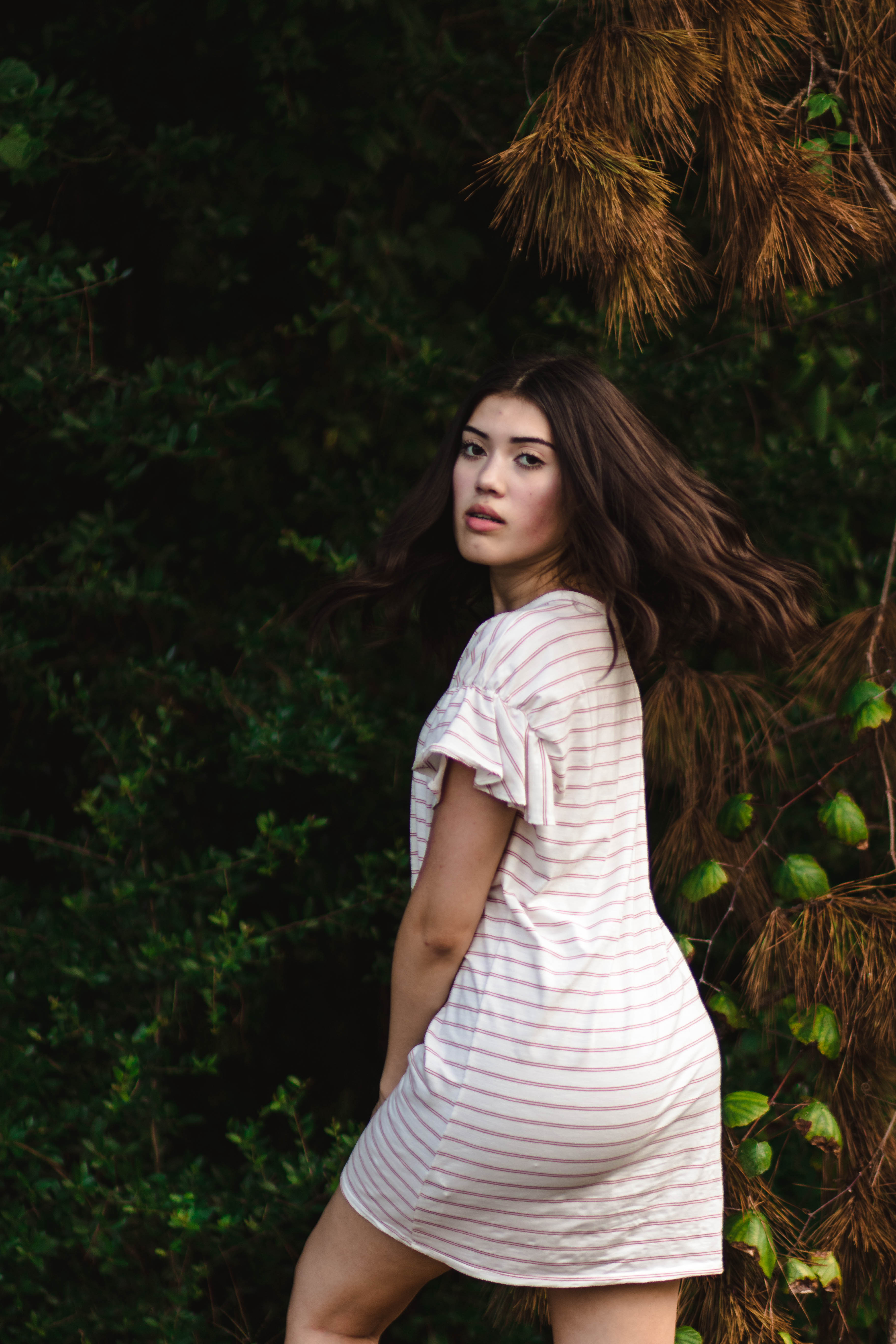
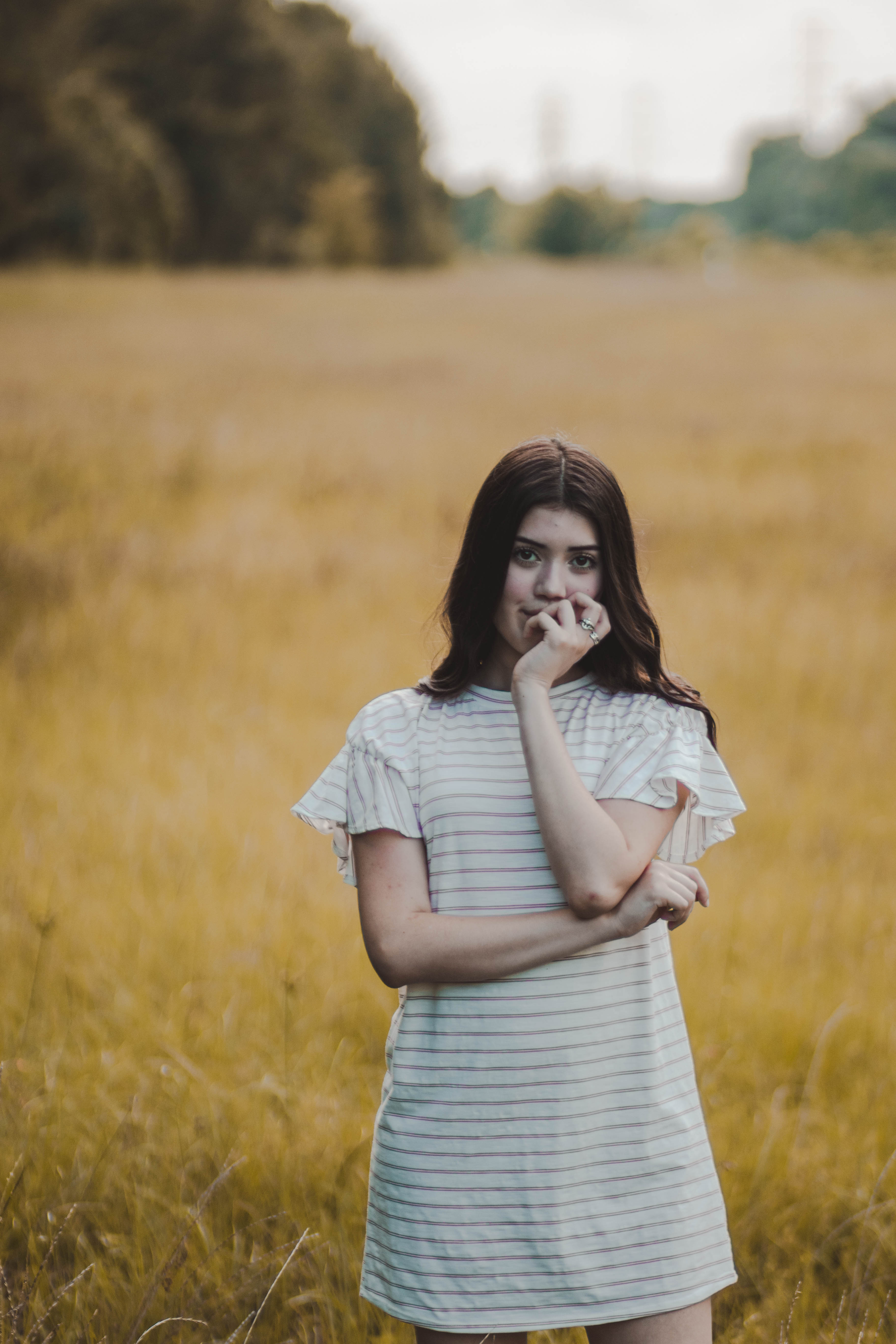
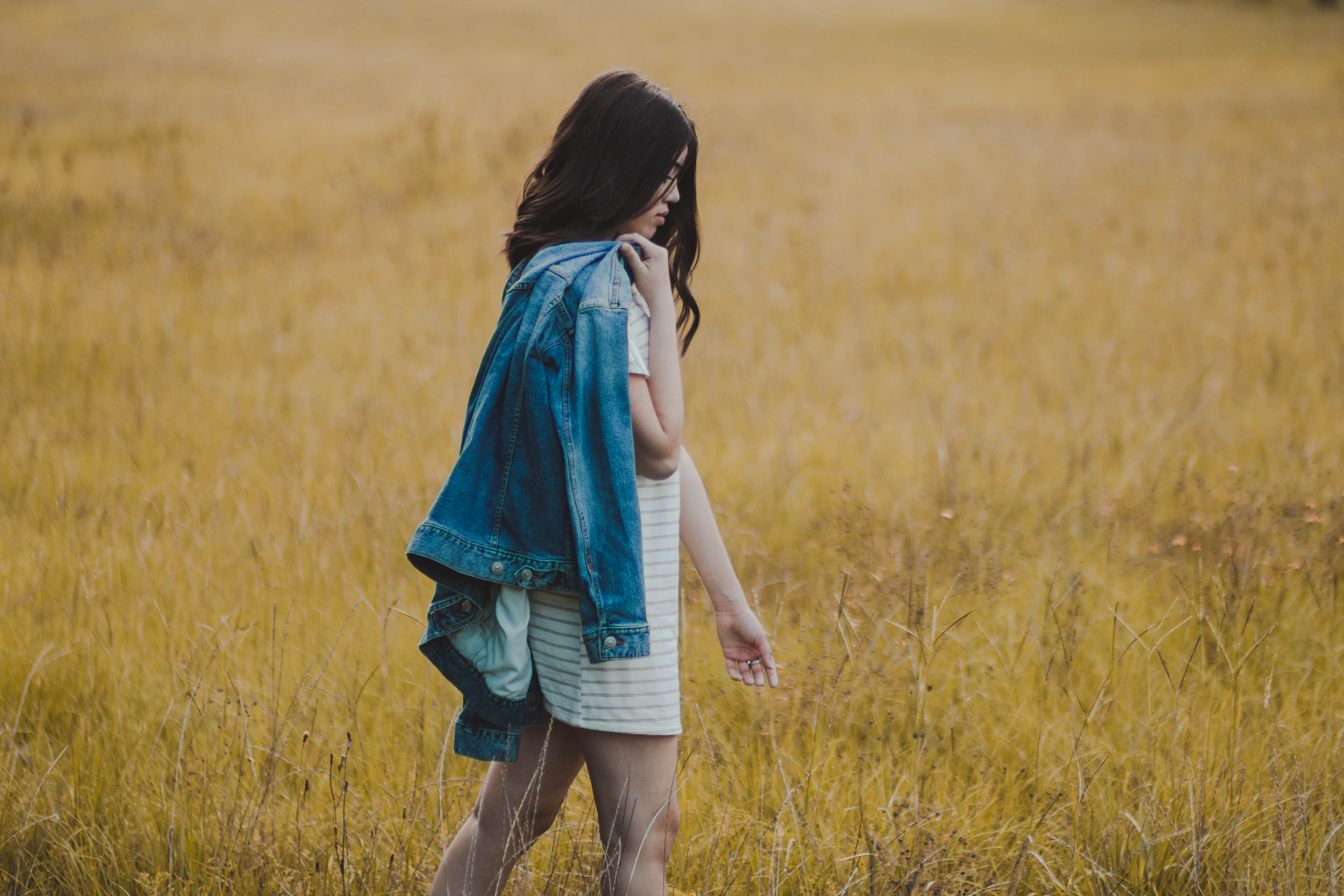
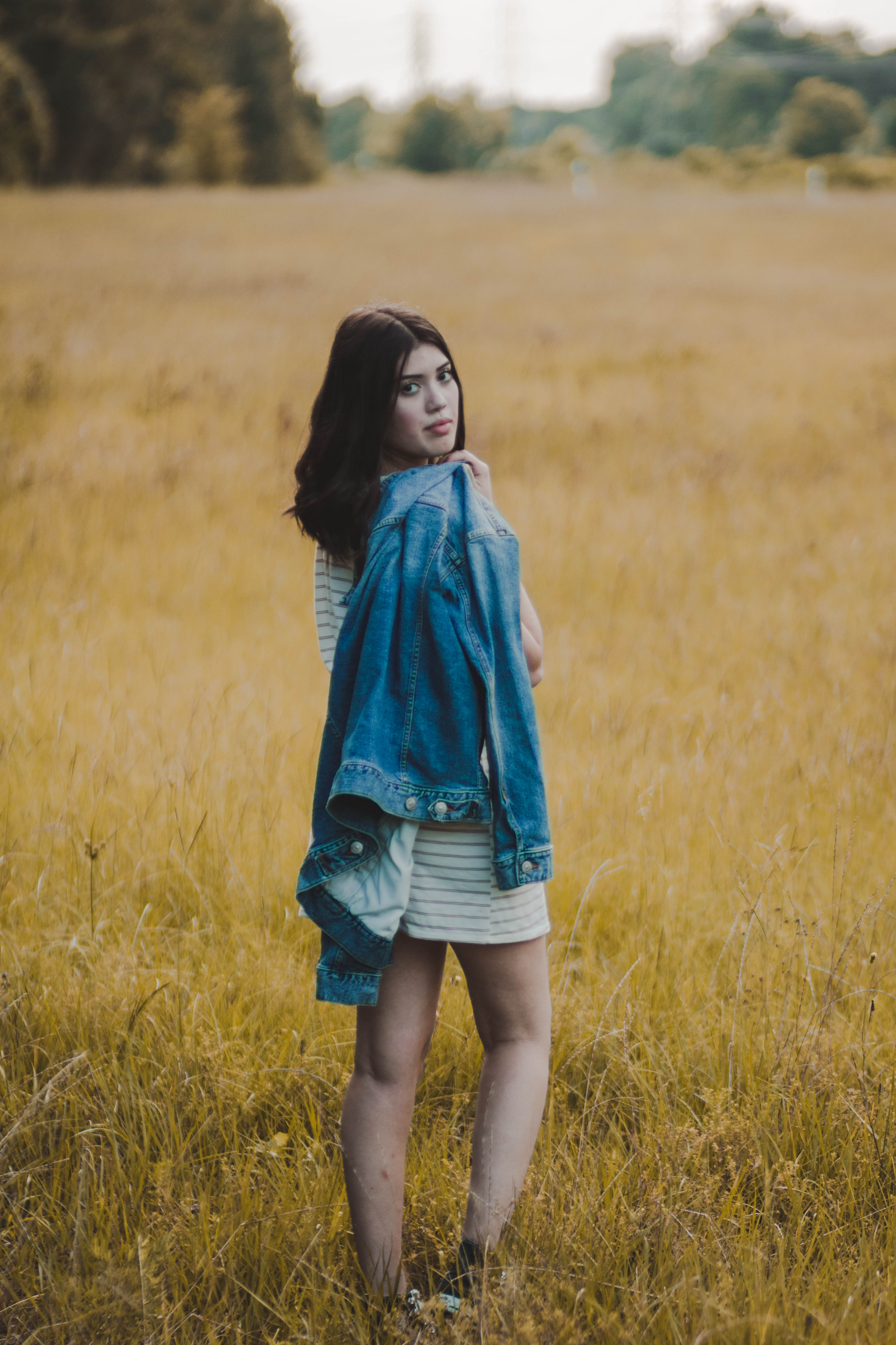
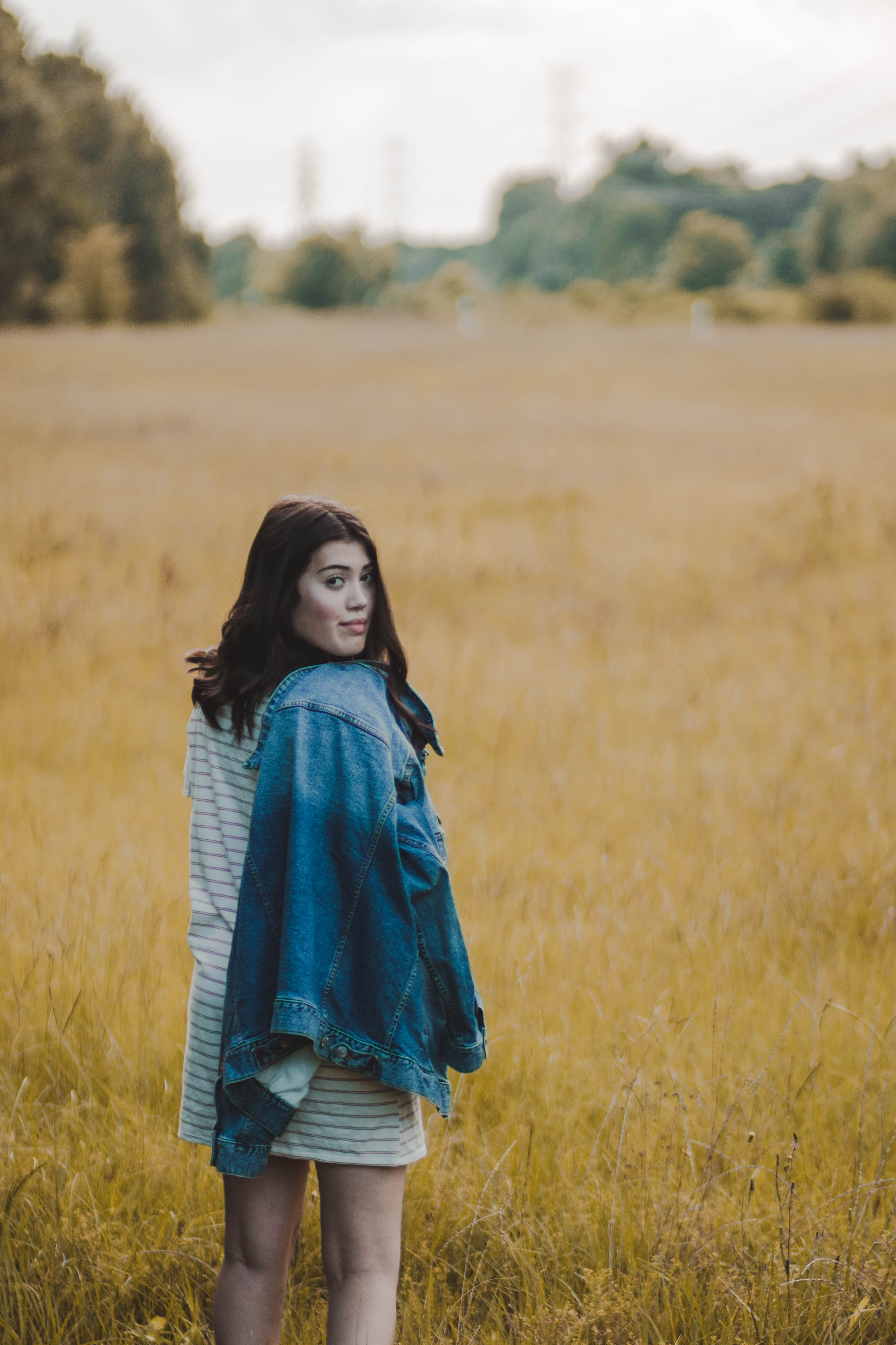
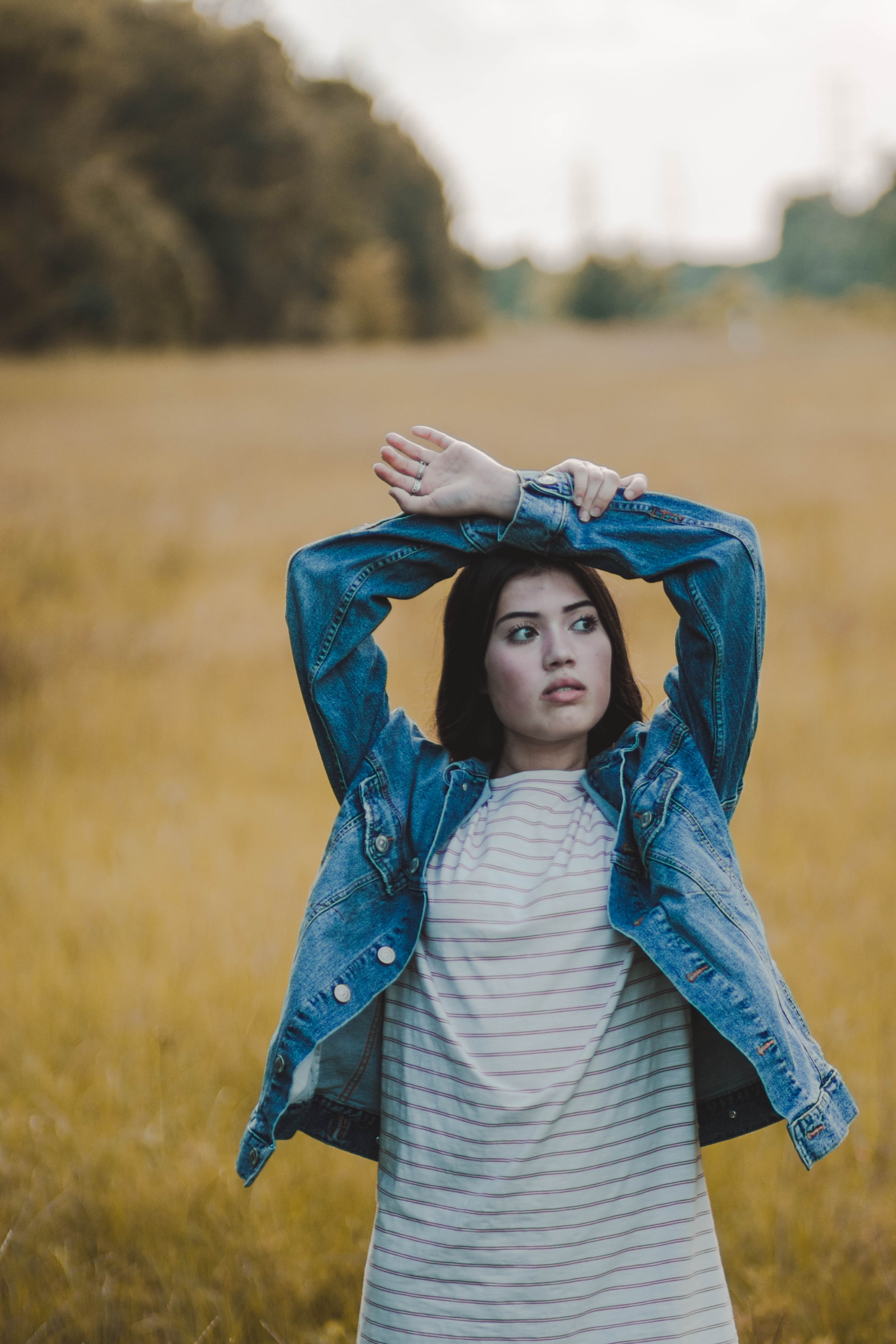
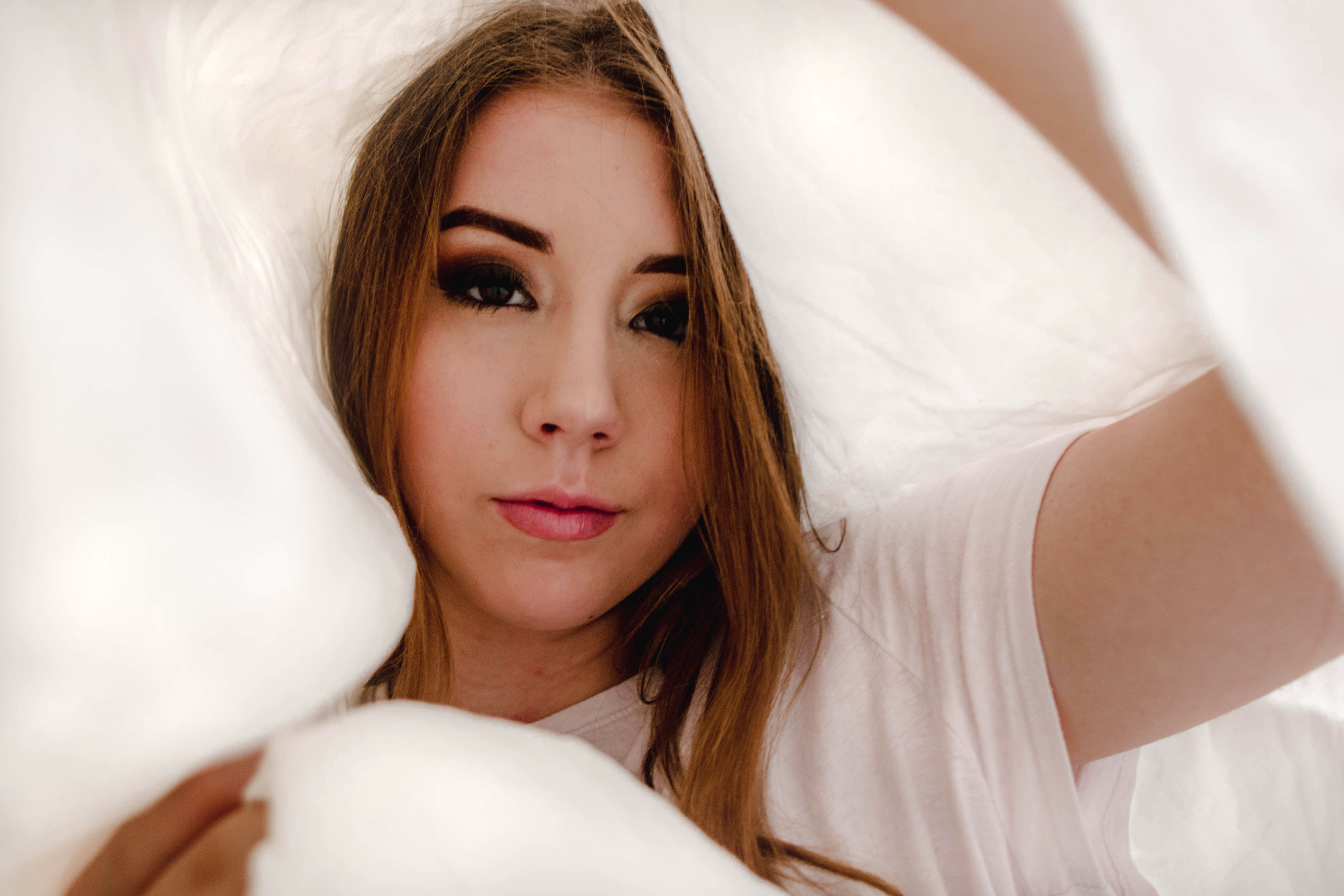
Neutrals
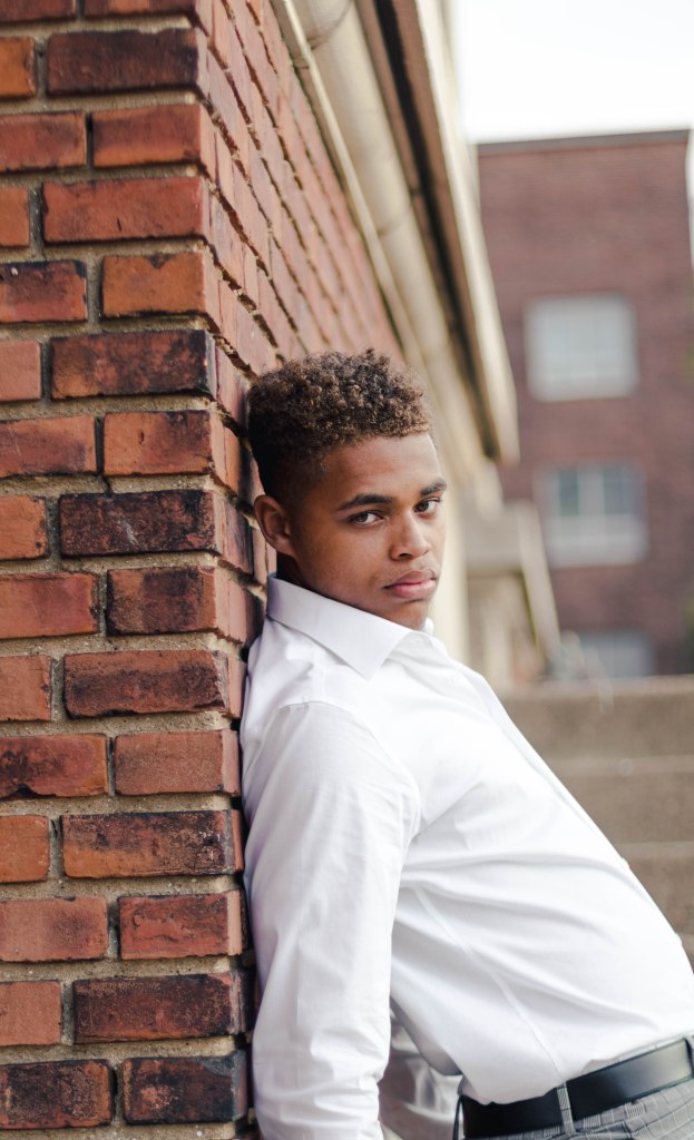
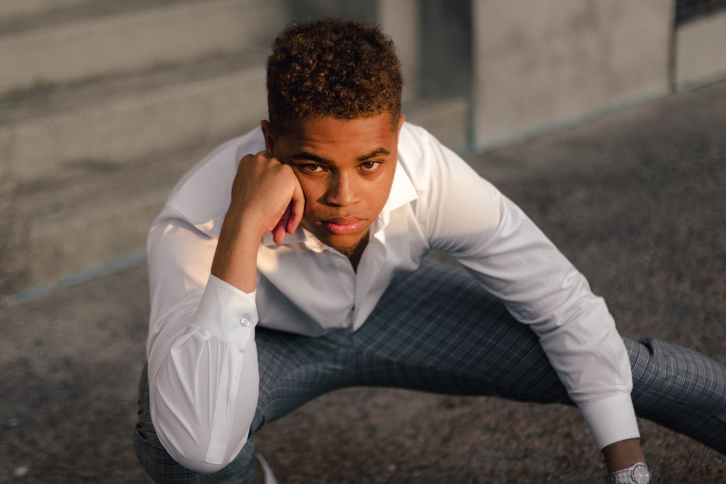
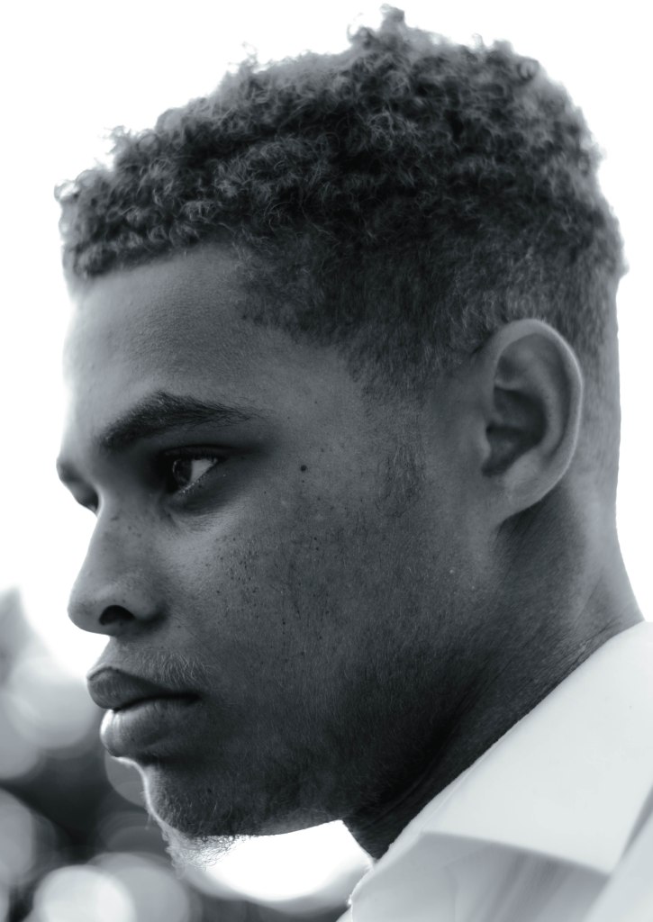
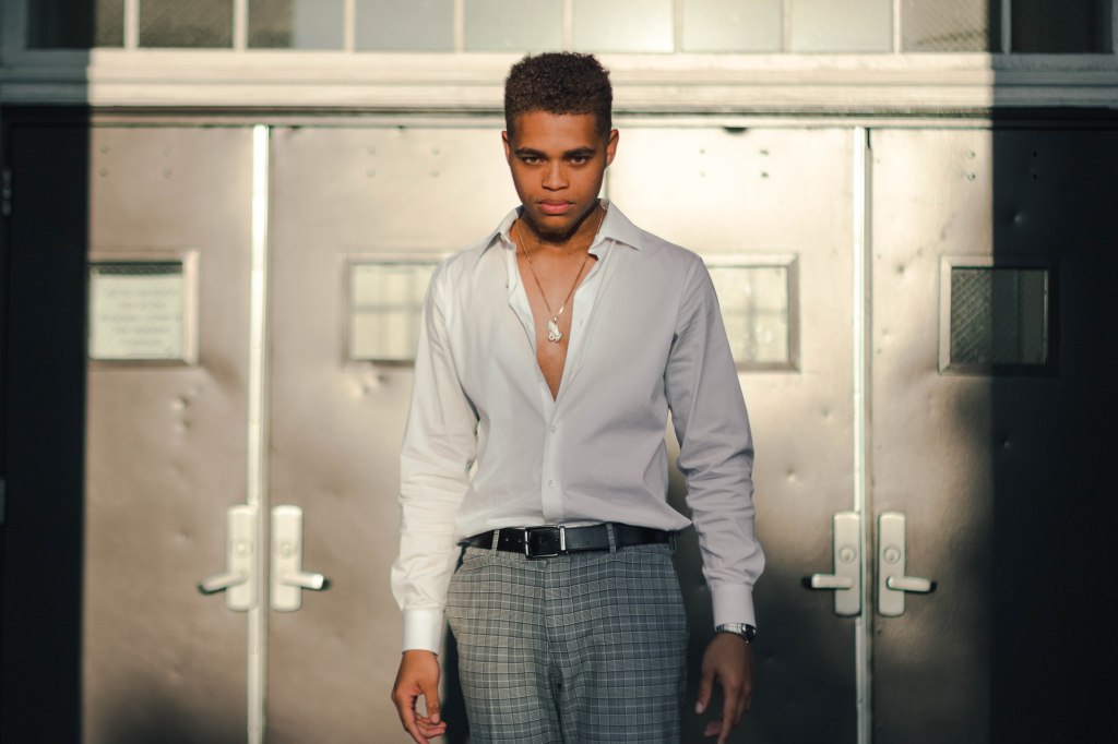
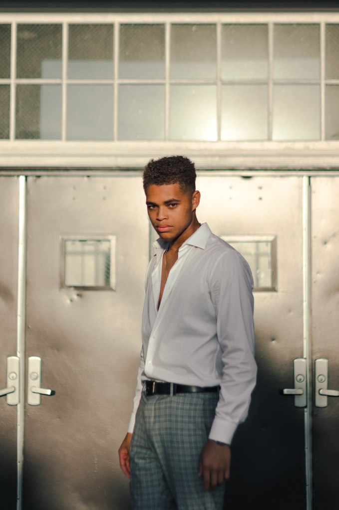
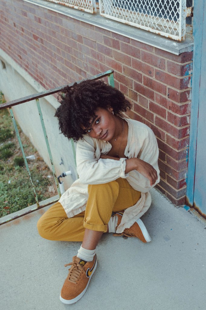
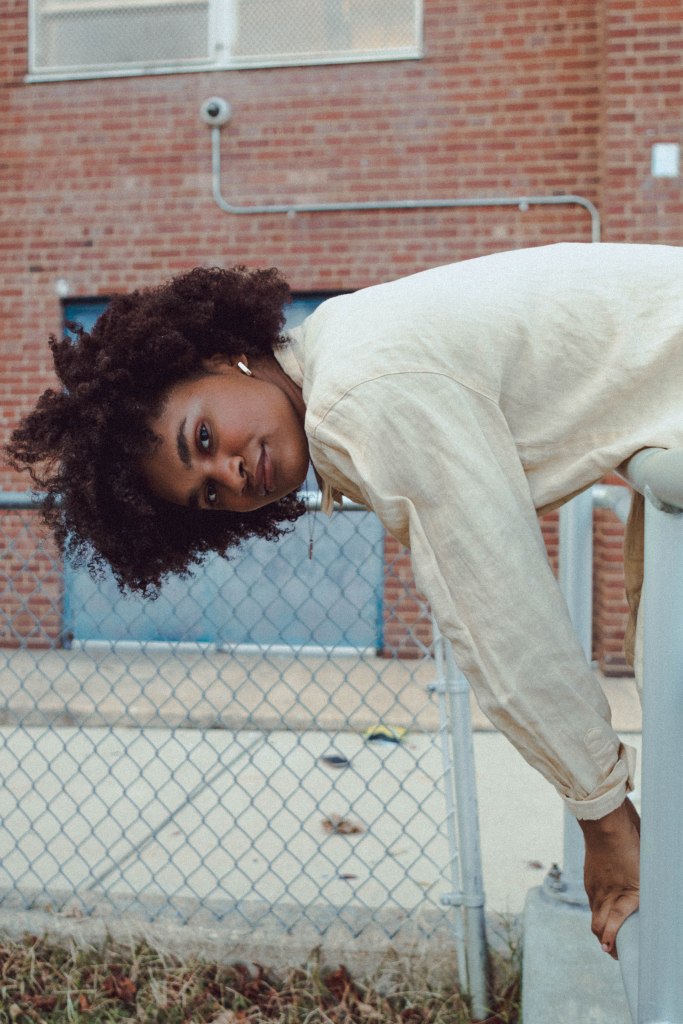
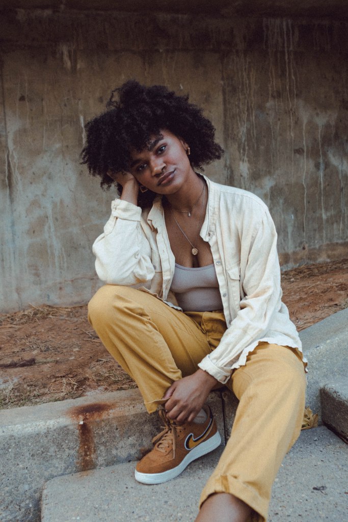
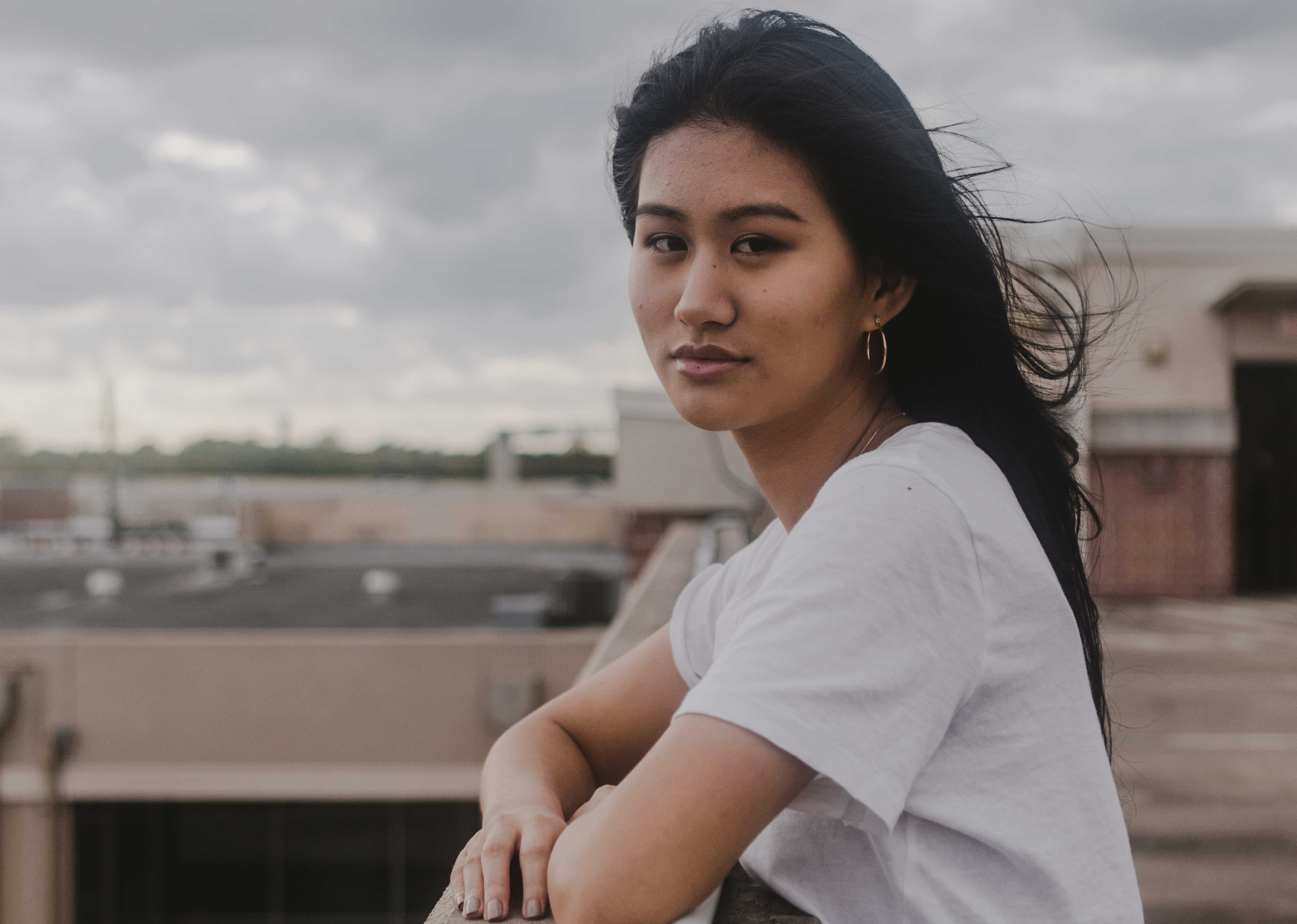
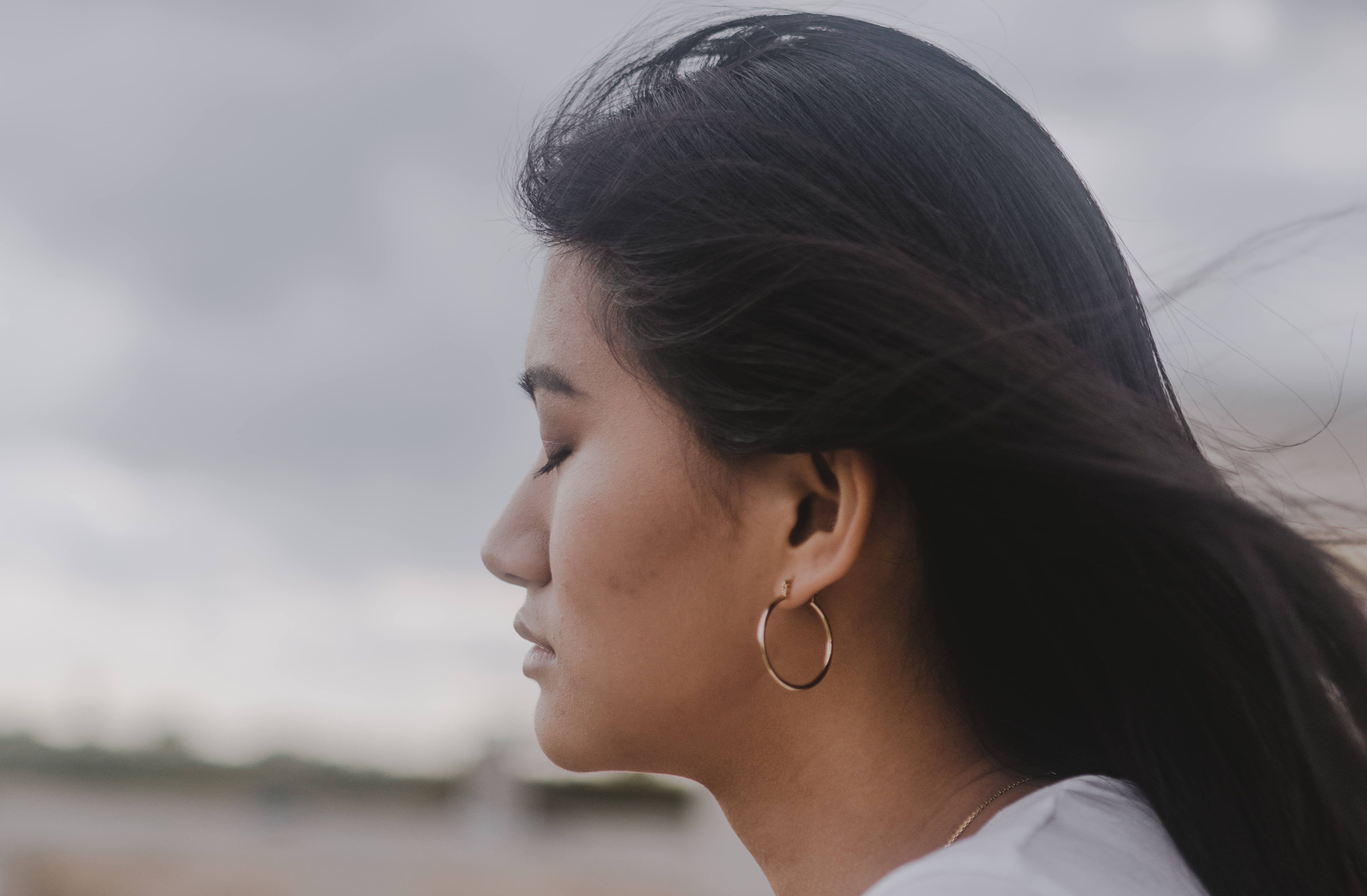
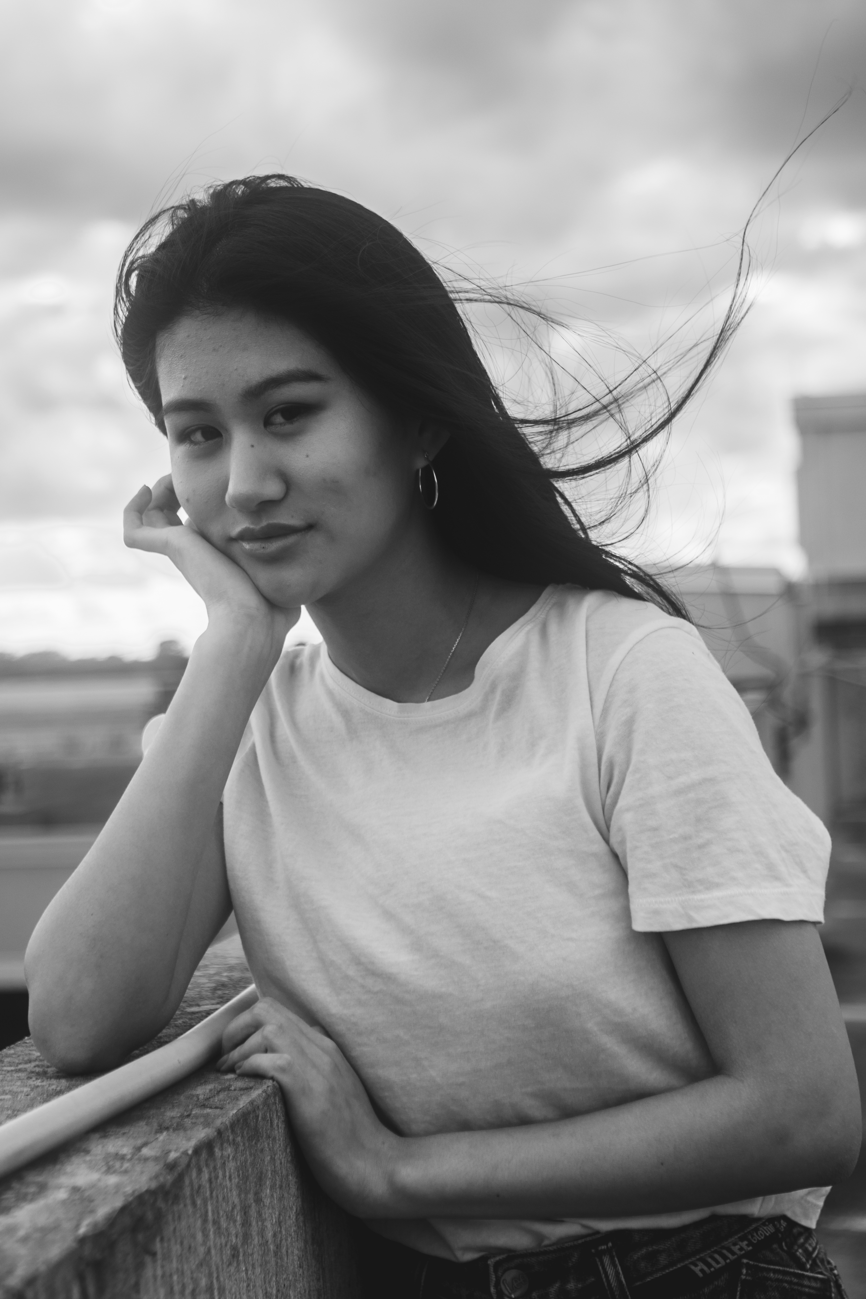
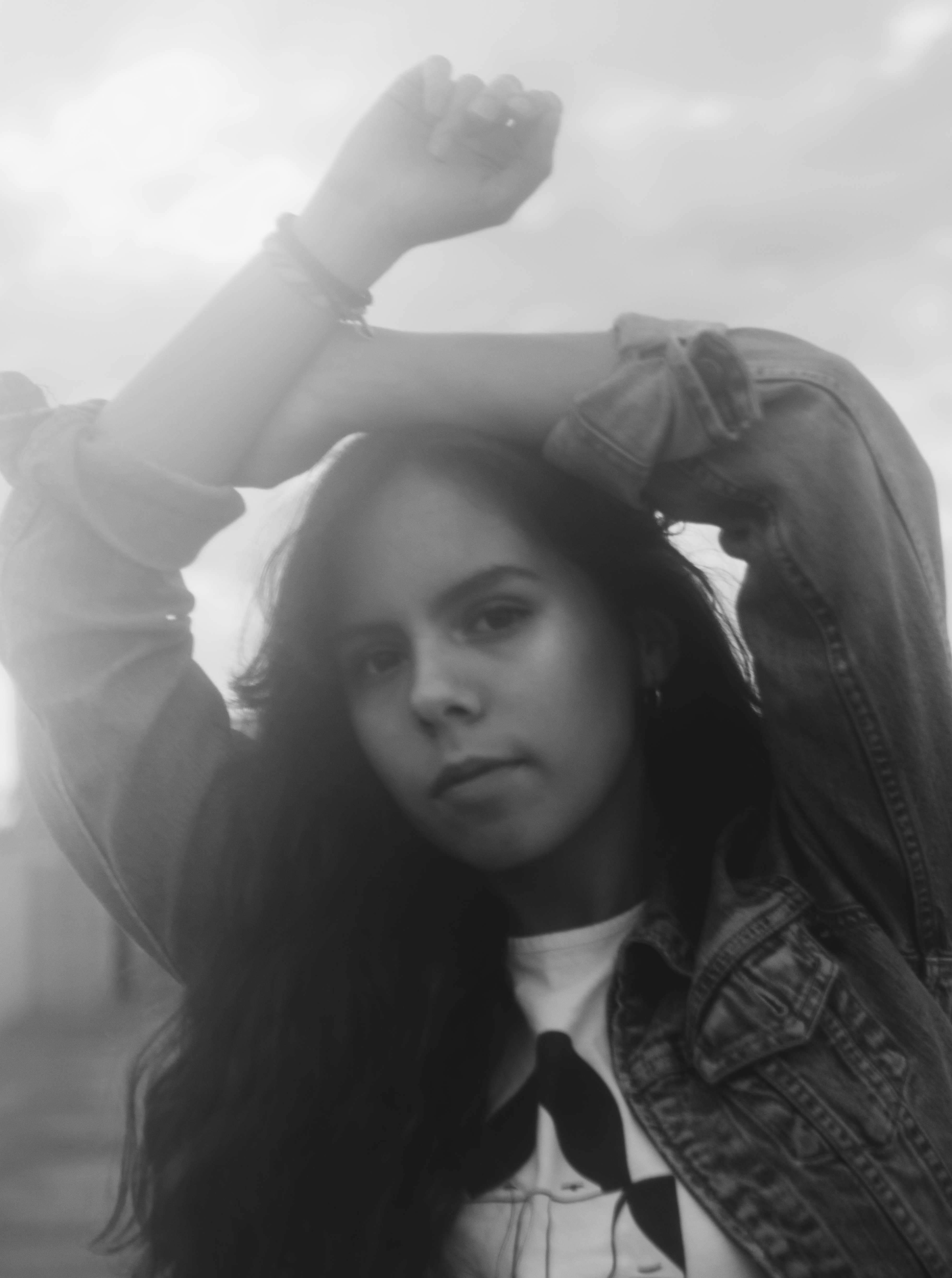
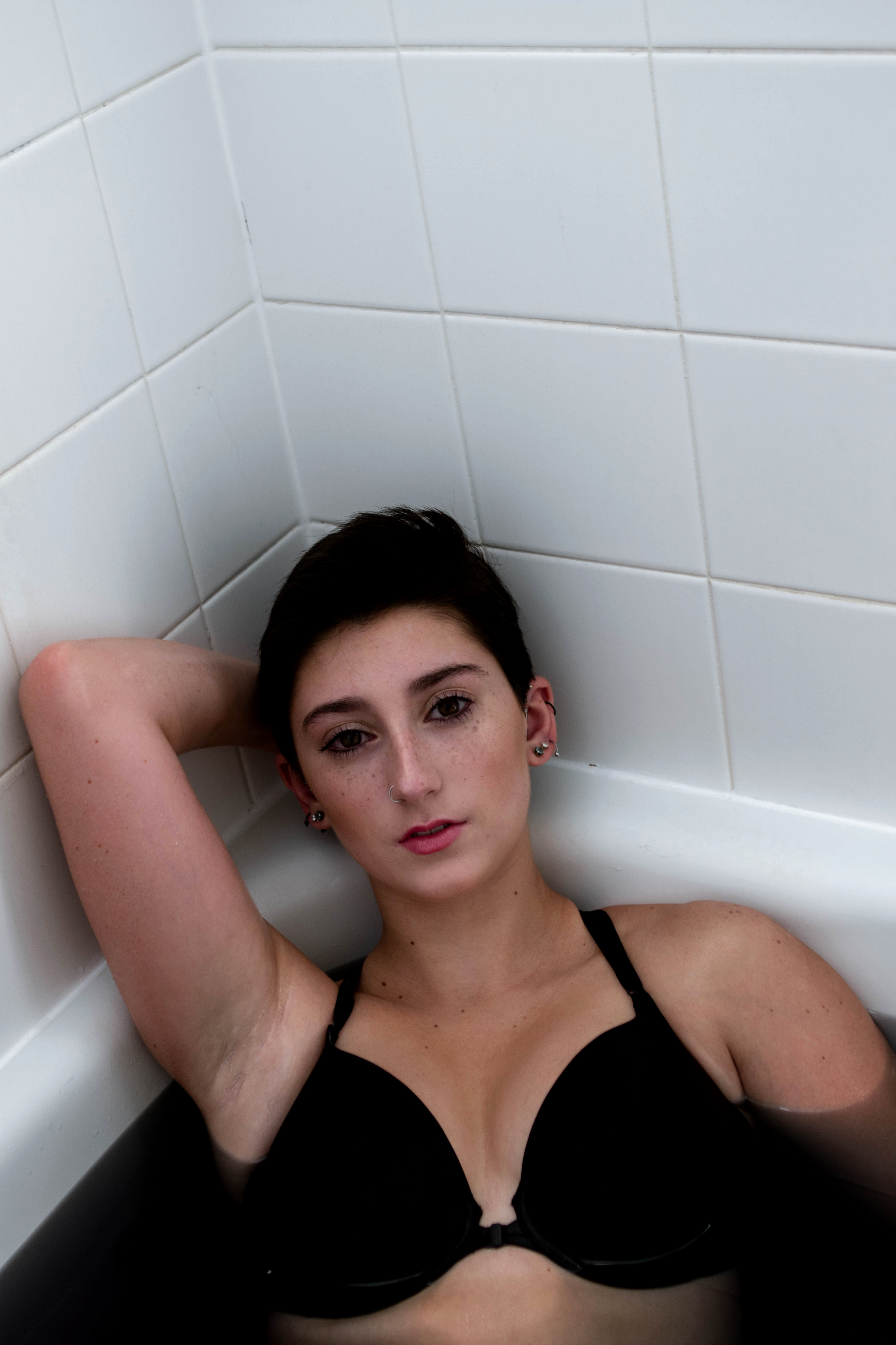
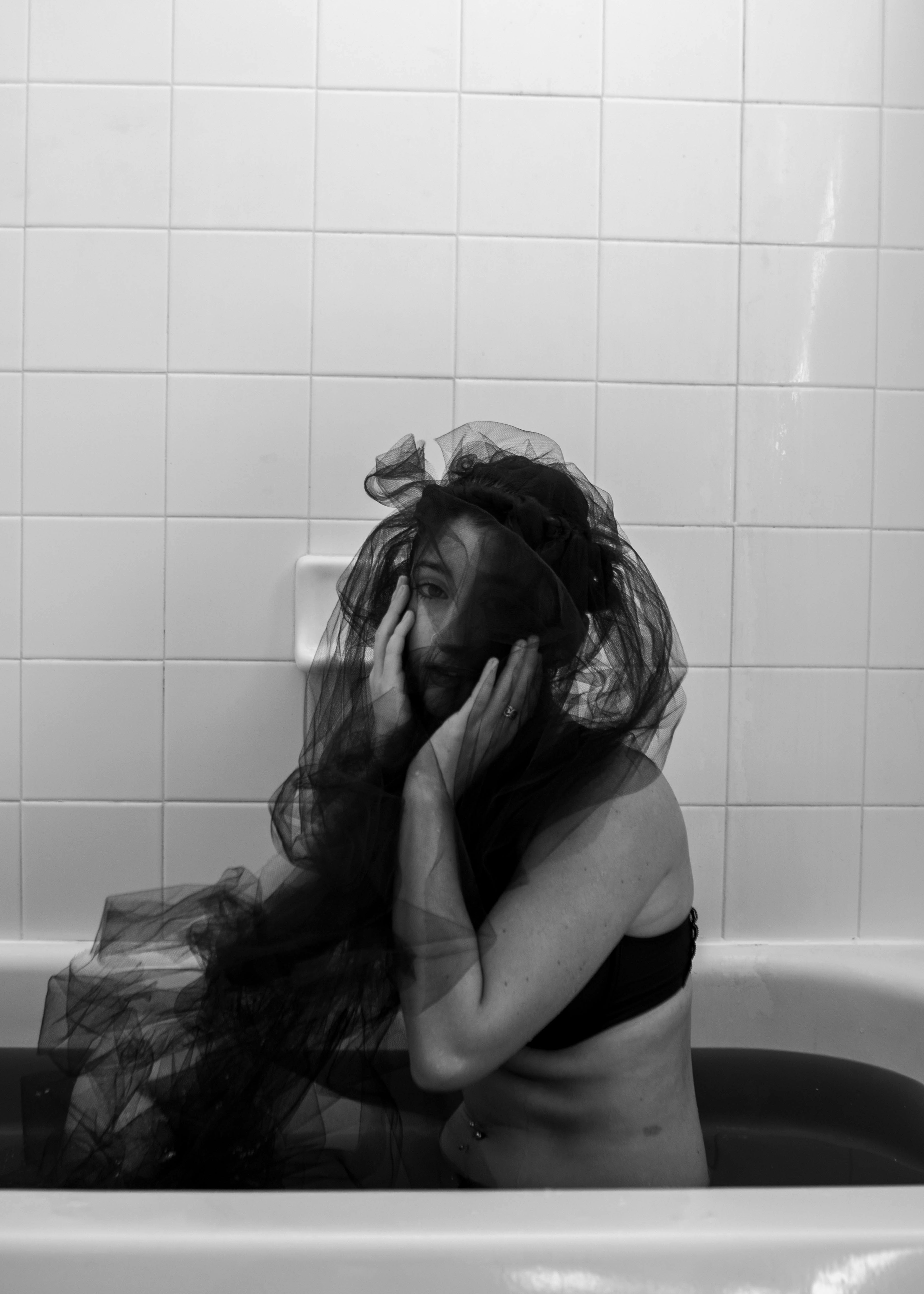
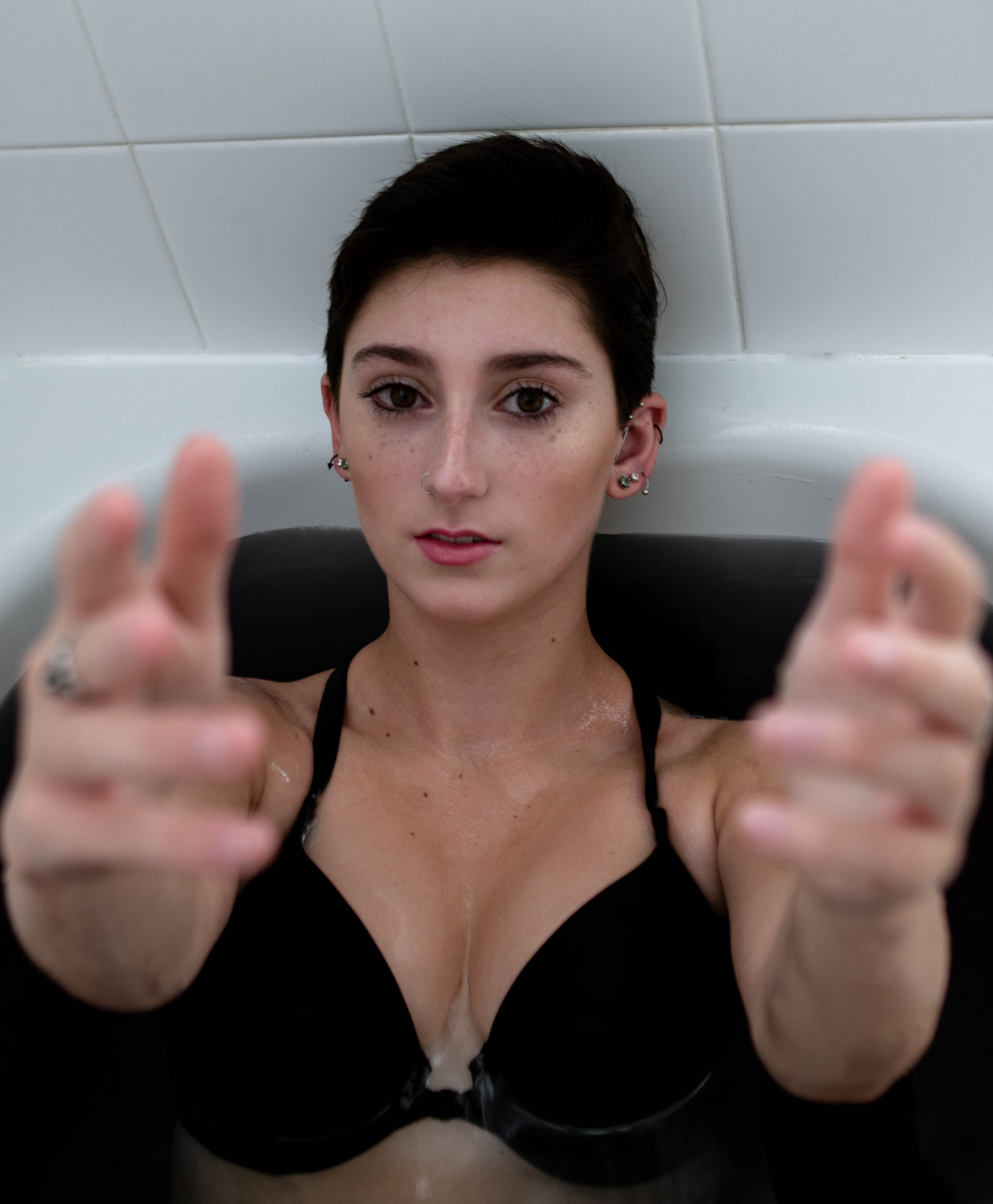
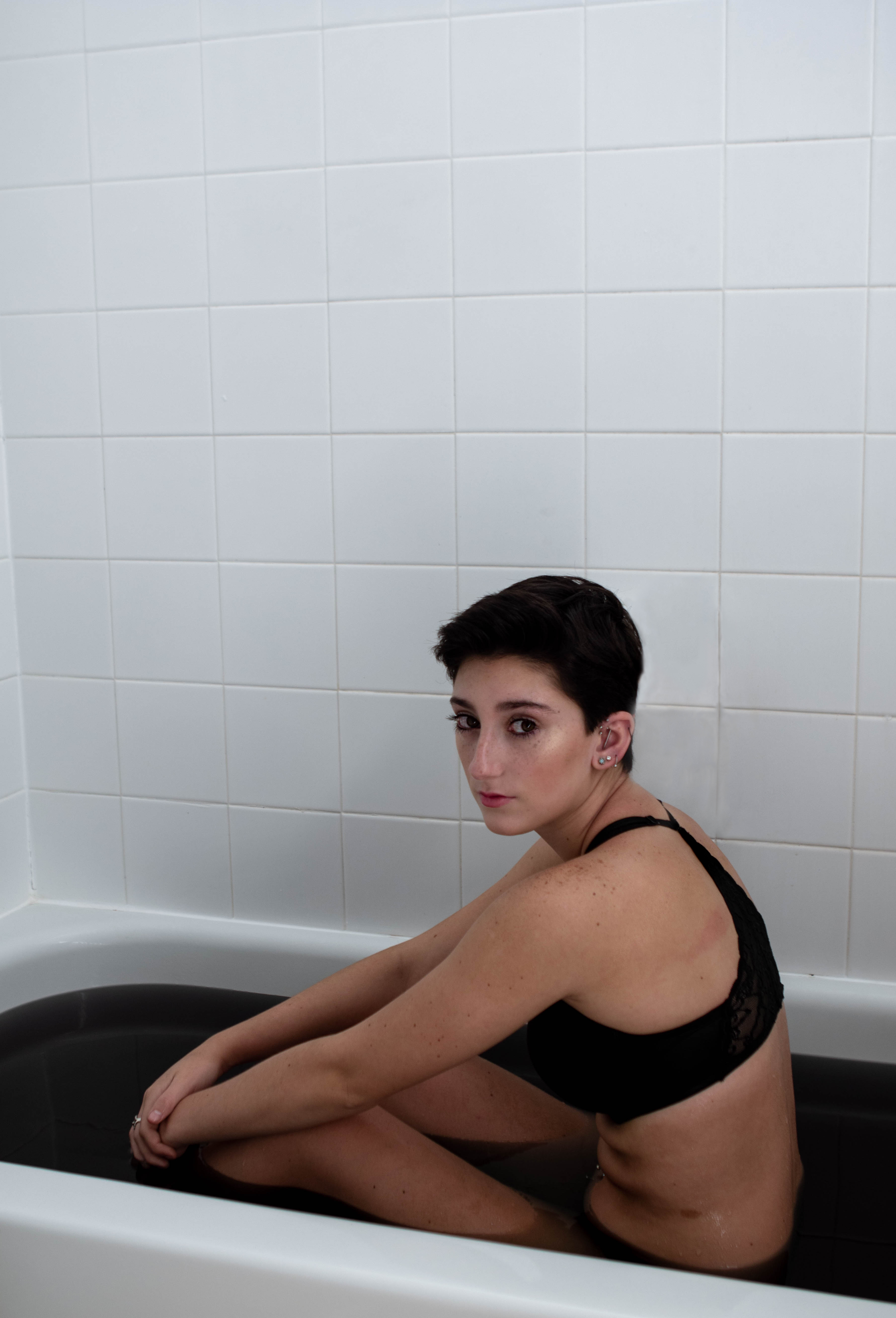
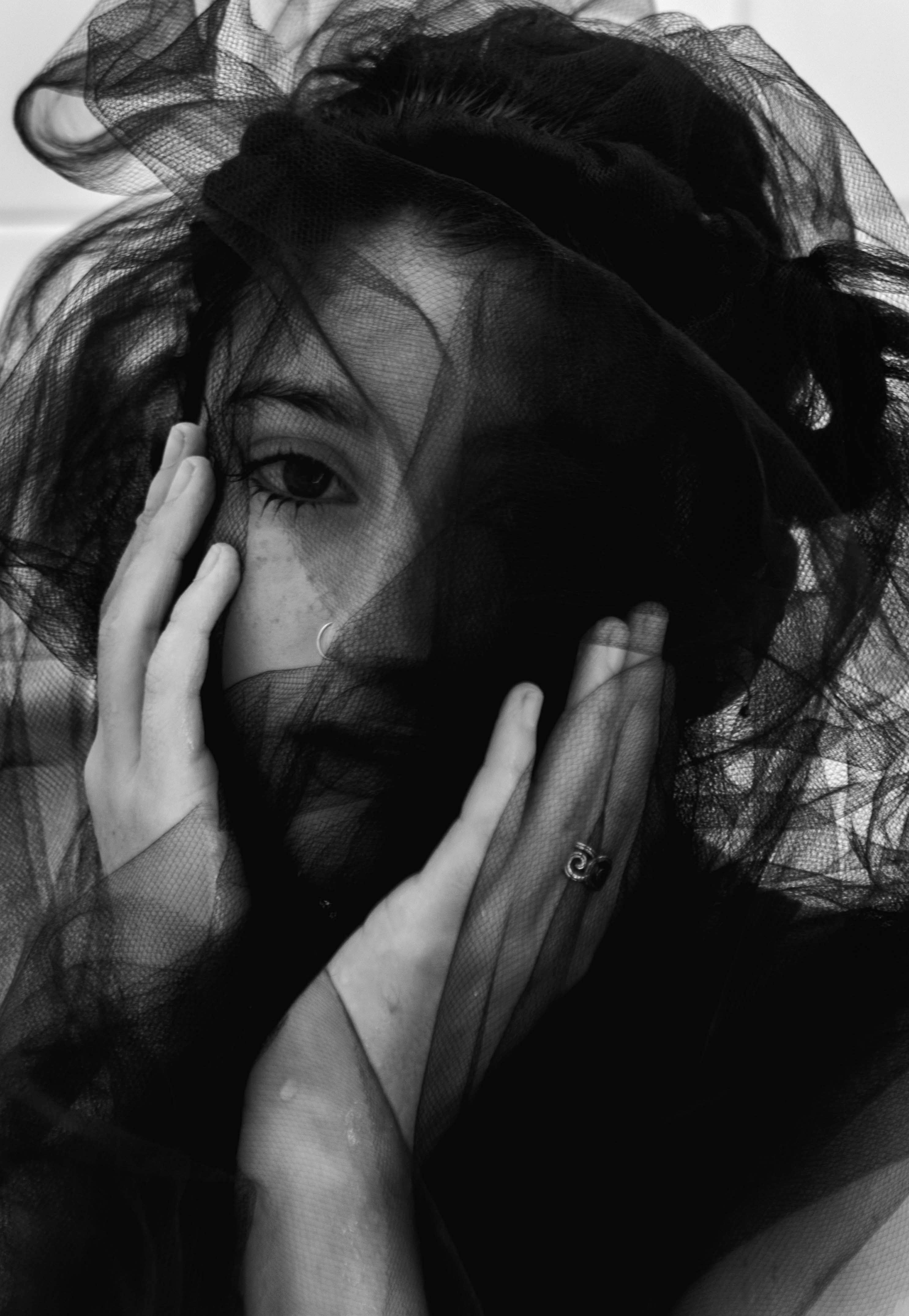
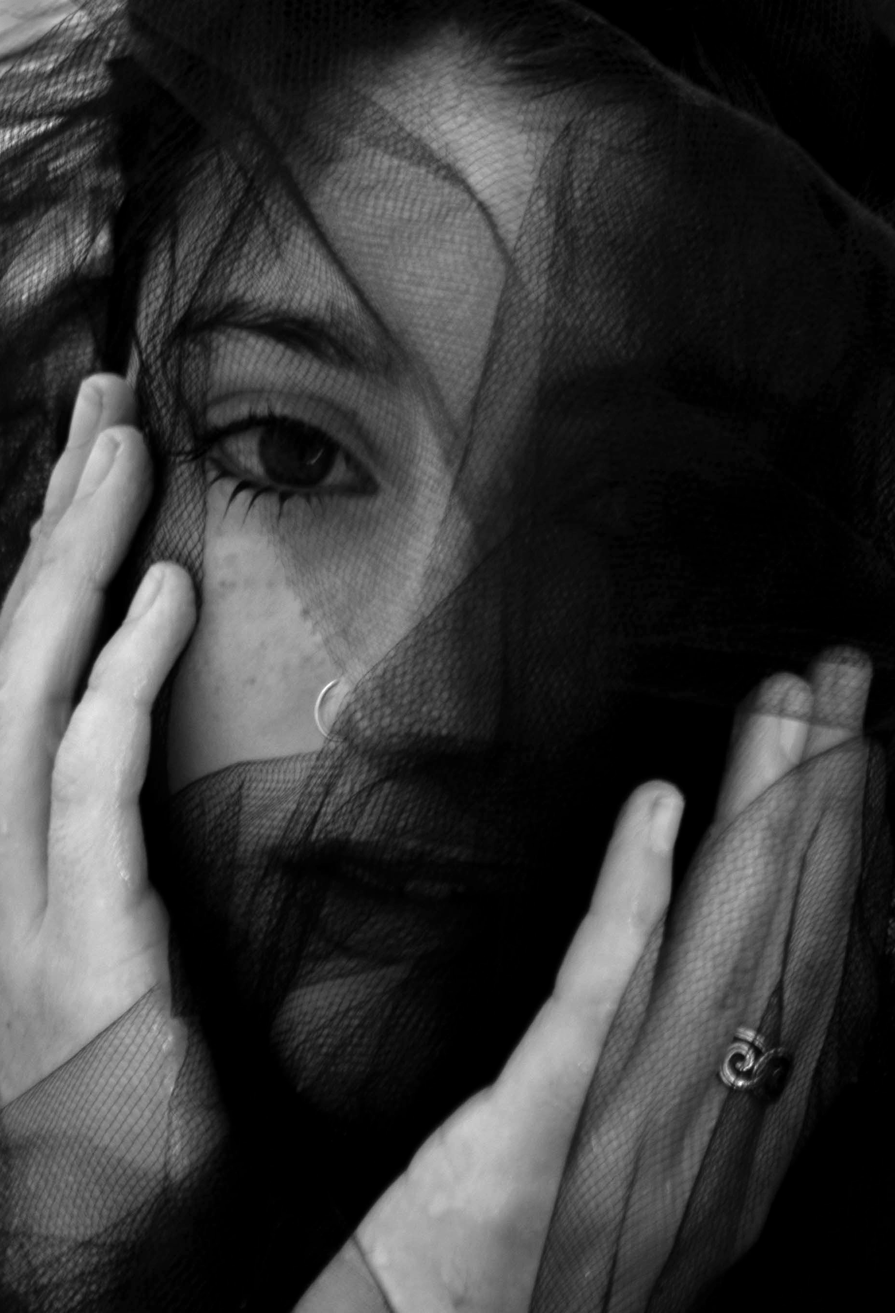
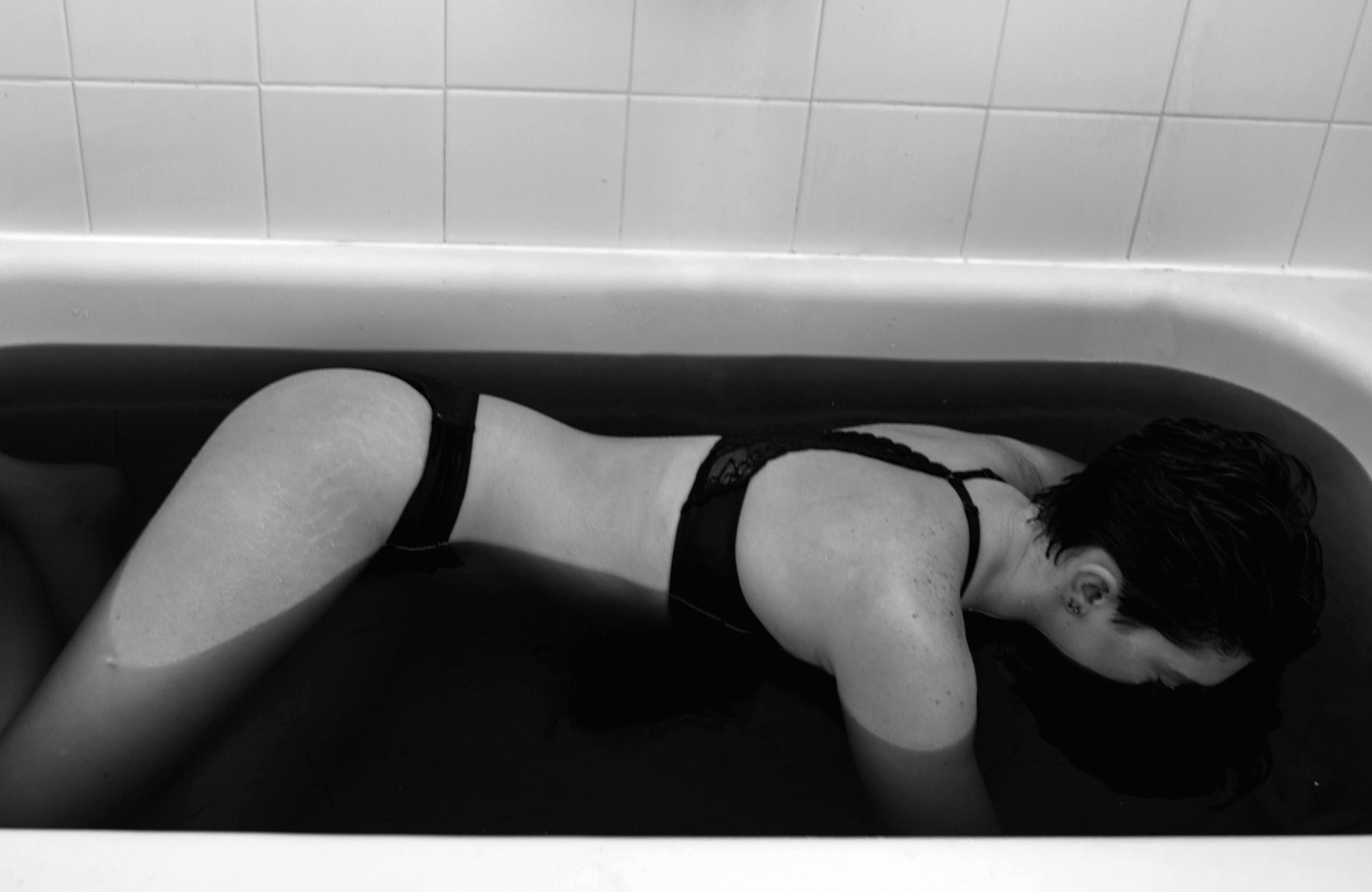
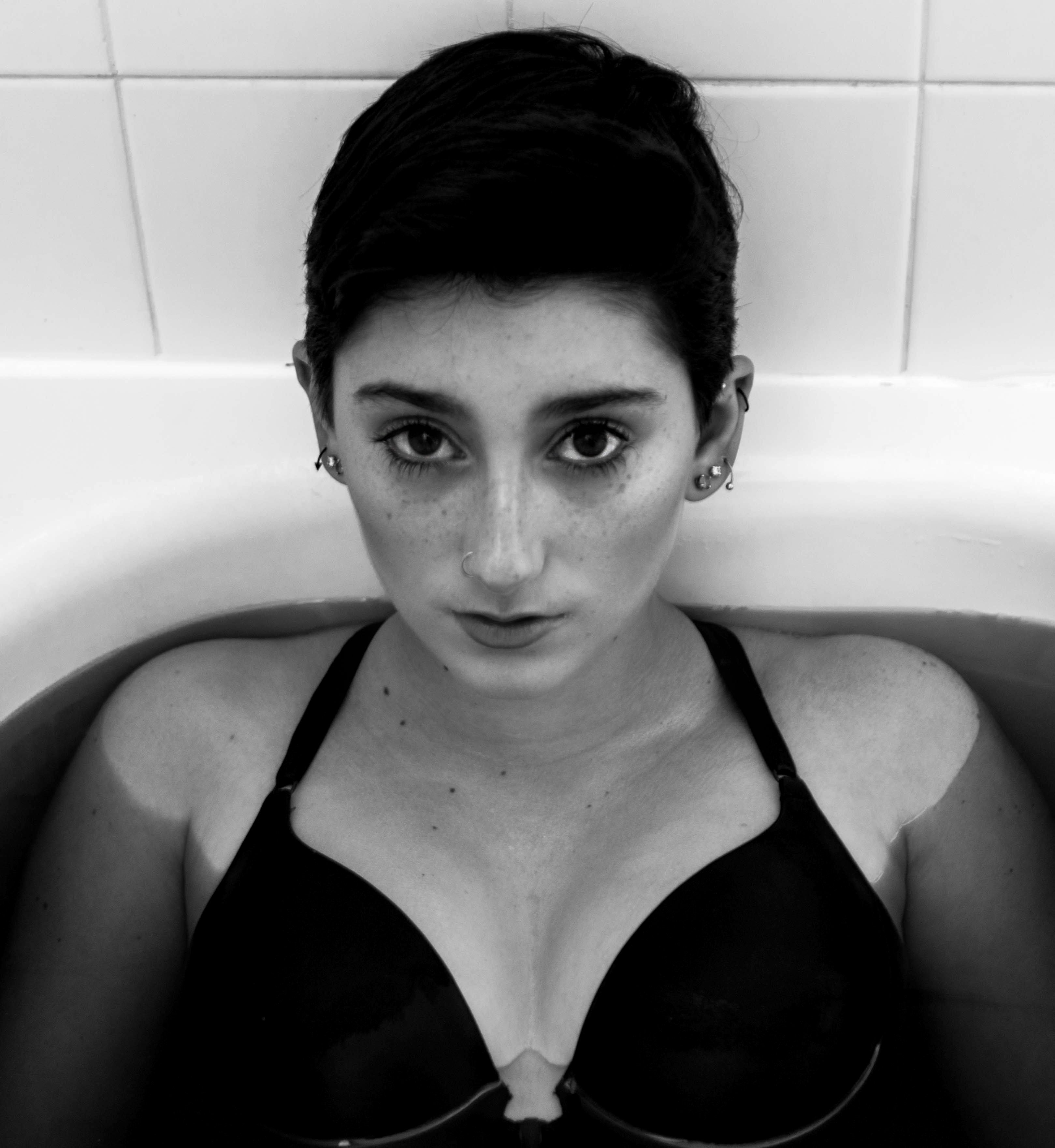
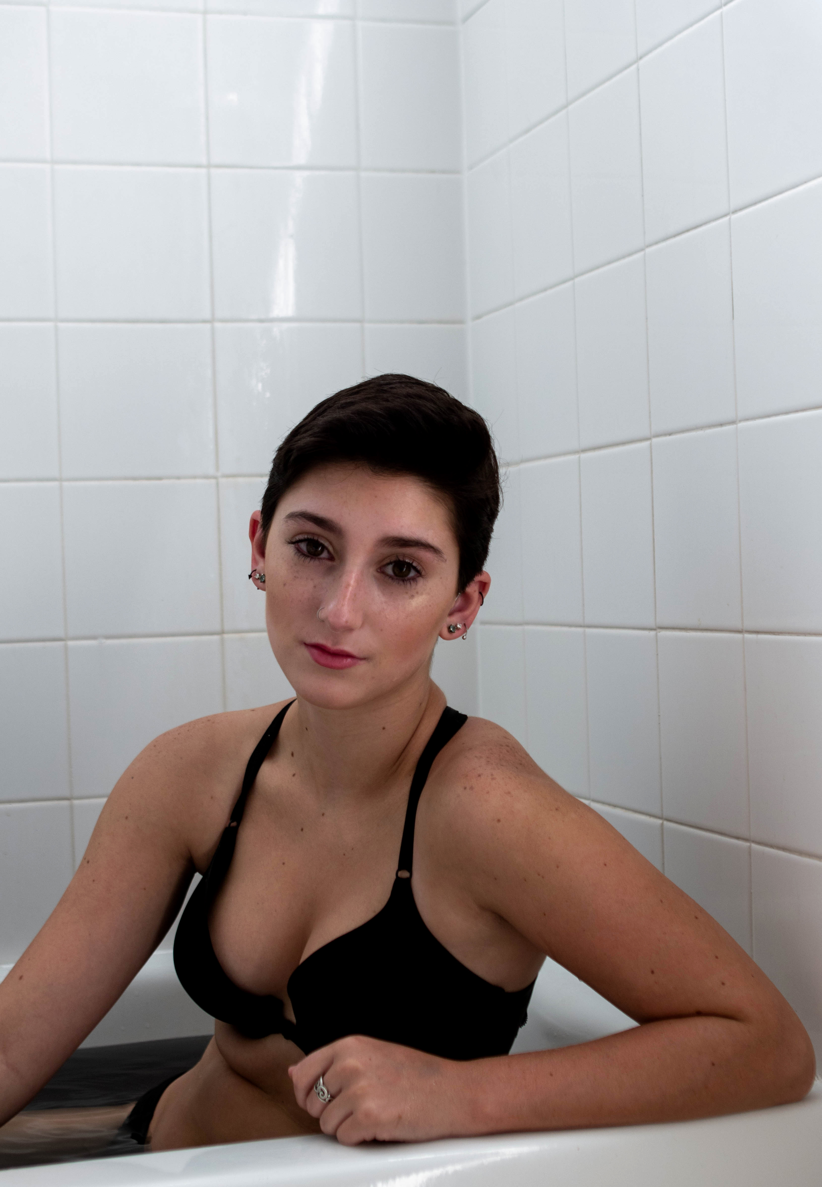
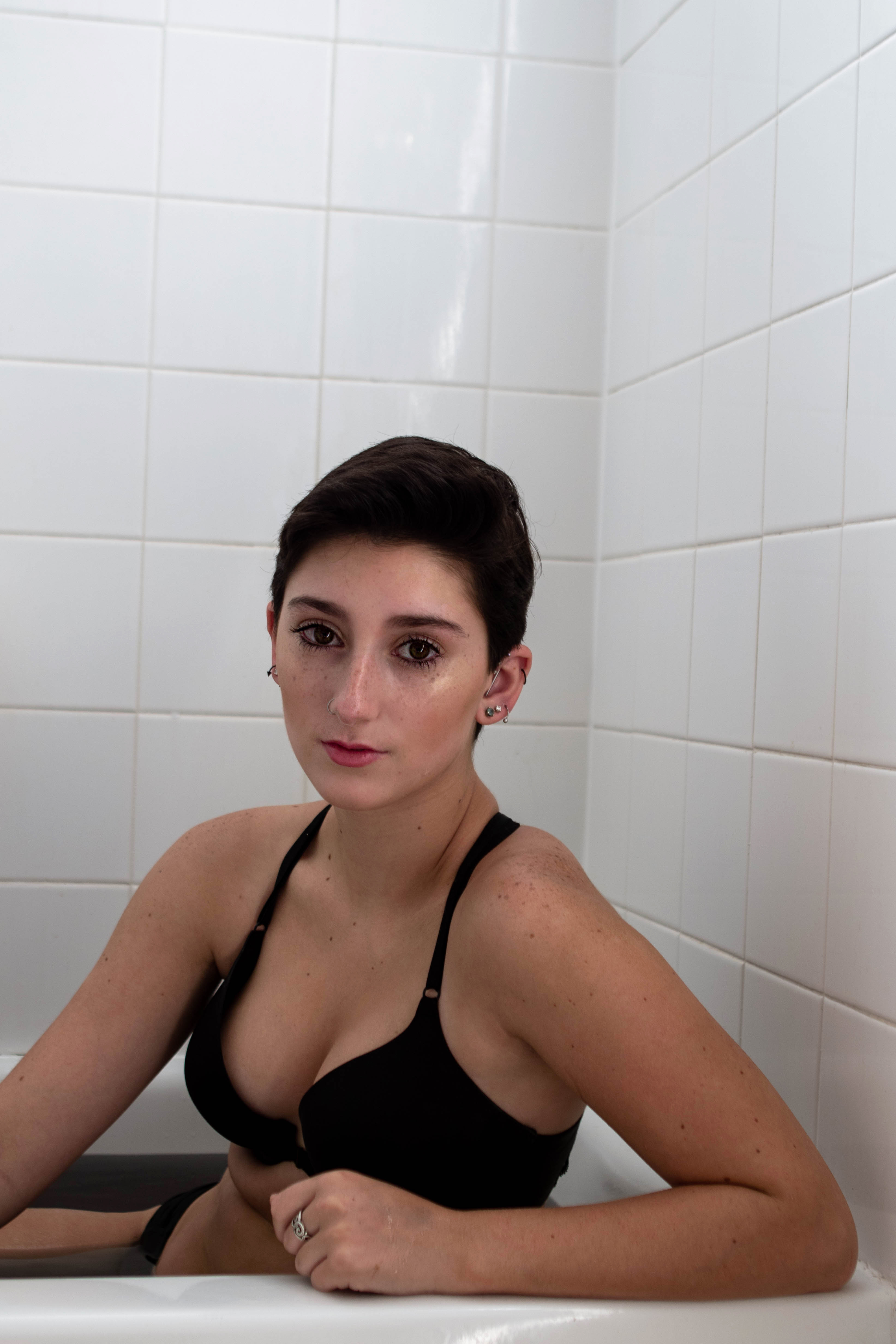
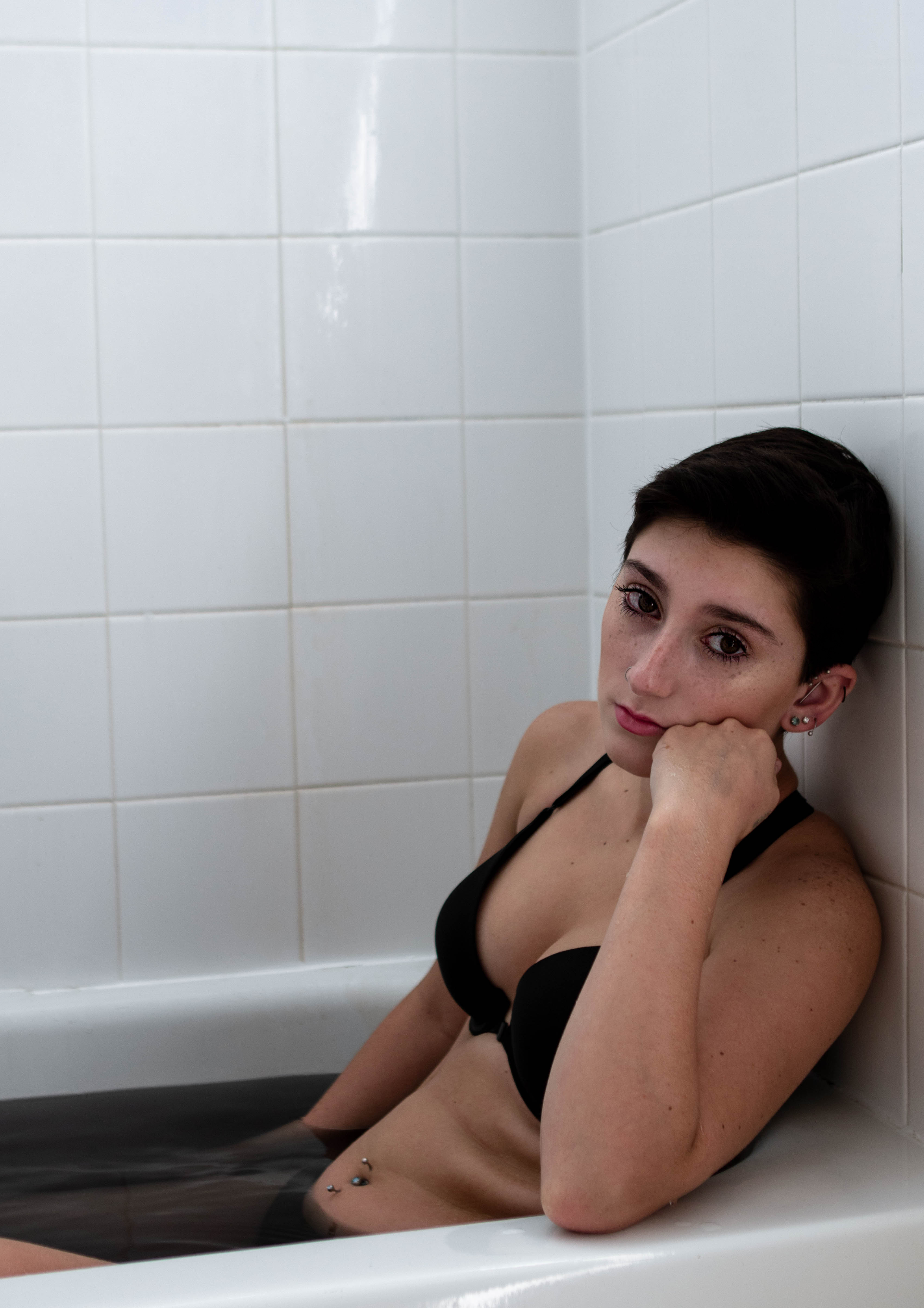
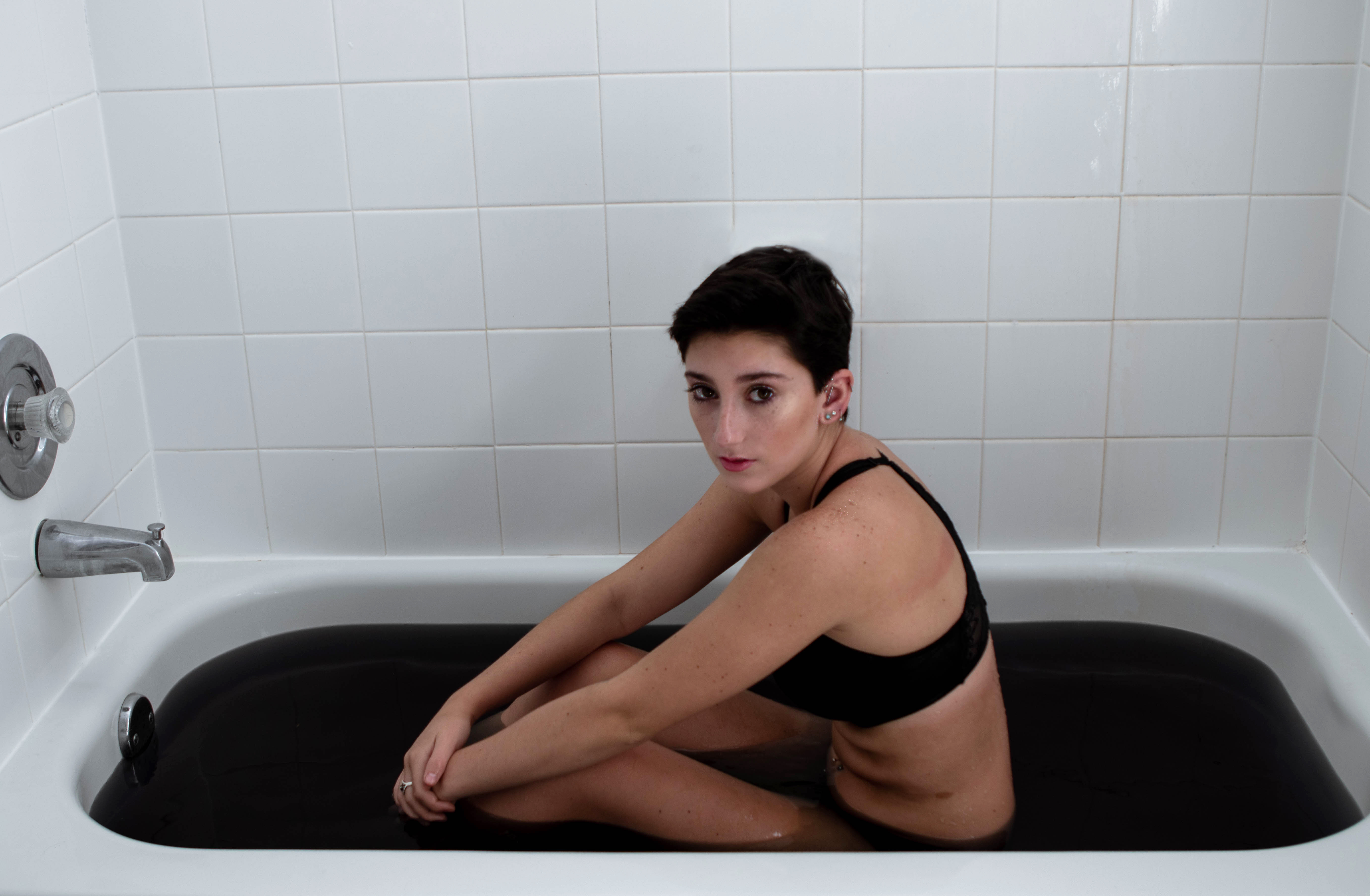
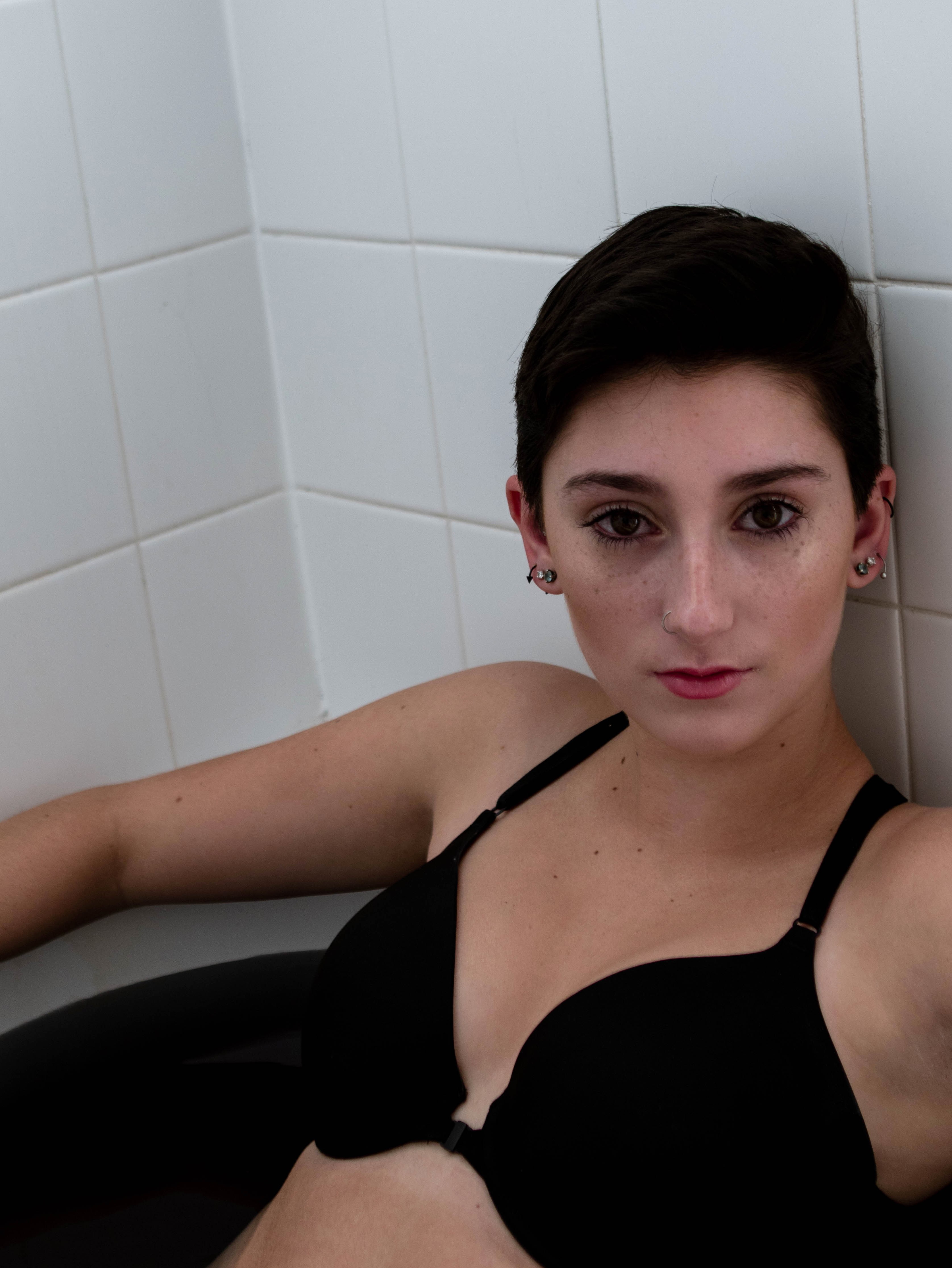
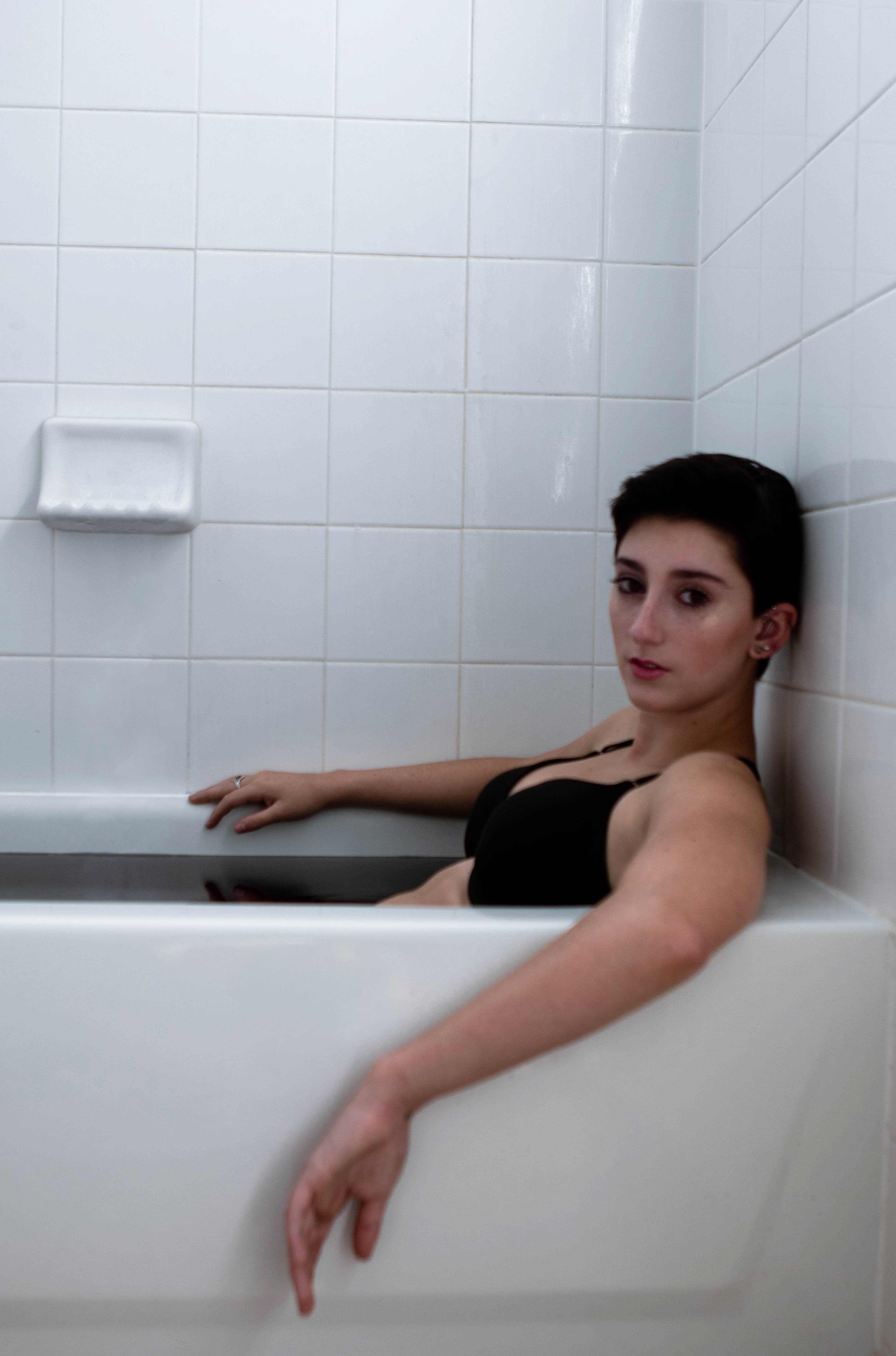
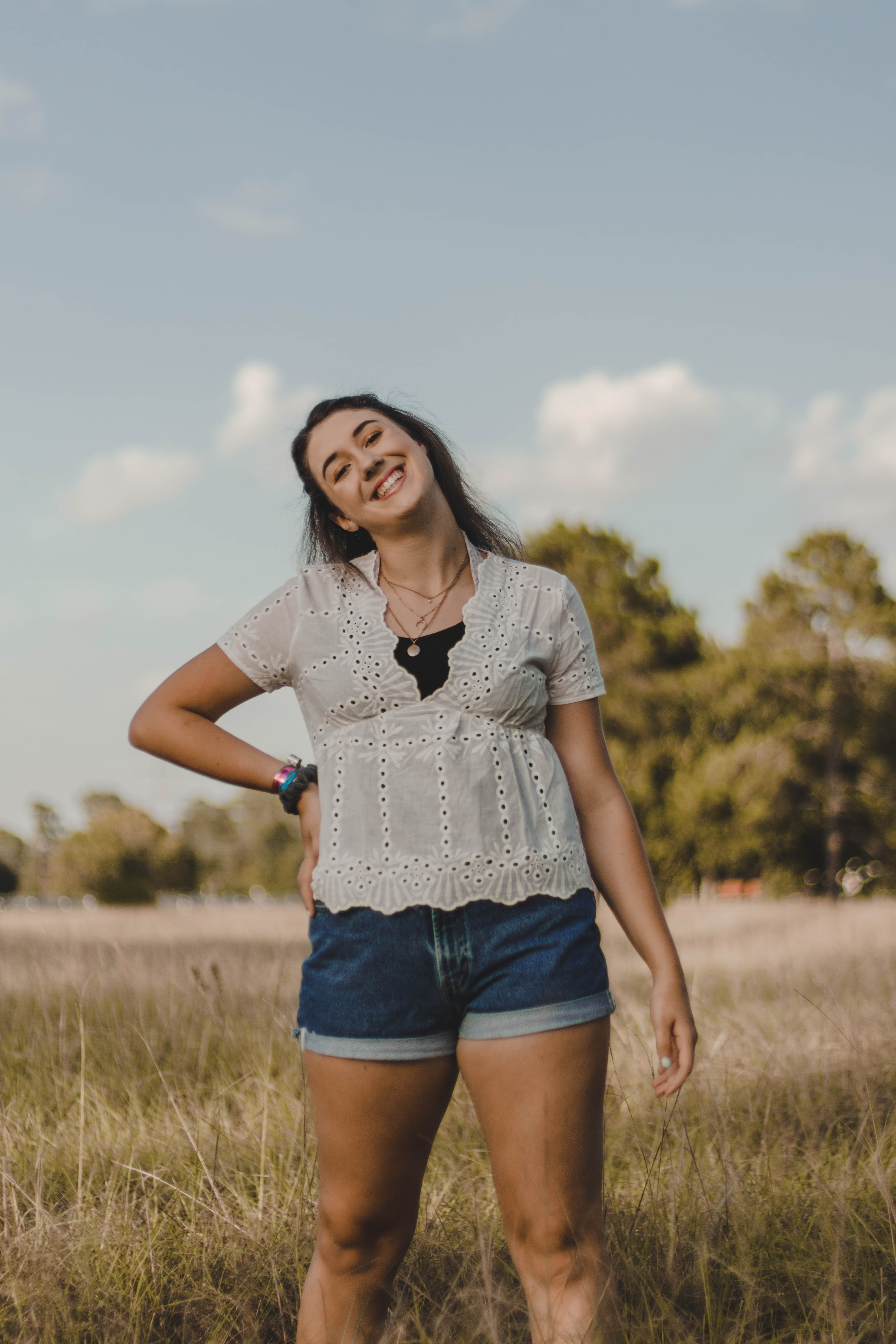
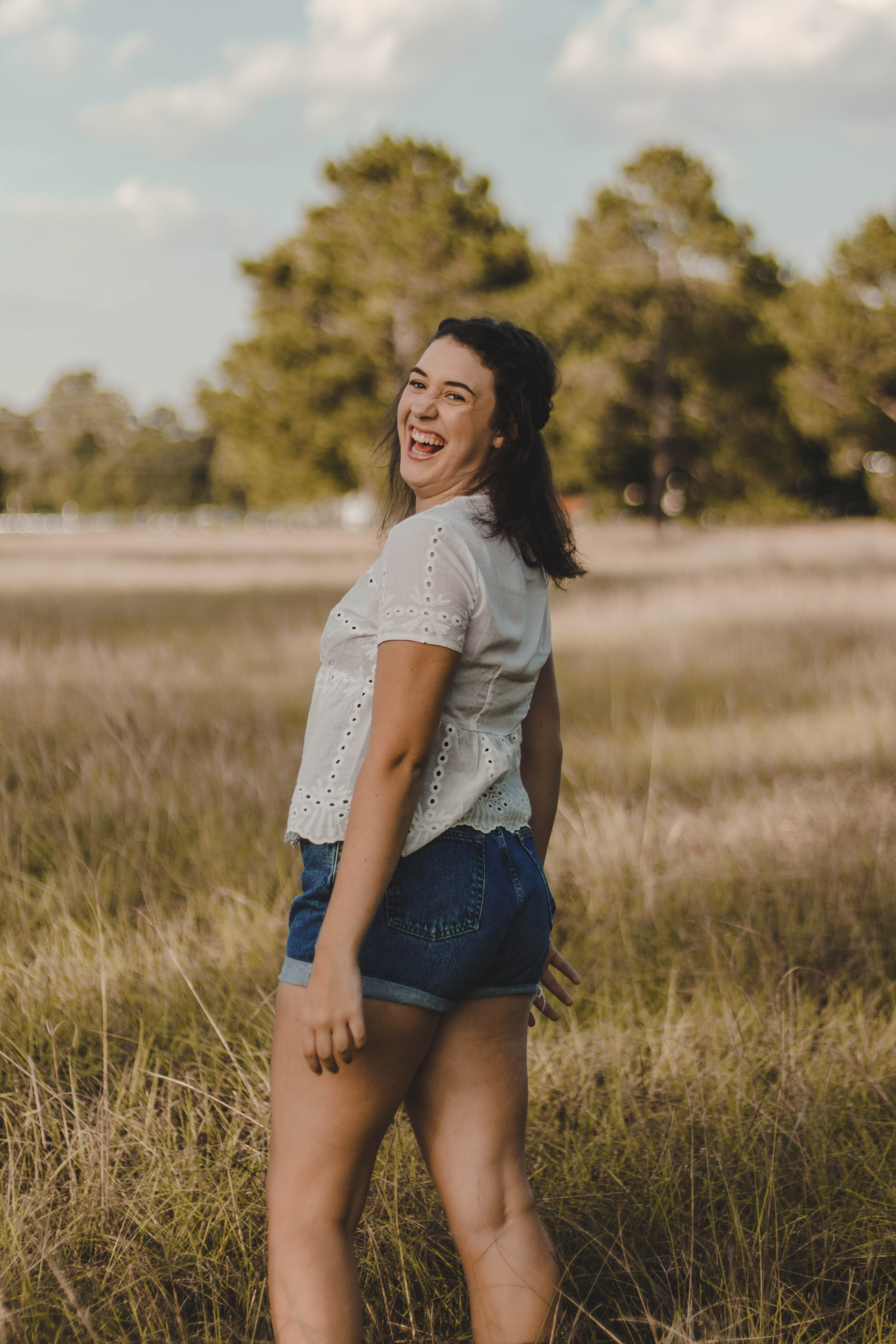
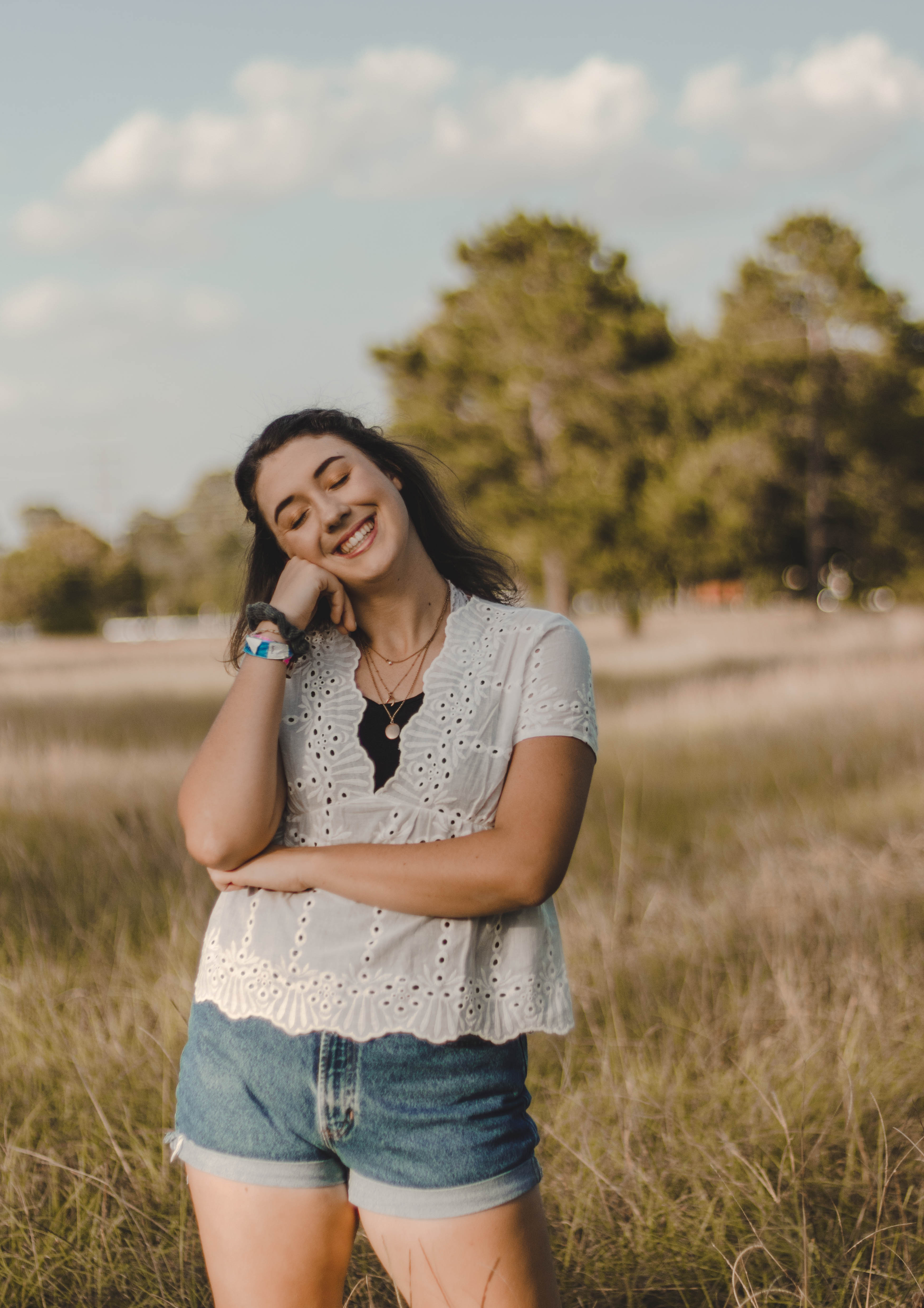
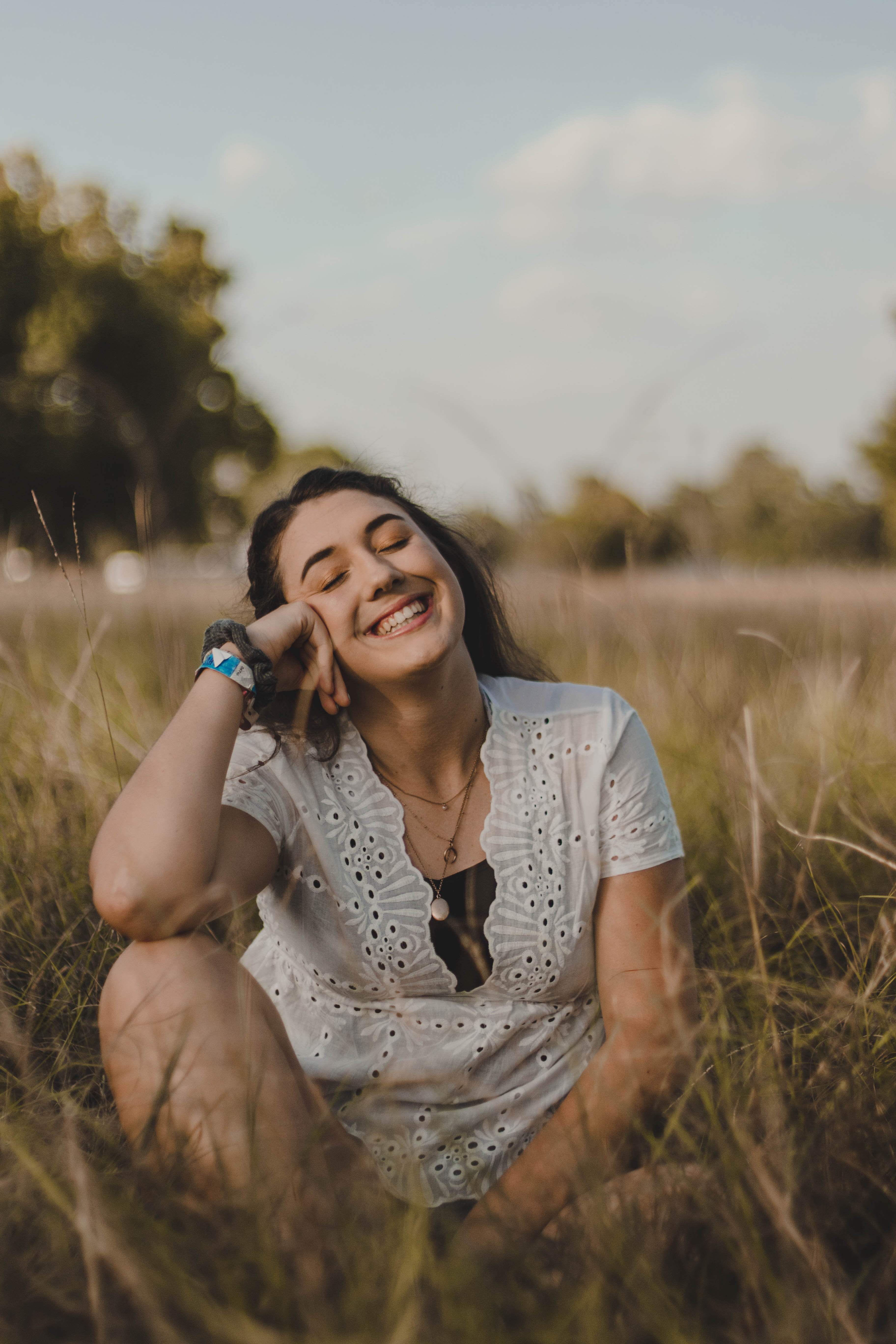
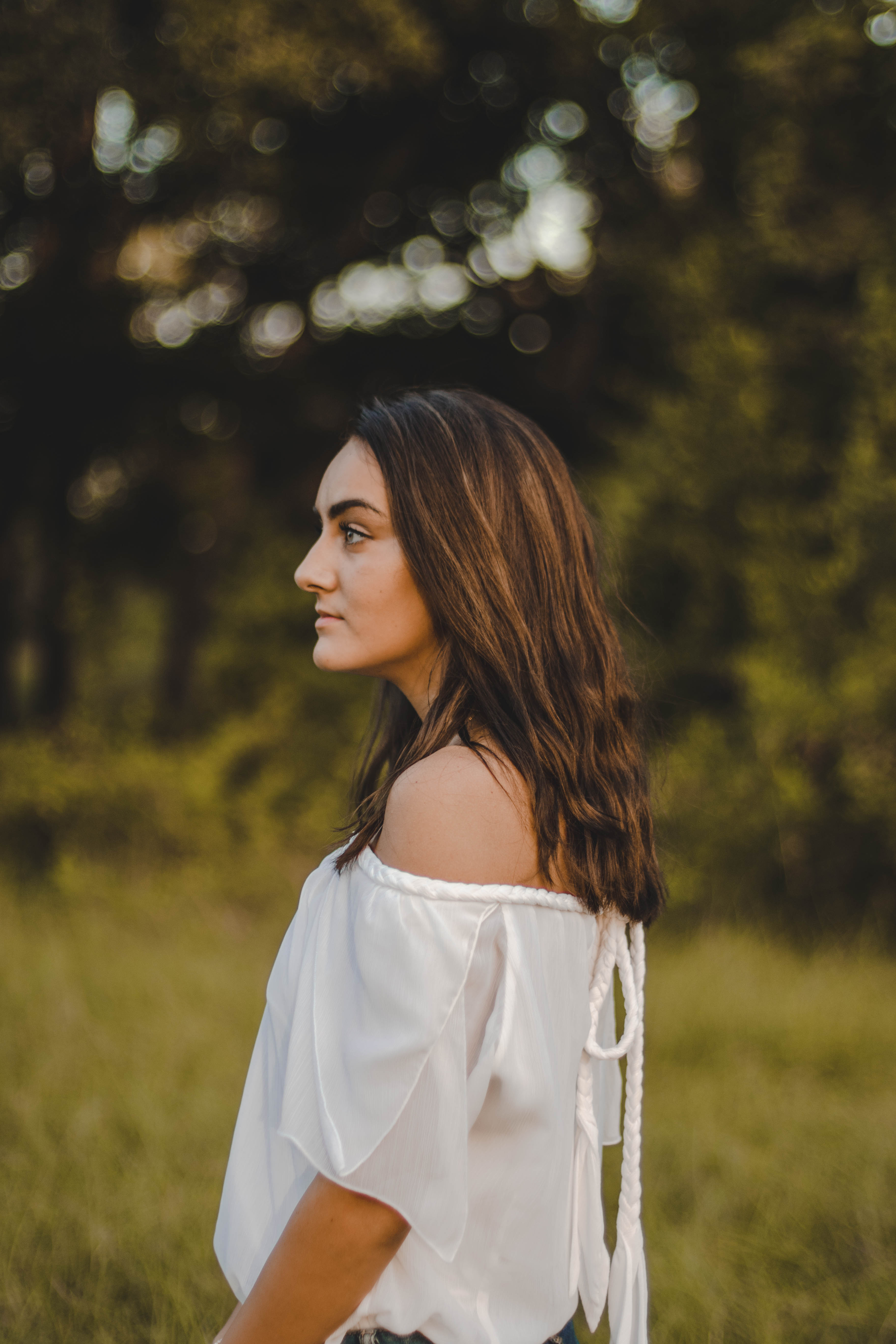
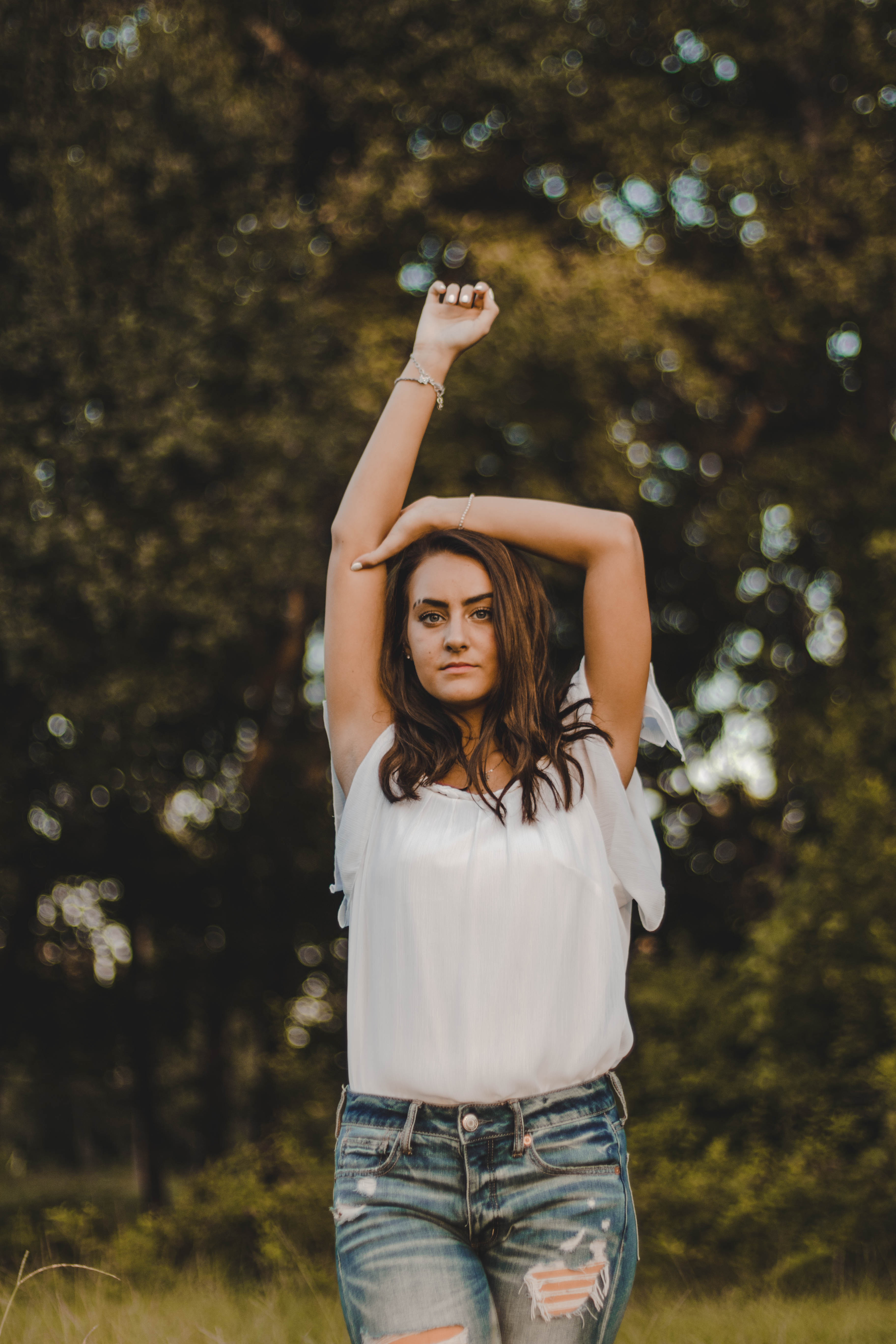
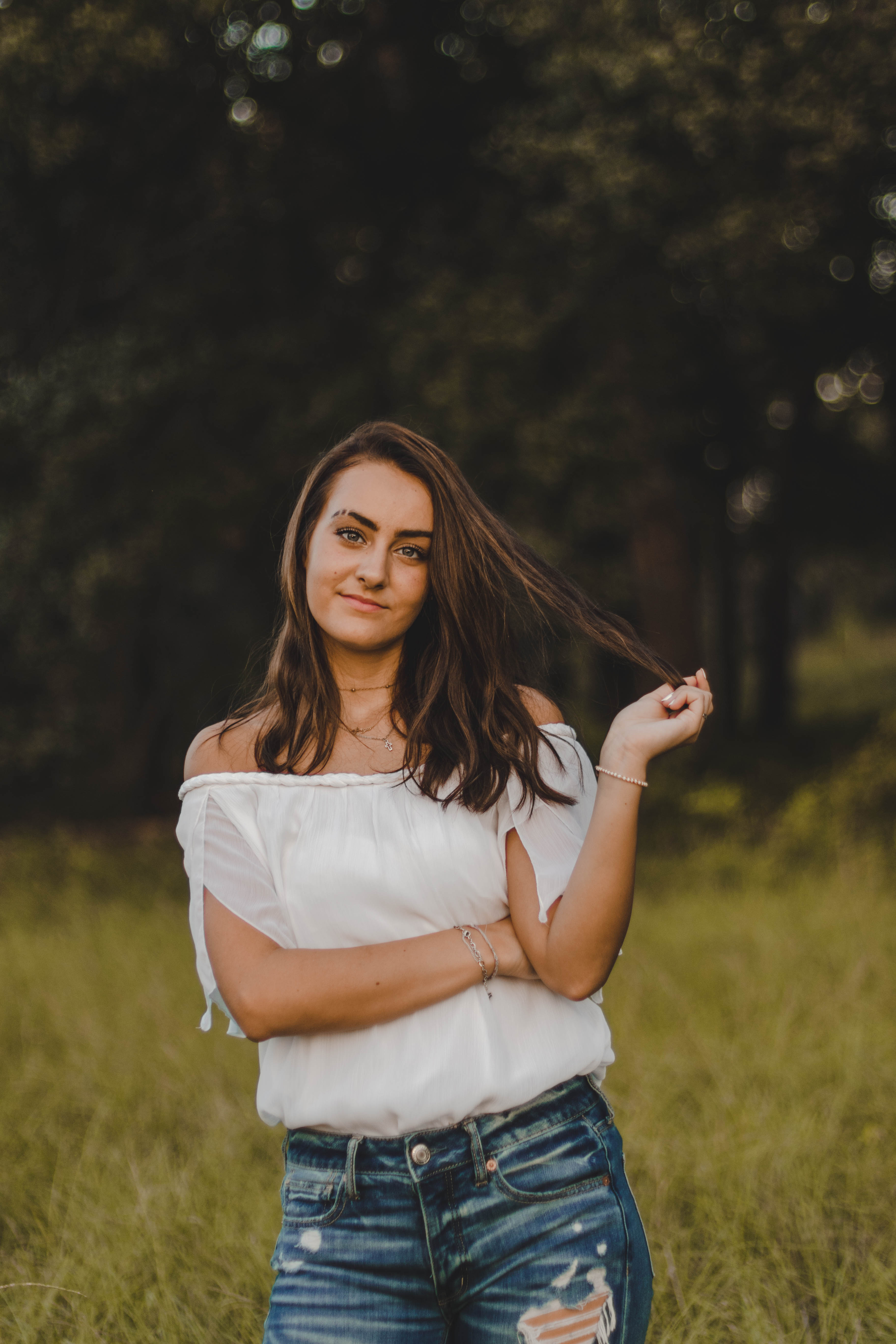
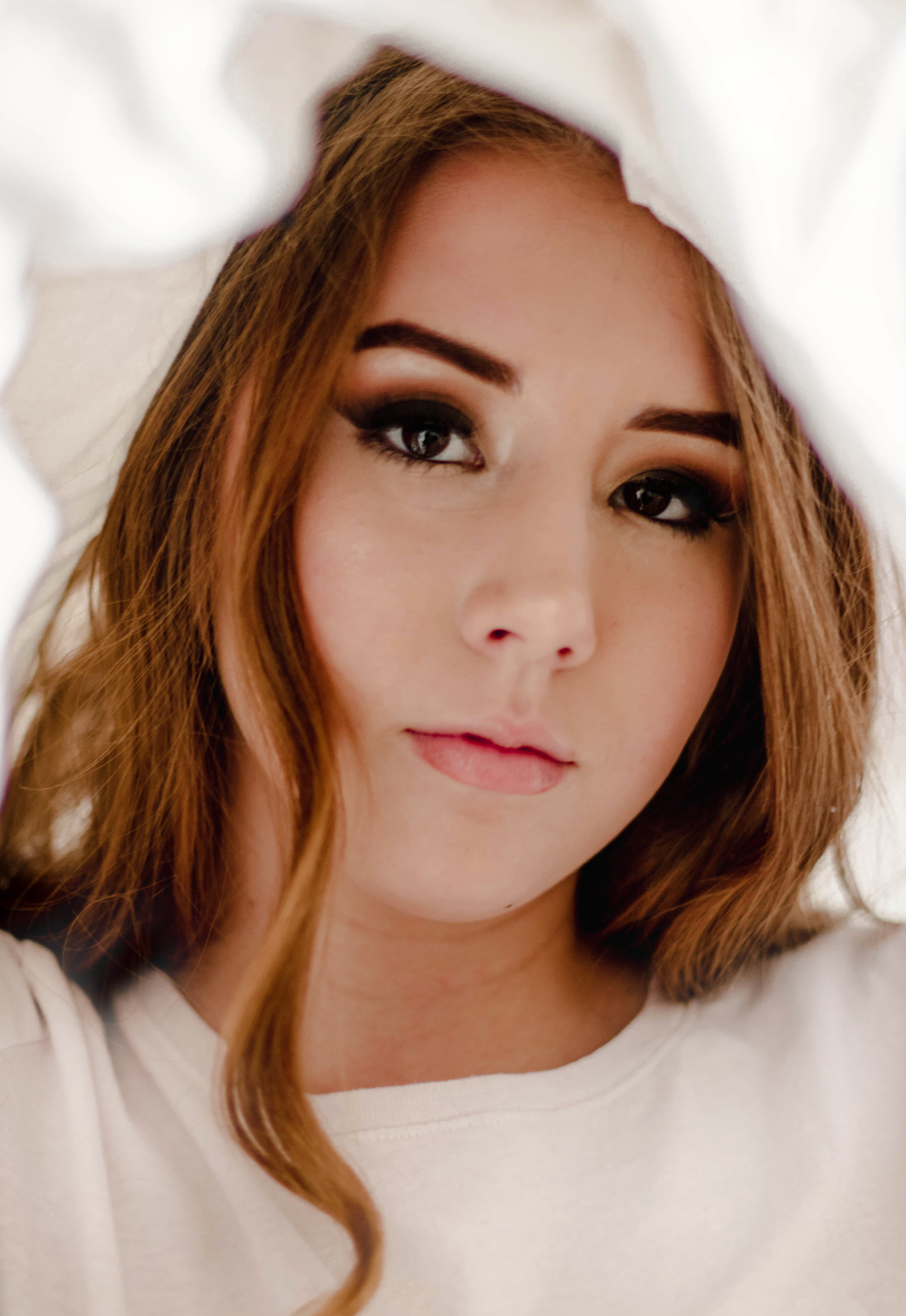
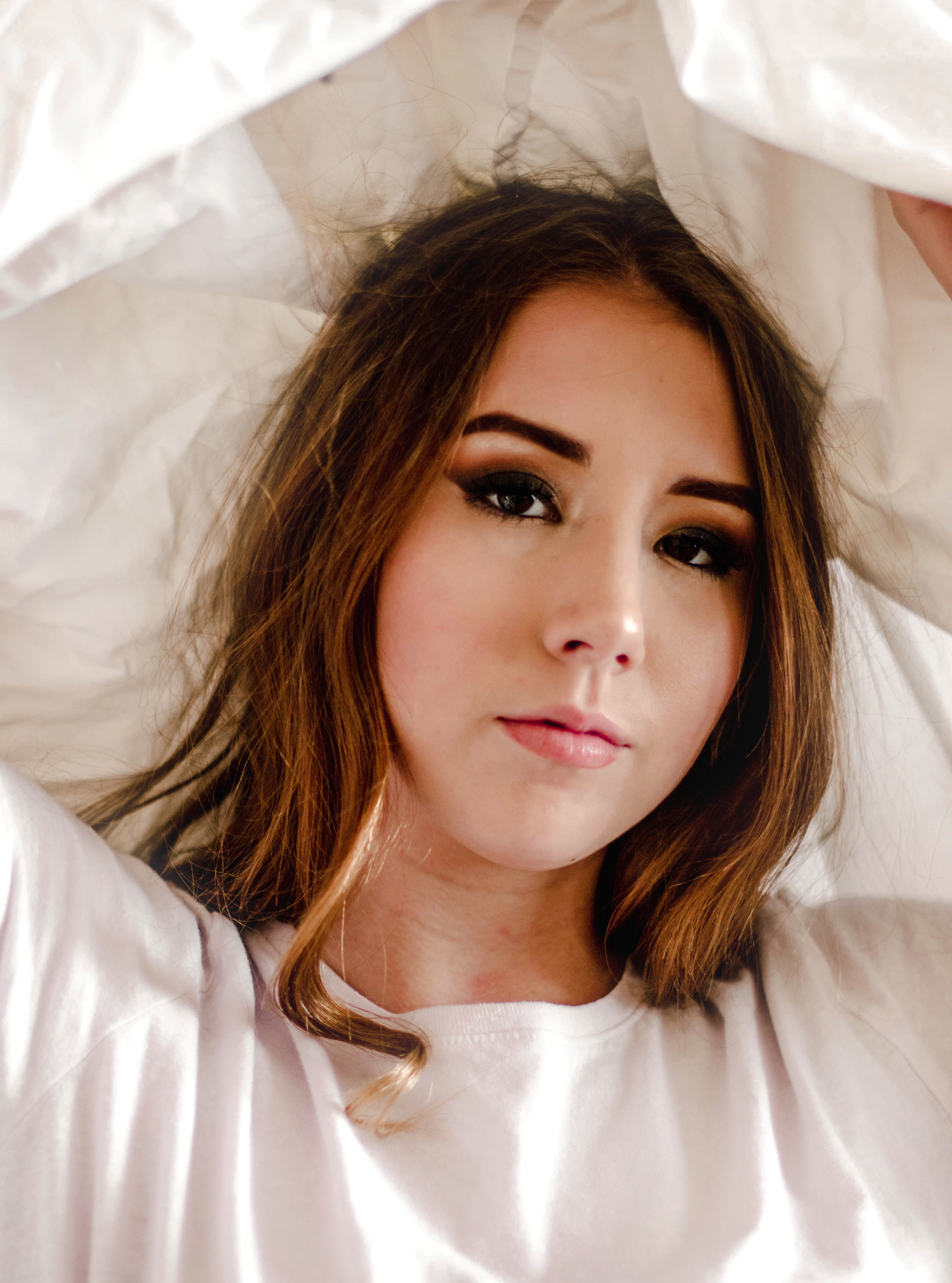
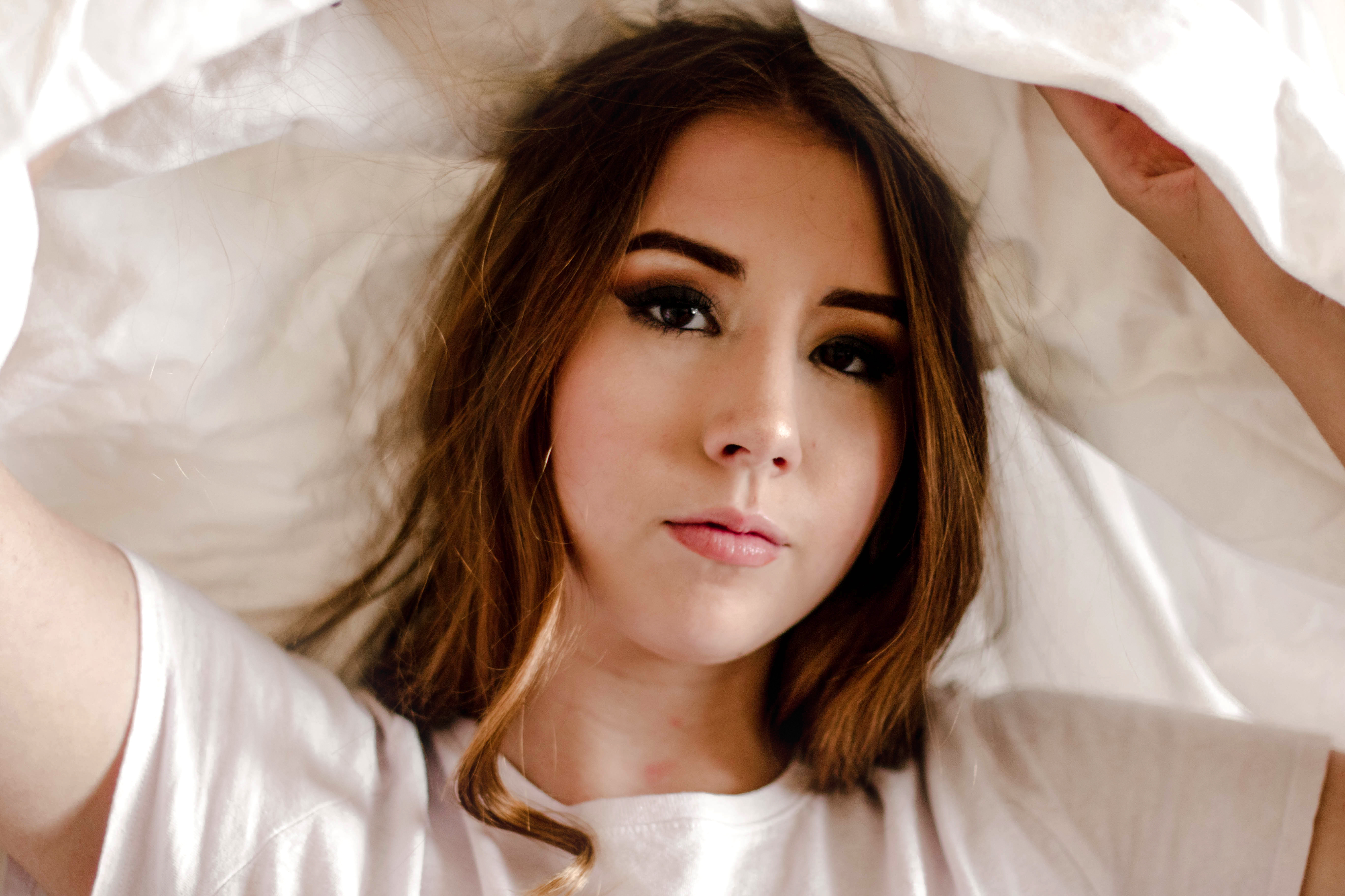
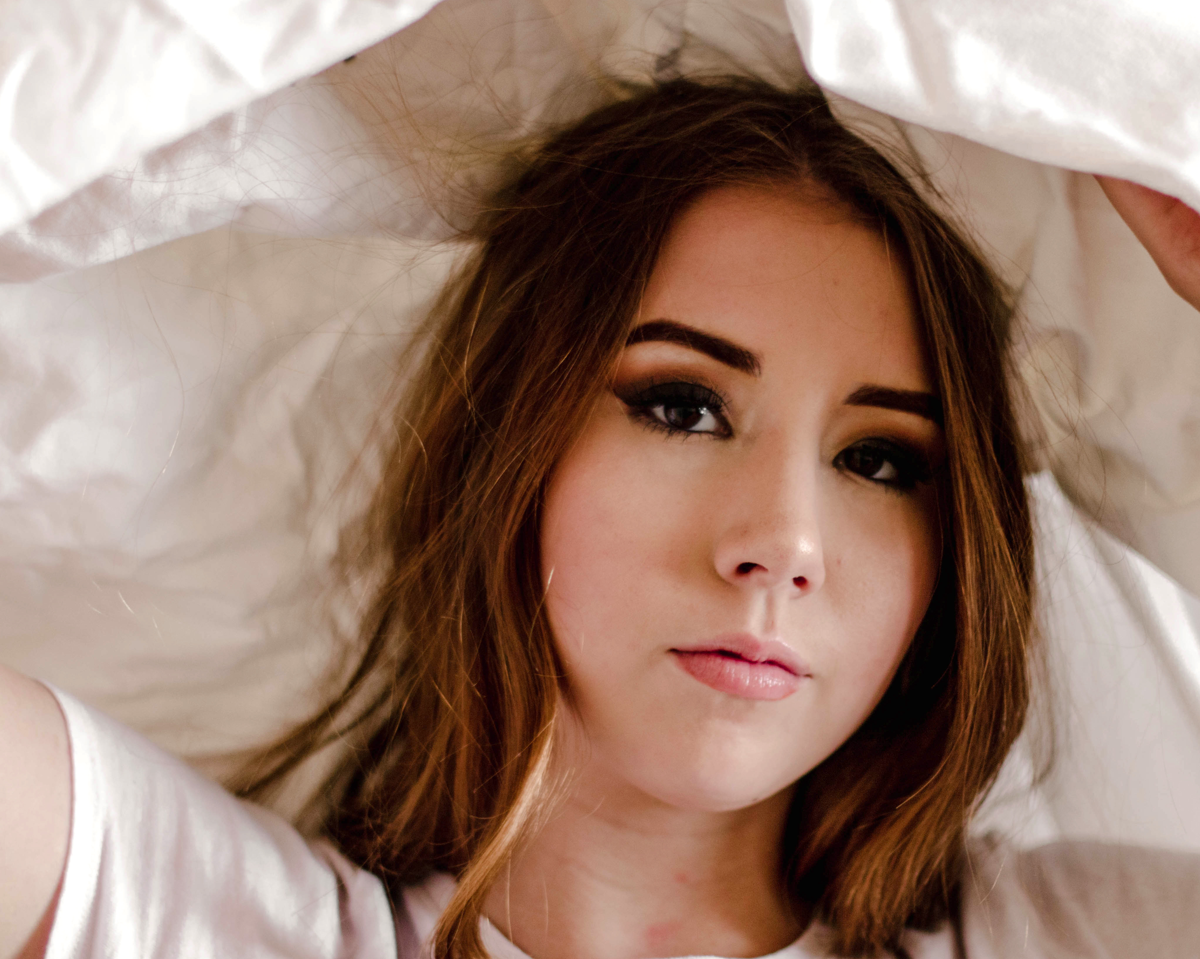
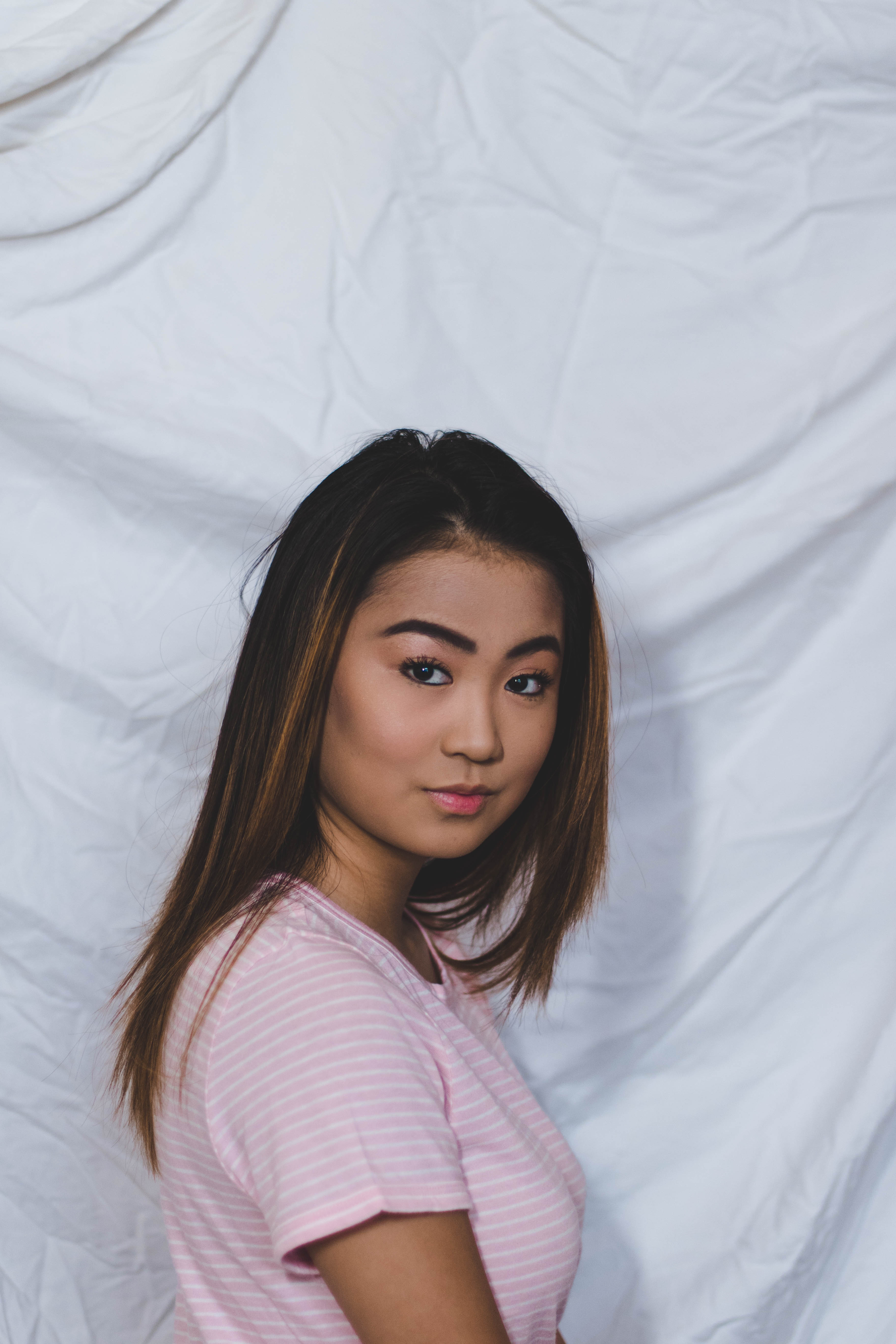
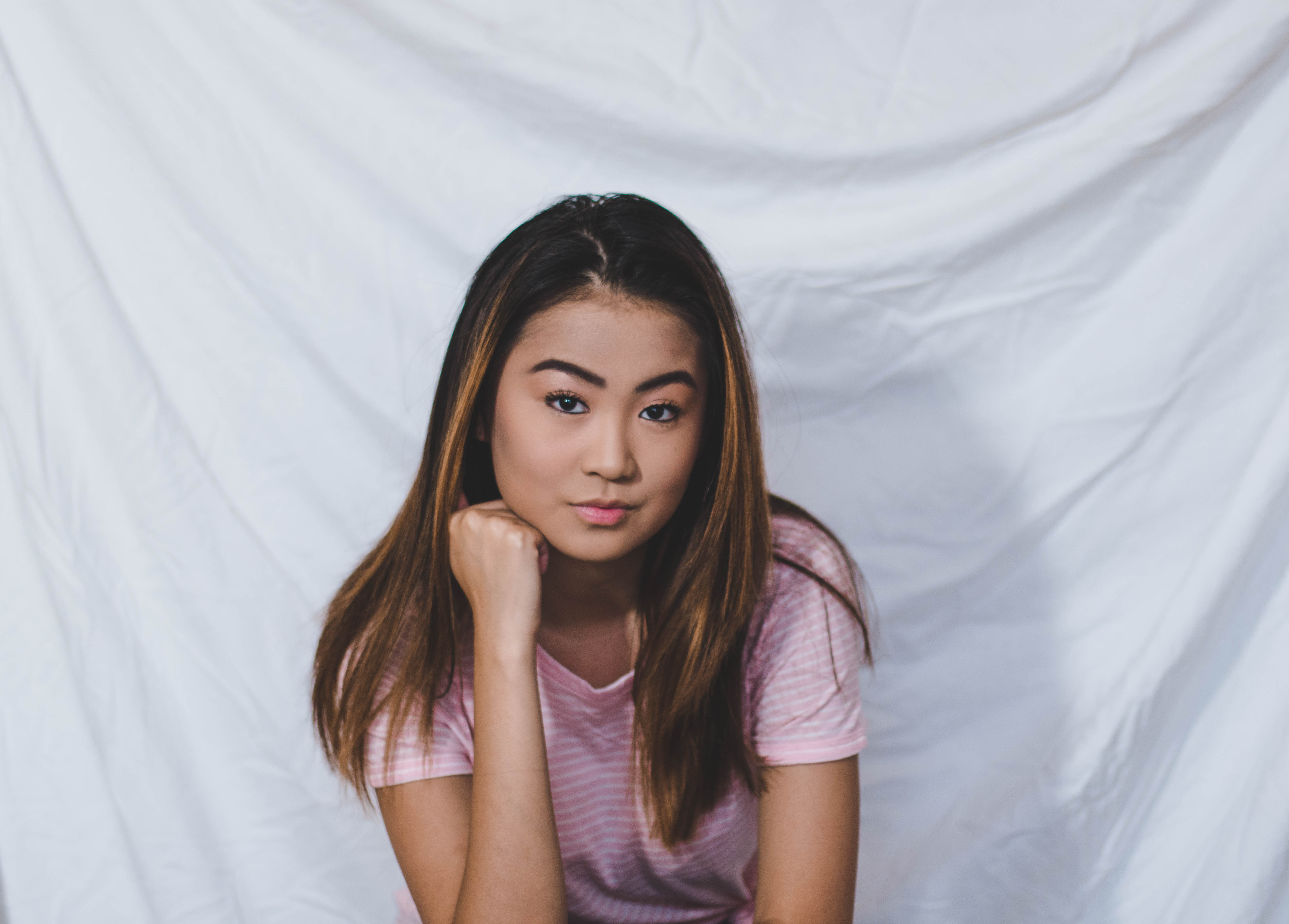
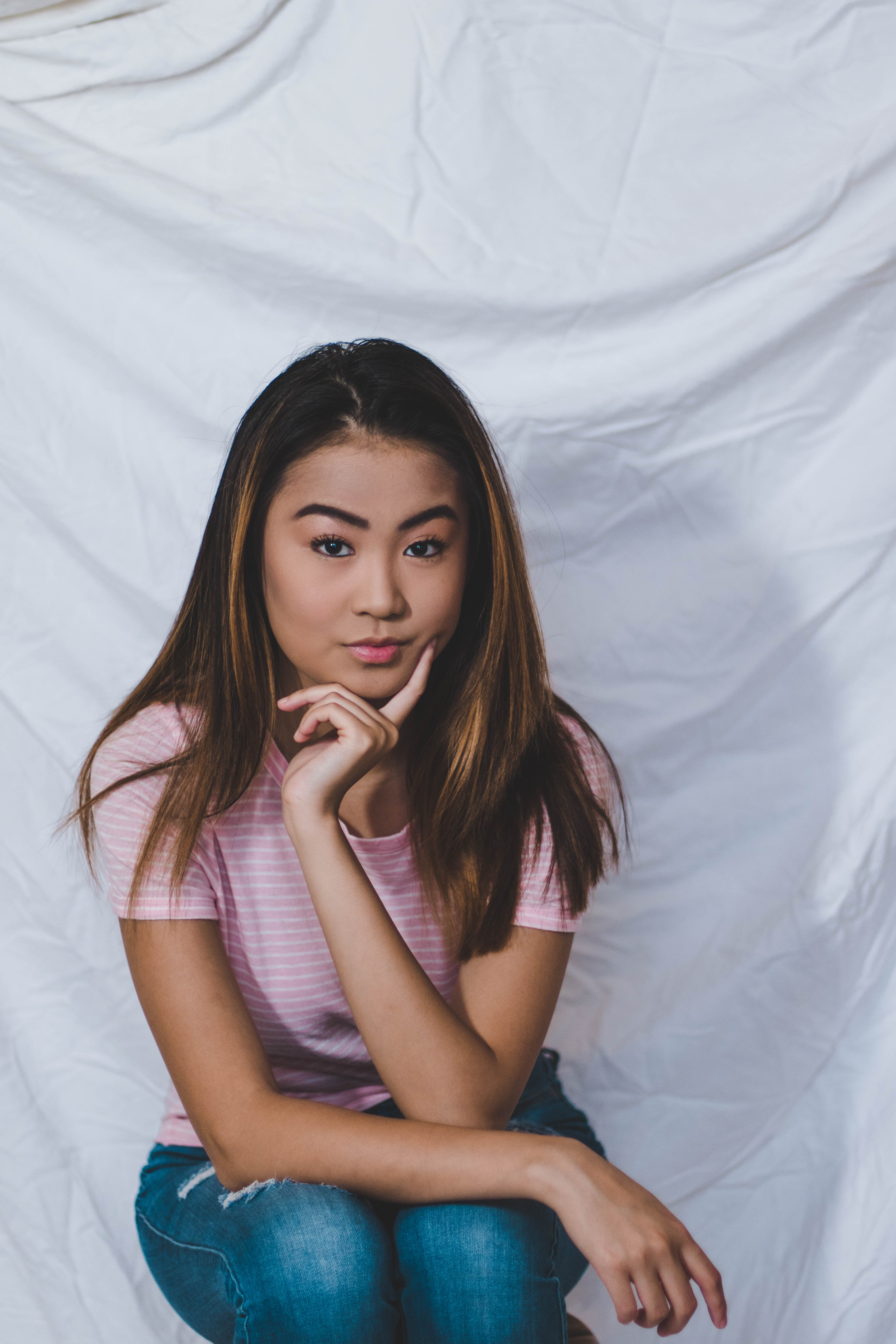
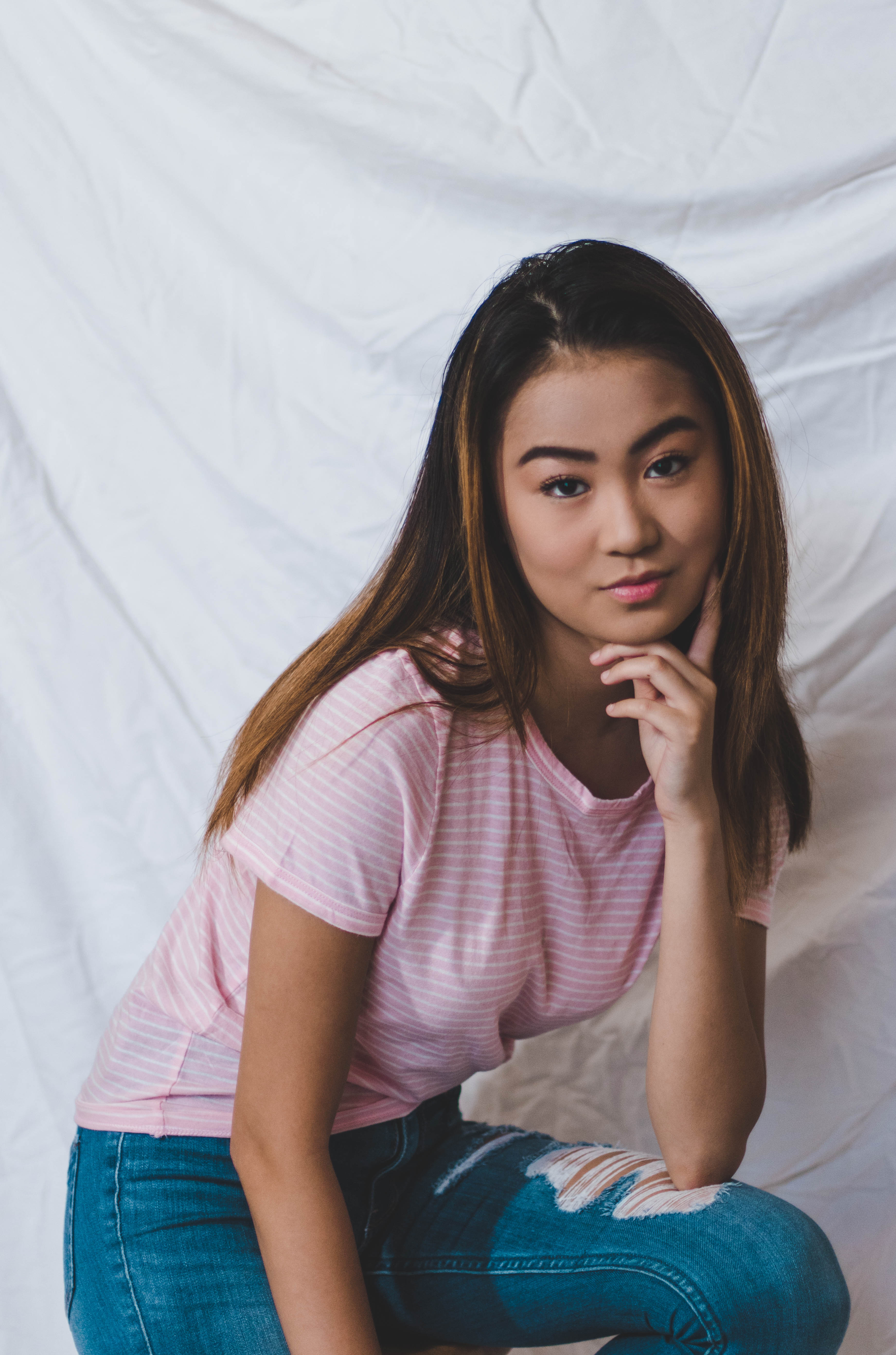
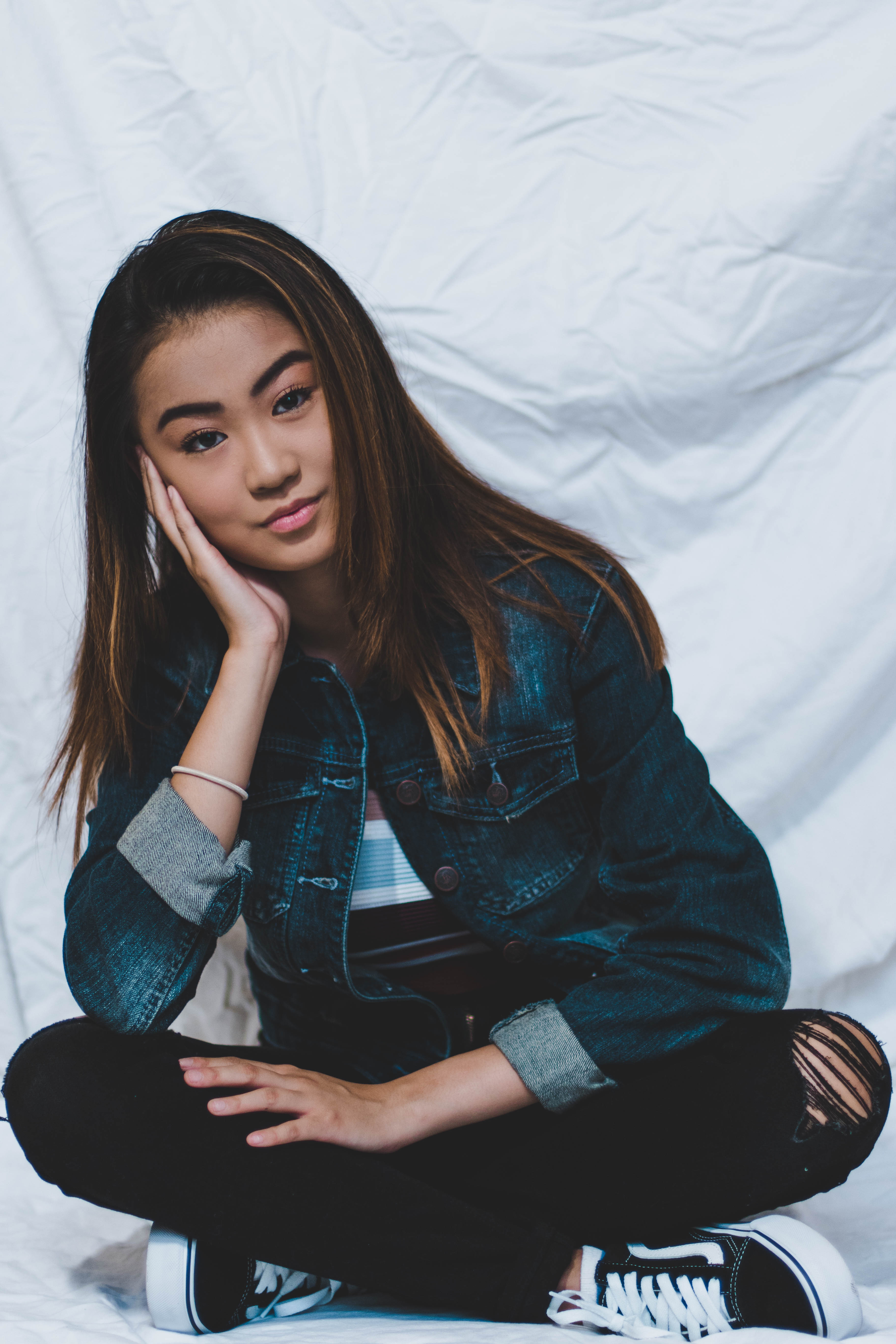
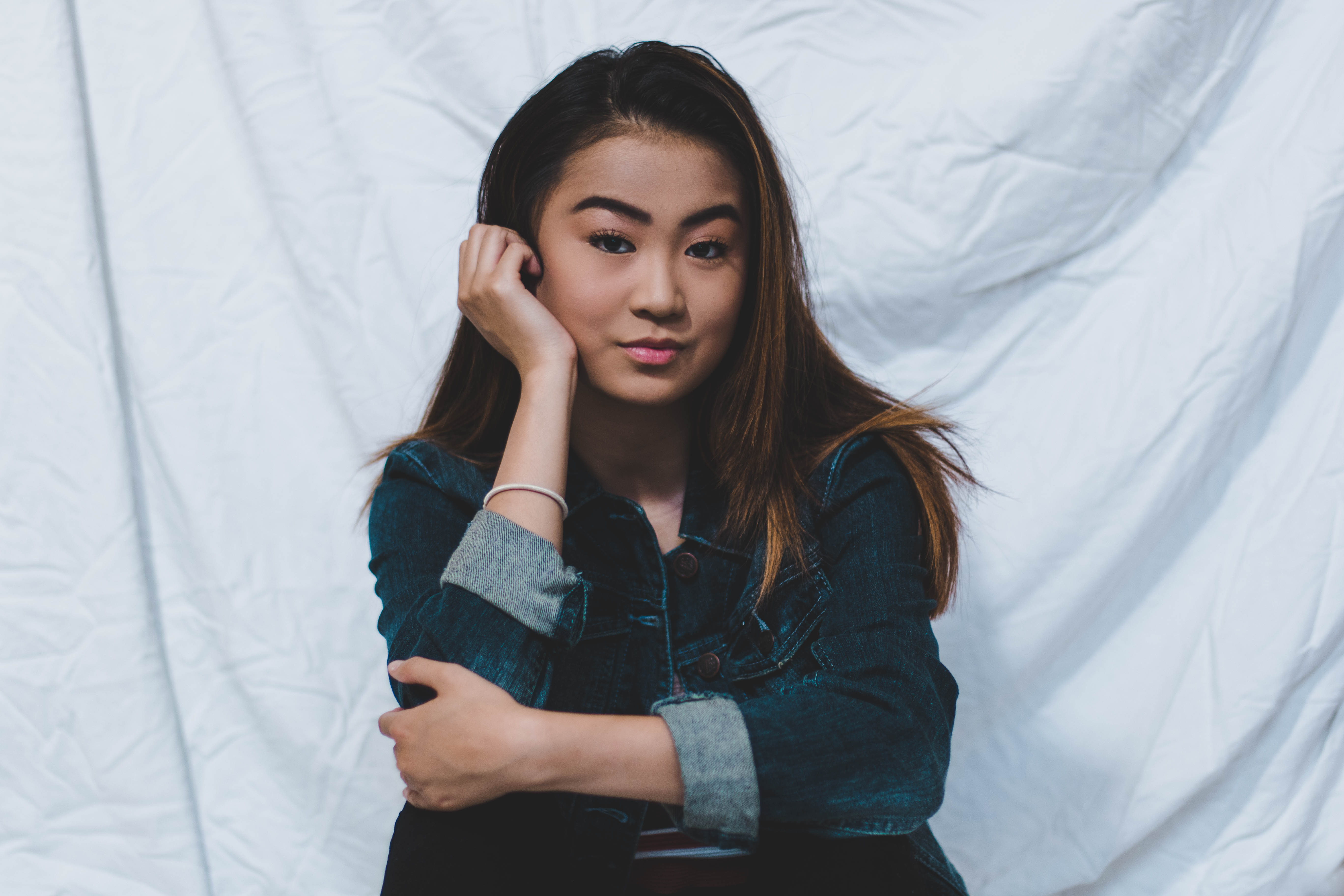
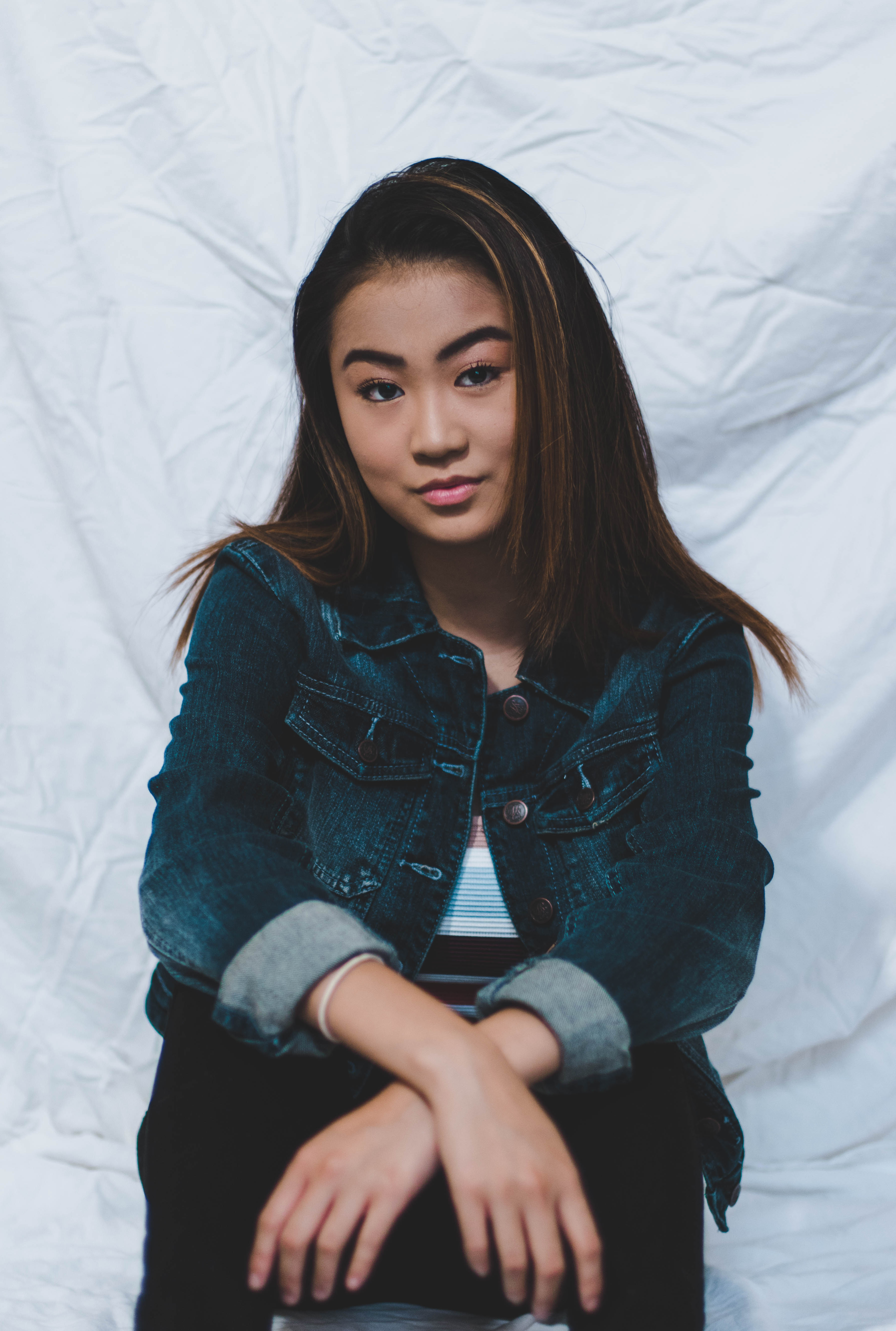
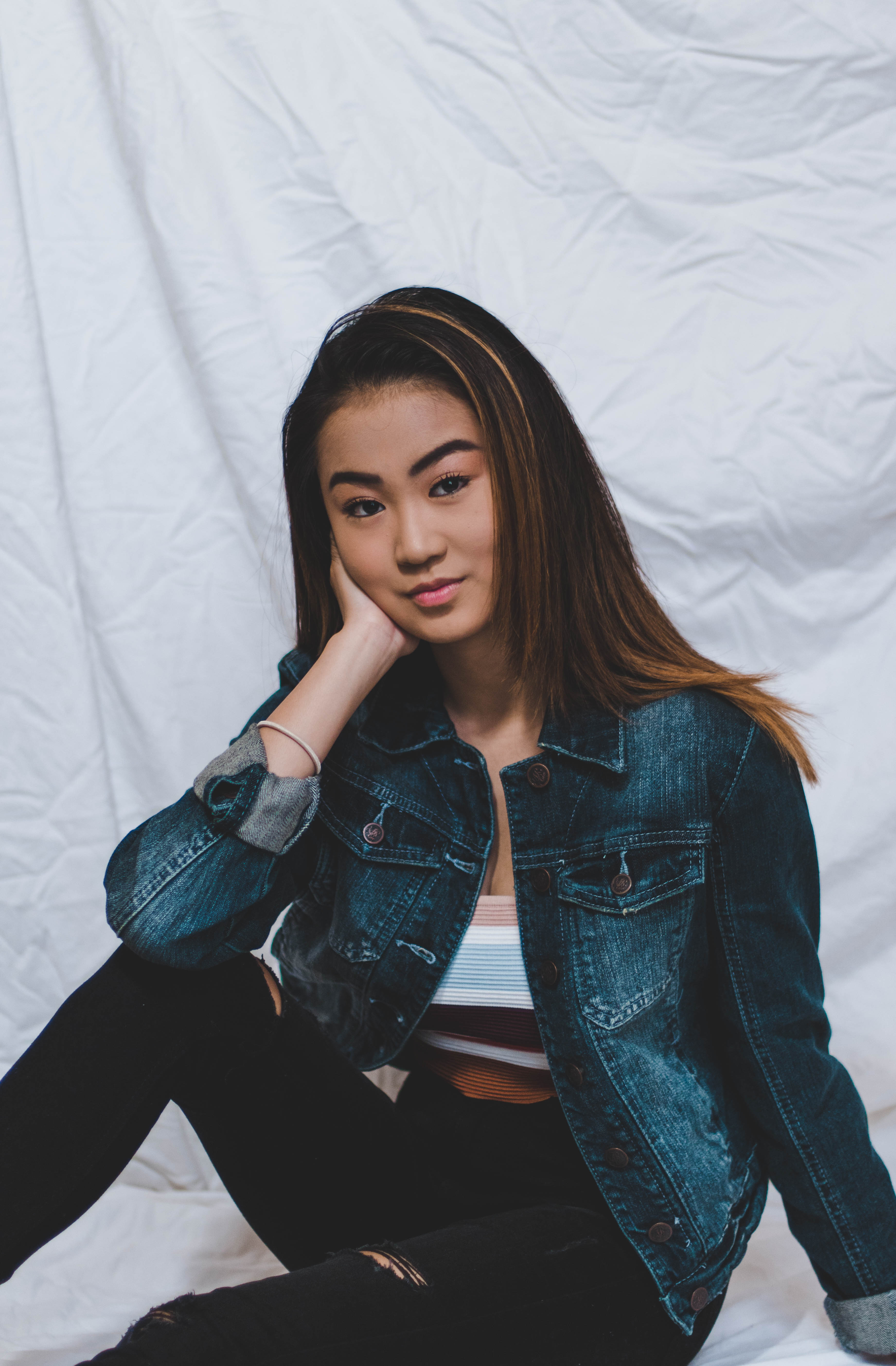
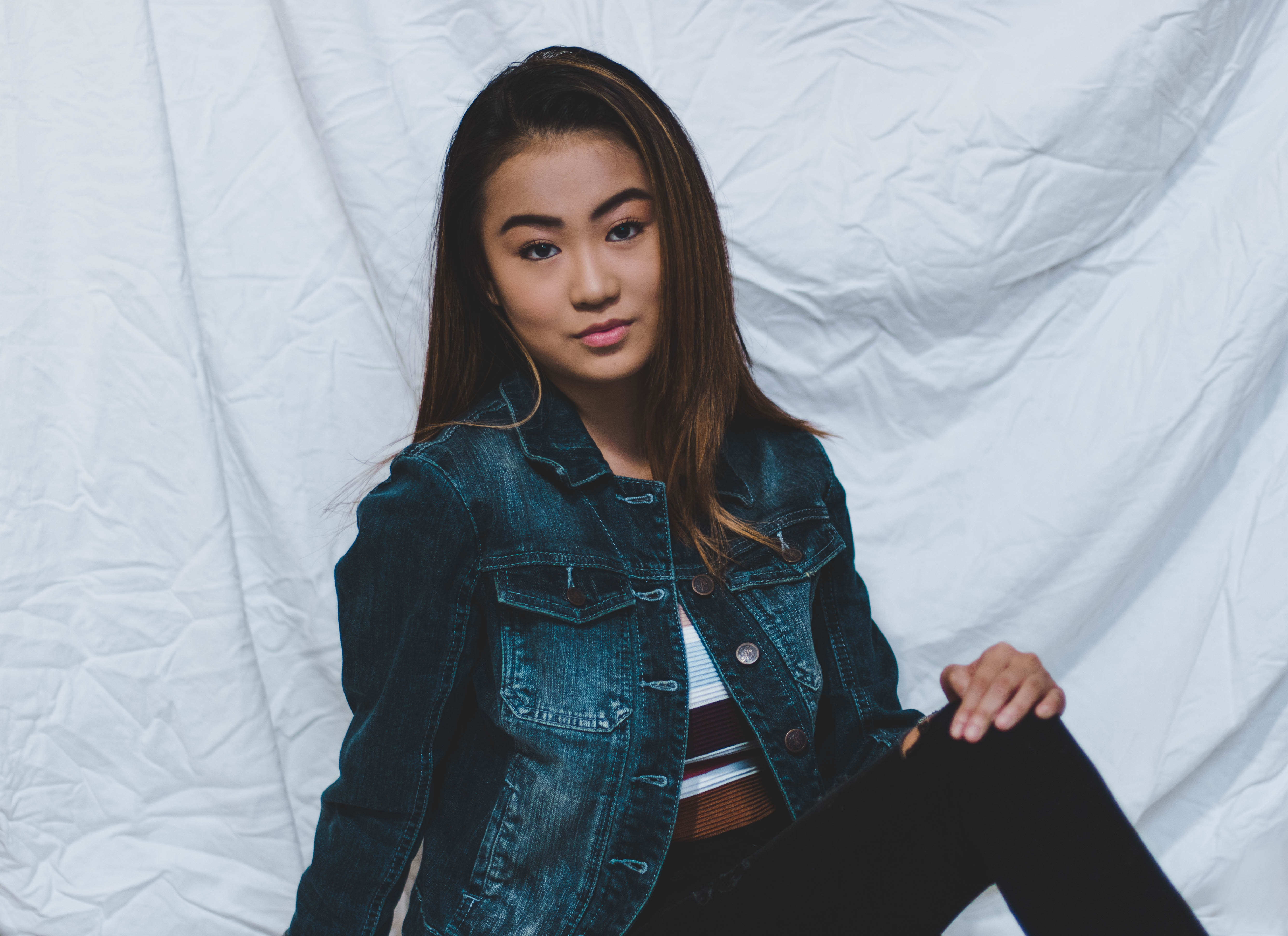
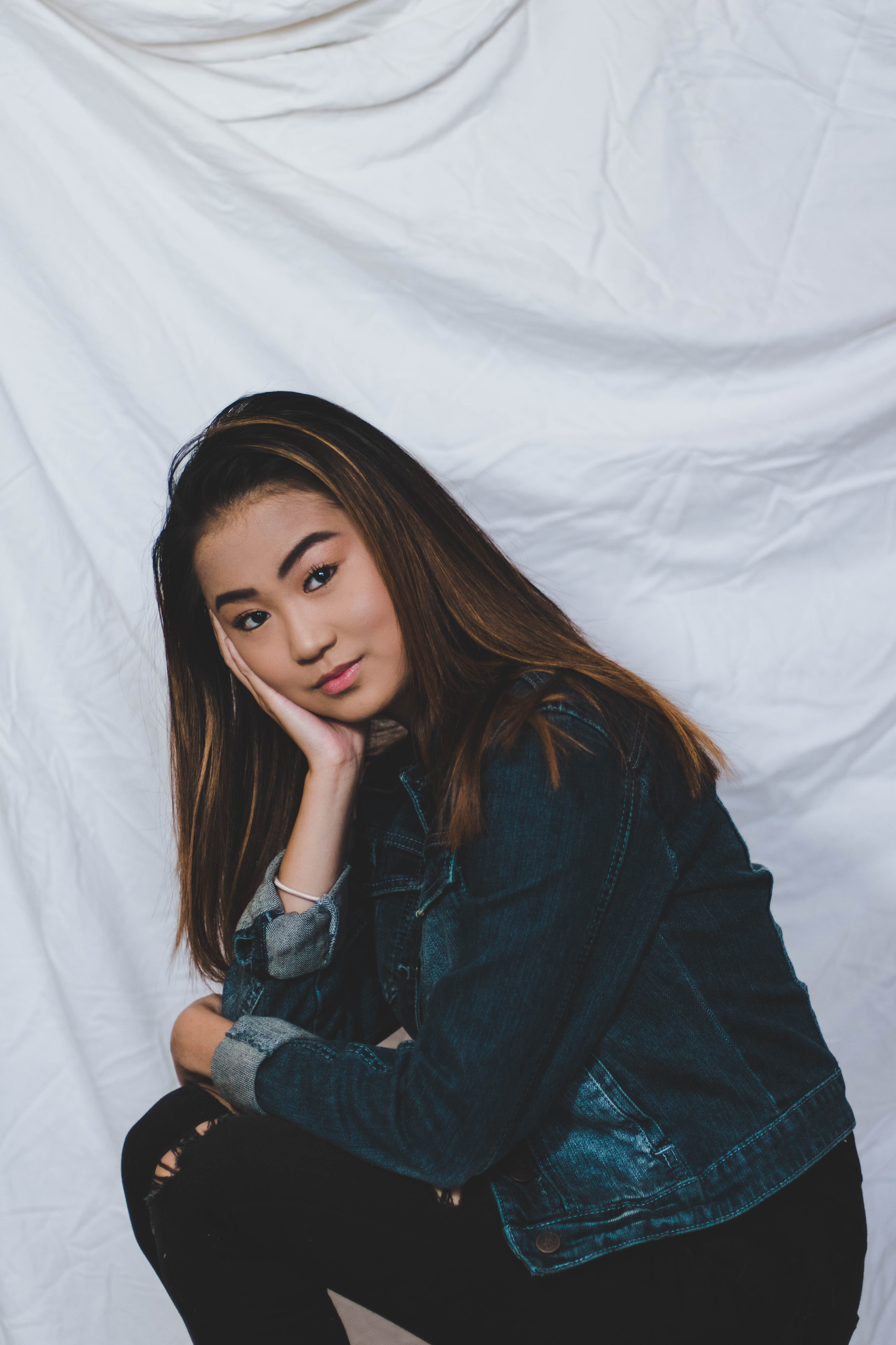
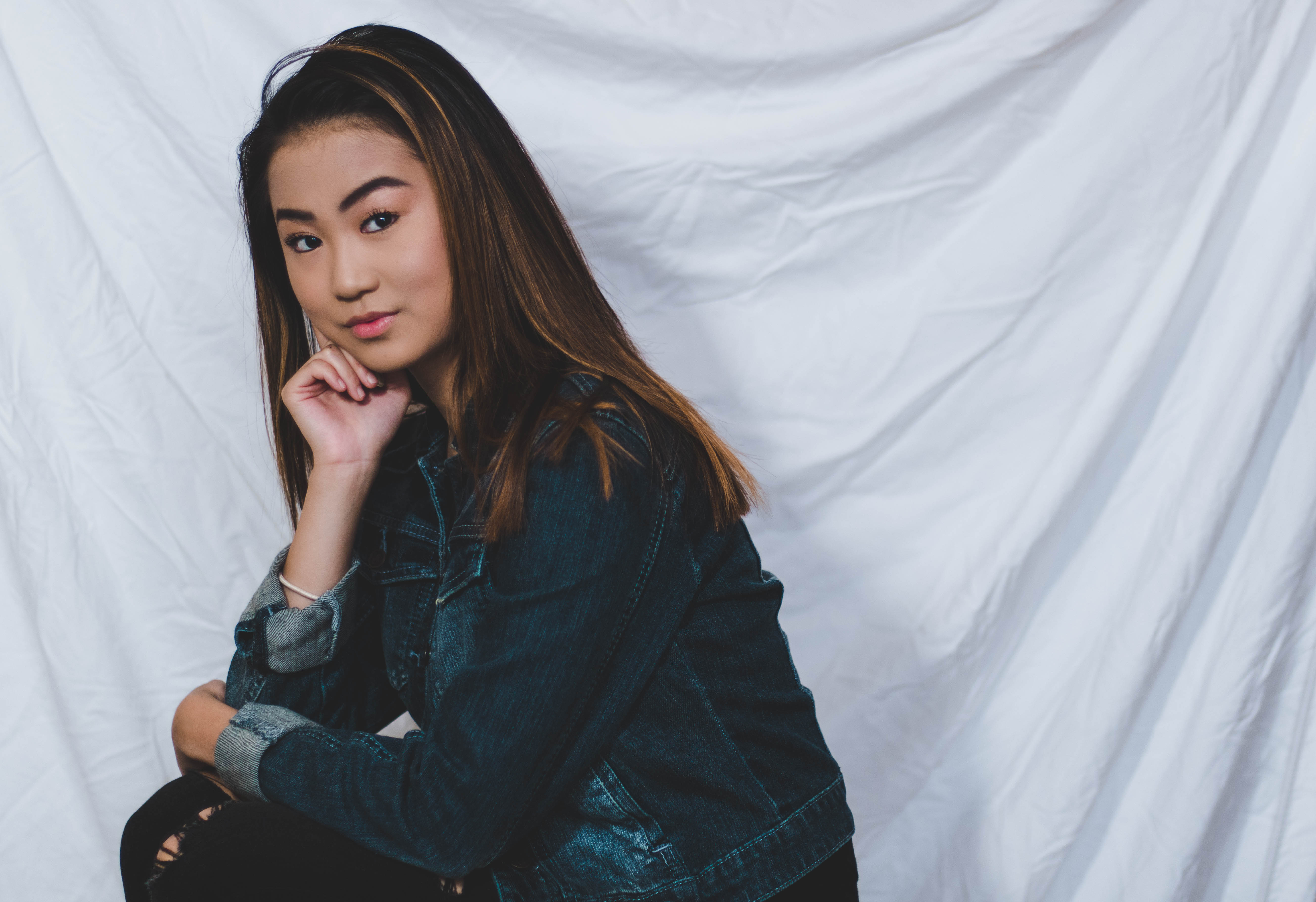
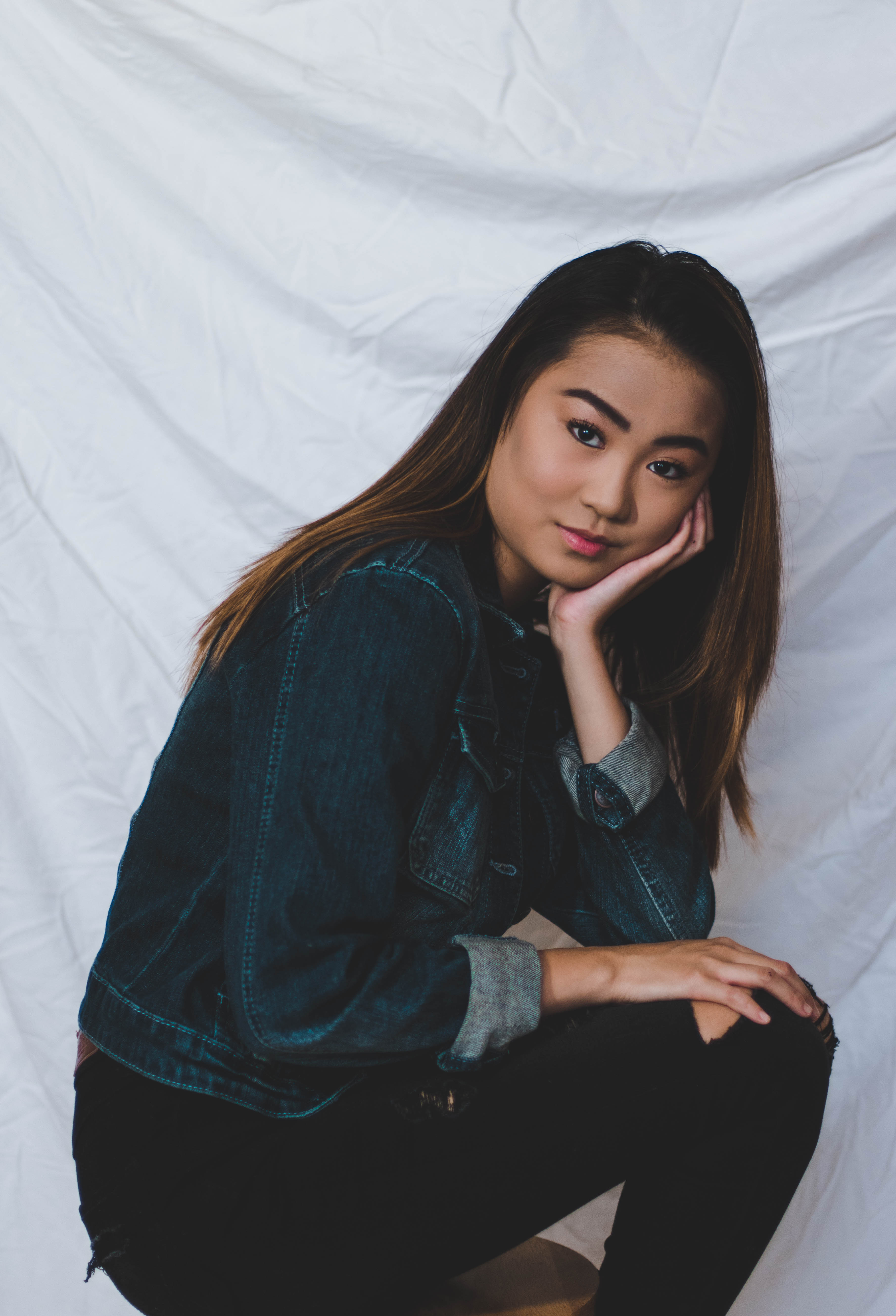
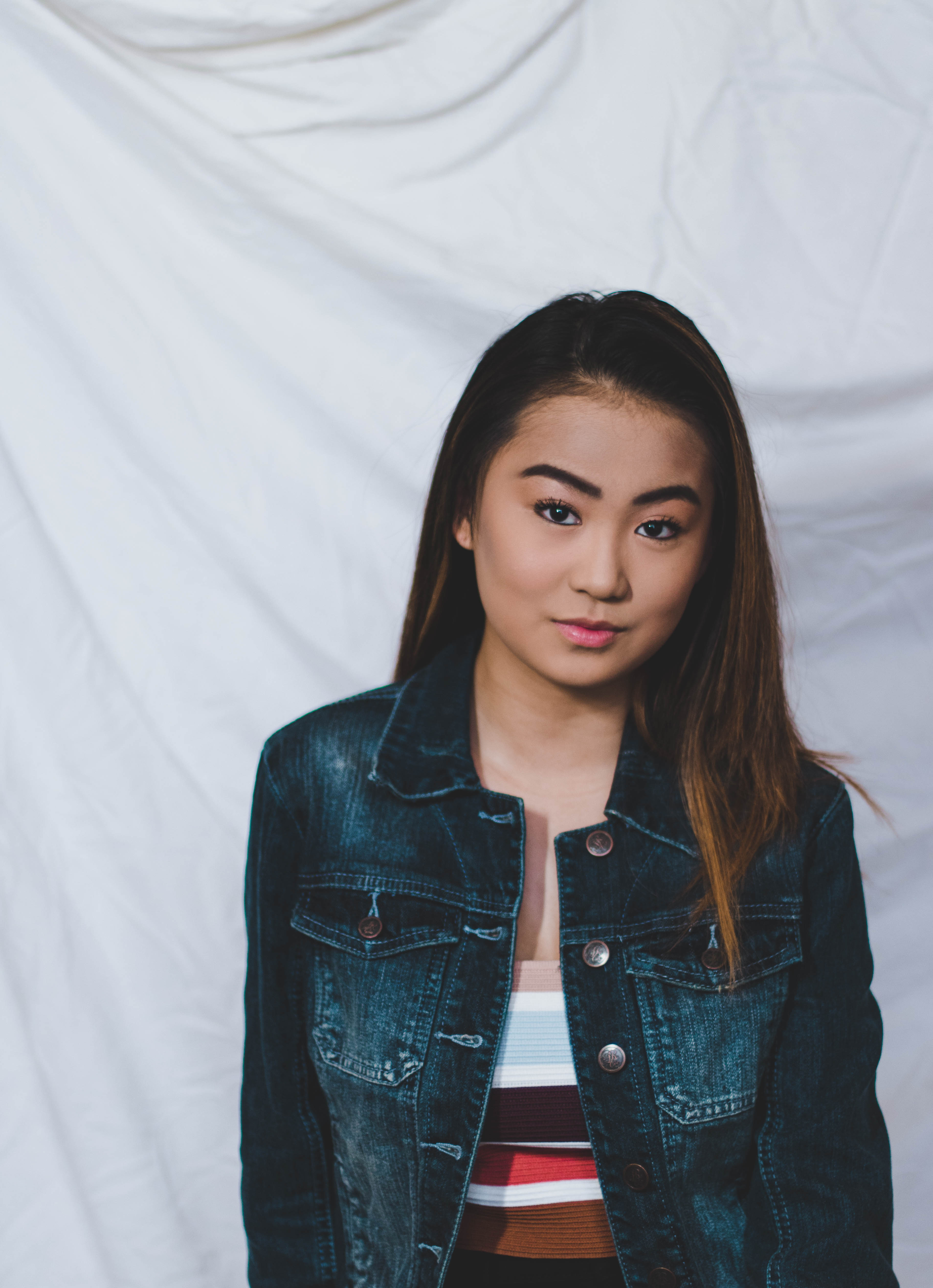
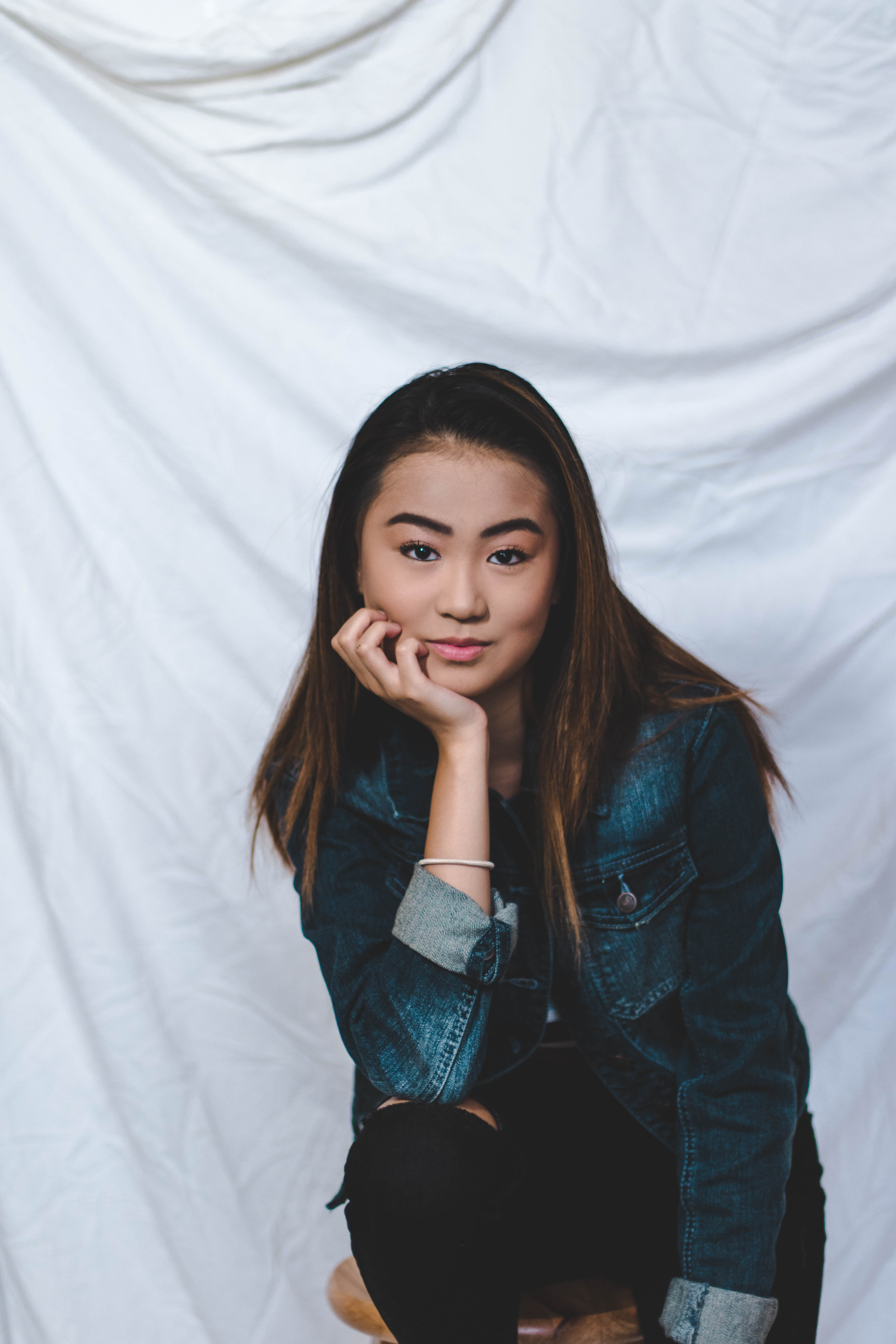
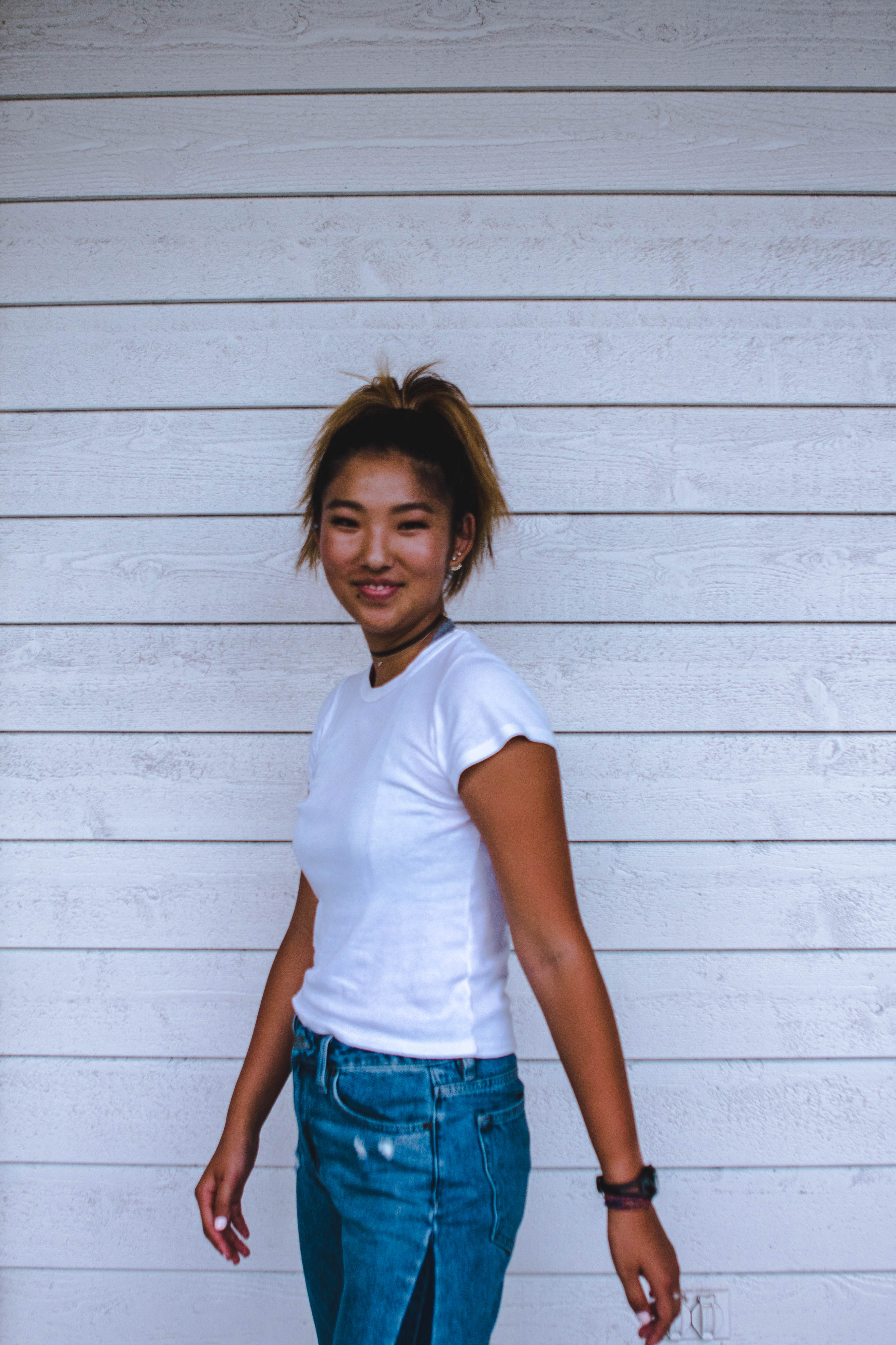
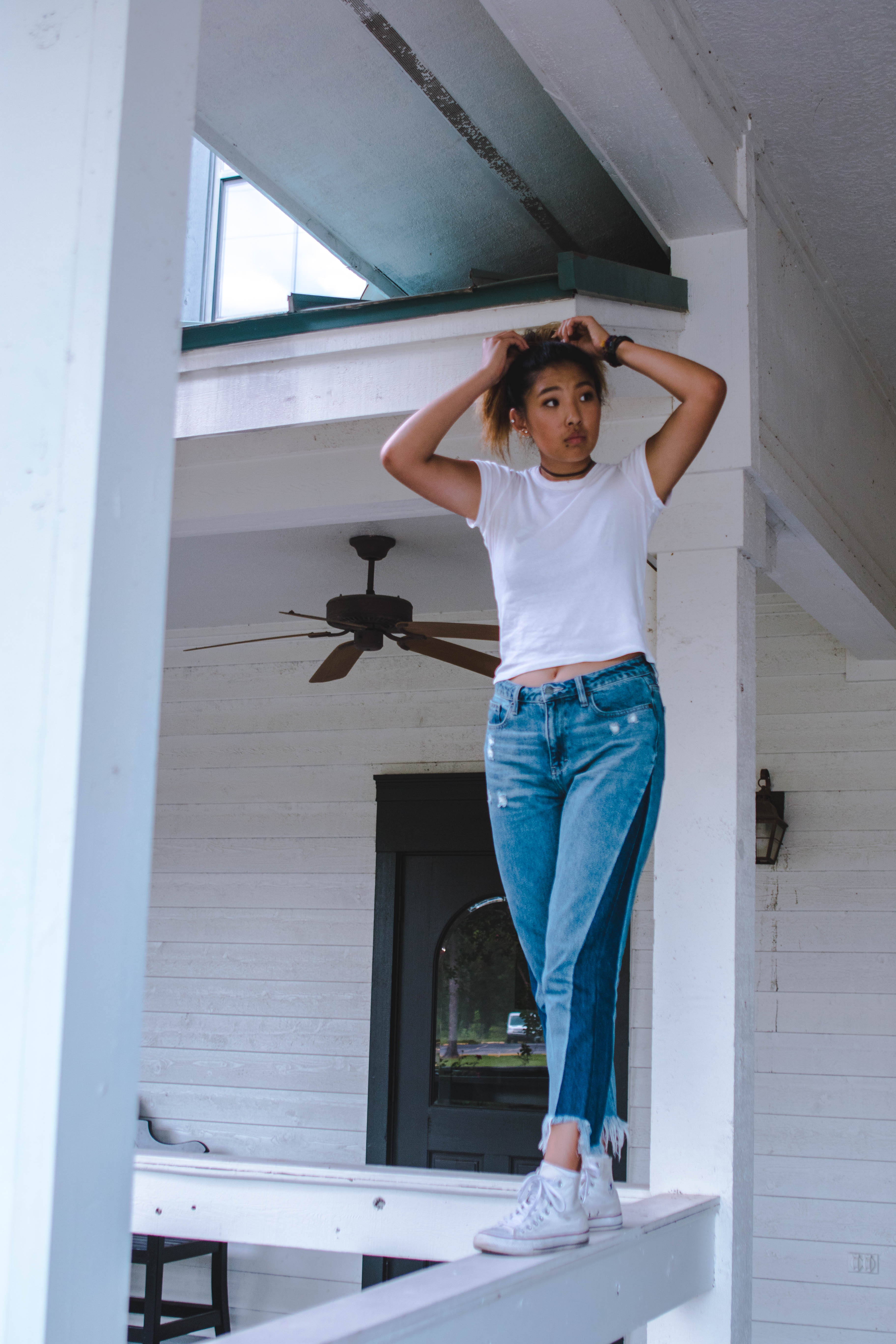
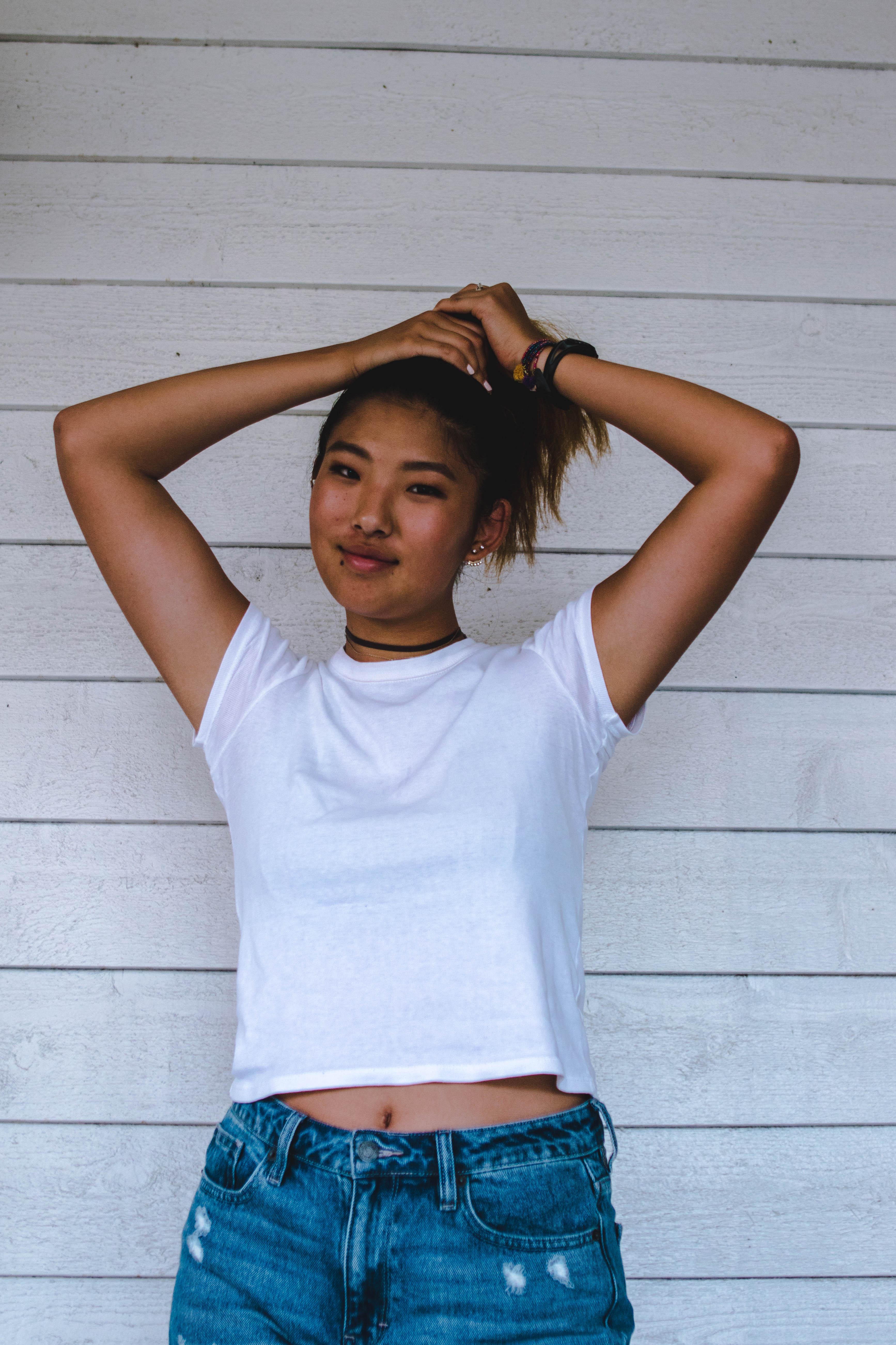
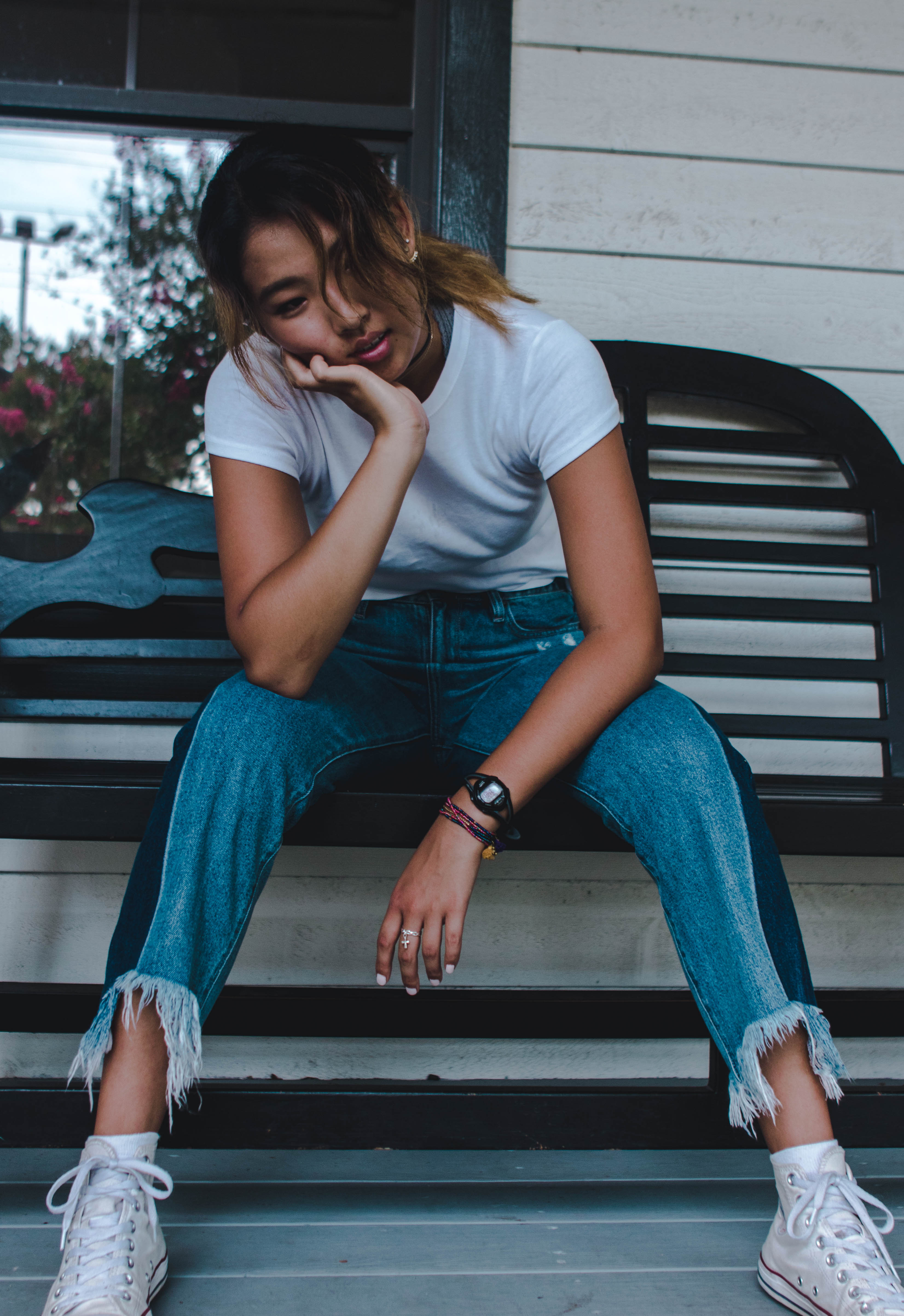
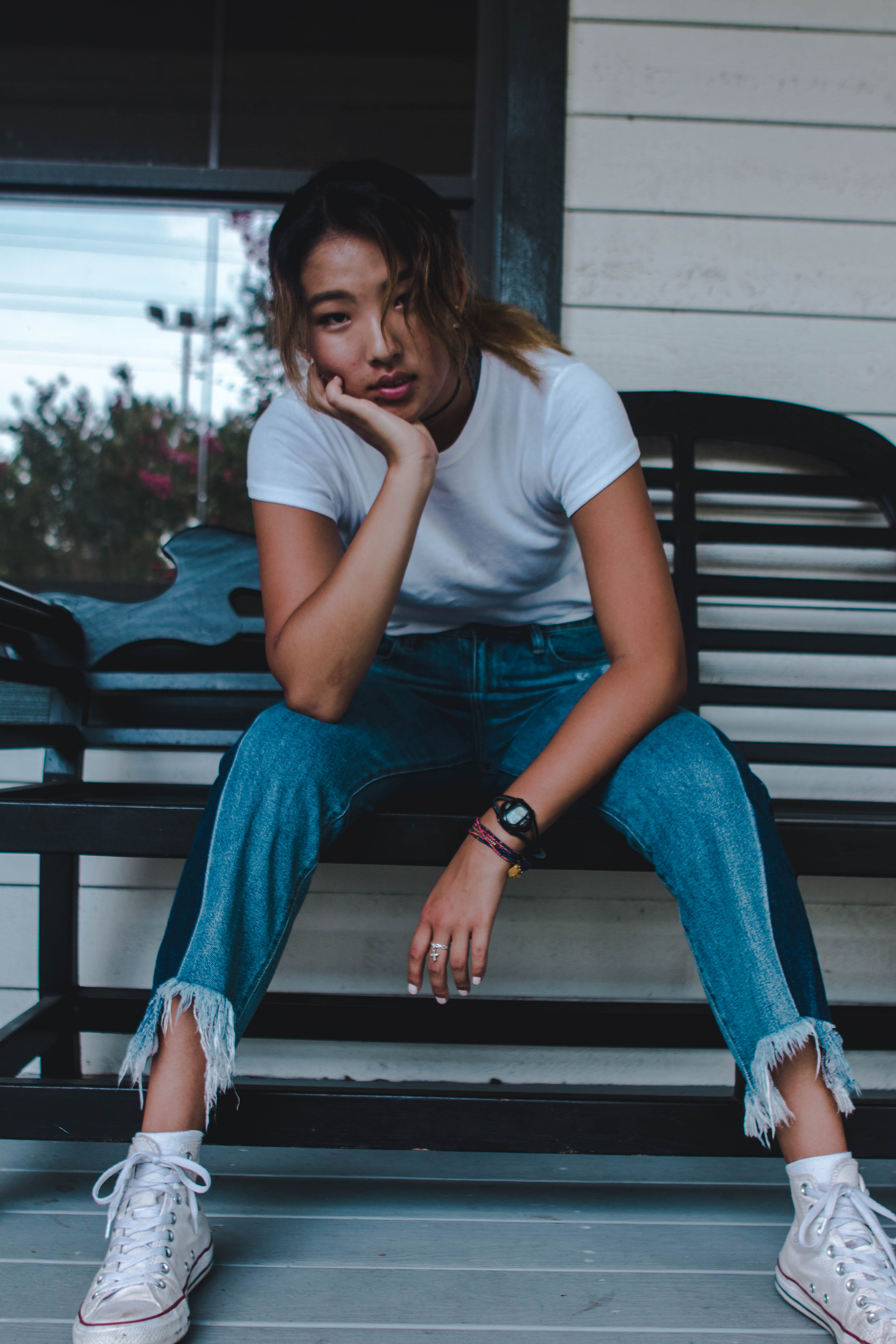
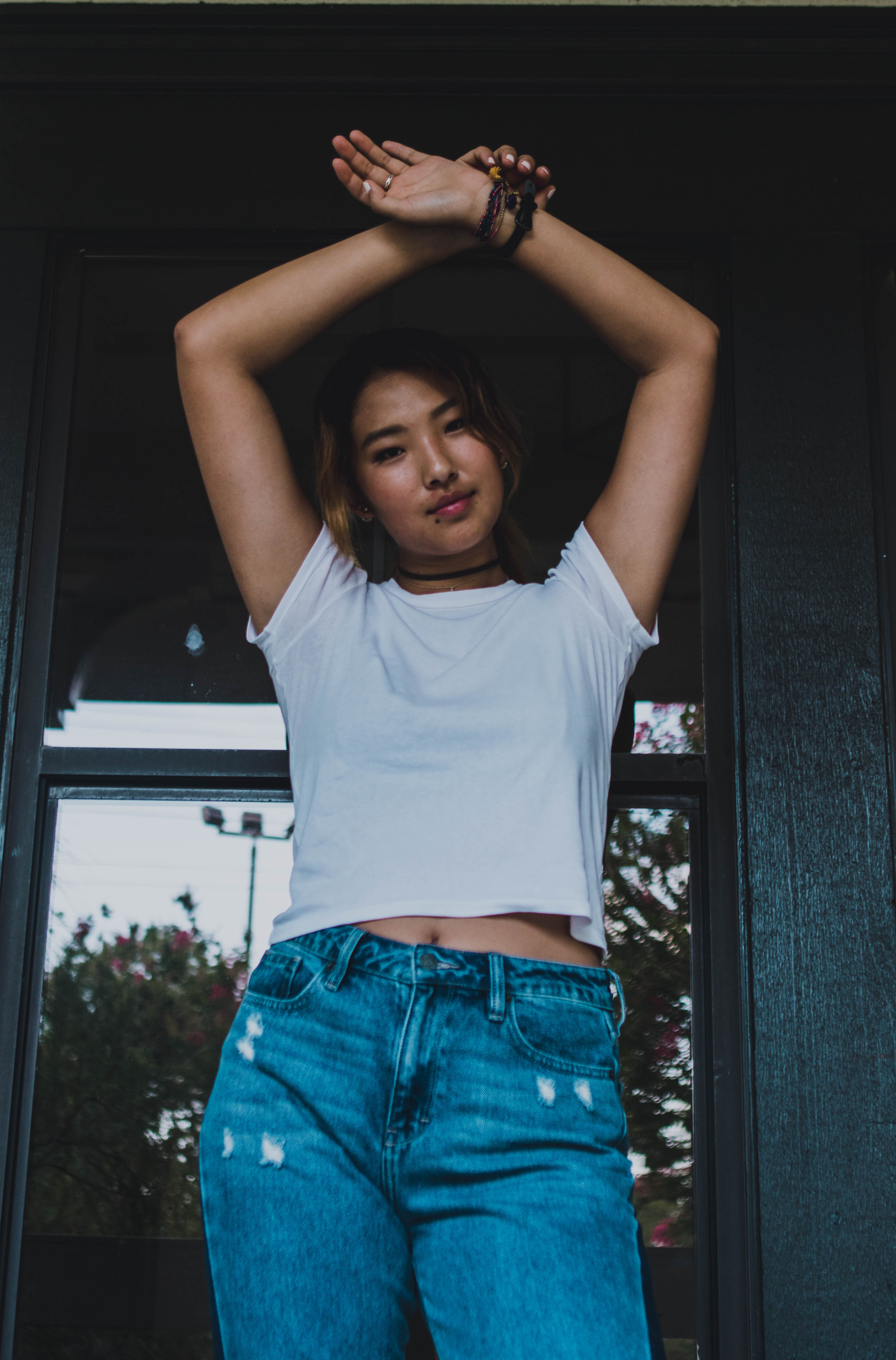
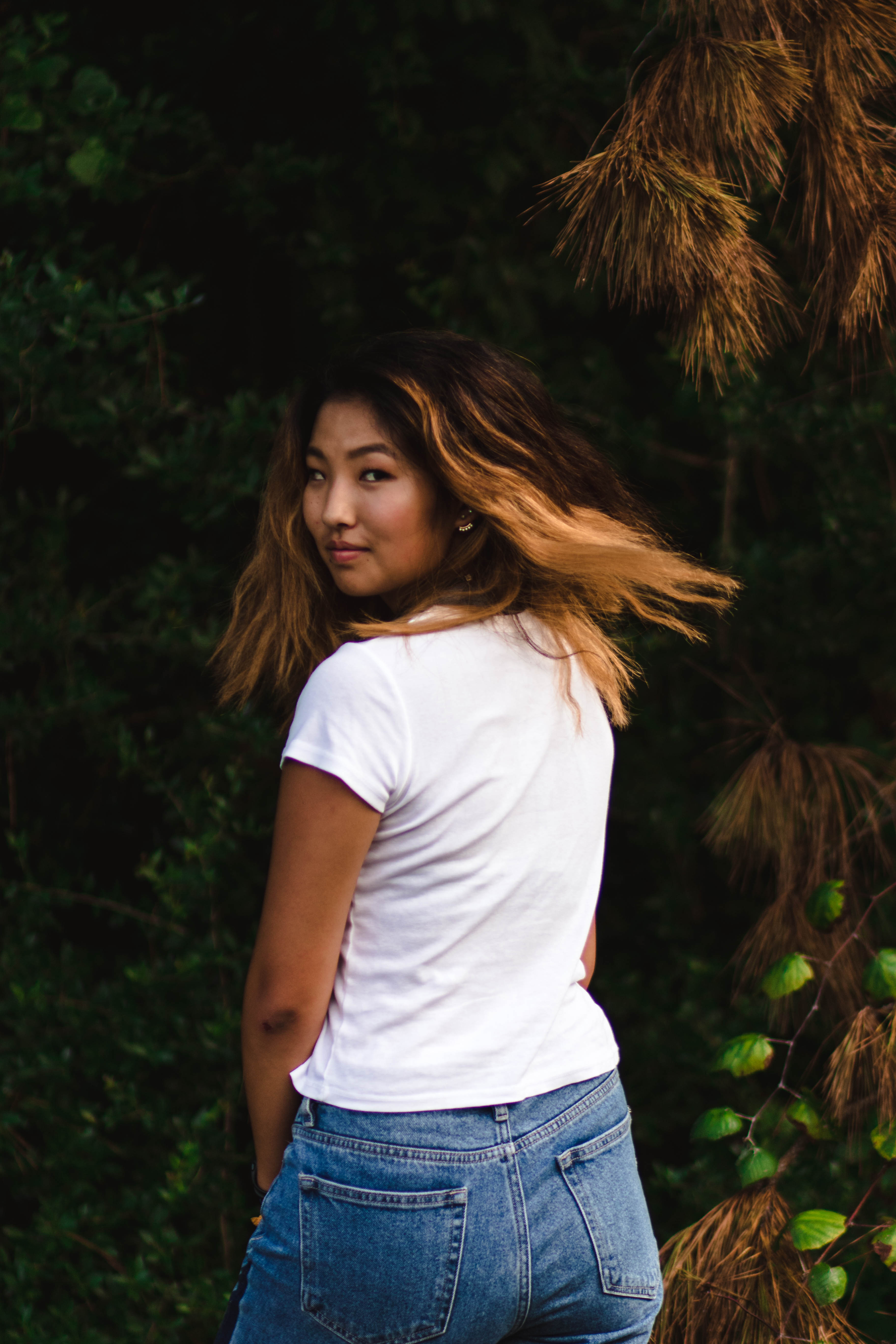
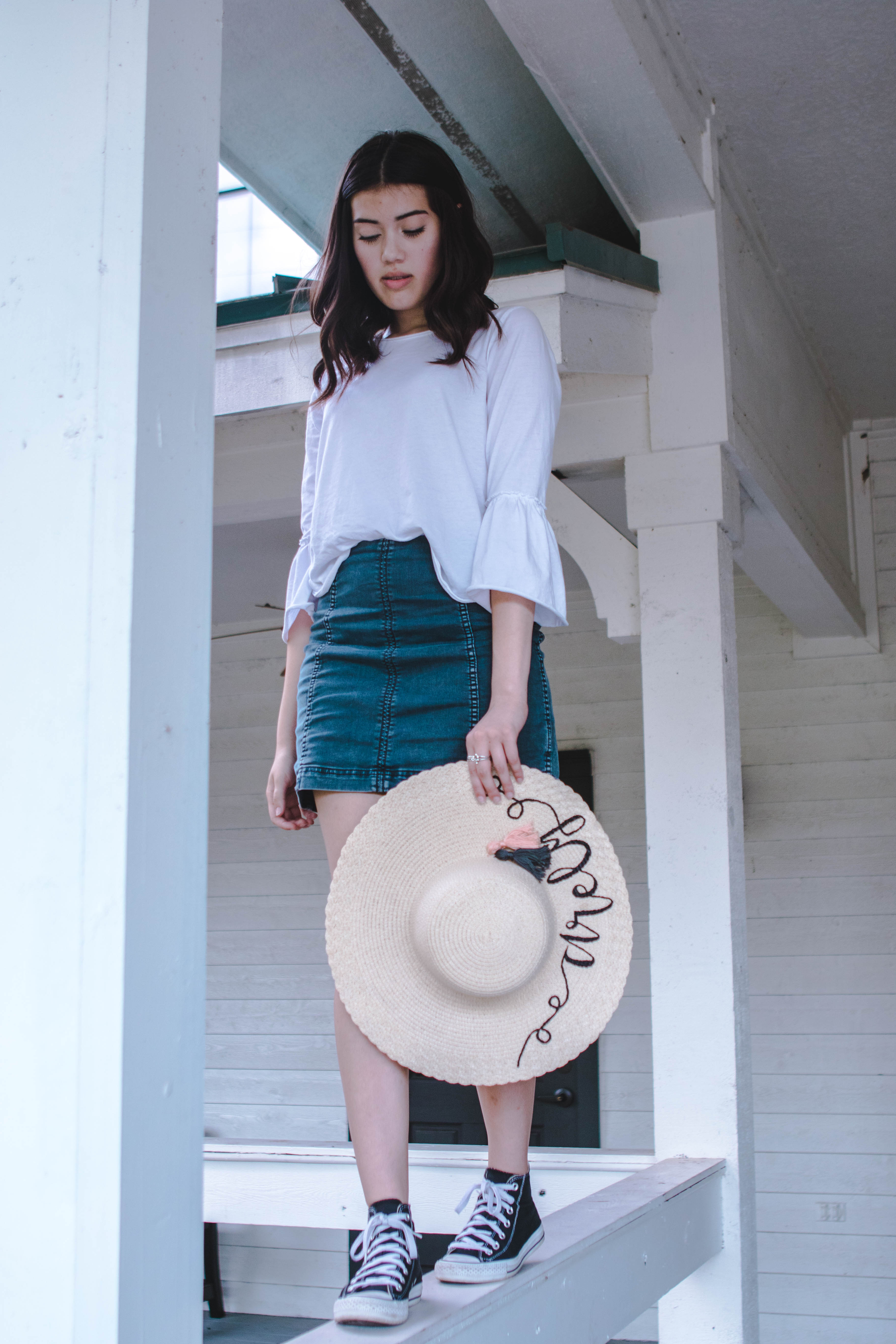
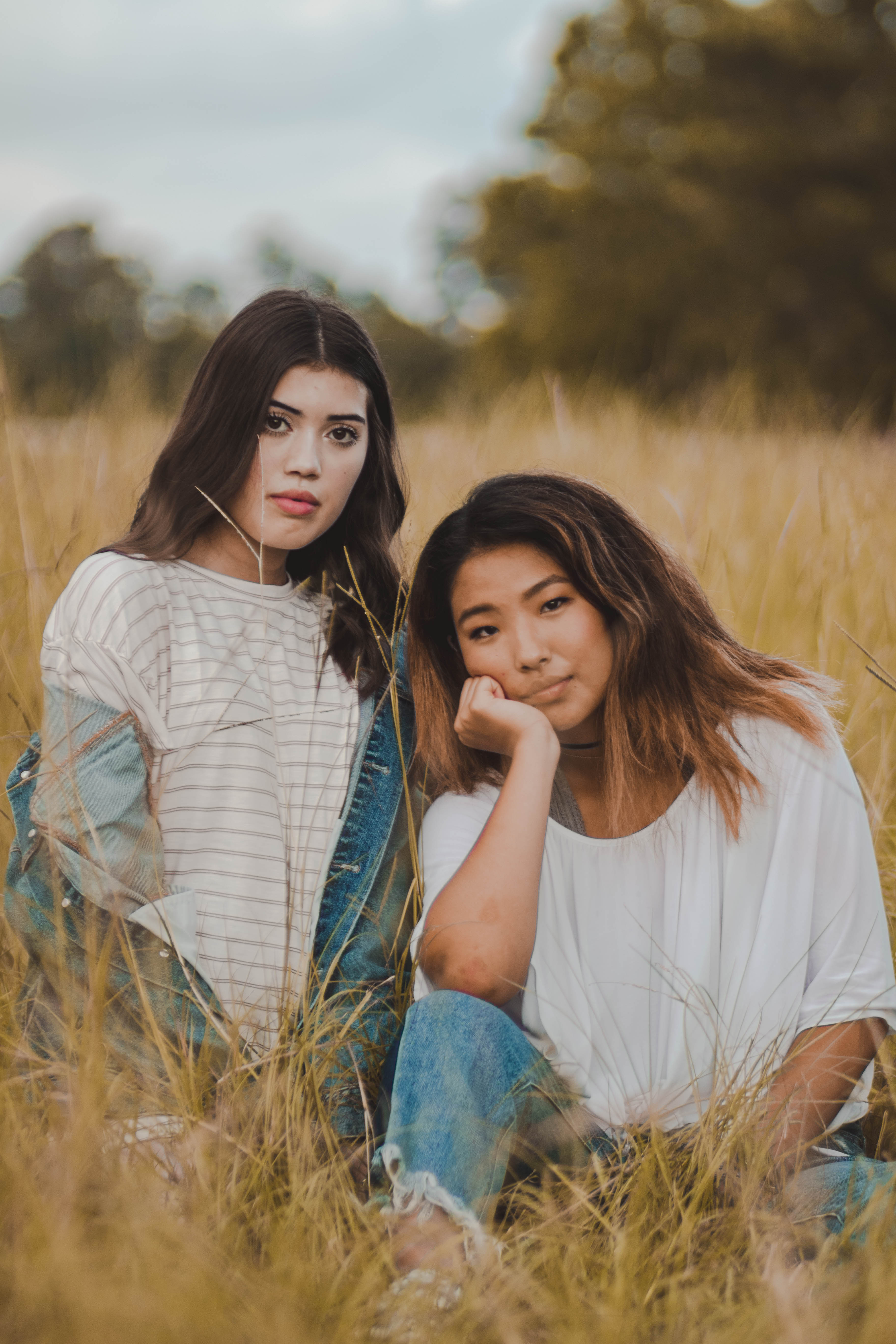
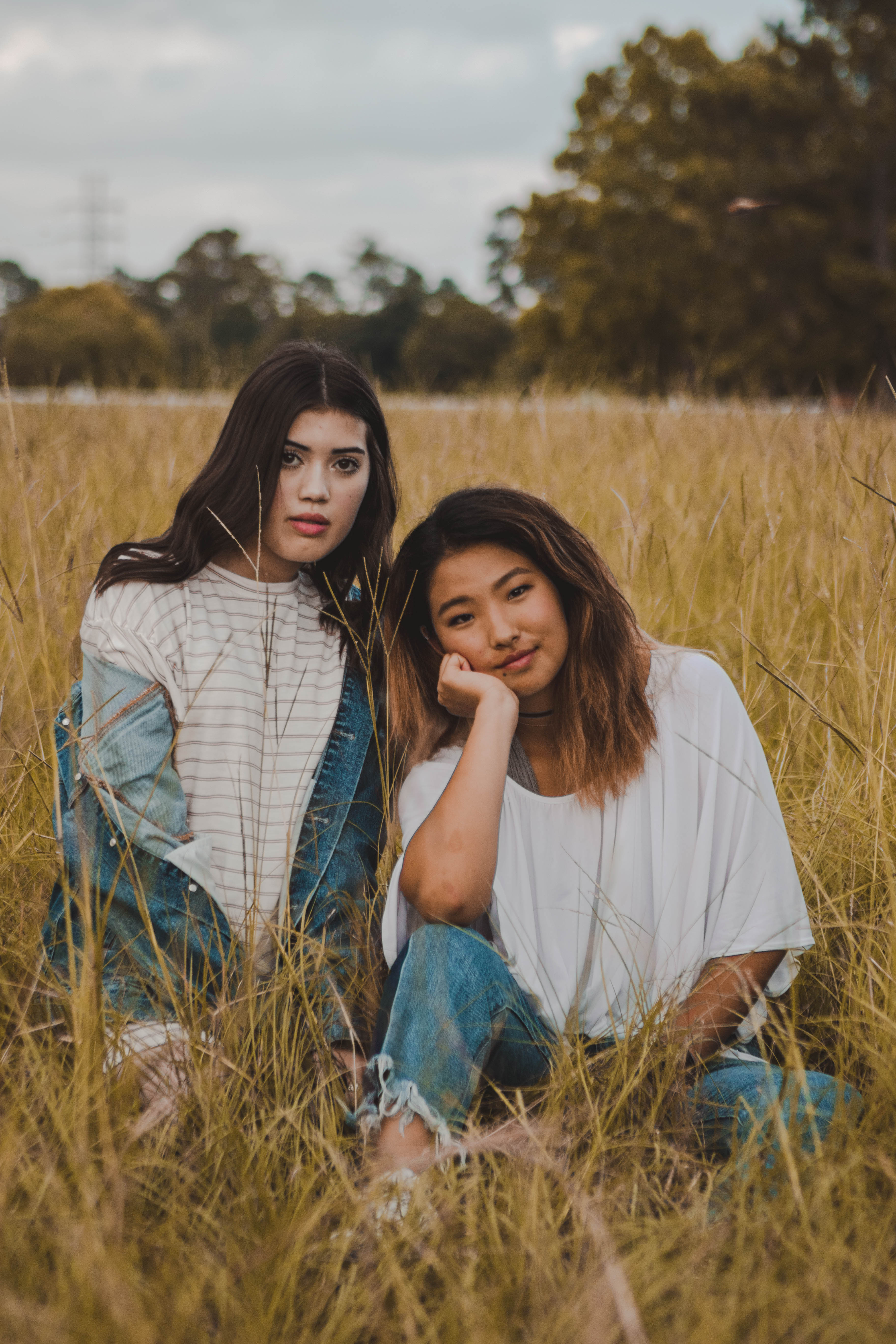
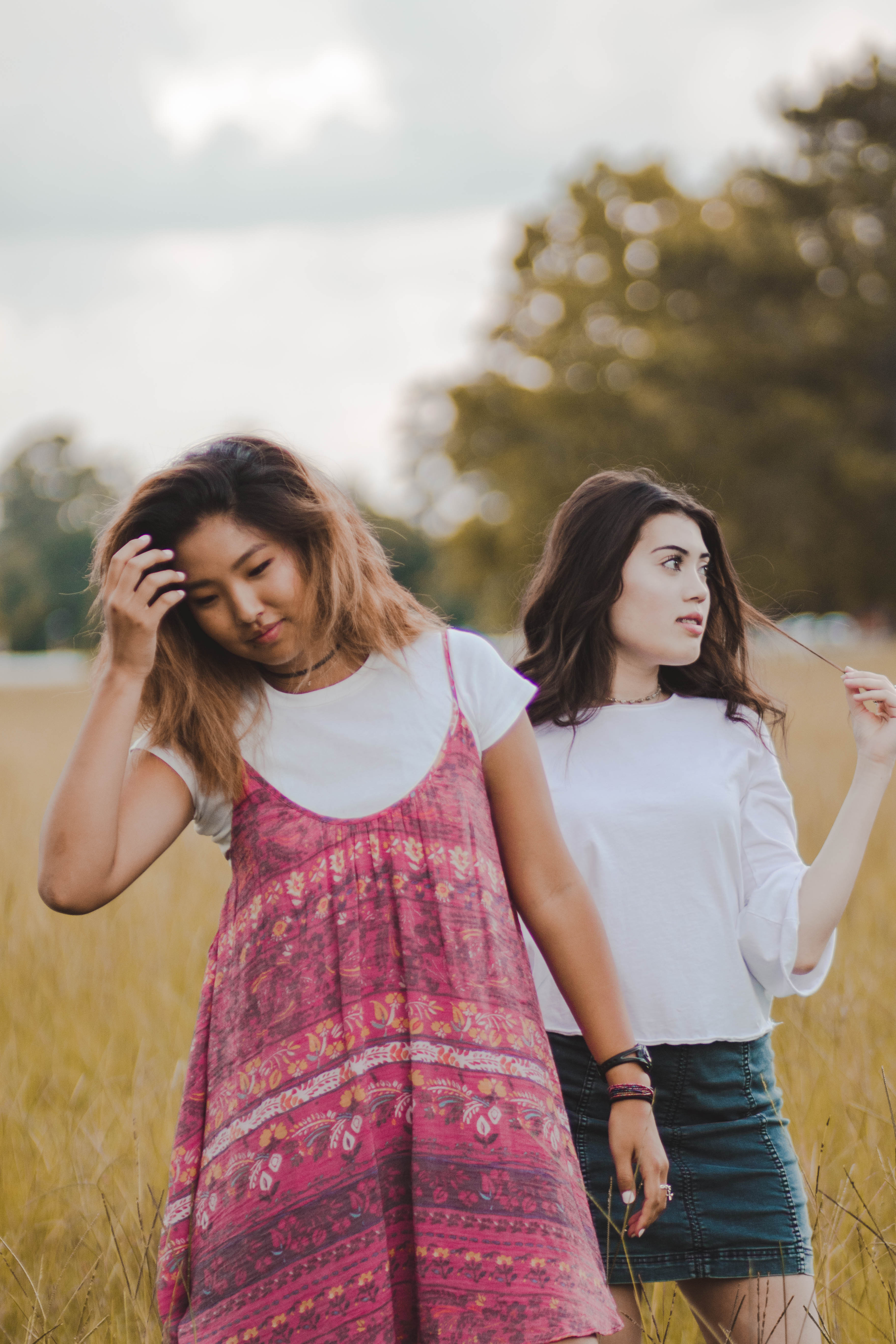
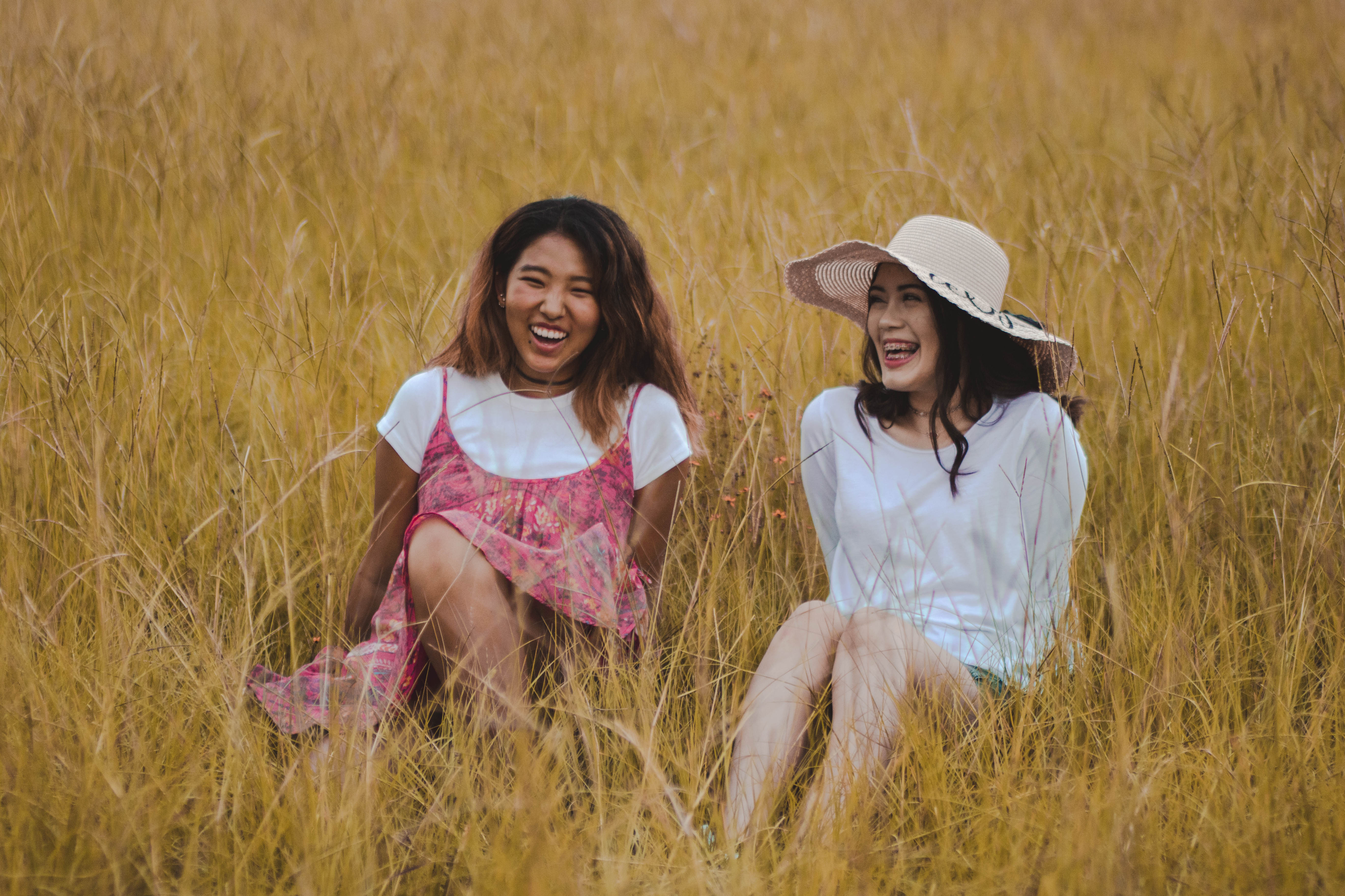
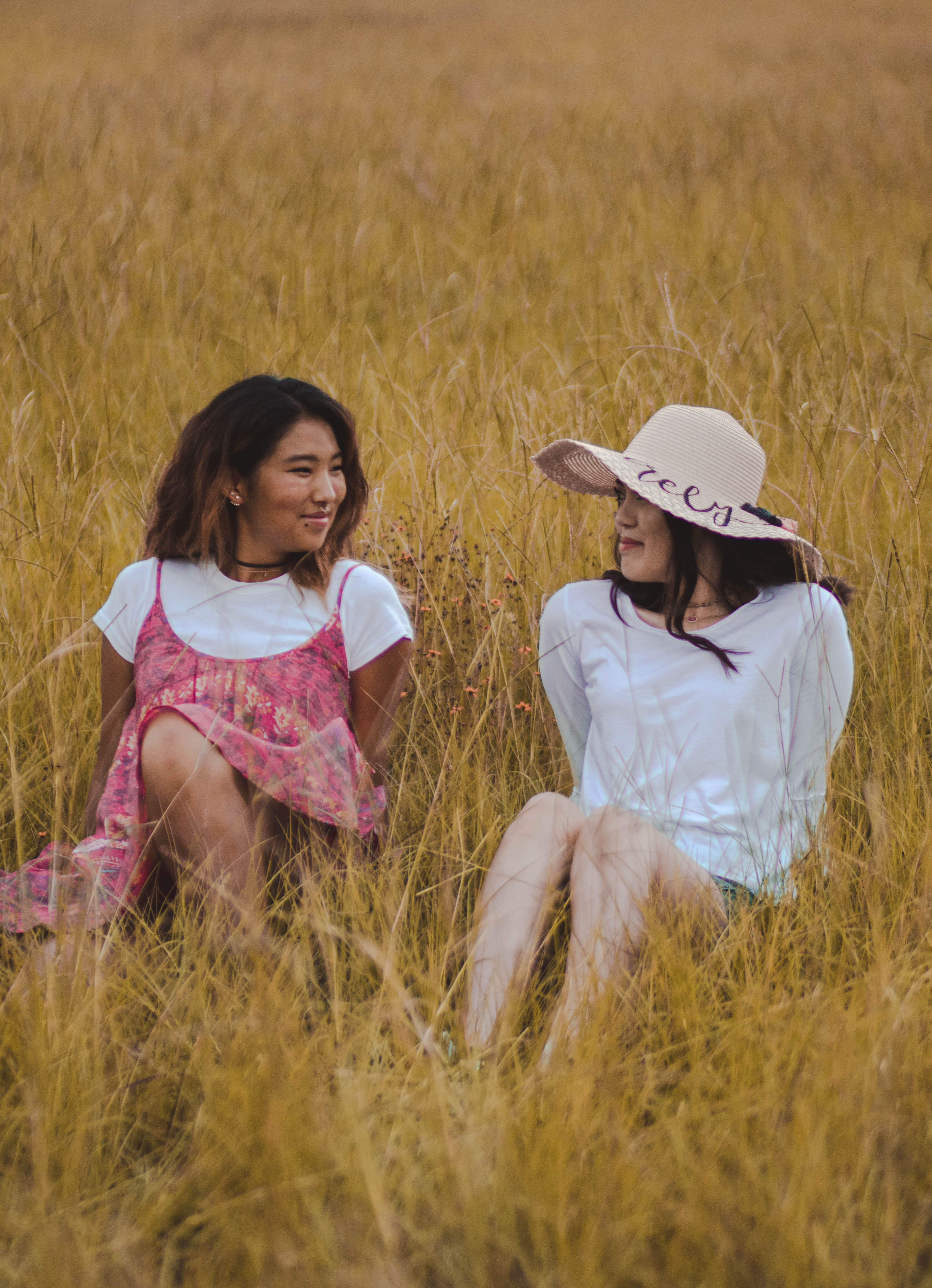
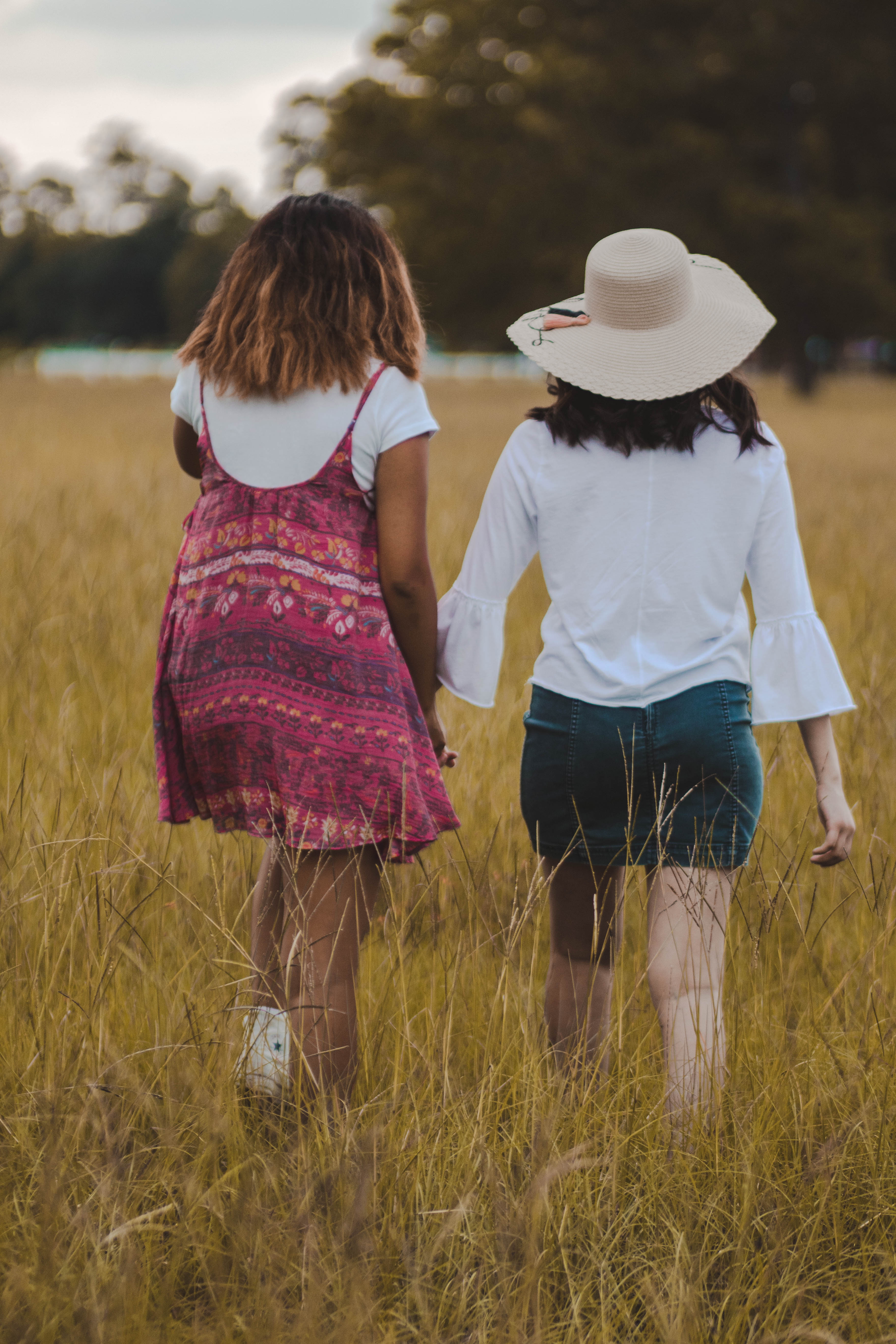
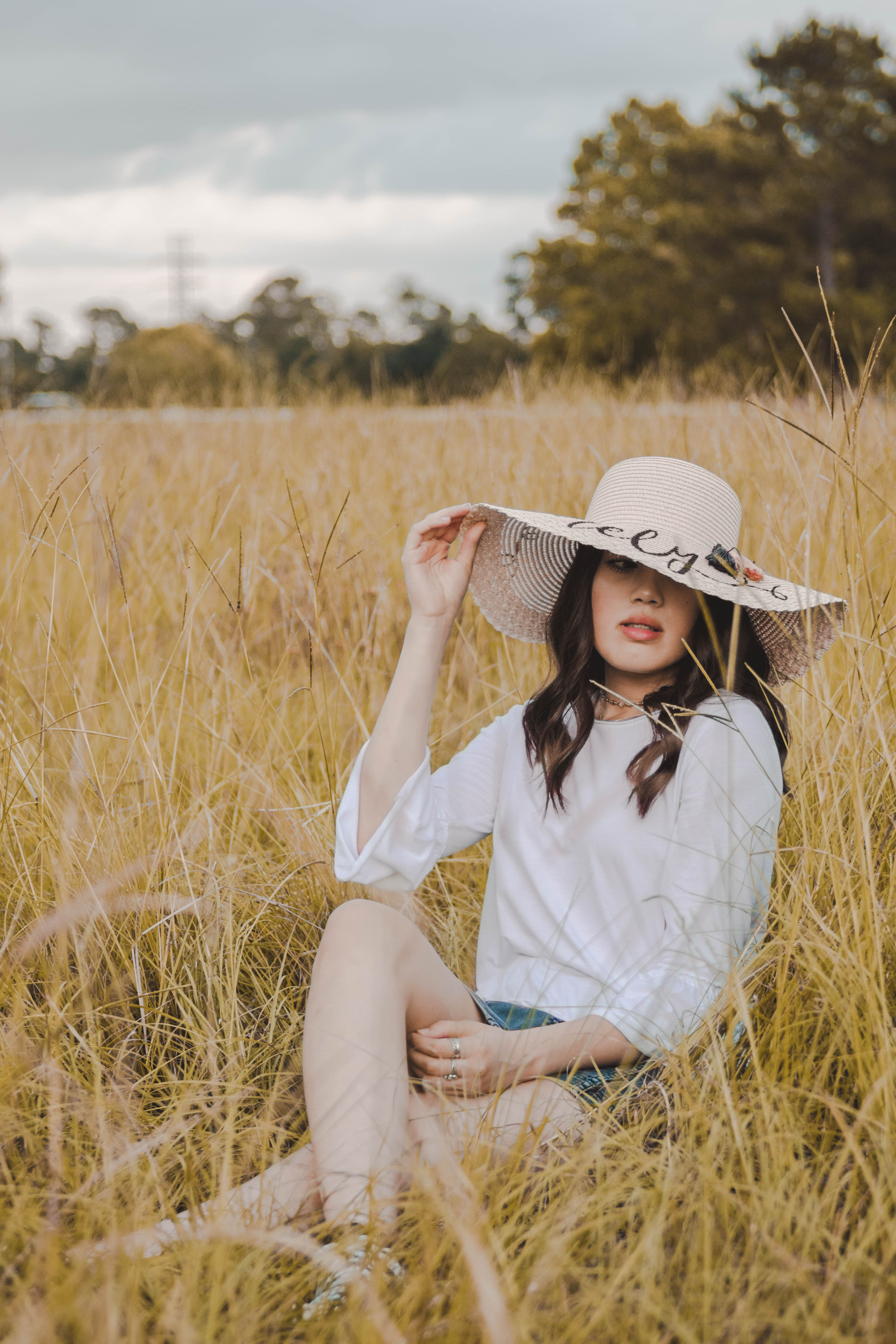
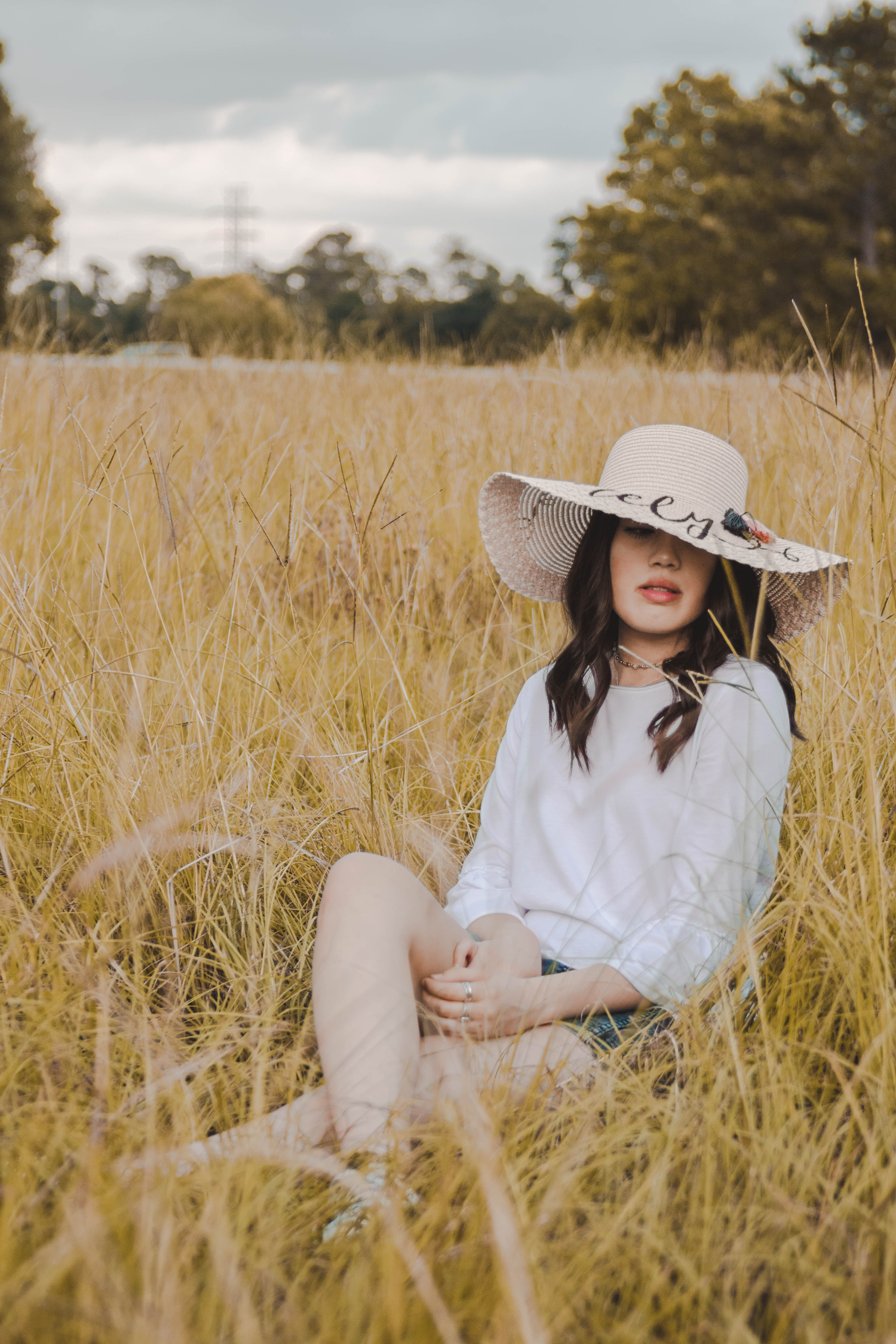
Neutral has a varying definition by who you’re asking. In the fashion community, a neutral would be a khaki, grey, black, white, brown, navy or denim as those colors go with and compliment almost everything. In photography, however, a neutral is when a color is simply lacking saturation or hues that will stand out to the eye. This mostly entails whites, blacks and brown shades as these colors are the most likely to lack color. Neutral colors will add a much more simplistic feel to any image that is very calming to the eye. A neutral color palette is often times seen in an Instagram feed like in Amanda Shadforth’s or Rachel Gulotta’s this can be achieved by desaturating the image, sticking to a very monochromatic color palette or simply converting the image to black and white.
I hope you enjoyed this tutorial on color scheming and that it helps improve your photographic game.
If you would like to see the full sets of any of these images click the links below!
Want to see more of my photography tutorials? Click here to see more!
Want to do a shoot together? Click here for booking and pricing information! or click here to book me for your photography needs!
Want to see more of my summer shoots? Click here!
Instagram: @goodallphotos
Facebook Page: @goodallphotographs
Contact me! goodallphotos1@gmail.com