If you look at Brandon Woelfel’s feed on Instagram you will notice a common theme in his images, a cotton candy color palette. Woelfel often uses Photoshop to achieve these unique colors in each of his images but I found a way to achieve something very similar in Lightroom. Here are the steps to achieve a similar look to Woelfel, I, however, do not encourage copying his style in all of your shoots. I think it is important to emulate a photographer from time to time to learn how to shoot with styles different than your own and improve your photography game. Personally emulating Woelfel’s style showed me some tricks for photographing portraits at night that I might use in my own images.
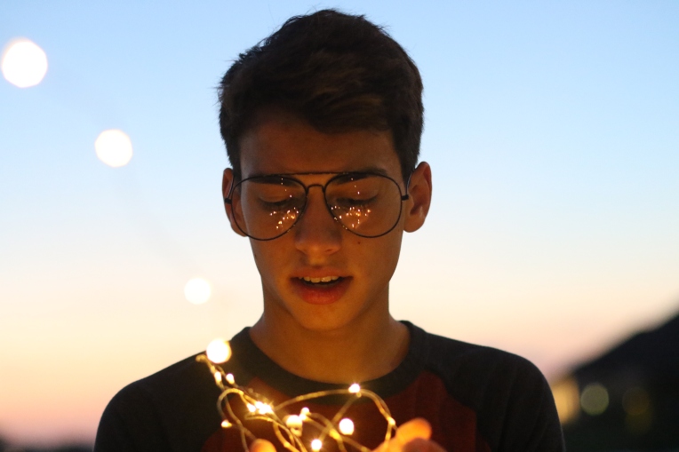
First, you must photograph a model holding fairy lights at some time after golden hour. Woelfel often photographs at blue hour or at night time with artificial light to illuminate his image. I photographed at sunset into the night time and I didn’t have any trouble achieving the look. I would also recommend purchasing some serial killer/ oversized glasses to reflect more of the fairy lights. Mango Street made a Brandon Woelfel starter pack that is relatively inexpensive and a good starting point to begin photographing like him.
Steps
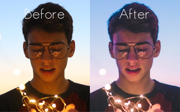
- After photographing the image you will begin your editing process.
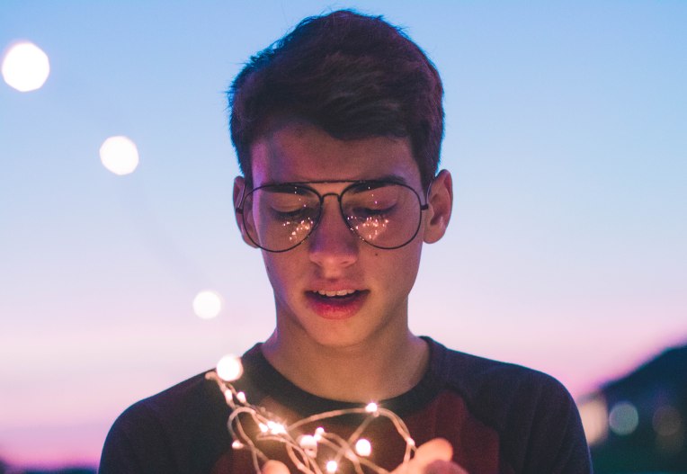
- I started by adjusting the temperature of the image to make it a lot cooler and making the tint a bit more magenta to achieve that aqua and pink look in Woelfel’s images.
- Next, I turned up the exposure a little to bring back some light on his face and brought down the contrast to create more of a faded look in the image.
- After that, I raised the shadows, dropped the blacks and dropped the whites almost all the way to add a little bit of contrast back in the image and even out the light distribution on his face.
- Next, I played with the tone curve a little bit to create the crushed black look and created a slight S curve from that point.
- I then played with the hues of the colors by making the yellows more orange, blues more aqua, aquas more blue, purples more magenta and magentas more purple which might sound a bit counterintuitive but it creates the colors that I wanted.
- After I adjusted the saturation by dropping the saturation of the oranges and yellows and bringing up the saturation of the blue and magenta to emphasize the colors further. I also brought the luminance of all of the colors up slightly.
- I added a pastel pink color into the highlights and a pastel blue color to the shadows to really create that cotton candy look to the image.
- Lastly, I raised the vibrance up and brought down the saturation while also bringing down the clarity slightly.
- I’m not saying these editing techniques will work for every image but they worked fairly well for me to create a similar looking image to something I thought Woelfel might create. For a more in-depth tutorial, I would recommend watching Mango Street’s video on this very technique.

One thought on “How To: Edit Like Brandon Woelfel”