I decided to review my cameras, lenses and editing software because I feel as though it will benefit you guys a lot when purchasing a camera or a new lens. I really enjoy the gear that I work with I feel as though it’s all very high quality and though the gear doesn’t completely matter it does help create beautiful images. I decided to not include my studio lights or camera bag that I personally use in this post because I simply could not find the make or model of the ones I use but I found a similar camera bag and decided to add it instead.
- Cameras: Canon 7D Mark ii + Canon Rebel T5 + Canon Powershot G7X mark ii
- Lenses: Canon 50mm 1.4, Canon 85mm 1.8, Canon 24-70mm 2.8 L series
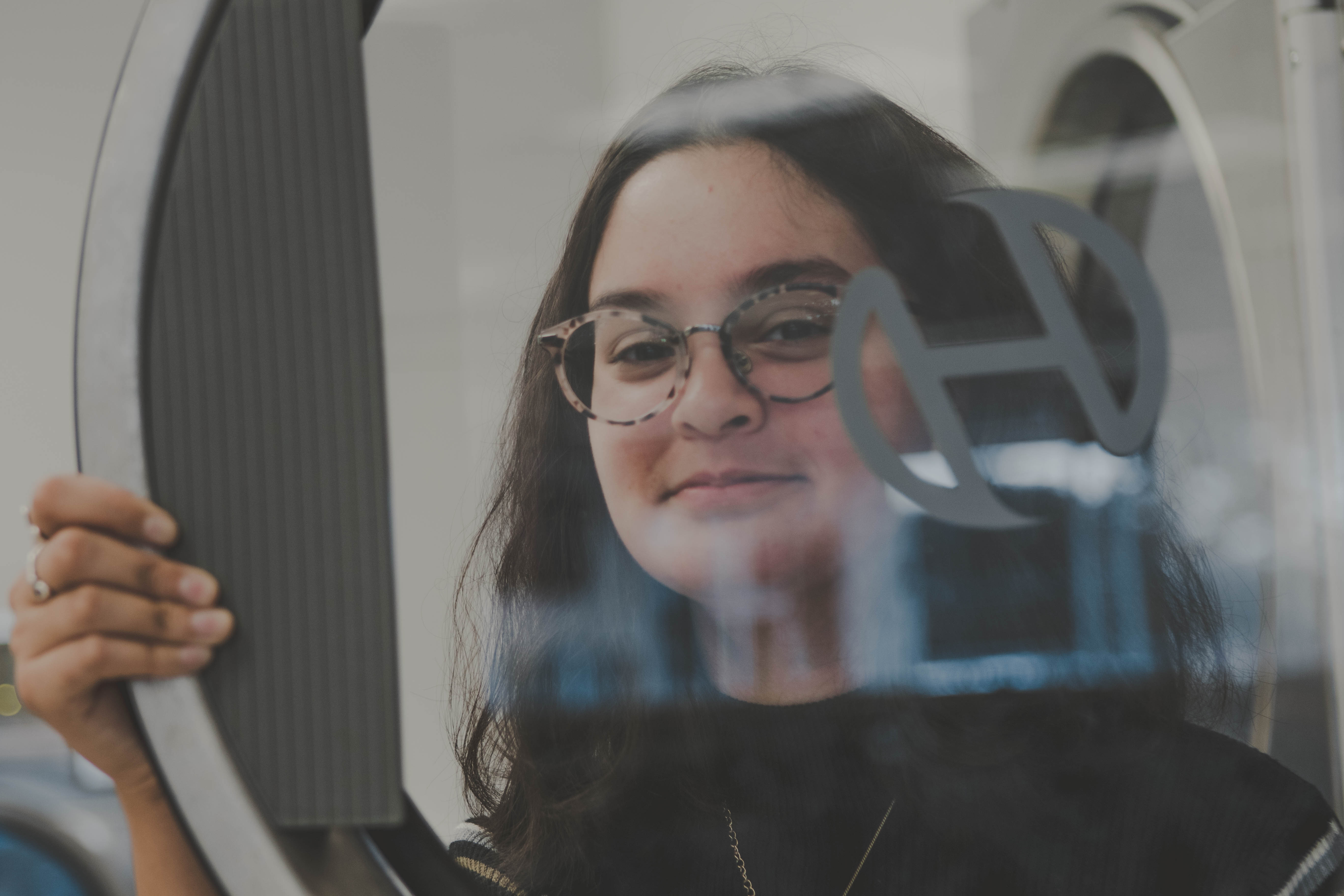
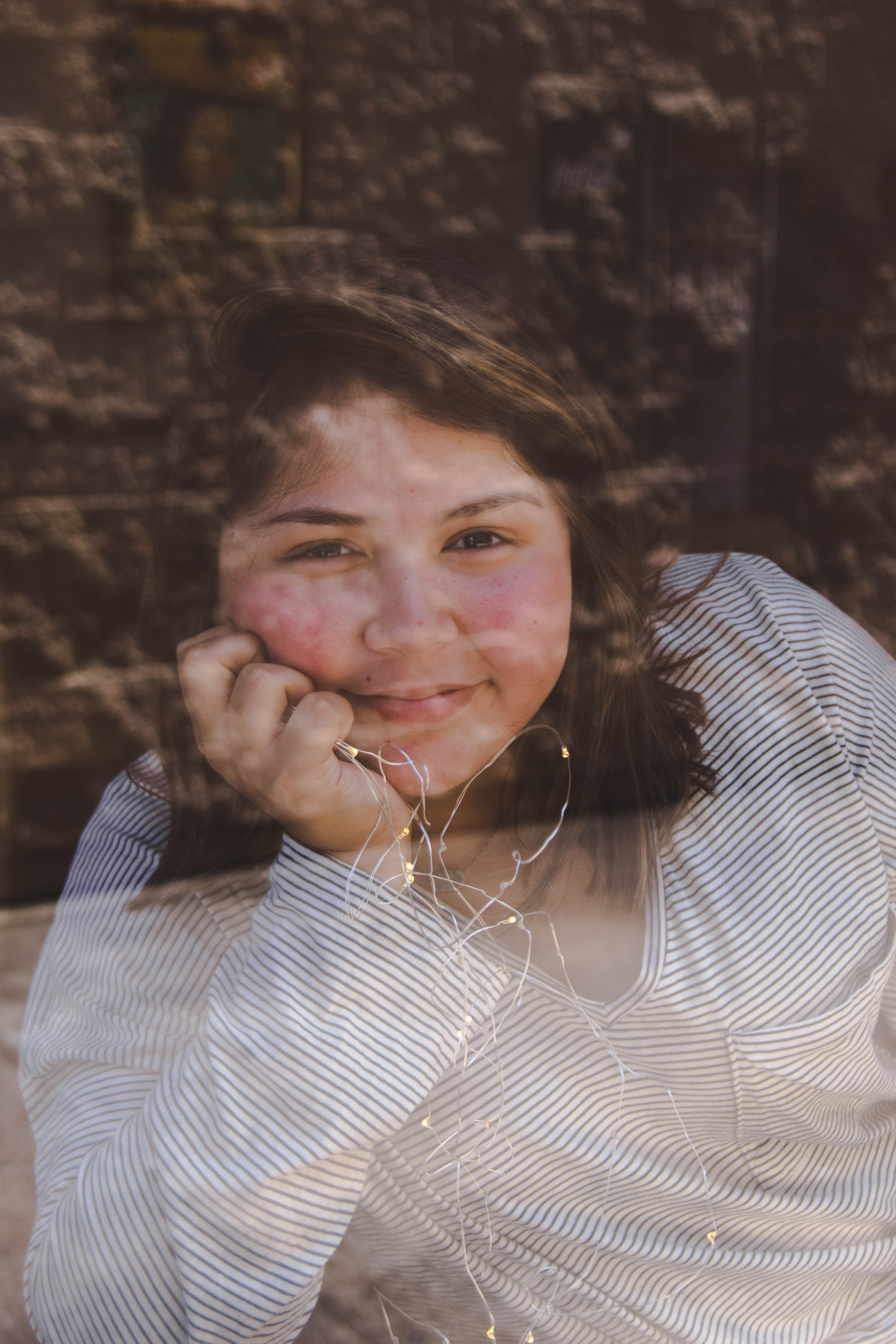
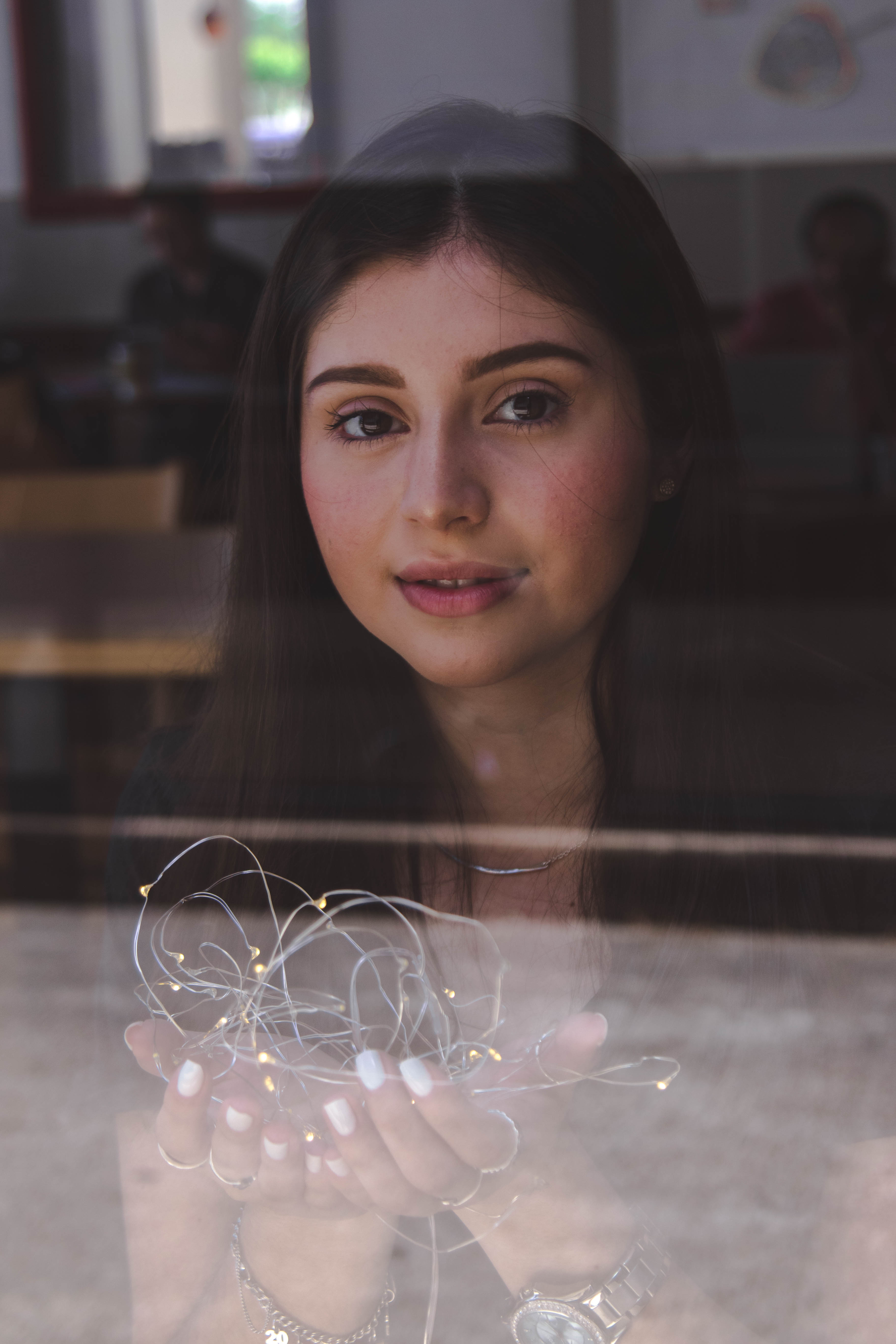
- Prism
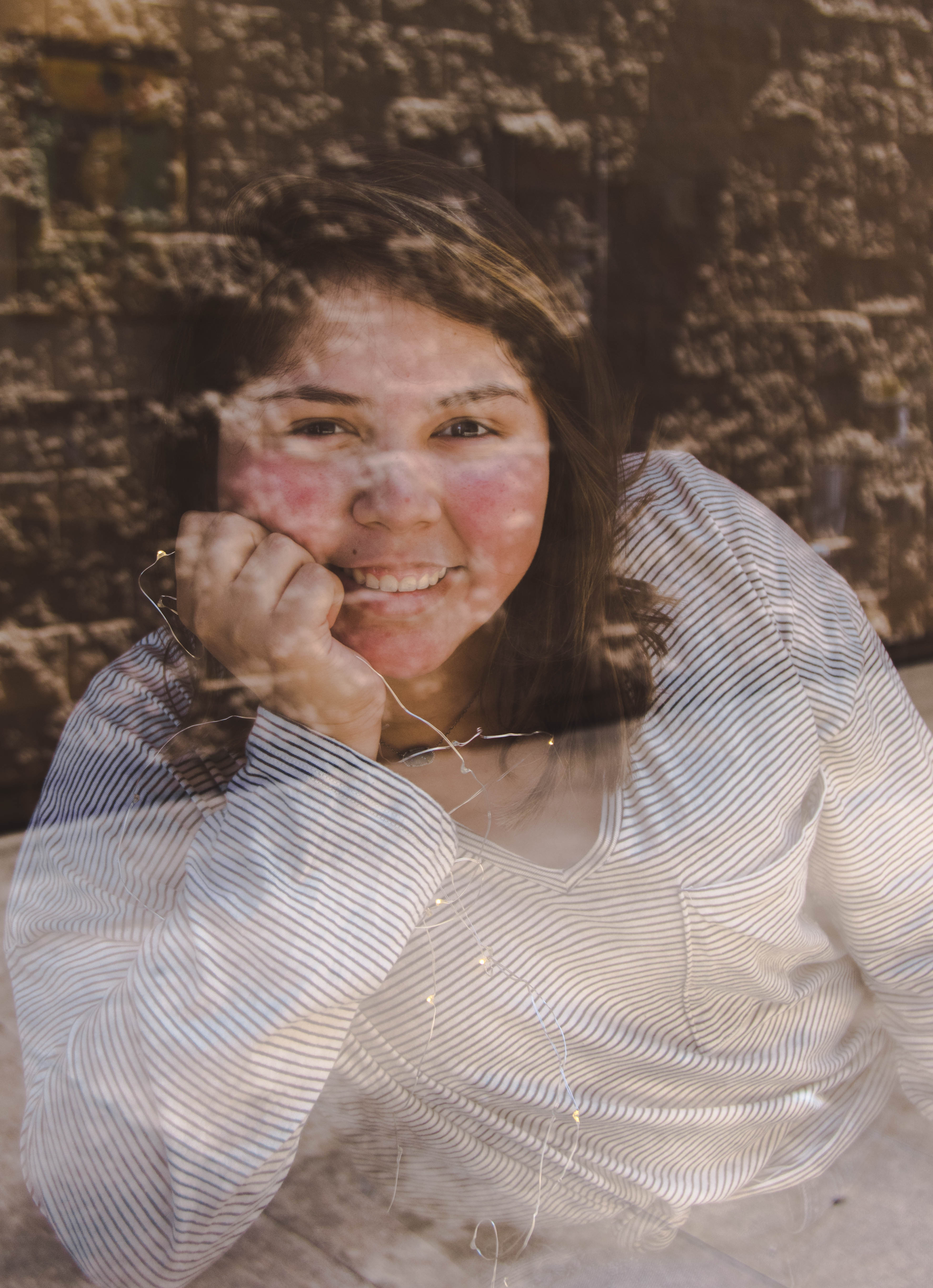
- Fairy Lights
- SD Cards: Sandisk 32 GB + many others but I primarily use these
- Hard Drive: Sandisk SSD Drive
- Camera Bag: Similar to mine but slightly bigger
- Extra Battery
- Lightroom Classic
- Photoshop Elements 15
- Lightroom Classic
Cameras
Canon Powershot G7X: I began my photography career with a simple Canon Powershot G7X Mark ii. The G7X is a point and shoot sized camera that has manual capabilities. This is a great camera for if you aren’t that serious about photography but you still want manual capability instead of a point and shoot.
Canon Rebel T5: I shot with this camera for about 2 years before transitioning over to the 7D and I got some really good pictures from it. I feel as though this camera is great for an amateur photographer because with the right lens you will still be able to capture striking photographs that look at the professional level. A few words of caution from this camera, I’ve found that for some reason the way the button is designed causes the images to appear blurry and causes quite a bit of camera shake. I’ve found that many times my images appear a lot shakier when I shoot with my rebel instead of my 7D, this could just be a user error but if you struggle with camera shake I would invest in a tripod or shoot on a high shutter speed at all times.
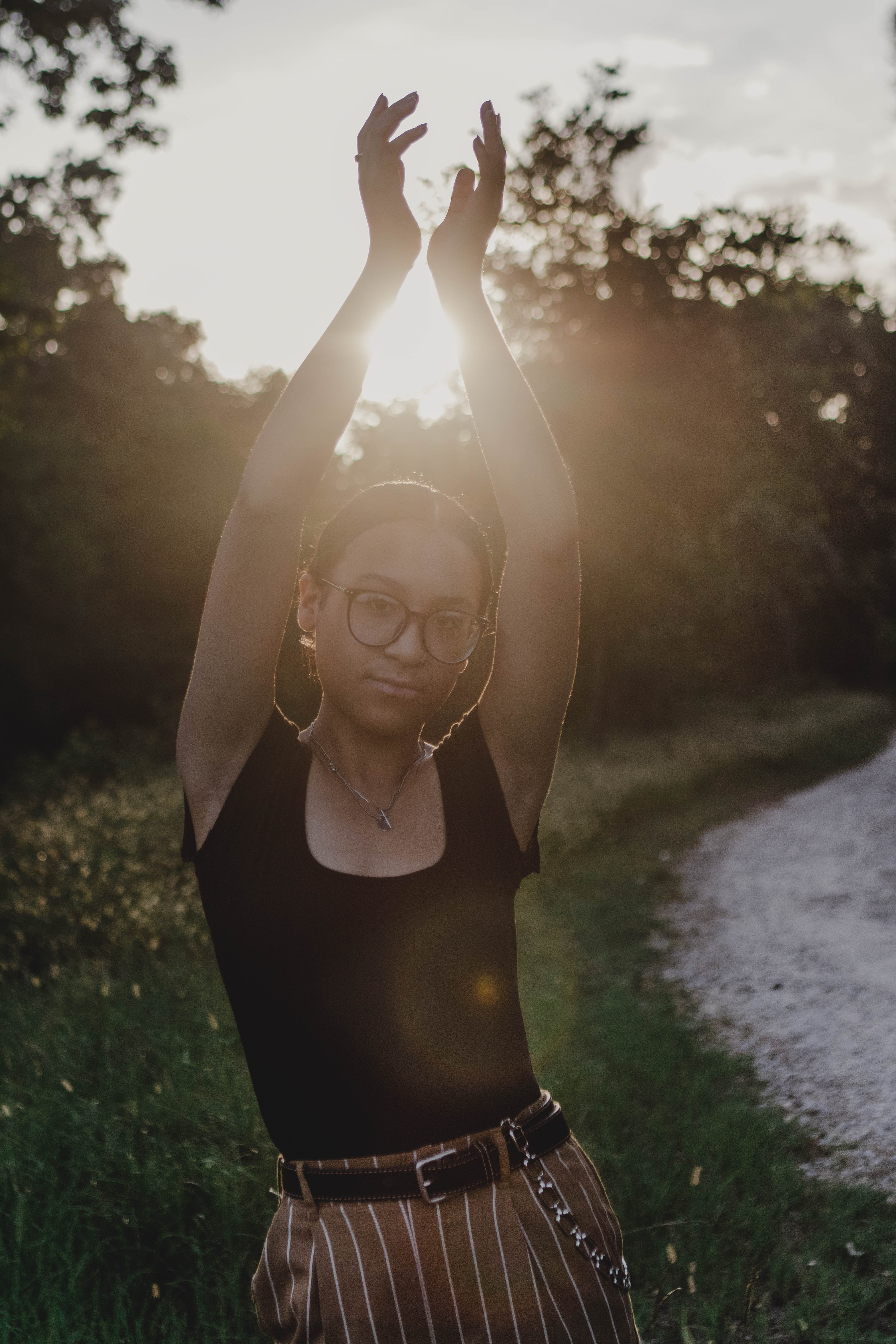
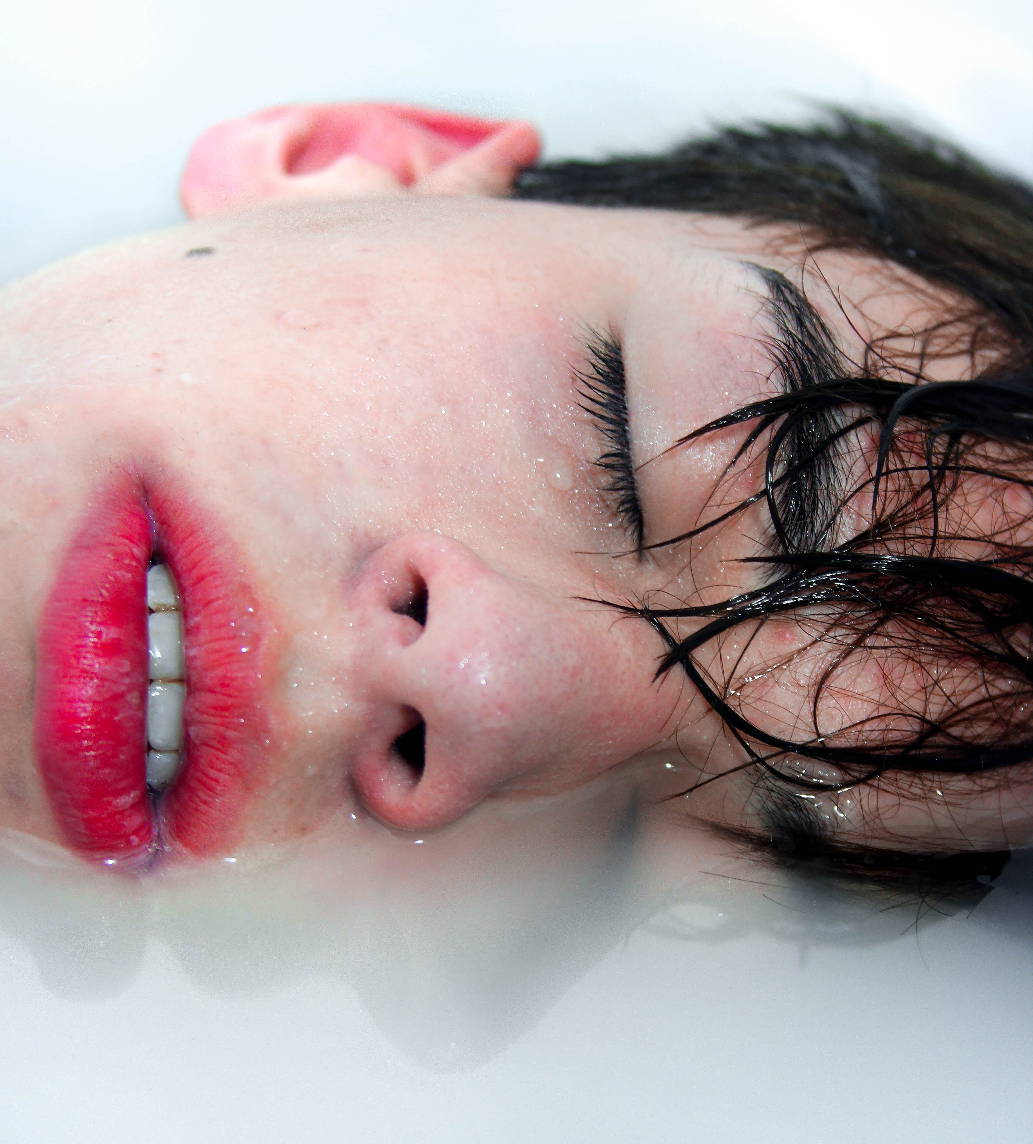
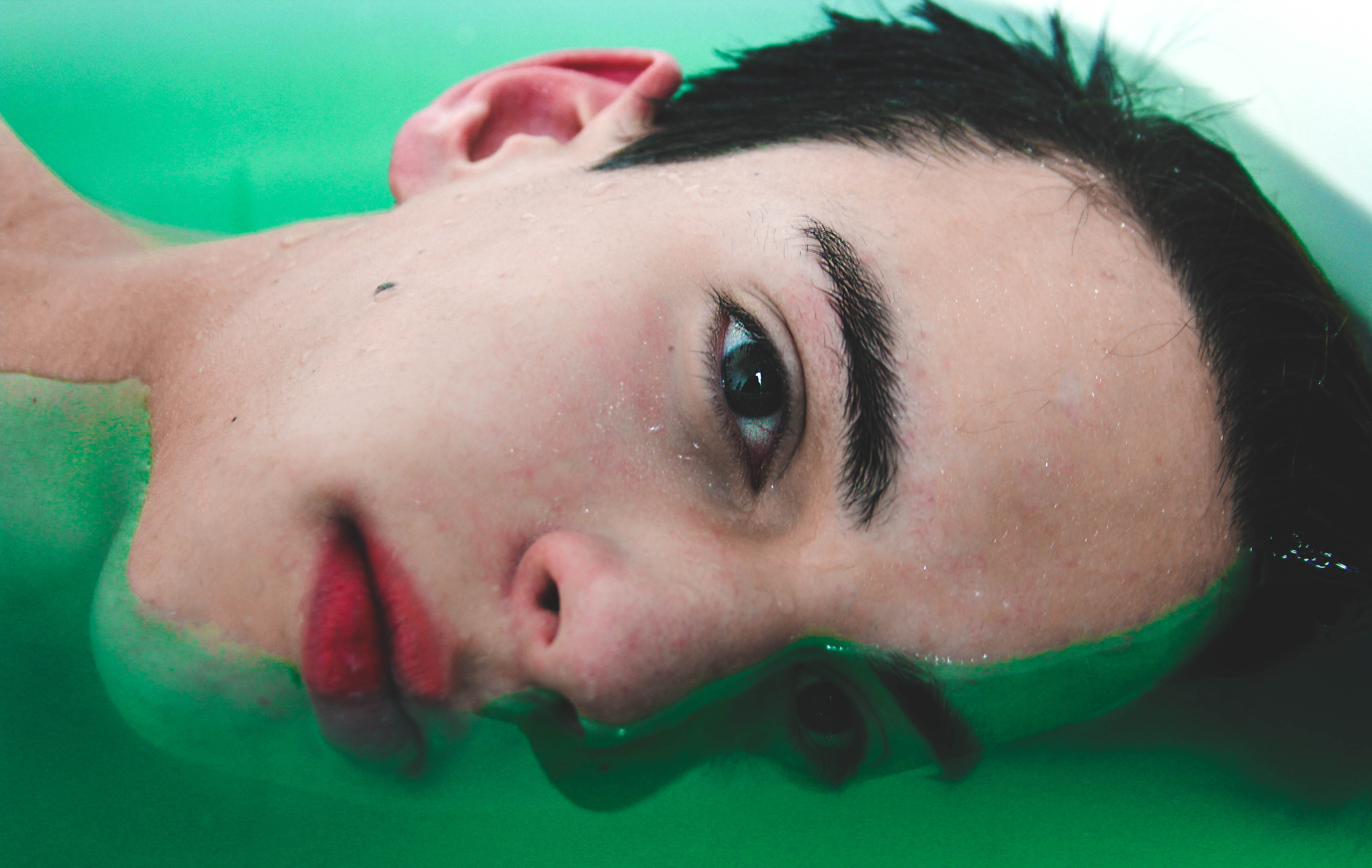
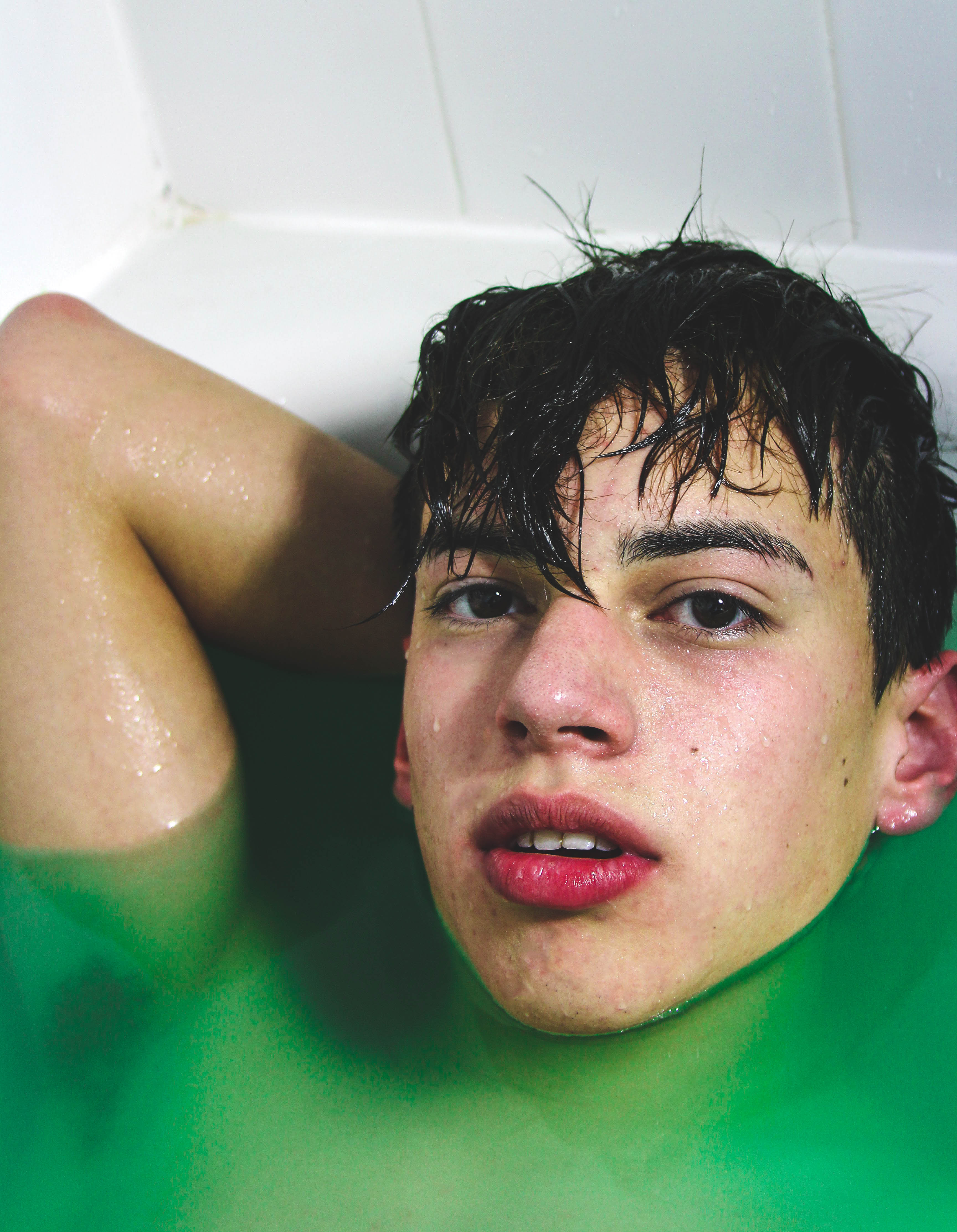
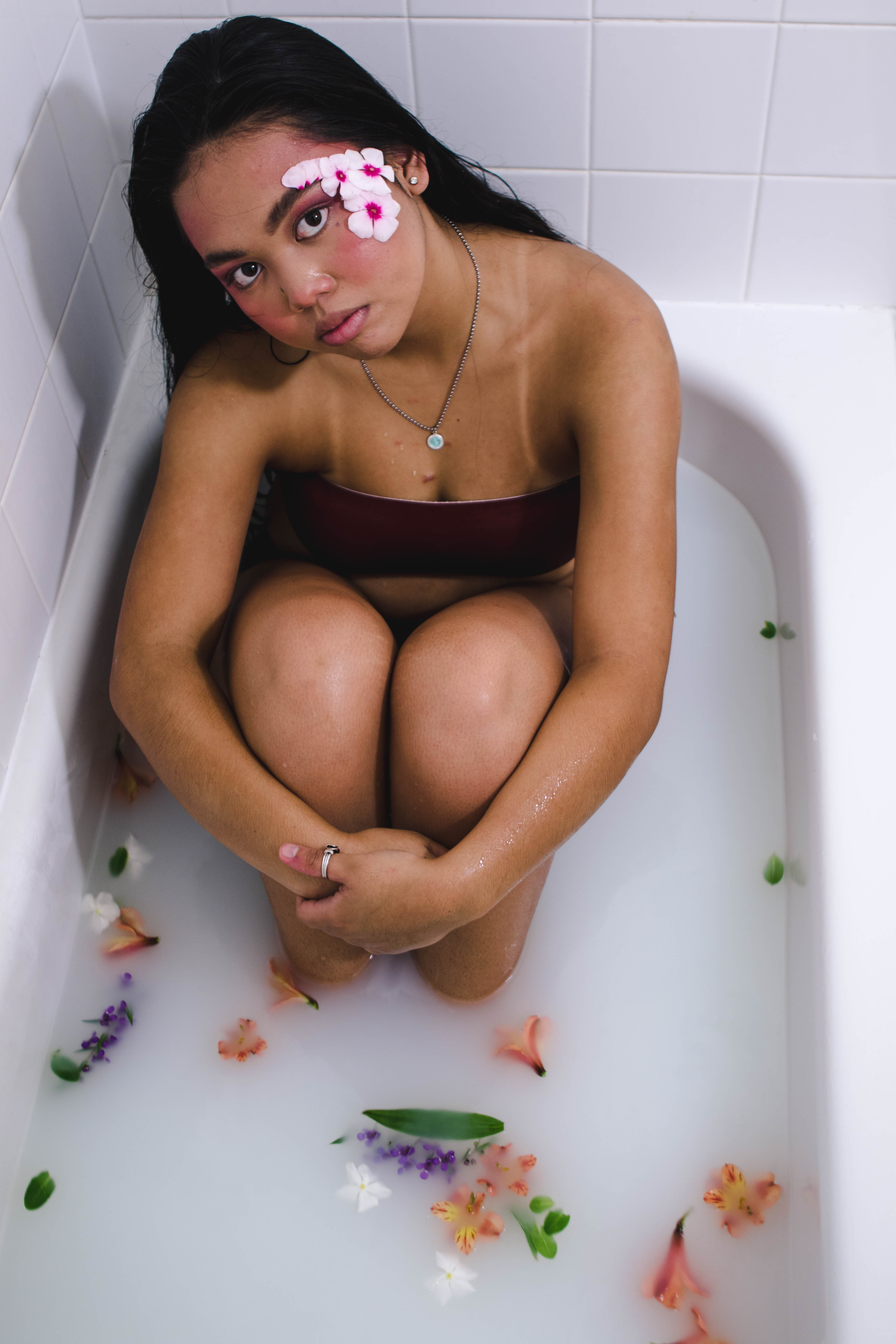
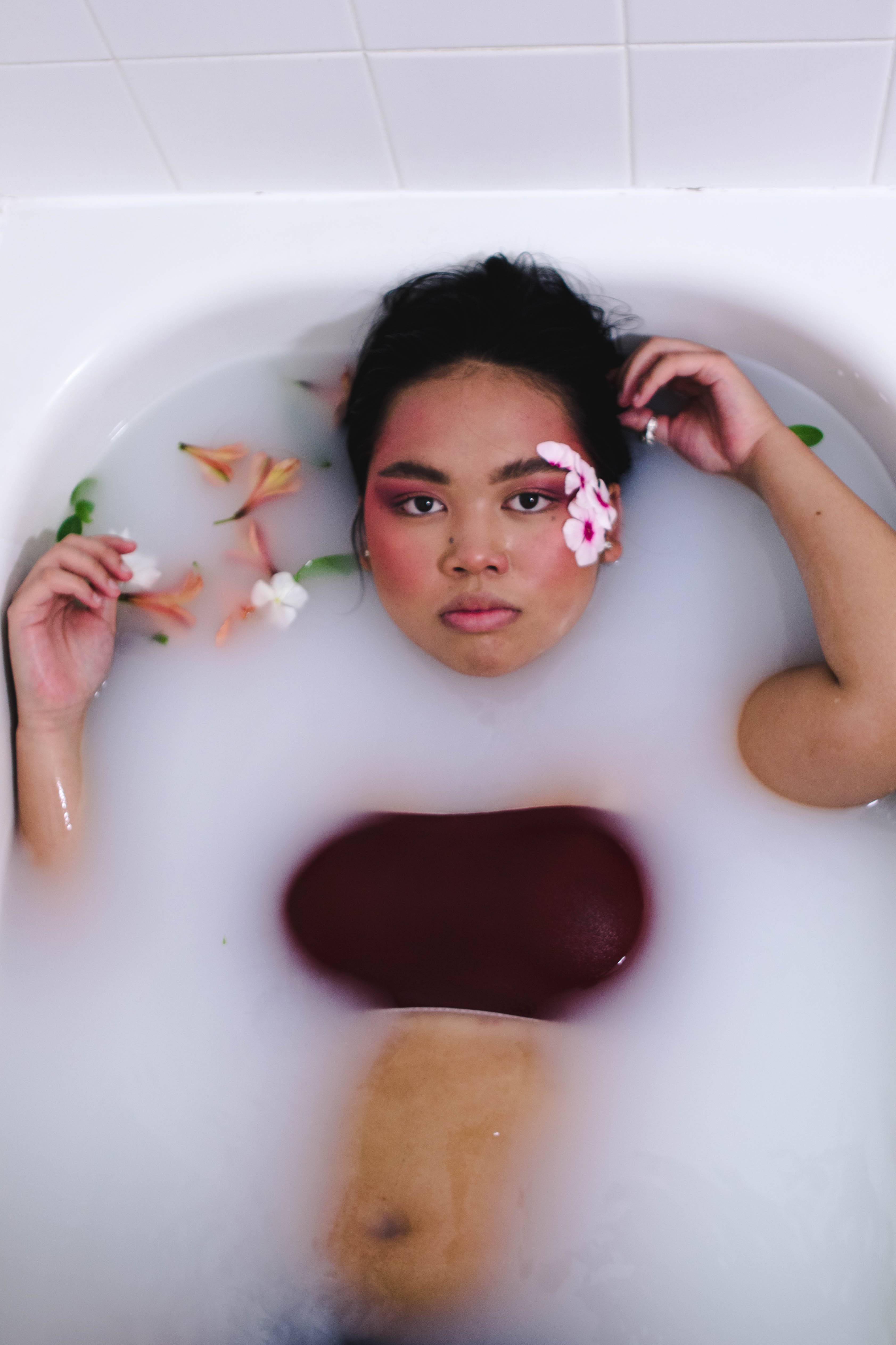
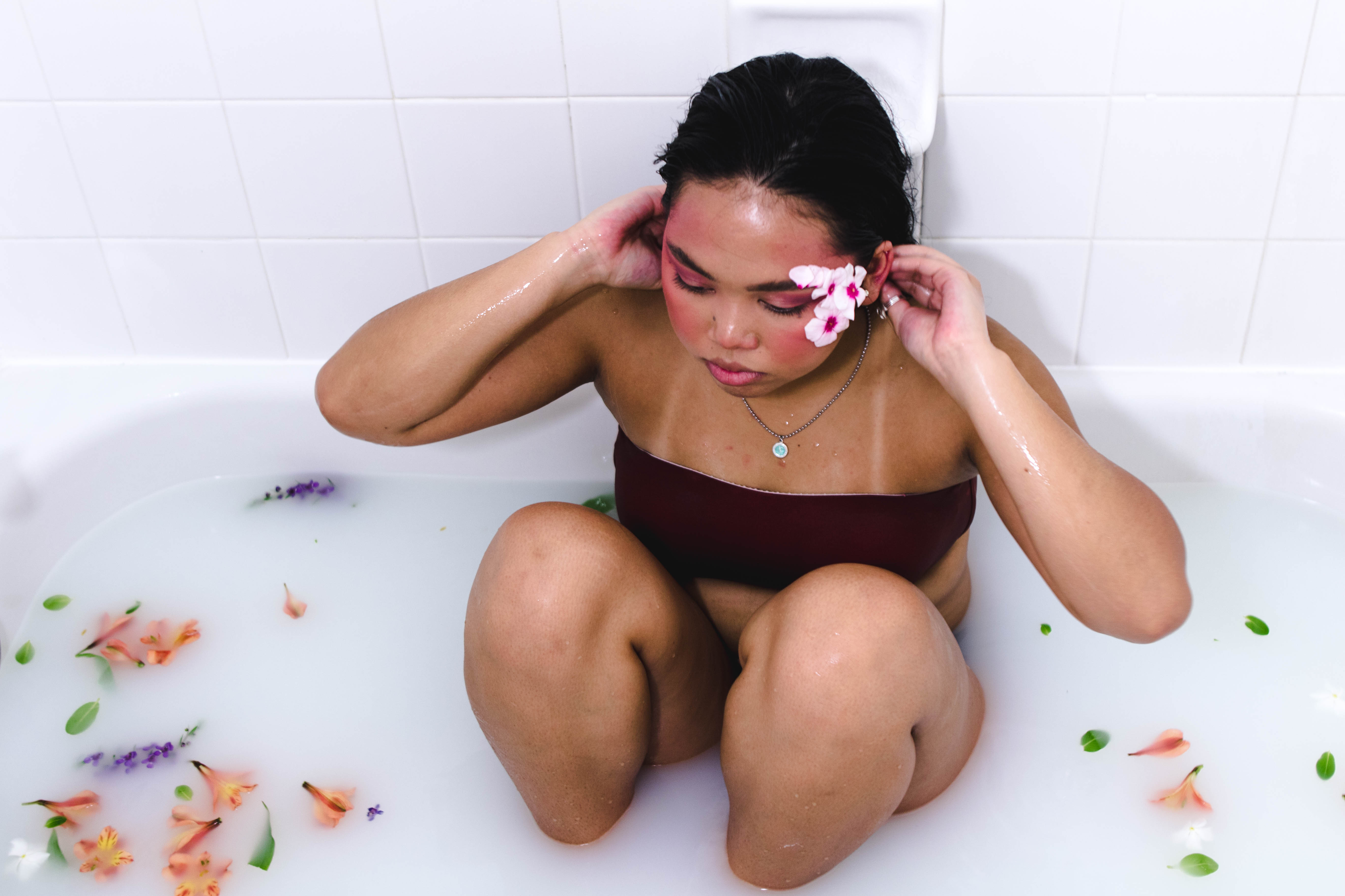
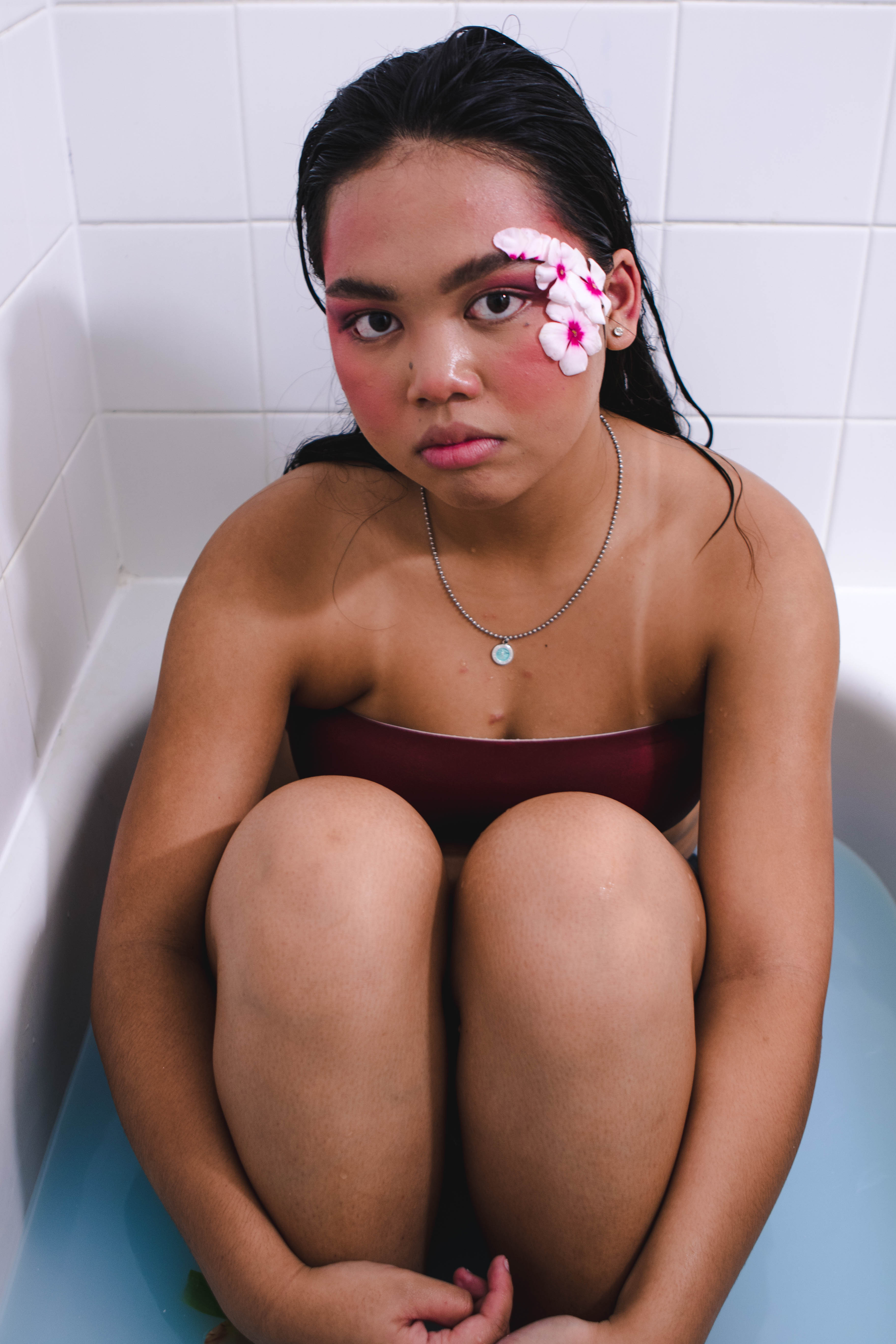
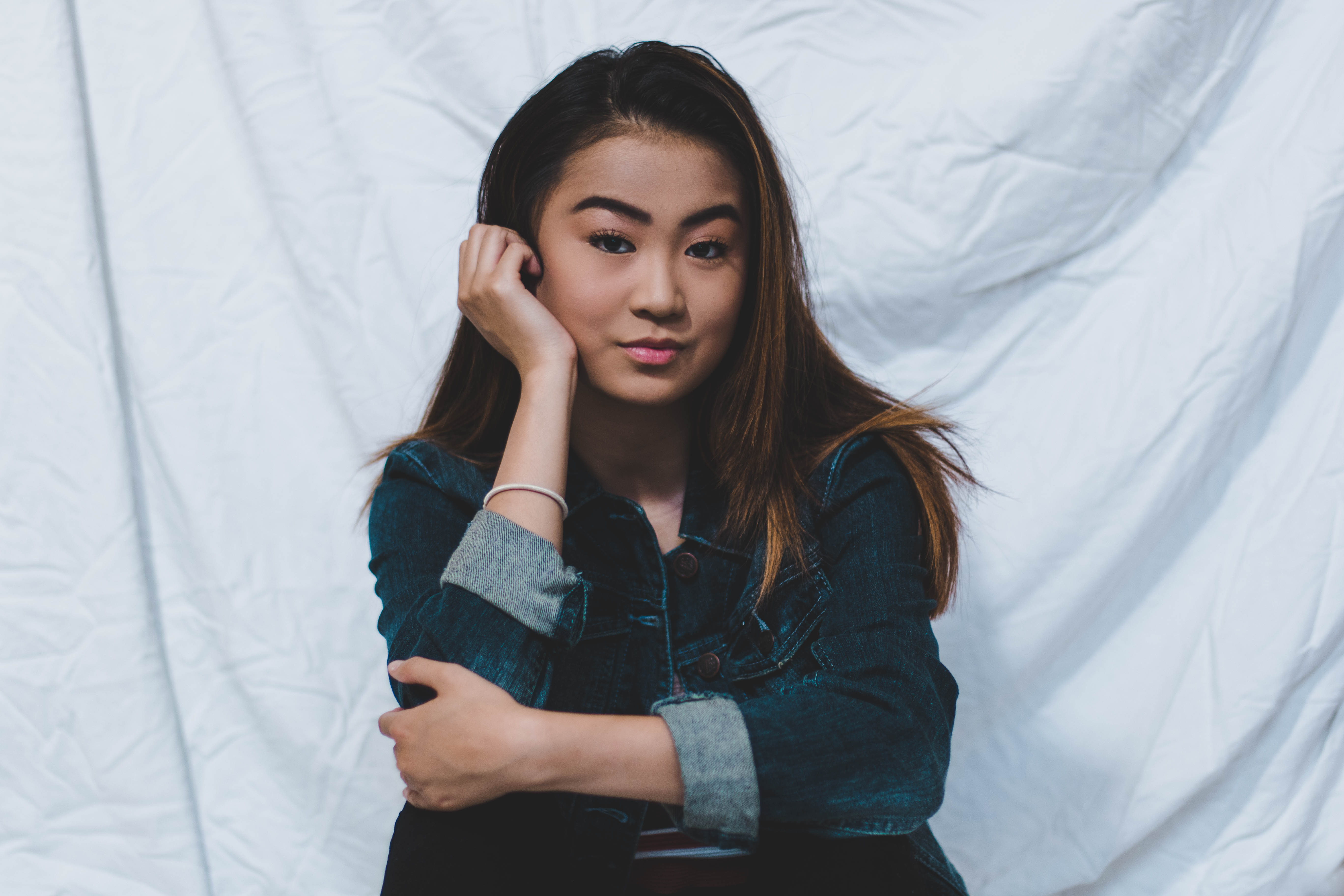
Canon 7D Mark ii: This is the camera I’ve been shooting with for the past 9 months and I’ve fallen in love with it. The camera makes it easy to get consistently clear shots at all times and works well with all of my lenses. I love the way my images look from the 7D and I feel like my photography has progressed quite a bit from using this camera. I would highly recommend this camera to anyone really serious about photography.
dream camera: canon 5d mark iv, a girl can dream
Lenses
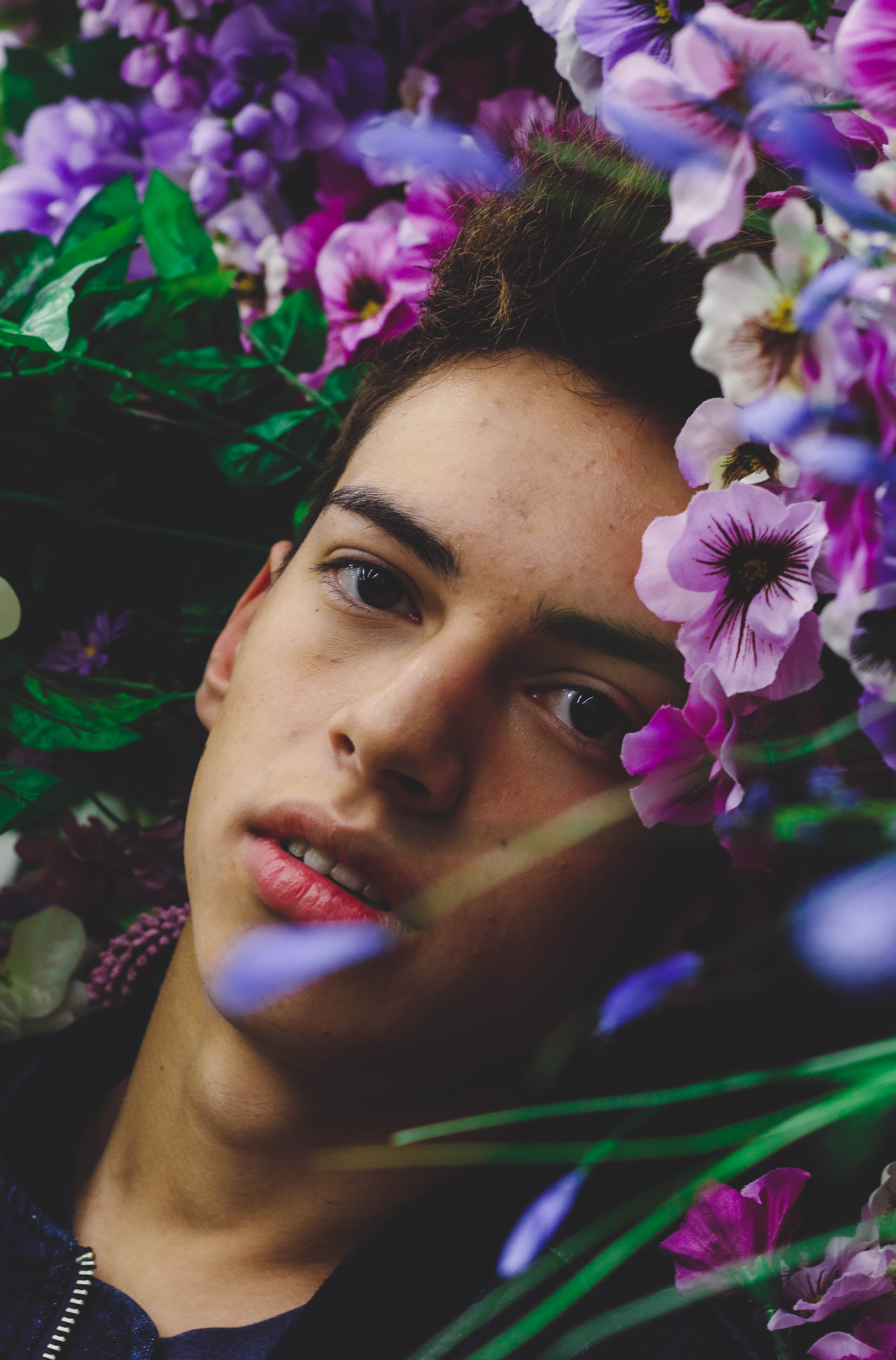
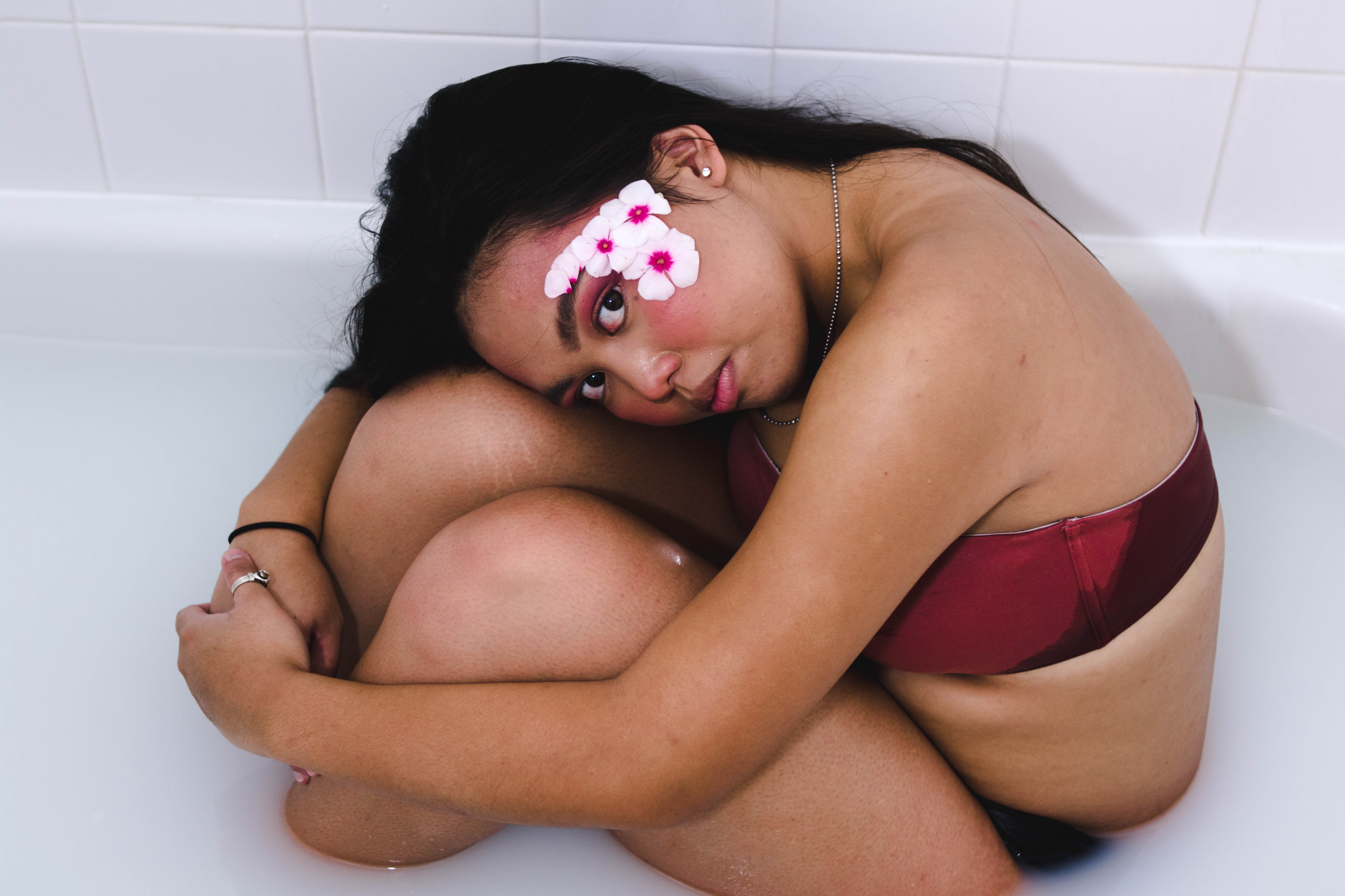
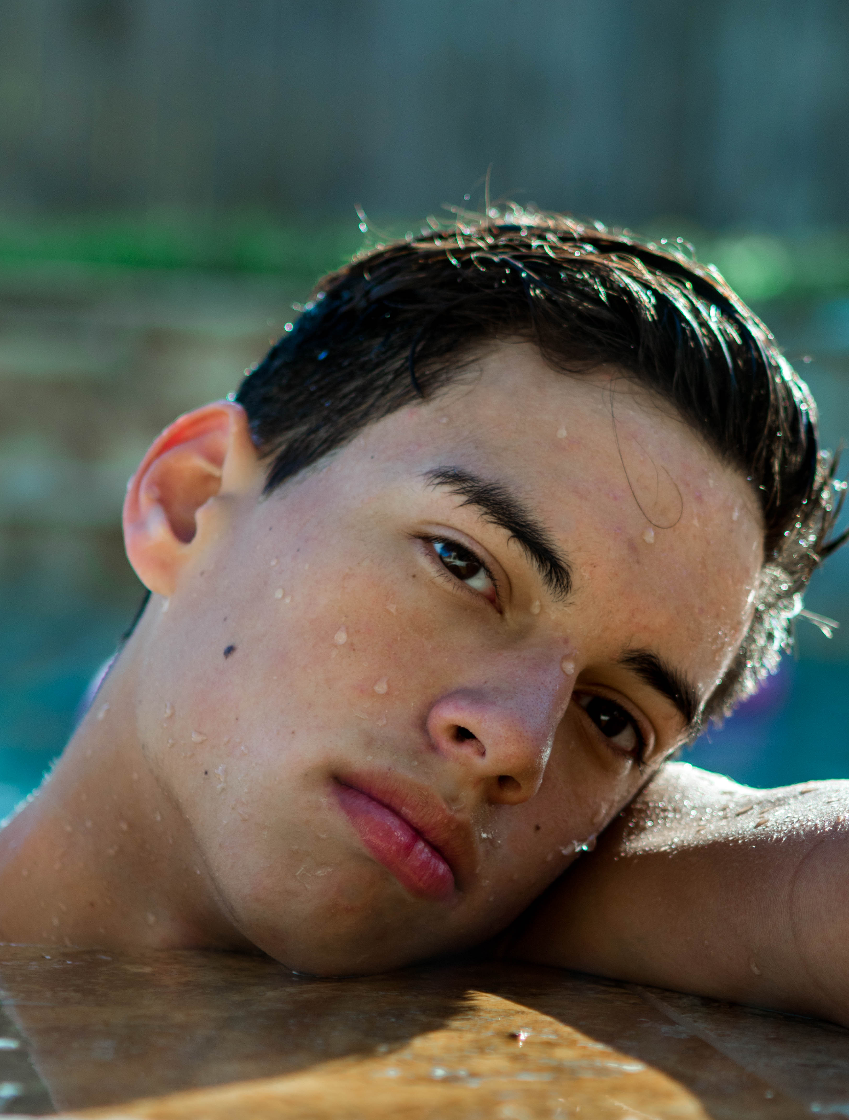
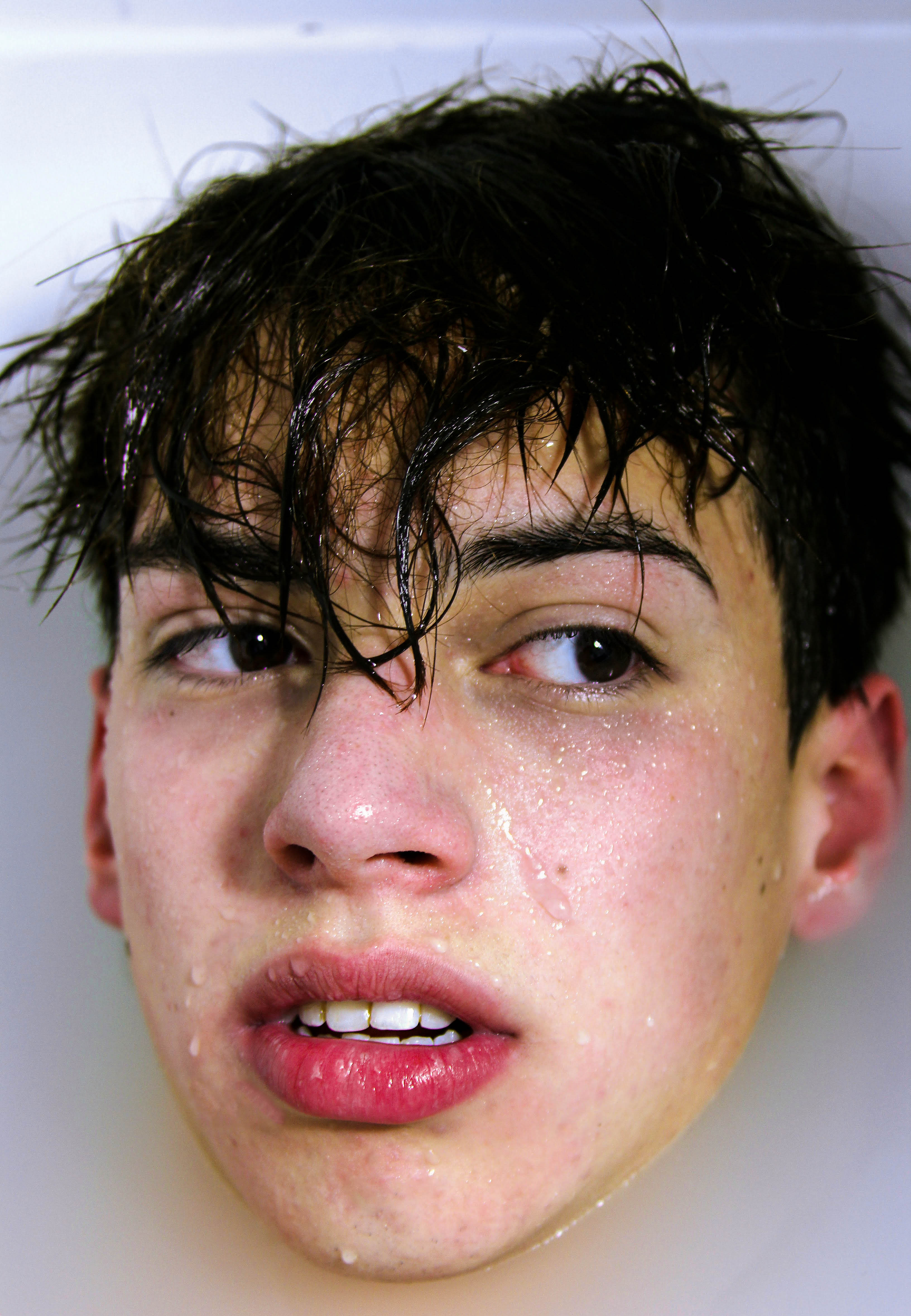
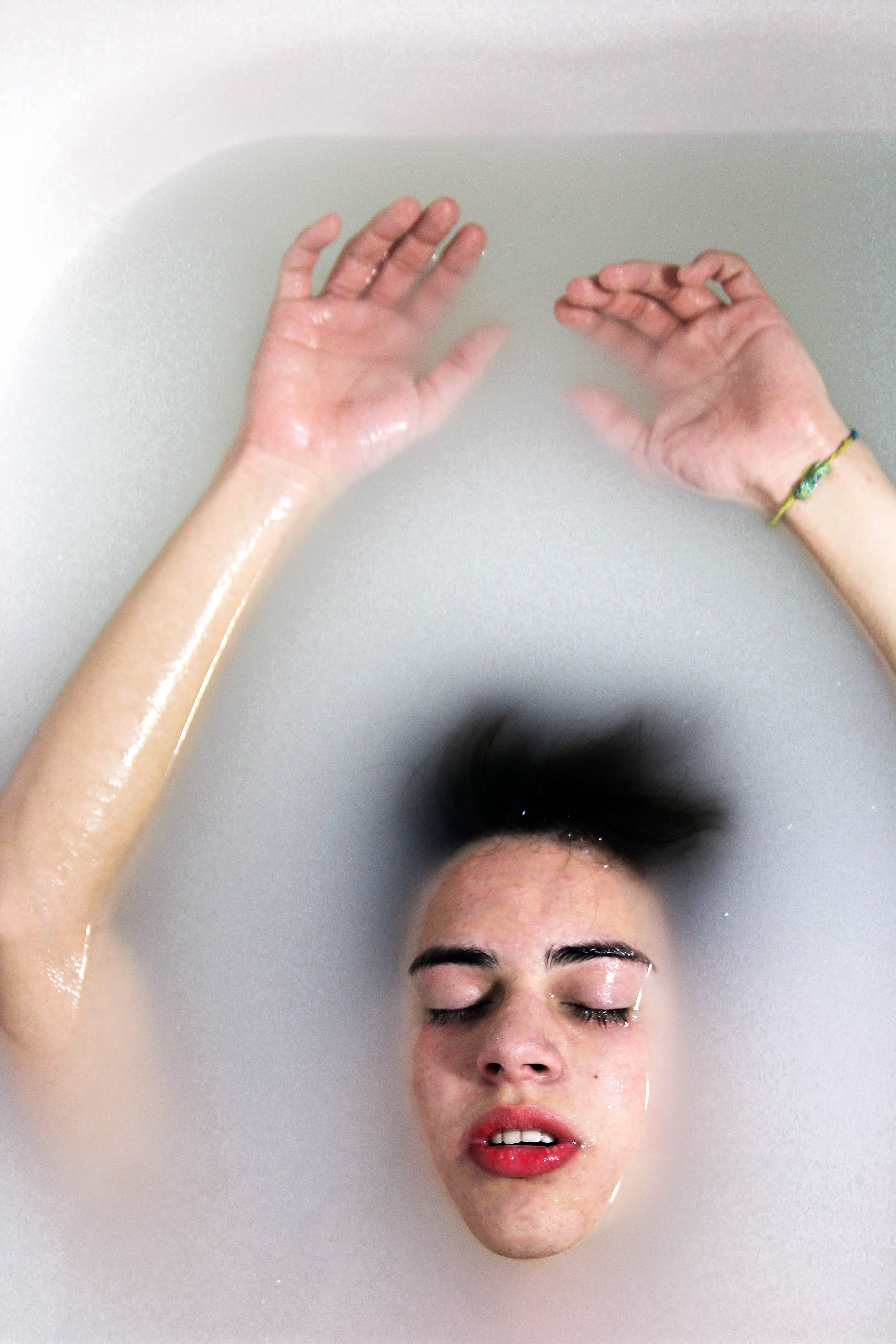
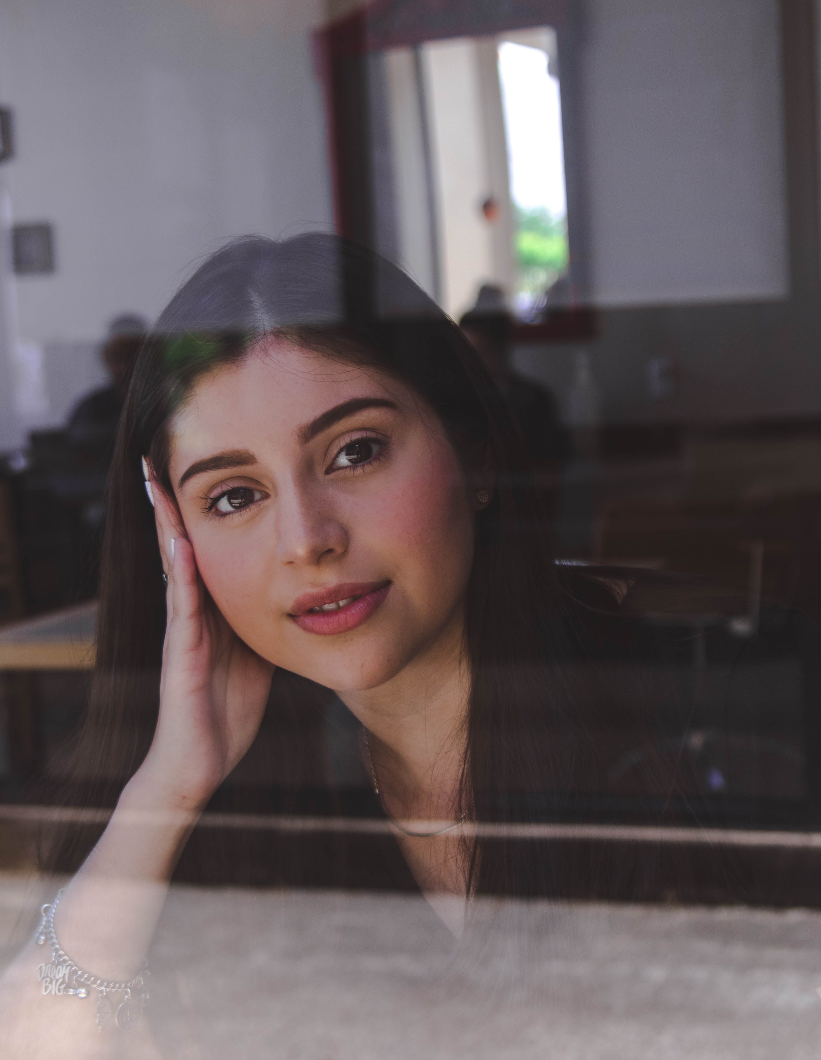
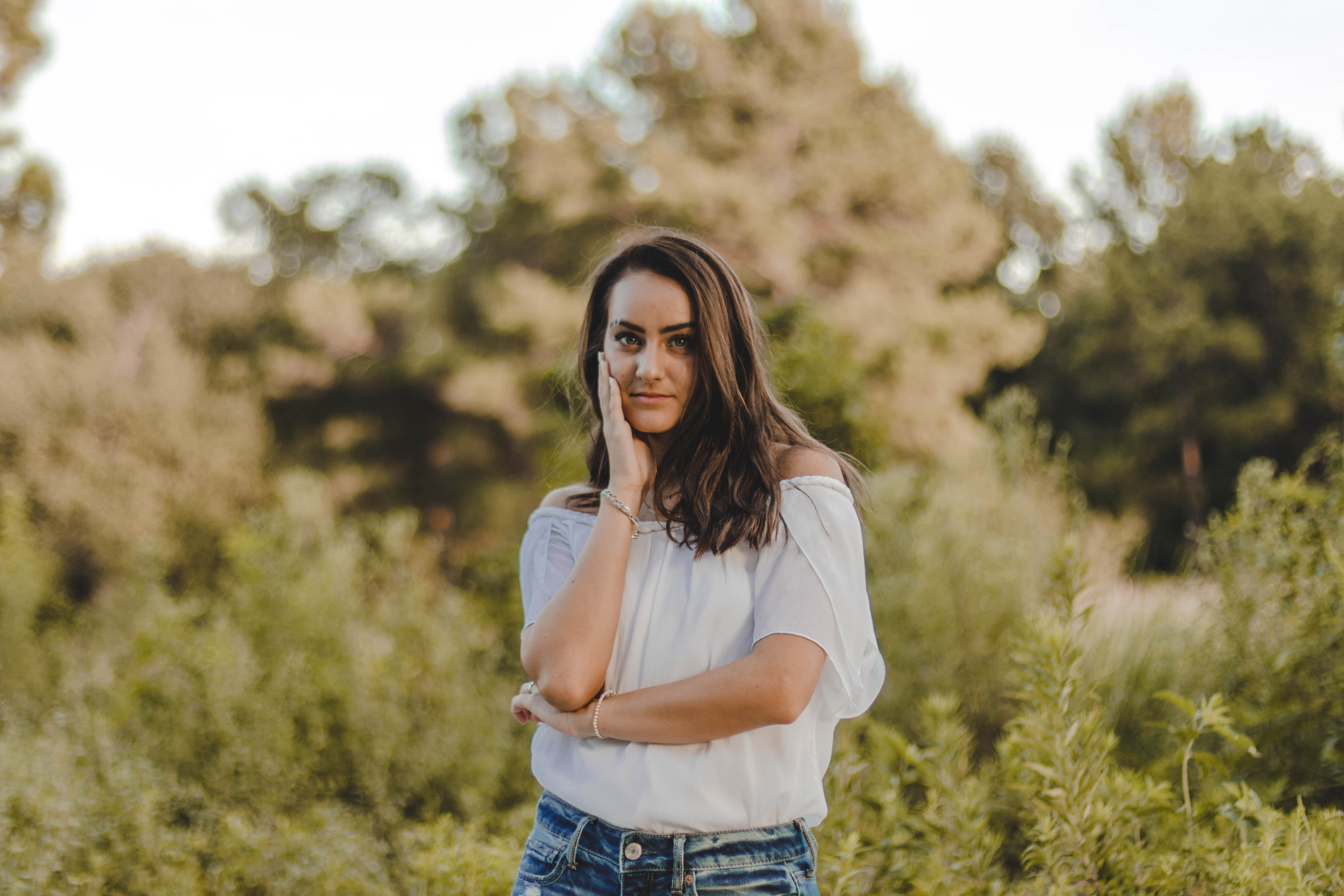
50mm 1.4: I absolutely LOVE this lens. The 50mm 1.4 lens is my favorite of all the lenses I’ve ever shot with. One of my favorite aspects of it is the fact that it’s a prime lens so it forces you to move around your model instead of easily zooming the lens. I love the bokeh effect that this lens gives and even though it doesn’t go down to aperture 1.2 I still think it is an amazing lens and highly recommend it to anyone interested in portraiture.
85mm 1.8: Again this is another prime lens that I like quite a bit. I haven’t practiced as much with the 85mm because I just adore the 50mm so much and my personal 85mm doesn’t go down to the low apertures that I like. I do really like how the 85mm really focuses a lot more on the subject rather than the background and creates a really nice blurred background for portraits. I recommend this as a good second portrait lens but I would recommend the 50mm lens over this one as my personal preference.
24-70mm 2.8: This lens is an absolute dream. This zoom lens is my second favorite lens in my collection because of its landscape capabilities. I shoot with this lens a lot of times when I either don’t have enough room to move around my model and need a zoom capability or on the rare occasion that I shoot something other than portraits. This lens is on a bit of the pricier side since it is an L series lens but I would still highly recommend it if you like more of your subject matter in focus for portraiture or like shooting basically any other subject matter.
Editing
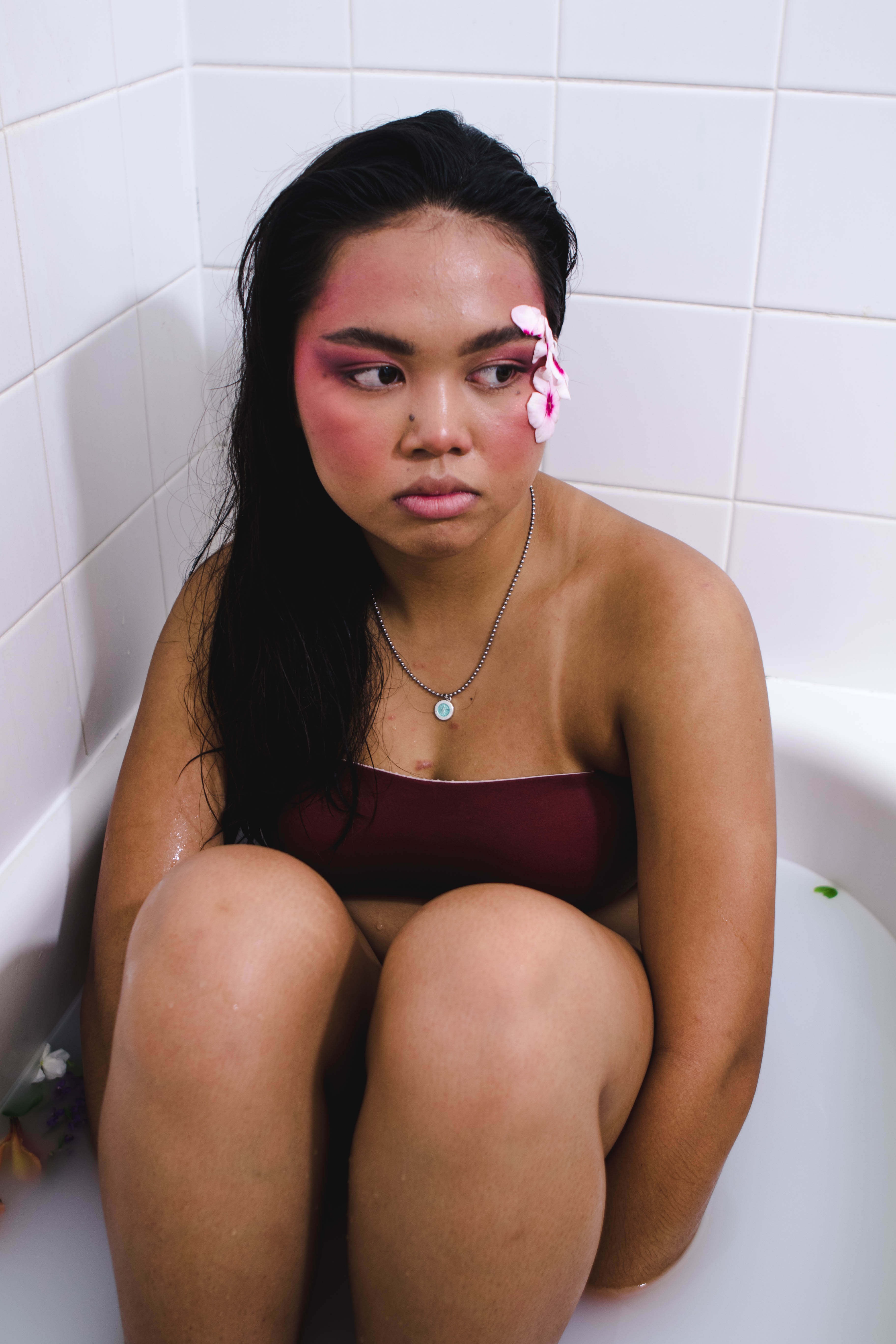
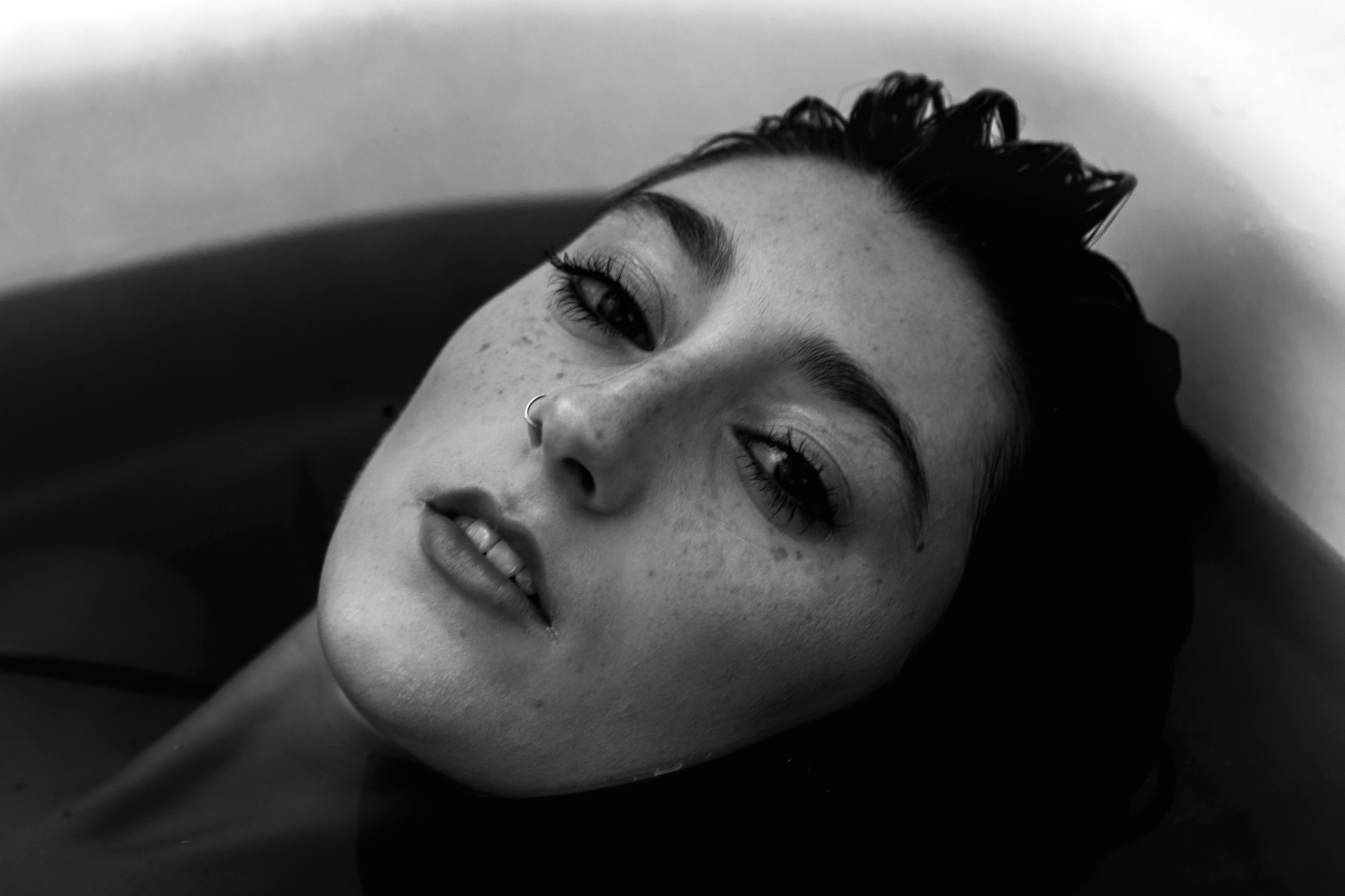
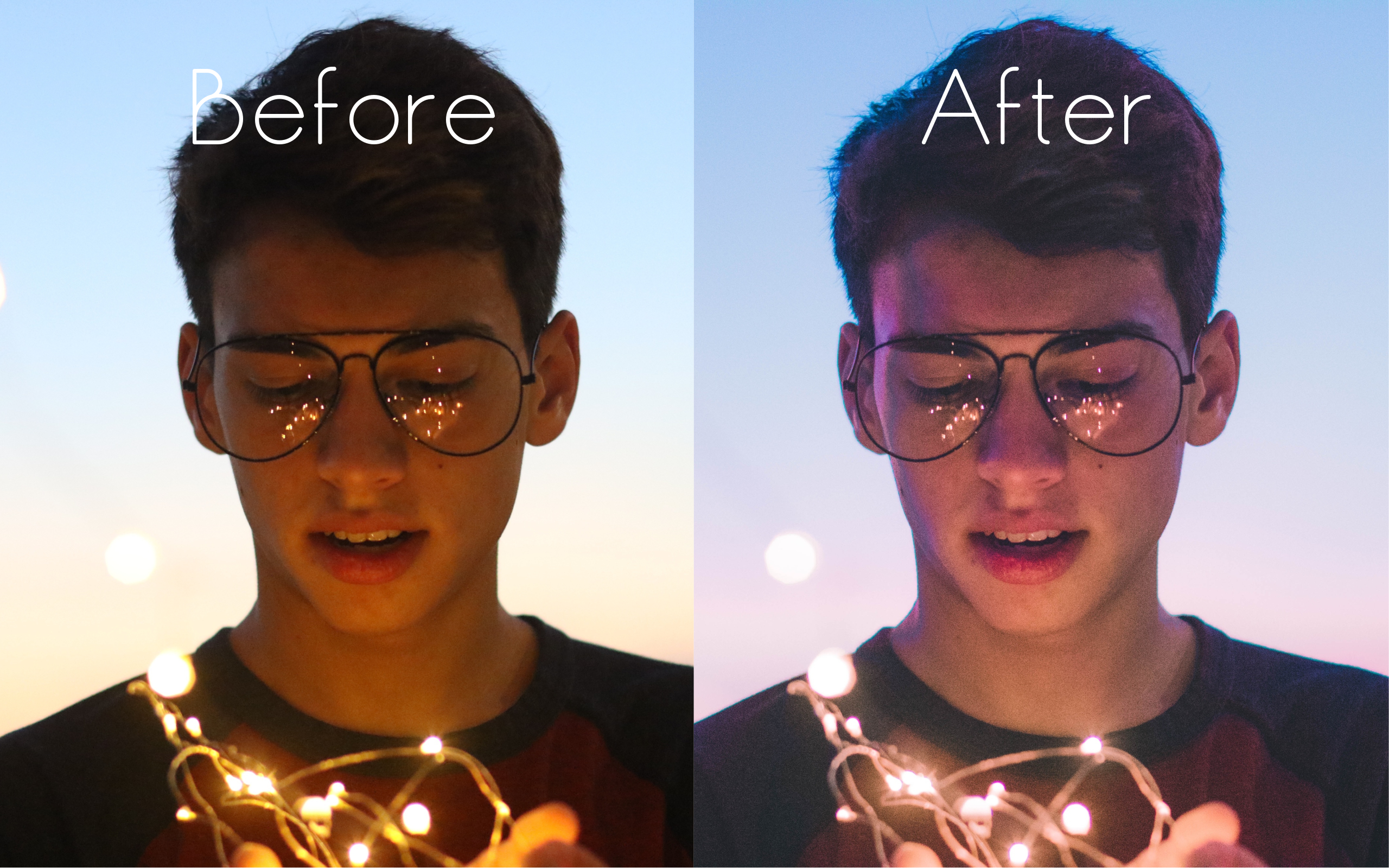
Editing Software: I originally used to edit completely in Photoshop Elements 15. I began to watch more and more YouTube videos on editing techniques but I wasn’t feeling inspired or like I could do much with Photoshop Elements. I decided to try the Lightroom CC trial and I couldn’t understand the hype, to me it was more confusing than photoshop ever was and I was even more frustrated. I quickly decided Lightroom wasn’t for me and studied Photoshop even deeper. I then began to realize that the Lightroom trial I had downloaded wasn’t the same as the videos I was watching so I downloaded a trial of Lightroom Classic and instantly fell in love.
I love the fact that I can save my edits from some images to create a more cohesive feel throughout all of my images. I also absolutely adore the HSL sliders, tone curves, split toning and camera calibration that Lightroom offers. I feel as though Lightroom’s layout of these tools is very easy to access and direct making it a lot easier for anyone to edit their images using it. However, I would say Lightroom’s spot removal tool is not very good and often doesn’t do what I want it to which causes me to take the image into Photoshop for that step. If you’re wanting to do more manipulations with your image I would recommend Photoshop however if you’re just wanting to edit an image I would recommend Lightroom.
Want to do a shoot together? Click here for booking and pricing information!
Instagram: @goodallphotos
Facebook Page: @goodallphotographs